はじめに
"Contact Analysis"を用いて物質溶解過程を解析する方法について紹介します。
実装にはPython3のOpenCV4を用いております。
(OpenCV3ではエラーが起きる可能性があります)
本稿では、牛乳にインスタントコーヒーを溶かす過程を解析します。
より実用に近い解析は以下の論文を参照してください。
- H. Barrington et.al., Org. Process Res. Dev. 2022, 26, 11, 3073–3088. DOI
大まかな流れ
- 閾値を決めて画像を2値化
- 白黒二つの領域の境界面の割合を算出
Pythonコード
流れ
## インポート
import cv2
import matplotlib.pyplot as plt
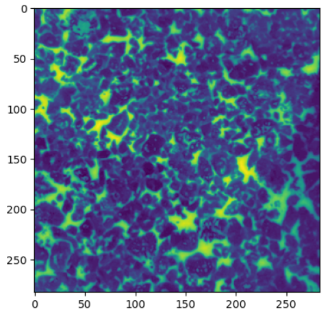
## 画像の読み込み
filepath = "./demo/coffee1.png"
img = cv2.imread(filepath, 0) #グレースケールで読み込み

## 可視化
plt.imshow(img)
plt.show()
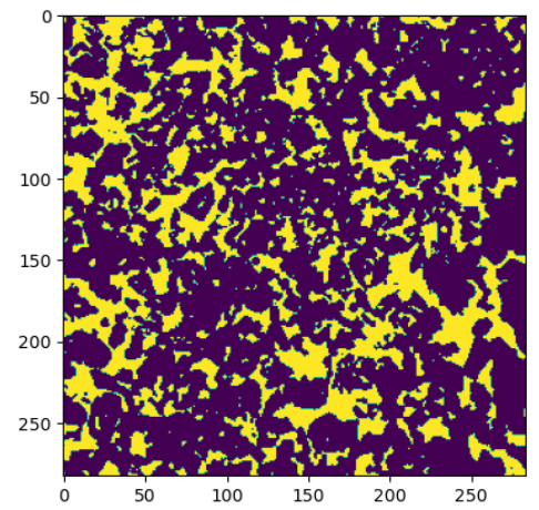
## 閾値を決めて2値化
threshold = 100
bi_img = cv2.threshold(img, threshold, 255, cv2.THRESH_BINARY)[1]

## 可視化
plt.imshow(bi_img)
plt.show()
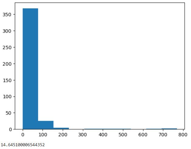
## 輪郭検出
cnts = cv2.findContours(bi_img, cv2.RETR_EXTERNAL, cv2.CHAIN_APPROX_NONE)[0]

## 周囲長の取得
perimeters = [cv2.arcLength(cnt, True) for cnt in cnts]

## 可視化
plt.hist(perimeters)
plt.show()

## 画像サイズあたりの合計周囲長の算出
perimeter_percent = 100 * sum(perimeters) / (bi_img.shape[0]*bi_img.shape[1])
print(perimeter_percent)
クラスの実装
import cv2
import matplotlib.pyplot as plt
import pandas as pd
import numpy as np
import os

class Perimeter_per_thereshold():
    def __init__(self):
        pass

    def get_perimeter_ratio(self, img, threshold):
        """
        Parameters
        ----------
        img: グレースケール画像. numpy.ndarray
        threshold: 閾値. int

        Returns
        -------
        perimeter_ratio: 割合. int
        """
        ## 2値化
        bi_img = cv2.threshold(img, threshold, 255, cv2.THRESH_BINARY)[1]

        ## 輪郭検出
        cnts = cv2.findContours(bi_img, cv2.RETR_EXTERNAL, cv2.CHAIN_APPROX_NONE)[0]

        ## 周囲長の取得
        perimeters = [cv2.arcLength(cnt, True) for cnt in cnts]

        ## 周囲長の割合
        perimeter_percent = 100 * sum(perimeters) / (bi_img.shape[0]*bi_img.shape[1])
        return perimeter_percent

    def scan_threshold(self, img, threshold_list = np.arange(10, 250, 10)):
        """
        Parameters
        ----------
        img: グレースケール画像. numpy.ndarray
        threshold_list: 2値化の閾値を格納したリスト. list


        Returns
        -------
        perimeter_percent_list: 周囲長の割合を格納したリスト. list
        """
        ## 周囲長の割合を取得
        perimeter_percent_list = [self.get_perimeter_ratio(img, threshold) for threshold in threshold_list]

        ## 割合が最大となる閾値で画像を2値化
        max_idx = perimeter_percent_list.index(max(perimeter_percent_list))
        max_threshold = threshold_list[max_idx]
        max_bi_img = cv2.threshold(img, max_threshold, 255, cv2.THRESH_BINARY)[1]
        return perimeter_percent_list, max_bi_img

    def scan_filepaths(self, filepaths, threshold_list=np.arange(10, 250, 10)):
        """
        Parameters
        ----------
        filepaths: 画像のファイルパスリスト. list
        threshold_list: 2値化の閾値を格納したリスト. list

        Returns
        -------
        sum_df: 結果を集約した表. DataFrame
        max_bi_img_list: 周囲長が最大となる2値画像のリスト. list
        """
        sum_df = pd.DataFrame()
        max_bi_img_list = []
        for filepath in filepaths:
            ## 画像の読み込み
            img = cv2.imread(filepath, 0)

            ## 周囲長の割合、割合が最大になる2値画像
            perimeter_percent_list, bi_img = self.scan_threshold(img, threshold_list)

            ## ファイル名、閾値とともにDataFrameに格納
            filename = os.path.splitext(os.path.basename(filepath))[0]
            df = pd.DataFrame([threshold_list, perimeter_percent_list], index=["threshold", "arcLen_%"]).T
            df.index = [filename]*len(df)

            ## 結合
            sum_df = pd.concat([sum_df, df], axis=0)

            ## 2値画像を格納
            max_bi_img_list.append(bi_img)
        return sum_df, max_bi_img_list
クラスの実行と画像間の比較
## ファイルパスリストの取得
filepaths = glob.glob("./demo/coffee*.png")

## 解析実行
scan_obj = Perimeter_per_thereshold()
sum_df, max_bi_img_list = scan_obj.scan_filepaths(filepaths)

## sum_dfの可視化
import seaborn as sns
fig = plt.figure()
ax = fig.add_subplot()
sns.lineplot(data=scan_df, x="threshold", y="arcLen_%", hue=scan_df.index, ax=ax)
plt.show()
解析結果

元画像

さいごに
インスタントコーヒーが溶解していく過程で、周囲長の割合が減少してく傾向を確認することができました。
また、白い牛乳が次第に茶色く(2値画像では黒)に変化していくことに起因して、ピークトップもシフトしていく様子も確認されました。
より本格的に解析するには、写真に紛れ込んだ影の影響を消すなどの検討が必要となります。