大学の研究の際にpythonでグラフを作成する機会があったため,matplotlibとpandasを用いてグラフを作成してみた.
matplotlibとは
matplotlibは,プログラミング言語Pythonのためのグラフ描画ライブラリである.オブジェクト指向のAPIを提供しており,様々な種類のグラフを描画する能力を持つ.
グラフの作成に使用したメソッド
| メソッド | 説明 |
|---|---|
| figure | figureのインスタンスが複数ある時など,どのfigureに割り当てるかを指定する. |
| subplot | 引数によって生成するAxes(サブプロット)の数を変更できる。 |
| twinx | 元のAxesオブジェクトを複製する。ただし新たなAxesには横軸がなく縦軸が逆側にある。 |
| set_xlabel | x軸のラベルを設定する |
| set_ylabel | y軸のラベルを設定する |
| get_legend_handles_labels | 二つ目のグラフを描写する |
| set_xlim | x軸の上限値を設定する |
| set_ylim | y軸の上限値を設定する |
| savefig | 作成したプロットを保存する |
pandasとは
pandasは,プログラミング言語Pythonにおいて,データ解析を支援する機能を提供するライブラリである.特に,数表および時系列データを操作するためのデータ構造と演算を提供する.
ソースコード
matplotlibとpandasを使用してグラフを作成した際のソースコード.
import pandas as pd
import matplotlib as mpl
import matplotlib.pyplot as plt

file = "./log/checkout_stats_history.csv"
df = pd.read_csv(filepath_or_buffer=file,encoding="cp932")
df_time = df.iloc[:, 0]         #タイムスタンプ
df_init_time = df.iloc[0,0]     #開始時間
df_time -= df_init_time         #タイムスタンプの整理,x軸
df_req = df.iloc[:, 4]          #リクエスト/s,y軸1
df_res = df.iloc[:, 22]         #最大応答時間,y軸2

fig = plt.figure()

ax1 = fig.subplots()
ax2 = ax1.twinx()
ax1.plot(df_time, df_res, c="b", label="res")
ax2.plot(df_time, df_req, c="r", label="req")
ax1.set_xlabel("Time Stamp (s)", fontsize=10)
ax1.set_ylabel("Total Max Response Time (s)", fontsize=10)
ax2.set_ylabel("Requests per second", fontsize=10)
h1, l1 = ax1.get_legend_handles_labels()
h2, l2 = ax2.get_legend_handles_labels()
ax1.legend(h1 + h2, l1 + l2)
ax1.set_xlim(0)
ax1.set_ylim(0)
plt.savefig('./graph/checkout_graph_data.png')
plt.close()
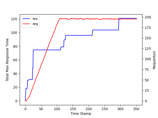
完成したグラフ
今回は負荷試験の結果から最大応答時間と秒間リクエスト量の関係を表すグラフを作成した.