ライブラリとバージョン
| ライブラリ | バージョン |
|---|---|
| react | 18.2.0 |
| react-dom | 18.2.0 |
| typescript | 4.7.4 |
| @emotion/react | 11.9.3 |
| @emotion/babel-preset-css-prop | 11.2.0 |
| @storybook/react | 6.5.9 |
Reactプロジェクト作成
$ npx create-react-app react-storybook --template typescript
$ cd react-storybook
StoryBookをインストール
$ npx storybook init
↓のコマンドで立ち上げを確認
$ npm run storybook
emotionをインストール
$ npm i @emotion/react @emotion/babel-preset-css-prop
Storybookにemotionを適用させる
.storybookディレクトリの直下にwebpack.config.jsを作成。
以下を記述。
webpack.config.js
module.exports = ({ config }) => {
  config.module.rules.push({
    test: /\.(ts|tsx)$/,
    loader: require.resolve("babel-loader"),
    options: {
      presets: [
        ["react-app", { flow: false, typescript: true }],
        // css prop を使えるように,追加
        require.resolve("@emotion/babel-preset-css-prop"),
      ],
    },
  });

  config.resolve.extensions.push(".ts", ".tsx");

  return config;
};
Global cssを作成
srcディレクトリ直下にGlobalStyle.tsxを作成
中にリセットcssなどGlobalで当てたいcssを記述。
GlobalStyle.tsx
import { Global, css } from "@emotion/react";

const GlobalStyle = () => (
  <Global
    styles={css`
      * {
        box-sizing: border-box;
      }

      html,
      body,
      div,
      span,
      object,
      iframe,
      h1,
      h2,
      h3,
      h4,
      h5,
      h6,
      p,
      blockquote,
      pre,
      abbr,
      address,
      cite,
      code,
      del,
      dfn,
      em,
      img,
      ins,
      kbd,
      q,
      samp,
      small,
      strong,
      sub,
      sup,
      var,
      b,
      i,
      dl,
      dt,
      dd,
      ol,
      ul,
      li,
      fieldset,
      form,
      label,
      legend,
      table,
      caption,
      tbody,
      tfoot,
      thead,
      tr,
      th,
      td,
      article,
      aside,
      canvas,
      details,
      figcaption,
      figure,
      footer,
      header,
      hgroup,
      menu,
      nav,
      section,
      summary,
      time,
      mark,
      audio,
      video {
        padding: 0;
        margin: 0;
        font-size: 100%;
        vertical-align: baseline;
        background: transparent;
        border: 0;
        outline: 0;
      }

      article,
      aside,
      details,
      figcaption,
      figure,
      footer,
      header,
      hgroup,
      menu,
      nav,
      section {
        display: block;
      }

      ul,
      li {
        list-style: none;
      }

      a {
        color: inherit;
        text-decoration: none;
        outline: none;
      }

      a:visited {
        border: none;
      }

      /* Form Style Reset */
      input,
      button,
      select,
      textarea {
        font: inherit;
        background: transparent;
        border: none;
        border-radius: 0;
        outline: none;
        -webkit-appearance: none;
        -moz-appearance: none;
        appearance: none;
      }

      textarea {
        resize: none;
      }

      input[type="checkbox"],
      input[type="radio"] {
        display: none;
      }

      input[type="submit"],
      input[type="button"],
      label,
      button,
      select {
        cursor: pointer;
      }

      select::-ms-expand {
        display: none;
      }

      input:-webkit-autofill {
        -webkit-box-shadow: 0 0 0 1000px #fff inset;
      }

      input[type="number"] {
        -moz-appearance: textfield;
      }

      input[type="number"]::-webkit-outer-spin-button,
      input[type="number"]::-webkit-inner-spin-button {
        -webkit-appearance: none;
        margin: 0;
      }
    `}
  />
);
export default GlobalStyle;
Global cssを適用
.storybookディレクトリ内のpreview.js内上部に以下を追記。
import GlobalStyle from "../src/GlobalStyle";

export const decorators = [
  (Story) => (
    <>
      <GlobalStyle />
      <Story />
    </>
  ),
];
↓のようになればOK
preview.js
+ import GlobalStyle from "../src/GlobalStyle";

+ export const decorators = [
+   (Story) => (
+     <>
+       <GlobalStyle />
+       <Story />
+     </>
+   ),
+ ];

export const parameters = {
  actions: { argTypesRegex: "^on[A-Z].*" },
  controls: {
    matchers: {
      color: /(background|color)$/i,
      date: /Date$/,
    },
  },
};
最後に、tsconfig.jsonにjsxImportSourceオプションを追加
tsconfig.json
{
  "compilerOptions": {
    // ...
    "jsx": "react-jsx",
    "jsxImportSource": "@emotion/react"
  },
  // ...
}
試してみる
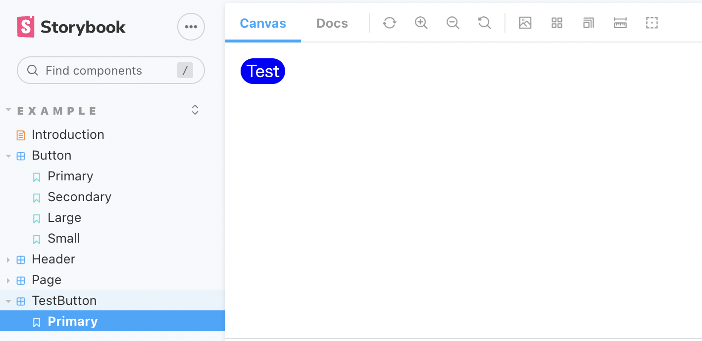
コンポーネントの作成
TestButton.tsx
import { css } from "@emotion/react";

export const TestButton = () => {
  const buttonStyle = css`
    color: #fff;
    background-color: blue;
    border-radius: 3em;
  `;

  return <button css={buttonStyle}>Test</button>;
};
ストーリーズの作成
TestButton.stories.tsx
import { TestButton } from "./TestButton";

export default {
  title: "Example/TestButton",
  component: TestButton,
};

const Template = () => <TestButton />;

export const Primary = Template.bind({});