データの可視化にはsns.swarmplotが便利ですが、swarmplotのみでは平均値や標準誤差をわかりやすく表示することができません。
そこで、sns.swarmplotの上にplt.errorbarを重ね、平均値と標準誤差を可視化する方法をご紹介します。
使用ライブラリ
matplotlib, pandas, seaborn
使用するデータセット
seabornで用意されているデータセットを使用します。
import matplotlib
import matplotlib.pyplot as plt
import pandas as pd
import seaborn as sns

df = sns.load_dataset("tips")
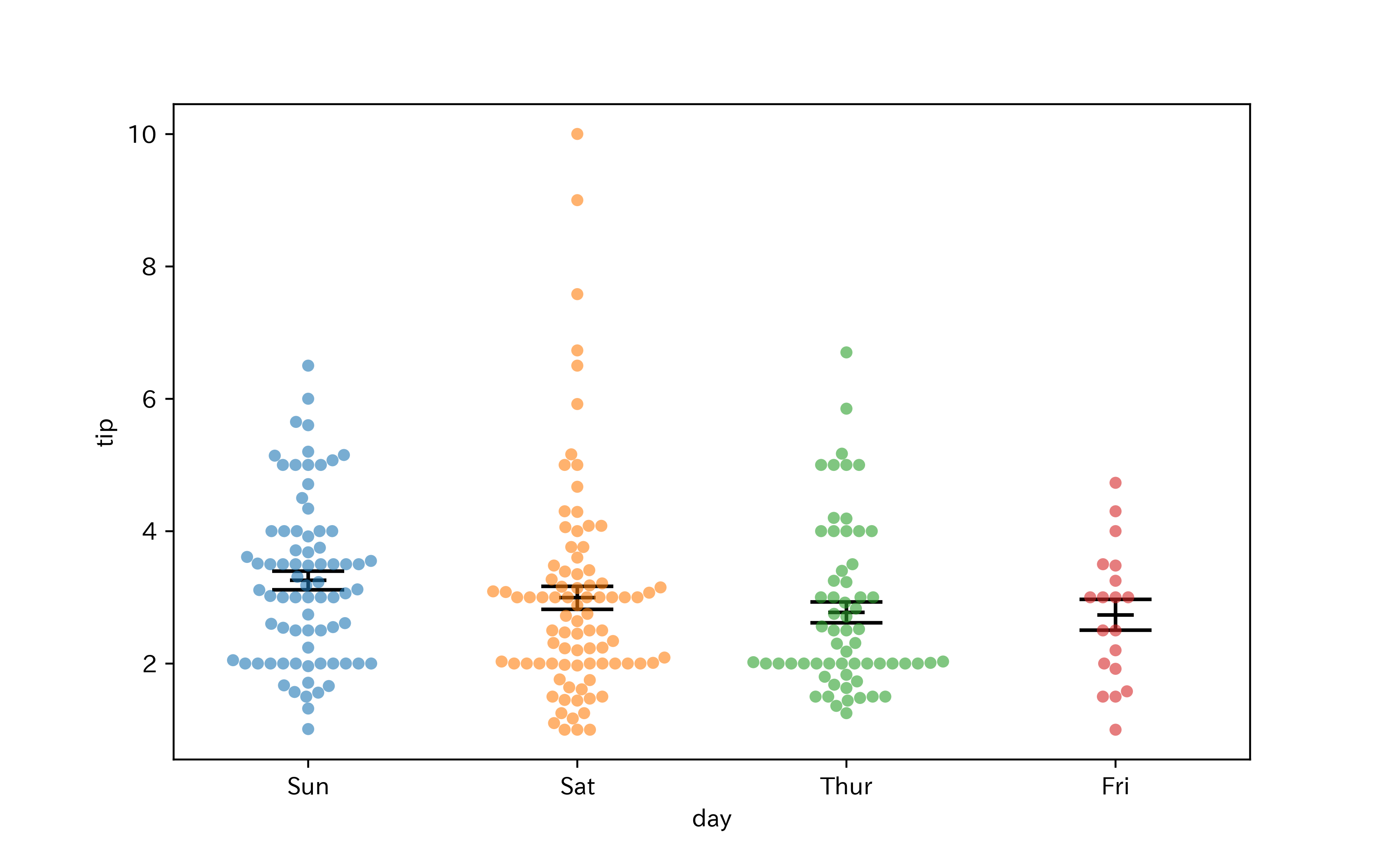
簡単な場合(hueを設定しないとき)
各データのswarmplotは、x = 0, 1, 2, ...の位置に描画されます。
従って、この位置にerrorbarを描画すればOKです。
swarmplotとerrorbarを対応づけるため、sns.swarmplotに渡す引数orderによってx軸ラベルの順序を指定しています。
また、errorbarが見やすくなるよう、引数alphaを使って透明度を調整しています。
plt.subplotを使ってFigureとAxesを生成し、ここにグラフを描いていきます。
Figureやerrorbarの大きさは見やすいように調整しました。
# FigureとAxes生成
fig, ax = plt.subplots(figsize = (8, 5))

# swarmplot描画
x = "day"
y = "tip"
xlabels = df[x].unique()  # x軸のラベルの種類
sns.swarmplot(data = df, x = x, y = y, ax = ax, order = xlabels, alpha = 0.6)

# plt.errorbarへの入力を生成
x_pos = []  # errorbarをプロットするx座標
mean = []  # 平均値
sem = []  # 標準誤差
for cnt, xl in enumerate(xlabels):
    df_tmp = df[df[x] == xl][y]
    x_pos.append(cnt)
    mean.append(df_tmp.mean())
    sem.append(df_tmp.std(ddof = 1) / (len(df_tmp) ** 0.5))

# errorbar描画
ax.errorbar(x = x_pos, y = mean, yerr = sem, fmt = "_", color = "black",
            capsize = 15, markersize = 15, markeredgewidth = 1.5, elinewidth = 1.5)

fig.show()
hueを設定する場合
hueを設定する(その上でdodge = Trueとする)と、swarmplotが描画されるx座標が先ほどのように単純ではなくなります。
そこで、swarmplotが描画されたx座標を取得し、その位置にerrorbarを描画します。
まずはerrorbarを描くx座標を取得するための関数を定義します。
ax.get_children()を用いるとプロットされた1つ1つの点の座標を取得できるので、各点のx座標の平均値にerrorbarを描画することにします。
def get_swarm_xpos(ax):

    swarm_xpos = []
    c = ax.get_children()

    i = 0
    while True:
        if isinstance(c[i], matplotlib.collections.PathCollection):
            x, _ = c[i].get_offsets().T
            if len(x) != 0:
                swarm_xpos.append(x.mean())
        else:
            break
        i += 1

    return swarm_xpos
続いて、グラフの作成です。
hueの順序も指定するため、今度はorderに加えてhue_orderも設定しています。
# FigureとAxes生成
fig, ax = plt.subplots(figsize = (10, 6))

# swarmplot描画
x = "day"
y = "tip"
hue = "sex"
xlabels = df[x].unique()  # x軸のラベルの種類
huelabels = df[hue].unique()  # hueの種類
sns.swarmplot(data = df, x = x, y = y, hue = hue, ax = ax,
              order = xlabels, hue_order = huelabels, dodge = True, alpha = 0.6)

# plt.errorbarへの入力を生成
x_pos = get_swarm_xpos(ax)  # errorbarをプロットするx座標
mean = []  # 平均値
sem = []  # 標準誤差
for xl in xlabels:
    for hl in huelabels:
        df_tmp = df[(df[x] == xl) & (df[hue] == hl)][y]
        mean.append(df_tmp.mean())
        sem.append(df_tmp.std(ddof = 1) / (len(df_tmp) ** 0.5))

# errorbar描画
ax.errorbar(x = x_pos, y = mean, yerr = sem, fmt = "_", color = "black",
            capsize = 10, markersize = 10, markeredgewidth = 1.5, elinewidth = 1.5)

fig.show()
