どんなの?
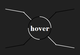
こんなの。画像の例だと、ホバーしたときに円から線がにょきにょき出てくる。実装の仕方が泥臭いので、実際に使えるかといわれると微妙。
HTML を書く
特にこれといった工夫はなし。
<div class="container">
  <h1>hover</h1>
  <ul>
    <li> </li>
    <li> </li>
    <li> </li>
    <li> </li>
  </ul>
</div>
CSS を書く
手順1. 円を描く
とりあえず、こんな感じの CSS を書いて円を作る。
*
{
    box-sizing: border-box;
    margin: 0;
    padding: 0;
}

body
{
    color: #fff;
}

ul
{
    list-style: none;
}

.container
{
    display: flex;
    height: 100vh;
    background: #212121;
    align-items: center;
    justify-content: center;
}

h1
{
    display: flex;
    overflow: hidden;
    max-width: 130px;
    height: 10vw;
    max-height: 130px;
    border: solid #fff;
    border-radius: 50%;
    flex-basis: 10vw;
    align-items: center;
    justify-content: center;
}
手順2. 円から線を生やす
横幅 0 , 縦幅 2 px の擬似要素を用意して、それらを絶対配置している。適宜transformプロパティを使って回転させている。そしてホバー時に、0 に設定しておいた横幅を伸ばして、円から線を生やしている。
*, *::before, *::after {
  box-sizing: border-box;
  margin: 0;
  padding: 0;
}

body {
  display: flex;
  height: 100vh;
  color: #fff;
  background: #212121;
  align-items: center;
  justify-content: center;
}

ul {
  position: absolute;
  list-style: none;
}

.container {
  position: relative;
  display: flex;
  overflow: hidden;
  width: 50vw;
  max-width: 500px;
  height: 50vh;
  max-height: 500px;
  align-items: center;
  justify-content: center;
}

h1 {
  position: relative;
  z-index: 1;
  display: flex;
  overflow: hidden;
  width: 10vw;
  max-width: 130px;
  height: 10vw;
  max-height: 130px;
  border-radius: 50%;
  align-items: center;
  justify-content: center;
}

h1::before {
  position: absolute;
  z-index: -1;
  width: 100%;
  height: 100%;
  content: "";
  transition: all 0.3s linear;
  transform: rotate(-135deg);
  border: 2px solid transparent;
  border-radius: 50%;
}

h1:hover::before {
  transform: rotate(225deg);
  border-color: #fff #000;
}

h1 ~ ul > li {
  position: absolute;
  width: 0;
  height: 2px;
  transition: width 0.3s ease-in-out;
  transform-origin: left;
}

h1:hover ~ ul > li {
  width: 10vw;
  max-width: 260px;
  transition: width 0.6s ease-in-out;
}

li:nth-of-type(odd) {
  background: #fff;
}

li:nth-of-type(even) {
  background: #000;
}

li:nth-of-type(1) {
  transform: rotate(225deg);
}

li:nth-of-type(2) {
  transform: rotate(-45deg);
}

li:nth-of-type(3) {
  transform: rotate(45deg);
}

li:nth-of-type(4) {
  transform: rotate(-225deg);
}
手順3. 好きなように CSS をいじくる
円からにょきにょき線が出てきたので、あとは好きなように CSS をいじくる。今回は一番上に載せた画像と同じになるように CSS を書いた。 li要素内の擬似要素を使っている。
*, *::before, *::after
{
    box-sizing: border-box;
    margin: 0;
    padding: 0;
}

body
{
    display: flex;
    height: 100vh;
    color: #fff;
    background: #212121;
    align-items: center;
    justify-content: center;
}

ul
{
    position: absolute;
    list-style: none;
}

.container
{
    position: relative;
    display: flex;
    overflow: hidden;
    width: 50vw;
    max-width: 500px;
    height: 50vh;
    max-height: 500px;
    align-items: center;
    justify-content: center;
}

h1
{
    position: relative;
    z-index: 1;
    display: flex;
    overflow: hidden;
    width: 10vw;
    max-width: 130px;
    height: 10vw;
    max-height: 130px;
    border-radius: 50%;
    background: #212121;
    align-items: center;
    justify-content: center;
}

h1::before
{
    position: absolute;
    z-index: -1;
    width: 100%;
    height: 100%;
    content: '';
    transition: all .3s linear;
    transform: rotate(-135deg);
    border: 2px solid transparent;
    border-radius: 50%;
}


h1:hover::before
{
    transform: rotate(225deg);
    border-color: #fff #000;
}

h1 ~ ul > li
{
    position: absolute;
    width: 0;
    height: 2px;
    transition: width .3s 2s ease-in-out;
    transform-origin: left;
}

h1:hover ~ ul > li
{
    width: 10vw;
    max-width: 260px;
    transition: width 1.2s ease-in-out;
}

li:nth-of-type(odd), li:nth-of-type(odd)::before
{
    background: #fff;
}

li:nth-of-type(even), li:nth-of-type(even)::before
{
    background: #000;
}

li:nth-of-type(1)
{
    transform: rotate(225deg);
}

li:nth-of-type(2)
{
    transform: rotate(-45deg);
}

li:nth-of-type(3)
{
    transform: rotate(45deg);
}

li:nth-of-type(4)
{
    transform: rotate(-225deg);
}

li::before
{
    position: absolute;
    right: 4px;
    width: 0;
    height: 2px;
    content: '';
}

h1:hover ~ ul > li::before
{
    width: 80px;
}

li:nth-of-type(odd)::before
{
    transform: rotate(-215deg);
    transform-origin: bottom right;
}

li:nth-of-type(even)::before
{
    transform: rotate(-145deg);
    transform-origin: top right;
}

li:nth-of-type(1)::before
{
    transition: width .5s;
}

h1:hover ~ ul > li:nth-of-type(1)::before
{
    transition: width .5s 1.2s;
}

li:nth-of-type(2)::before
{
    transition: width .5s .5s;
}

h1:hover ~ ul > li:nth-of-type(2)::before
{
    transition: width .5s 1.8s;
}

li:nth-of-type(3)::before
{
    transition: width .5s 1s;
}

h1:hover ~ ul > li:nth-of-type(3)::before
{
    transition: width .5s 2.4s;
}

li:nth-of-type(4)::before
{
    transition: width .5s 1.5s;
}

h1:hover ~ ul > li:nth-of-type(4)::before
{
    transition: width .5s 3s;
}
動作確認
動作確認用の CodePen を埋め込んでおく。出来れば CodePen のサイトに飛んで動作確認したほうが良い(狭い幅、高さだとうまく見れない)。
See the Pen 円からにょきにょき。 by Hakaato (@hakaato) on CodePen.
おわりに
もっとスマートにするつもりが、泥臭くなってしまったのが残念。また、自身の配色センスのなさに心が凍った。暇があれば、もう一度挑戦してみようと思う。