ROC Curve and AUC
For evaluating a binary classification model, Area under the Curve is often used. AUC (In most cases, C represents ROC curve) is the size of area under the plotted curve. In ROC (Receiver operating characteristic) curve, true positive rates are plotted against false positive rates. The closer AUC of a model is getting to 1, the better the model is. It means, a model with higher AUC is preferred over those with lower AUC.
Calculating AUC is not so difficult as you can find scikit-learn module for AUC and all you need to do is passing your prediction vector and target score vector to AUC module. Then, the module calculates true positive rates and false positive rates automatically and returns AUC value.
Plot ROC Curve
The purpose of using AUC is to evaluate your model's prediction. As AUC returns results as numeric values. So just by comparing those numbers, you can pick which model has the best prediction performance. However, in my opinion, showing a plot instead of numbers are instinctively much convincible and easy to grab the concept. Therefore, not just calculating AUC, but also I tried to plot ROC Curve.
Following the instruction here http://scikit-learn.org/stable/auto_examples/model_selection/plot_roc.html, I implemented the code like below. Note that, in the example below, "predictions_test" contains prediction results by my model and "outcome_test" is target score for comparison.
from sklearn.metrics import roc_curve, auc
fpr, tpr, thresholds = roc_curve(predictions_test, outcome_test)
roc_auc = auc(fpr, tpr)

plt.figure()
plt.plot(fpr, tpr, color='darkorange', lw=1, label='ROC curve (area = %0.2f)' % roc_auc)
plt.plot([0, 1], [0, 1], color='navy', lw=lw, linestyle='--')
plt.xlim([0.0, 1.0])
plt.ylim([0.0, 1.05])
plt.xlabel('False Positive Rate')
plt.ylabel('True Positive Rate')
plt.title('Receiver operating characteristic')
plt.legend(loc="lower right")
plt.show()
Then, the following figure returned.
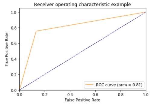
ROC Curve for binary classification
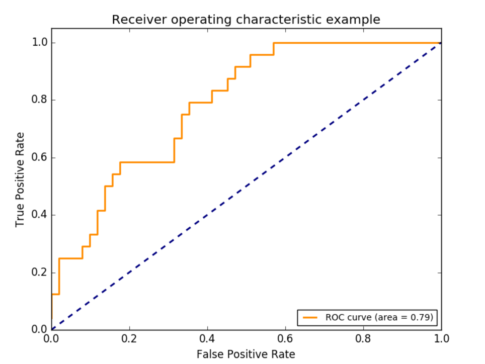
Successfully I was able to get ROC Curve polt, however, it is actually a little bit different from what I expected like below.
It seems like there are only 3 points (including [0,0] and [1,1]) in my ROC curve. It is not a curve at all. I wondered and googled it and I found out this is how ROC curve works.
According to the post: https://stackoverflow.com/questions/30051284/plotting-a-roc-curve-in-scikit-yields-only-3-points, the number of points in ROC curve depends on the number of unique value in input data. In this case, this is binary classification problem so input has only binary value 0 and 1. Therefore, ROC curve for my prediction model is nothing wrong.