ひとりCSS Advent Calendar 2022 2日目です。
Flexbox を学び直します。
Flexbox を使うには
親のコンテナーに display: flex と書くとできる。
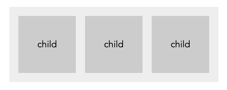
サンプル
<div class="parent">
  <div class="child">
    child
  </div>
  <div class="child">
    child
  </div>
  <div class="child">
    child
  </div>
</div>
.parent {
  display: flex;
  gap: 16px;
}
親のコンテナーに指定できるプロパティ
-
flex-
flex-grow,flex-shrink,flex-basisのショートハンド
-
-
flex-flow-
flex-direction,flex-wrapのショートハンド
-
-
flex-wrap- アイテムを1行に配置するか折り返しするか- wrap - 折り返したいときに使う
-
justify-content- 左右方向の配置を指定- flex-end - 行末
- space-between - 両端揃え
-
align-items- 上下方向の配置を指定(1行時)- stretch - 高さいっぱいに広がる
- center - 中央
-
align-content- 上下方向の配置を指定(複数行) -
flex-direction- 配置の向きを指定- row - 横並び(デフォルト値)
- row-reverse - row と同様だが、逆向き
- column - 縦ならび
- column-reverse - column と同様だが、逆向き
-
gap- 子(アイテム)まわりの余白を指定
子に指定できるプロパティ
-
align-self- 親に指定する align-items を上書きできる -
flex-basis- 幅の指定 -
flex-grow- どれだけ広くするか -
flex-shrink- どれだけ狭くするか -
order- 順番
遊んでみる
See the Pen Flexbox by Beco (@becolomochi) on CodePen.
感想
- 色々プロパティが用意されているものの、実務として使うのは限られているんだよな…という気持ちでいる
- flex-grow, flex-shrink はめったに使わない
- 挙動をしっかりコントロールできないため
- flex-grow, flex-shrink はめったに使わない
- gap がモダンブラウザ対応で使えるようになって便利になった。