はじめに
先日[1]の記事で「調査対象が日射量と水深だけで、海岸からの距離、波高、潮の流れの速さ、台風の進路でないか、船の航路になってないか、など他の項目が不足している」という課題を挙げました。
その中で今回は波高について調査していきたいと思います。
実行環境
- CPU: CORE i5 8th Gen
- メモリ: 8GB
- OSと環境: Window11にAnacondaをインストールした環境
- プログラミング言語とバージョン:python 3.11.5
使用したデータ
データのダウンロード方法は[1]の記事と同じでダウンロードしてくる項目を変えるだけです。
-
有義波高のデータ
- 気象データセット: ECMWF(欧州中期予報センター) ERA5
- 期間: ERA5で公開されている2022年の全ての日時
- 領域: 日本周辺 北緯:24°~46° 東経122°~153°
- 項目: significant height of combined wind waves and swell(有義波高と言うそうですが、[2]より、風とうねりによって生成される海洋/海の波の最も高い1/3の平均高さとのことです)
- 形式: netCDF
-
水深のデータ
- 地形データセット:NOAA ETOPO1
- ダウンロードしたデータファイル: ETOPO1_Bed_g_gmt4.grd
作成したコード
以下が作成したコードになります。
[1]の記事で作成したコードから修正したのは次の点になります。
- 波高のデータは陸地ではNaNとなるので陸地はETOPO1のデータを使って白く塗りつぶした。
- ERA5のデータの解像度は、緯度と経度がそれぞれ0.25°です。一方でETOPO1の解像度は、緯度と経度が1分です。そのため、日照量と同様にヒートマップとコンター図を組み合わせると、海岸線周辺で不連続な表示が生じます。この問題を解決するために、ERA5の緯度と経度の解像度を1分に調整し、各セルには最も近い緯度経度の値を使用しました。海岸付近のNaN(非数)の箇所は隣接するセルからの平均値で補間されています。
import xarray as xr
import matplotlib.pyplot as plt
from matplotlib.colors import ListedColormap
import numpy as np
import cartopy.crs as ccrs
import rasterio
from rasterio.windows import from_bounds

# ETOPO1データの読み込み
with rasterio.open('ETOPO1_Bed_g_gmt4.grd') as etopo_dataset:
    window = from_bounds(122, 24, 153, 46, etopo_dataset.transform)
    etopo_data = etopo_dataset.read(1, window=window)
    etopo_transform = etopo_dataset.window_transform(window)
    etopo_x, etopo_y = np.meshgrid(
        np.linspace(etopo_transform.c, etopo_transform.c + etopo_transform.a * etopo_data.shape[1], etopo_data.shape[1]),
        np.linspace(etopo_transform.f, etopo_transform.f + etopo_transform.e * etopo_data.shape[0], etopo_data.shape[0])
    )

# NetCDFファイルの読み込み
data = xr.open_dataset('download_significant_height_of_combined_wind_waves_and_swell_2022.nc')

# 波高データの選択
wave_height = data['swh']

# 月ごとの平均の計算
monthly_mean = wave_height.groupby('time.month').mean('time')

# カラーバーのリミットの定義
colorbar_max = monthly_mean.max().values
colorbar_min = monthly_mean.min().values

# 新しい座標を作成
new_lon = np.arange(122, 153, 1/60)
new_lat = np.arange(24, 46, 1/60)

# 元のデータの緯度経度を取得
original_lons = monthly_mean['longitude'].values
original_lats = monthly_mean['latitude'].values

# 月ごとの平均のヒートマップのプロット
for month in range(1, 13):
    plt.figure(figsize=(12, 8))
    ax = plt.axes(projection=ccrs.PlateCarree())
    ax.set_extent([122, 153, 24, 45])

    # 月ごとのデータの選択
    monthly_data = monthly_mean.sel(month=month).values

    # 補間処理を行うための空の配列を作成
    interpolated_np = np.empty((len(new_lat), len(new_lon)))

    # 最も近いポイントを見つけて補間する
    for i, lat in enumerate(new_lat):
        for j, lon in enumerate(new_lon):
            # 最も近い緯度経度のインデックスを見つける
            lat_idx = (np.abs(original_lats - lat)).argmin()
            lon_idx = (np.abs(original_lons - lon)).argmin()
            # 最も近いポイントの値を新しいグリッドに割り当てる
            interpolated_np[i, j] = monthly_data[lat_idx, lon_idx]

    # NaNデータの処理
    def fill_nulls(data, i, j):
        # 直接隣接するセルをチェックする(上、下、左、右)
        adjacent_indices = [(i-1, j), (i+1, j), (i, j-1), (i, j+1)]
        valid_values = []
        for idx in adjacent_indices:
            if 0 <= idx[0] < data.shape[0] and 0 <= idx[1] < data.shape[1]:
                if not np.isnan(data[idx[0], idx[1]]):
                    valid_values.append(data[idx[0], idx[1]])
        # 有効な隣接セルがある場合のみ平均値を計算する
        return np.mean(valid_values) if valid_values else np.nan

    # 各グリッドポイントでNaNデータの処理を適用
    for i in range(interpolated_np.shape[0]):
        for j in range(interpolated_np.shape[1]):
            if np.isnan(interpolated_np[i, j]):
                interpolated_np[i, j] = fill_nulls(interpolated_np, i, j)

    # ヒートマップの作成
    mesh = ax.pcolormesh(new_lon, new_lat, interpolated_np,
                         shading='auto', cmap='viridis',
                         vmin=colorbar_min, vmax=colorbar_max, zorder=2)

    # 水深が0より大きい場所は陸地であり、ここを白色で上書きする
    land_cmap = ListedColormap(["none","white"])
    # 陸地を白色で上書き
    land_mask = etopo_data > 0
    ax.pcolormesh(etopo_x, etopo_y, land_mask, cmap=land_cmap, zorder=3)

    # 水深のコンターを追加(1000m間隔)
    contour_levels = np.arange(-10000, 1, 1000)
    contours = ax.contour(etopo_x, etopo_y, etopo_data, levels=contour_levels,
                          colors='grey', linestyles='solid', linewidths=0.5, transform=ccrs.PlateCarree())
    coastline = ax.contour(etopo_x, etopo_y, etopo_data, levels=[0],
                           colors='black', linestyles='solid', linewidths=0.5, transform=ccrs.PlateCarree())

    # 水深値のラベル追加
    ax.clabel(contours, inline=True, fontsize=8, fmt='%1.0f m')

    # カラーバーの追加
    cbar = plt.colorbar(mesh, orientation='vertical', pad=0.02, aspect=50)
    cbar.set_label('Significant Height of Wave in Month (m)', rotation=270, labelpad=20)

    # タイトルの設定
    plt.title(f'Significant Height of Wave Monthly Mean Heatmap with Water Depth in Month {month}')

    # 図の保存
    plt.savefig(f"heatmap_wave_month_{month}.png", bbox_inches='tight', dpi=300)
    plt.close()
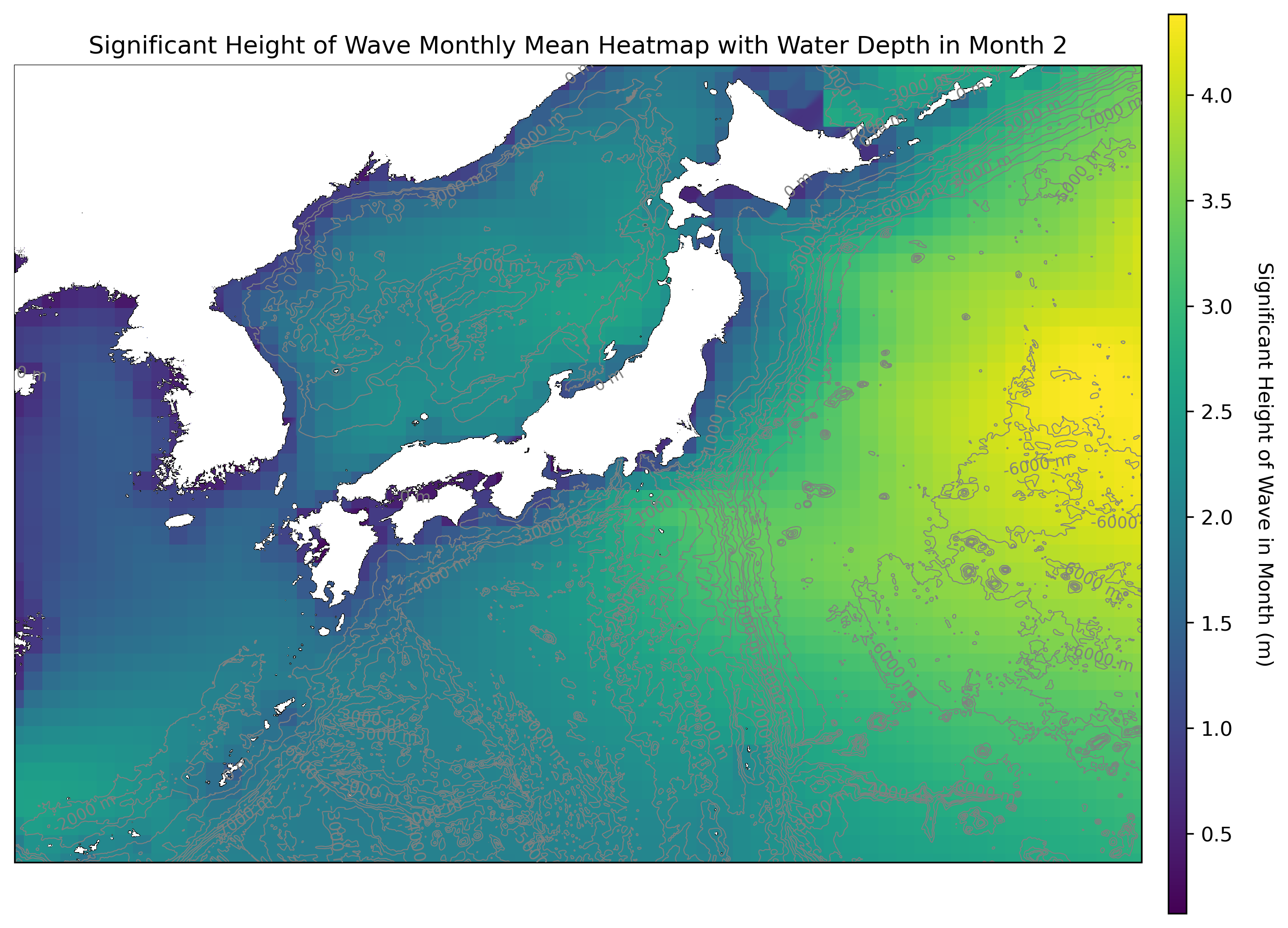
作成したヒートマップ
月ごとのヒートマップを見たかったので「月ごとの平均」で有義波高のヒートマップを作りました。以下は色がはっきり出ていた2月の有義波高のヒートマップです。
候補地における有義波高
[3]の記事で抽出した候補地における2月の有義波高を以下のコードで抽出しました。
import pandas as pd
import xarray as xr
import numpy as np

# 指定した緯度経度
locations = [
    (25.50, 142.00),
    (24.75, 132.00),
    (25.50, 142.25)
]

# NetCDFファイルの読み込み
data = xr.open_dataset('download_significant_height_of_combined_wind_waves_and_swell_2022.nc')

# 波高データの選択
wave_height = data['swh']

# 月ごとの平均の計算
monthly_mean = wave_height.groupby('time.month').mean('time')

# 元のデータの緯度経度を取得
original_lons = monthly_mean['longitude'].values
original_lats = monthly_mean['latitude'].values

# 緯度経度から最も近いインデックスを見つける関数
def find_nearest_idx(array, value):
    idx = (np.abs(array - value)).argmin()
    return idx

# CSVファイル用のデータフレームを作成
df = pd.DataFrame(columns=['latitude', 'longitude', 'Month', 'monthly_mean_wave'])

# 各緯度経度の月ごとの波高を抽出
for lat, lon in locations:
    lat_idx = find_nearest_idx(original_lats, lat)
    lon_idx = find_nearest_idx(original_lons, lon)

    for month in range(1, 13):
        monthly_data = monthly_mean.sel(month=month).values
        wave_height_at_location = monthly_data[lat_idx, lon_idx]
        print(f"Wave height at {lat}, {lon} in month {month}: {wave_height_at_location}")
        row = pd.DataFrame({'latitude': [lat], 'longitude': [lon], 'Month': [month], 'monthly_mean_wave': [wave_height_at_location]})
        df = pd.concat([df, row], ignore_index=True)

# CSVファイルに出力
df.to_csv('selected_wave_heights.csv', index=False)
結果は以下の表になります。
| No. | 緯度 | 経度 | 有義波高(2月の平均値) |
|---|---|---|---|
| 1 | 北緯25.5° | 東経142° | 2.2m |
| 2 | 北緯24.75° | 東経132° | 1.9m |
| 3 | 北緯25.5° | 東経142.25° | 2.2m |
考察と課題
抽出した候補地の有義波高は2m近くあり、印象としては相当に波高が高いと感じました。[4]の情報によれば、波高が1.5m以上では海上工事が中止される基準とされています。このため、ここでの海上太陽光発電所の建設はかなり困難であると考えられます。
また、今回の候補地抽出では、水深>日射量>波高の優先順位を採用しました。しかし、水深=波高>日射量といった優先順位で候補地を再抽出することが、より現実的な候補地を探せる可能性があるのではないかと考えられます。
今回はここまでですが、今後は潮の流れの速さや台風の進路でないか、船の航路でないかなどの調査にも機会があれば取り組みたいと考えています。
参考サイト
[1] 海上の太陽光発電所に最適なとこってどこなんだろうか?
[2] ECMWF Parameter details
[3]海上の太陽光発電所に最適なとこってどこなんだろうか? 候補地探索編
[4]工事・作業許可申請要領 下田海上保安部