記事の内容
子供の頃に台風ってこんなに頻繁に発生してたっけ?とか10月ぐらいに台風って日本に来てたっけ?という漠然とした疑問がありました。
気象庁が公開している台風に関するデータを使ってこのあたりの疑問を解決出来たらないいなと思い、色々やってみました。
データ取得元
政府が運営しているデータカタログサイトから取得しました。
気象予報_天気予報・台風の資料
このページの「台風位置表のCSVデータ」を使用します。
この記事ではリンク先に掲載されている2001年から2019年までのCSVデータを使用しました。
foliumを使って台風の経路を地図上に書いてみる
準備
CSVデータのヘッダーが日本語だったので英語に変えました。だいぶ適当です
year,month,day,hour(UTC),typhoon_no,typhoon_name,rank,latitude,longitude,central_pressure,max_wind_speed,50KT_LDD,50KT_LD,50KT_MA,30KT_LDD,30KT_LD,30KT_MA,landing
コード
あまり、工夫したところはありません
import folium
import pandas as pd

pd.options.display.precision = 3

# 開始と終了の年
start_year = 2001
end_year = 2019

# 1年単位で処理する
for year in range(start_year, end_year+1):
    print('# ' + str(year) + ' year start')
    # データの読み込み
    df = pd.read_csv('./typhoon/table' + str(year) + '.csv',encoding="SHIFT-JIS")
    typhoon_names = list(df['typhoon_name'])
    latitude = list(df["latitude"])
    longitude = list(df["longitude"])
    landing = list(df["landing"])

    map = folium.Map(location=[35.6611098,139.6953576], zoom_start=3)

    target_typhoon = typhoon_names[0]
    target_location = []
    color = 'blue'
    typhoon_count = 0

    # CSVデータを1行ずつ処理する
    for lt, lo, name, land in zip(latitude, longitude, typhoon_names, landing):
        # 台風の名前が変わったら処理中の台風の情報を地図に書く
        if name != target_typhoon:
            map.add_child(folium.PolyLine(locations=target_location, color=color))
            target_location = [[float(lt), float(lo)]]
            target_typhoon = name
            typhoon_count += 1
        else:
            target_location.append([float(lt), float(lo)])

    map.add_child(folium.PolyLine(locations=target_location, color=color))
    map.save('./output/' + str(year) + '_typhoon_location.html')
    print('# Number of typhoon : ' + str(typhoon_count))
    print('# ' + str(year) + ' year end')
出力結果
出力結果は年毎に「output」フォルダの配下に出力しています。
出力したHTMLを開くとこんな感じになります。
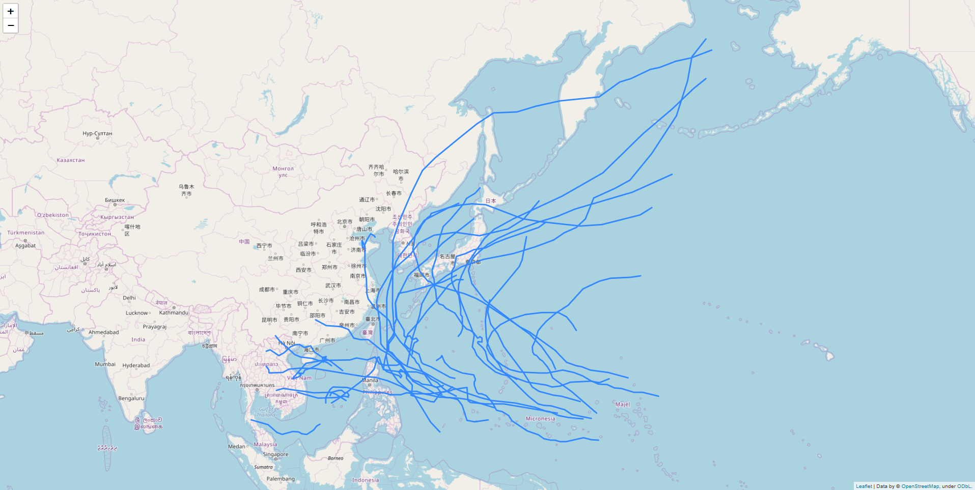
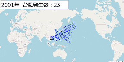
出力結果の画像を2001年から2019年まで表示するGIFを作ってみました。
日本に上陸した台風は線の色を変えてみる
やはり、日本に上陸した台風は目立たせたいですよね。
データの最終項目に「上陸」という項目がありました。上陸していたら1、していなかったら0です。
このデータを使って色分けをします。
注意しないといけないのが、この「上陸」は「日本に」ではありません。
そのため、日本かどうかの判定を入れる必要がありました。
コード
import folium
import pandas as pd

pd.options.display.precision = 3

# 開始と終了の年
start_year = 2001
end_year = 2019

# 日本の東西南北の端の座標
east_end = 153.5911
west_end = 122.5601
north_end = 45.3326
south_end = 20.2531

def is_japan_randing(lt, lo, randing):
    if south_end <= lt and lt <= north_end and west_end <= lo and lo <= east_end and randing == 1:
        return True
    else:
        return False

# 1年単位で処理する
for year in range(start_year, end_year+1):
    print('# ' + str(year) + ' year start')
    # データの読み込み
    df = pd.read_csv('./typhoon/table' + str(year) + '.csv',encoding="SHIFT-JIS")
    typhoon_names = list(df['typhoon_name'])
    latitude = list(df["latitude"])
    longitude = list(df["longitude"])
    landing = list(df["landing"])

    map = folium.Map(location=[35.6611098,139.6953576], zoom_start=3)

    target_typhoon = typhoon_names[0]
    target_location = []
    typhoon_count = 0
    color = 'blue'

    # CSVデータを1行ずつ処理する
    for lt, lo, name, land in zip(latitude, longitude, typhoon_names, landing):
        # 台風の名前が変わったら処理中の台風の情報を地図に書く
        if name != target_typhoon:
            map.add_child(folium.PolyLine(locations=target_location, color=color))
            target_location = [[float(lt), float(lo)]]
            target_typhoon = name
            typhoon_count += 1
            color = 'blue'
        else:
            target_location.append([float(lt), float(lo)])
            if is_japan_randing(lt, lo, land):
                color = 'red'

    map.add_child(folium.PolyLine(locations=target_location, color=color))
    map.save('./output/' + str(year) + '_typhoon_location.html')
    print('# Number of typhoon : ' + str(typhoon_count))
    print('# ' + str(year) + ' year end')
「is_japan_randing」の中で日本国内の判定をしています。
凄く雑な気がしますが、緯度が日本の最北端、最南端の範囲か?経度が最西端、最東端の範囲か?を判定しています。
結果
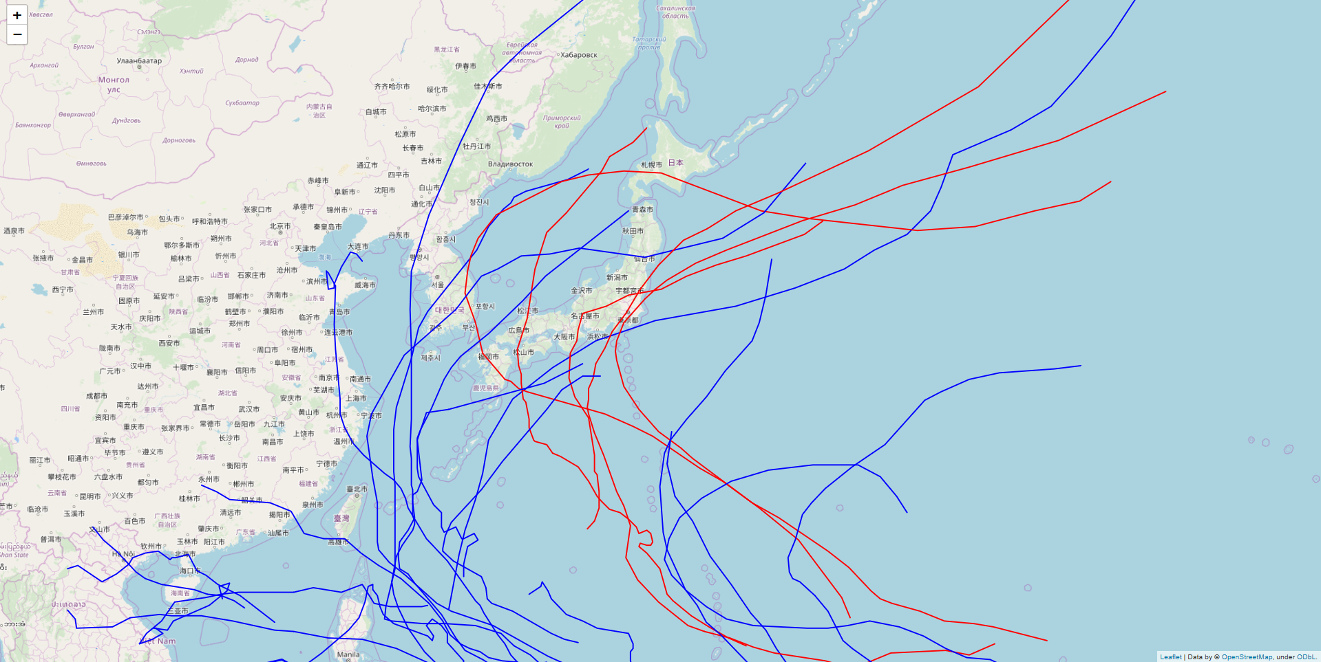
日本上陸している線だけが赤くなりました。
九州や本州にかなり近づいている線がありますね。以下、お天気.comの引用です。
台風の上陸とは台風の中心が北海道、本州、九州、四国の海岸に達した場合を言います。 (沖縄は台風の上陸とは言わず、通過と言う。) 台風の接近とは半径300km以内に入る事を言います。
こう考えると、この線は中心の座標なんだということが改めて分かりますね。
終わりに
近年こんなに台風って日本に上陸してたっけ?という疑問からこれをやってみましたが、上陸数とかは2001年以降だとあまり変わってないようですね。
次は台風の規模も可視化してみようと思います。