やりたいこと
シンプルなテーブルをCSSのみでレスポンシブデザインに対応する。
↓
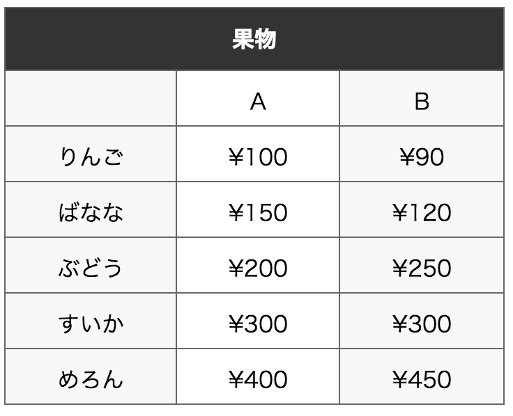
横に並んでいる項目を縦に並べて、スマホでも見やすいテーブルを作る。
flexboxを使うので、IE9とかは非対応。まぁスマホ向けなので問題はないかと。
Android4系の標準ブラウザにも対応するためにboxも併用する。
→デモ
まずHTMLでテーブルを作る
見出しとなる部分はTHEADタグで囲んで、ウインドウ幅で変化させたい部分はTBODYタグで囲む。
html
<table>
<thead>
<tr>
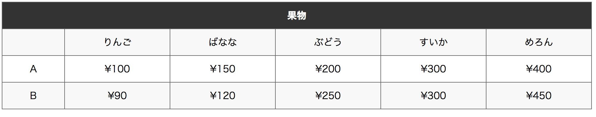
<th colspan="6">果物</th>
</tr>
</thead>
<tbody>
<tr>
<td> </td>
<td>りんご</td>
<td>ばなな</td>
<td>ぶどう</td>
<td>すいか</td>
<td>めろん</td>
</tr>
<tr>
<td>A</td>
<td>¥100</td>
<td>¥150</td>
<td>¥200</td>
<td>¥300</td>
<td>¥400</td>
</tr>
<tr>
<td>B</td>
<td>¥90</td>
<td>¥120</td>
<td>¥250</td>
<td>¥300</td>
<td>¥450</td>
</tr>
</tbody>
</table>
CSSでメディアクエリを使ってレスポンシブ対応
まずは普通にテーブルのデザインする。
css
table,
th,
td {
  -webkit-box-sizing: border-box;
  box-sizing: border-box;
}

table {
  border-collapse: collapse;
  border-spacing: 0;
}

table {
  width: 100%;
  text-align: center;
}

th,
td {
  border: 1px solid #666;
  padding: 10px 20px;
  white-space: nowrap;
}

th {
  background-color: #333;
  color: #fff;
}

tr:nth-child(2n+1) {
  background-color: #f8f8f8;
}
メディアクエリの部分。ブレークポイントは適宜変更を。
css
@media screen and (max-width: 768px) {
/* tbodyにflexboxしてtrを横並びにする */
  tbody {
    display: -webkit-box;
    display: -webkit-flex;
    display: flex;
  }
/* 各セルが横いっぱいになるようにする */
  tbody tr {
    -webkit-box-flex: 1;
    -webkit-flex-grow: 1;
    flex-grow: 1;
/* (Android4用)tdを縦並びにする */
    -webkit-box-orient:vertical;
    -webkit-flex-direction: column;
    flex-direction: column;
  }
/* borderが二重になるので消す */
  tbody td {
    border-top: none;
    border-right: none;
/* tdを縦並びにし、高さを指定して揃える */
    display: block;
    height: 40px;
  }
/* 一番右端のborderが消えちゃうのでborder-rightで復活 */
  tr:last-child {
    border-right: 1px solid #666;
  }
/* 垂直方向のズレがあればpadding-topで適当に微調整 */
  tr:first-child td {
    padding-top: 8px;
  }
}
SCSSバージョン
css(scss)
@media screen and (max-width: 768px) {
  tbody {
    display: -webkit-box;
    display: -webkit-flex;
    display: flex;
    td {
      border-top: none;
      border-right: none;
      display: block;
      height: 40px;
    }
    tr {
      -webkit-box-flex: 1;
      -webkit-flex-grow: 1;
      flex-grow: 1;
      -webkit-box-orient:vertical;
      -webkit-flex-direction: column;
      flex-direction: column;
      &:first-child td {
        padding-top: 8px;
      }
      &:last-child {
        border-right: 1px solid #666;
      }
    }
  }
}