はじめに
BootstrapVue の Stacked table というものがあります。
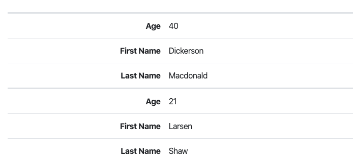
普通のテーブルだとヘッダーにあたる部分が左に表示され、データを key, value の形式で表すことができます。
b-table タグに stacked というオプションを入れるだけでこのようになってくれるので非常に頼もしいのですが、
key 項目の文字左寄せや背景色の変更など、スタイルを自由にできないところが難点です。
そこで、Bootstrap の設定を上書きすることで、このようなカワイイ stacked table を作りたいと思います!
アドベントカレンダーなのでクリスマスカラー🎄
- vue-cli でのアプリ開発をしたことがある方を対象に書いています。
- 内容は主に Sass ですが、解説というより「コピペしたら使えるもの」を目指しています。
- 完全なコードはこちら(github)
環境
vue-cli 3
bootstrap-vue 2.0.2
準備
BootstrapVue をインストール
公式ドキュメントの Getting Started に沿って BootstrapVue の使える環境にします。
$ npm install bootstrap-vue bootstrap
import Vue from 'vue'
import App from './App.vue'
import BootstrapVue from 'bootstrap-vue'

import 'bootstrap/dist/css/bootstrap.css'
import 'bootstrap-vue/dist/bootstrap-vue.css'
Vue.use(BootstrapVue)

Vue.config.productionTip = false

new Vue({
  render: h => h(App),
}).$mount('#app')
Stacked table を作成
<template>
<div class="content-area">
<b-table
stacked
:items="items"
:fields="fields"
>
</b-table>
</div>
</template>
<script>
export default {
name: 'HelloWorld',
data() {
return {
fields: [
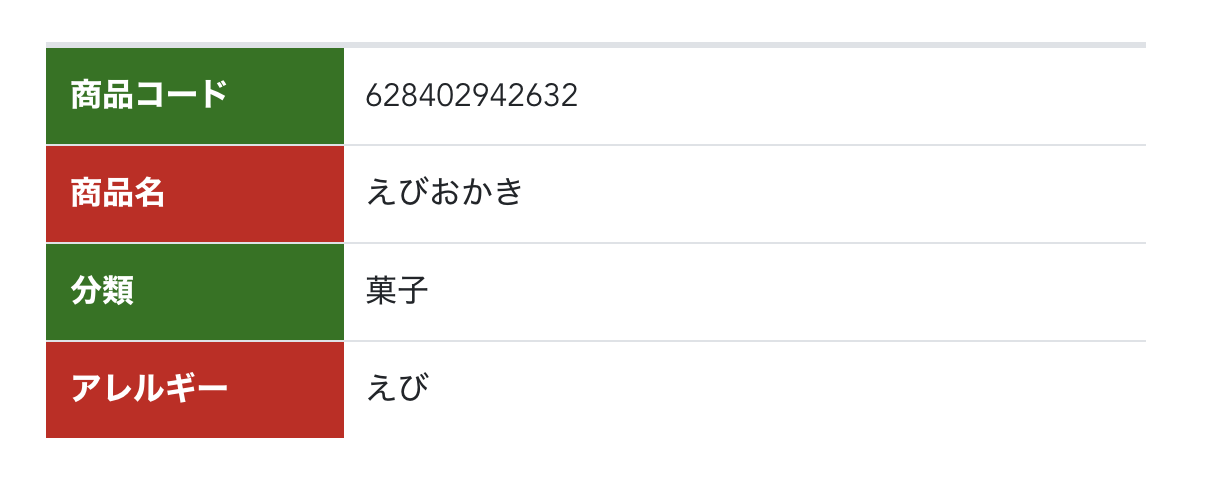
{ key: 'id', label: '商品コード' },
{ key: 'name', label: '商品名' },
{ key: 'group', label: '分類' },
{ key: 'allergies', label: 'アレルギー' },
],
items: [
{
id: '628402942632',
name: 'えびおかき',
group: '菓子',
allergies: 'えび'
}
]
}
}
}
</script>
<style scoped>
.content-area {
width: 550px;
margin: auto;
}
</style>
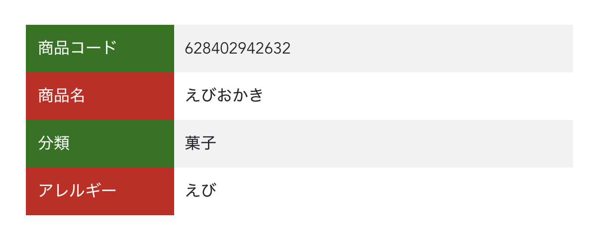
商品詳細画面を想定し、items はオブジェクトひとつです。
今から
- key 項目の文字を左寄せにする
- key 項目の背景色を変える
- value 項目の背景を縞々にする
- ボーダーを消す
をやります。
スタイル上書きファイルの作成
1. Sass が使える環境にします
$ npm install sass-loader node-sass
※ Windowsの場合、Rubyのインストールが必要だそうです。詳しくはググってください。
2. 適当な場所に .scss ファイルを作ります
今回は src/assets の下に scss ディレクトリを噛ませ、 custom.scss という名前で作りました。
src
├── App.vue
├── assets
│   ├── logo.png
│   └── scss
│       └── custom.scss
├── components
│   └── HelloWorld.vue
└── main.js
3. main.js を書き換えます
import Vue from 'vue'
import App from './App.vue'
import BootstrapVue from 'bootstrap-vue'

//import 'bootstrap/dist/css/bootstrap.css'      // 削除
//import 'bootstrap-vue/dist/bootstrap-vue.css'  // 削除
import './assets/scss/custom.scss'               // 追加
Vue.use(BootstrapVue)
// ・・・
4. custom.scss で Bootstrap の設定を import します
// Bootstrap and its default variables
@import "~bootstrap/scss/bootstrap";
@import "~bootstrap-vue/src";
これで準備完了です!
Sass を書いていく
Sass には記法が2つ、sass 記法と scss 記法があります。
Bootstrap が scss 記法で書かれているので、そちらに合わせて scss で書きます。
key 項目の文字を左寄せにする
先ほどの import の下から書いていきます。
// ・・・
@if $bv-enable-table-stacked {
  .table.b-table {
    &.b-table-stacked {
      @each $breakpoint in map-keys($grid-breakpoints) {
        $next: breakpoint-next($breakpoint, $grid-breakpoints);
        $infix: breakpoint-infix($next, $grid-breakpoints);

        &#{$infix} {
          @include media-breakpoint-down($breakpoint) {

            > tbody {
              > tr {
                > [data-label] {
                  &::before {
                    text-align: left;
                  }
                }
              }
            }
          }
        }
      }
    }
  }
}
key 項目の要素は <th> ではなく、:before で表現されています。
だから容易にカスタマイズできないんだろうな…
key項目の背景色を変える
$b-table-stacked-heading-width: 27%;

// Bootstrap and its default variables
@import "~bootstrap/scss/bootstrap";
@import "~bootstrap-vue/src";

// ・・・

            > tbody {
              > tr {
                > td {
                  padding: 0;
                  position: relative;
                }
                > [data-label] {
                  > div {
                    width: 100%;
                    padding: $table-cell-padding;
                    padding-left: 29%;
                  }
                  &::before {
                    text-align: left;
                    color: #ffffff;
                    background-color: #ca1818;
                    padding: $table-cell-padding;
                    position: absolute;
                    height: 100%;
                  }
                > [data-label]:nth-of-type(odd) {
                  &::before {
                    background-color: #157512;
                  }
                }
                }
              }
            }
// ・・・
ポイント解説
-
一番上の
$b-table-stacked-heading-widthは Bootstrap-vue の scss ファイル内で使われている変数です。
この変数を上書きすることで、key 項目の幅を調節できます。 -
... > [data-label] > divのpadding-left: 29%;は、:before要素の幅分スペースを空けてあげるための記述です。 -
:before要素の height を100%にすることで、value 項目の改行に耐えることができます。
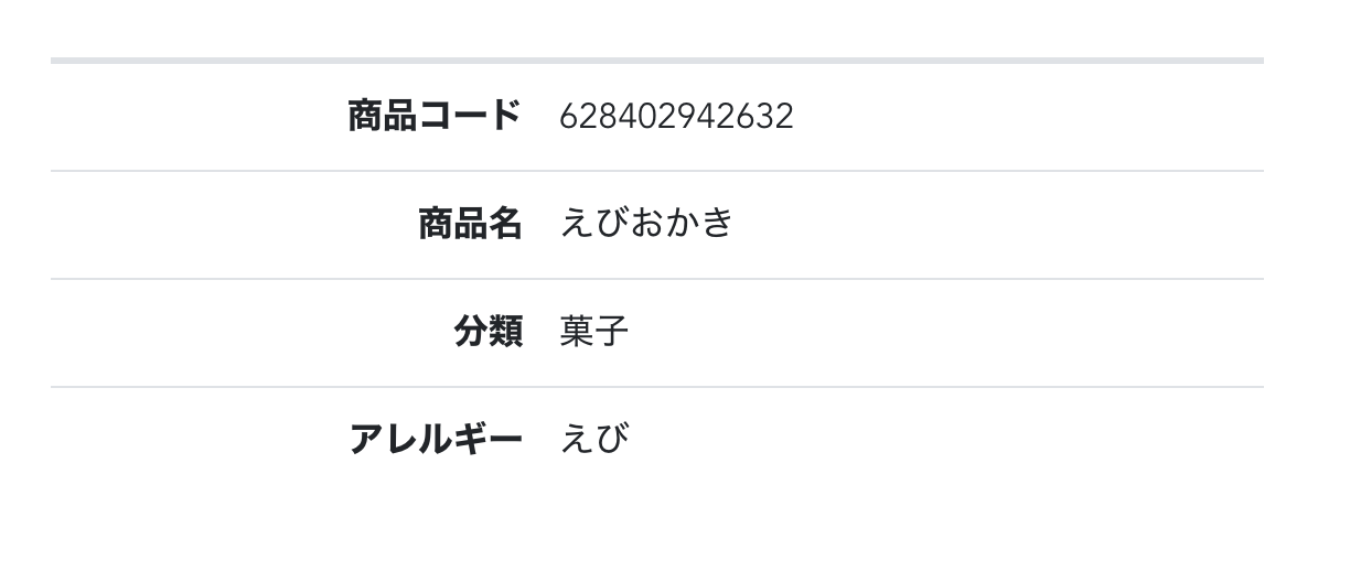
value項目の背景を縞々にする
// ・・・
            > tbody {
              > tr {
                > td:nth-of-type(odd) {
                  background-color: $table-accent-bg;
                }
// ・・・
$table-accent-bg も Bootstrap に元からある変数です。
普通の table に striped オプションをつけた時と同じ色の縞々になります。
ボーダーを消す
.table {
  td {
    border-top: 0px;
  }
}
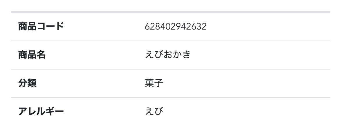
あとは微調整して…
できました
おわりに
上書きする前のスタイルは ./node_modules/bootstrap-vue/src/components/table/_table.scss で確認できます。
Sass というものを初めて触りましたが、css をプログラムっぽく書けるのが面白かったです。
また、一度設定すると全ての vue コンポーネントに反映するので、プロジェクト全体に統一感を与えることができるのも良いなと思いました。
primary とかの variant color をカスタマイズできるのがめっちゃ便利✨
それでは、よいクリスマスを🎅🍻🎅
ハンズラボアドベントカレンダー2019 👉18日目は @mimimi-no-sesese さんです🏓