Flex Message
Flex Message の機能が新規追加されたので、色々試してみることにした。
下記に「curlのサンプル」と「トークルームで表示される画像」を添付しておくので参考にして欲しい。
詳しい概要説明は、LINE公式のリファレンス参照
https://developers.line.me/ja/reference/messaging-api/
PushMessage の messageObject の構成
- 全体構成を簡単にまとめておく。
バブルコンテナの構成
- to
- message = messageObject (テンプレートメッセージ (カルーセルで使用) or Flex Message など..)
              - type (flex)
              - altText (代替テキスト)
              - contents = Flex Messageのコンテナオブジェクト (バブルコンテナ)
                              - type = bubble
                              - header = ボックスコンポーネント
                              - hero = 画像コンポーネント
                              - body = ボックスコンポーネント
                              - footer = ボックスコンポーネント
                              - direction = テキストの書字方向および水平ボックス内のコンポーネントの並び順
                              - styles = バブルスタイルオブジェクト
                                            - header = ブロックスタイル
                                            - hero = ブロックスタイル
                                            - body = ブロックスタイル
                                            - footer = ブロックスタイル
                                                        - backgroundColor
                                                        - separator
                                                        - separatorColor
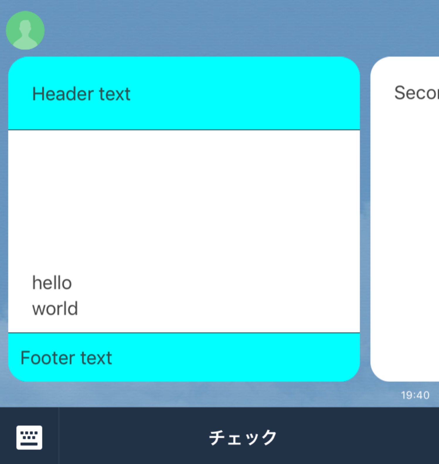
バブルコンテナのSAMPLE
百聞は一見に如かずという事で、まずサンプル (バブルコンテナとカルーセルコンテナ) をお見せする。
コンテナの構成する要素の説明については、後ほど説明していきます。
curl -X POST -H 'Content-Type:application/json' -H 'Authorization: Bearer {トークン}' -d '
{
    "messages": [
        {
        "type": "flex",
        "altText": "this is a flex message",
        "contents": {
          "type": "bubble",
          "header": {
            "type": "box",
            "layout": "vertical",
            "contents": [
              {
                "type": "text",
                "text": "Header text"
              }
            ]
          },
          "hero": {
            "type": "image",
            "url": "https://www.sample.jpg"
          },
          "body": {
            "type": "box",
            "layout": "vertical",
            "contents": [
              {
                "type": "text",
                "text": "hello"
              },
              {
                "type": "text",
                "text": "world"
              }
            ]
          },
          "footer": {
            "type": "box",
            "layout": "vertical",
            "contents": [
              {
                "type": "text",
                "text": "Footer text"
              }
            ]
          },
          "styles": {
             "header": {
               "backgroundColor": "#00ffff"
             },
             "hero": {
               "separator": true,
               "separatorColor": "#000000"
             },
             "footer": {
               "backgroundColor": "#00ffff",
               "separator": true,
               "separatorColor": "#000000"
             }
           }
        }
      }
    ],
    "to": "LINE UserID"
}' \https://api.line.me/v2/bot/message/push

カルーセルコンテナの構成
- type = carousel になっている
- バブル数は、最大10個までとなっている
- バブルコンテナにボディブロックがある場合は、そのバブルコンテナがカルーセルで最大の高さを持つバブルコンテナと同じ高さになるように、ボディブロックが伸長します。 (※リファレンス引用)
- to
- message = メッセージオブジェクト (テンプレートメッセージ or Flex Message etc..)
             - type (flex)
             - altText (代替テキスト)
             - contents = Flex Messageのコンテナオブジェクト (カルーセル)
                             - type = carousel
                             - contents = [バブルコンテナ1, バブルコンテナ2, バブルコンテナ3] // 最大バブル数:10
カルーセルコンテナのSAMPLE
curl -X POST -H 'Content-Type:application/json' -H 'Authorization: Bearer {トークン}' -d '{
    "messages": [
        {
        "type": "flex",
        "altText": "this is a flex message",
        "contents": {
          "type": "carousel",
          "contents": [
          {
            "type": "bubble",
            "header": {
              "type": "box",
              "layout": "vertical",
              "contents": [
                {
                  "type": "text",
                  "text": "Header text"
                }
              ]
            },
            "hero": {
              "type": "image",
              "url": "https://example.com/flex/images/image.jpg"
            },
            "body": {
              "type": "box",
              "layout": "vertical",
              "contents": [
                {
                  "type": "text",
                  "text": "hello"
                },
                {
                  "type": "text",
                  "text": "world"
                }
              ]
            },
            "footer": {
              "type": "box",
              "layout": "vertical",
              "contents": [
                {
                  "type": "text",
                  "text": "Footer text"
                }
              ]
            },
            "styles": {
               "header": {
                 "backgroundColor": "#00ffff"
               },
               "hero": {
                 "separator": true,
                 "separatorColor": "#000000"
               },
               "footer": {
                 "backgroundColor": "#00ffff",
                 "separator": true,
                 "separatorColor": "#000000"
               }
             }
          },
            {
              "type": "bubble",
              "body": {
                "type": "box",
                "layout": "vertical",
                "contents": [
                  {
                    "type": "text",
                    "text": "Second bubble"
                  }
                ]
              }
            }
          ]
        }
      }
    ],
    "to": "LINE UserID"
}' \https://api.line.me/v2/bot/message/push
バブルコンテナ を構成する要素の説明
バブルコンテナ =
      - type = bubble
      - direction = テキストの書字方向および水平ボックス内のコンポーネントの並び順
      - header = ボックスコンポーネント
      - hero = 画像コンポーネント
      - body = ボックスコンポーネント
      - footer = ボックスコンポーネント
      - styles = バブルスタイルオブジェクト
directionについて
- 指定可能な値
-
- ltr
-
- rtl
direction = ltr
- left to right に配置する
curl -X POST -H 'Content-Type:application/json' -H 'Authorization: Bearer {トークン}' -d '
{
    "messages": [
        {
        "type": "flex",
        "altText": "this is a flex message",
        "contents": {
          "type": "bubble",
          "direction": "ltr",
          "hero": {
                    "type": "image",
                    "url": "https://www.sample.jpg",
                    "size": "full"
                  },
          "body": {
            "type": "box",
            "layout": "vertical",
            "contents": [
              {
                "type": "text",
                "text": "hello"
              },
              {
                "type": "text",
                "text": "world"
              }
            ]
          }
        }
      }
    ],
    "to": "LINE UserID"
}' \https://api.line.me/v2/bot/message/push

direction = rtl
- right to left に配置する
curl -X POST -H 'Content-Type:application/json' -H 'Authorization: Bearer {トークン}' -d '
{
    "messages": [
        {
        "type": "flex",
        "altText": "this is a flex message",
        "contents": {
          "type": "bubble",
          "direction": "ltr",
          "hero": {
                    "type": "image",
                    "url": "https://www.sample.jpg",
                    "size": "full"
                  },
          "body": {
            "type": "box",
            "layout": "vertical",
            "contents": [
              {
                "type": "text",
                "text": "hello"
              },
              {
                "type": "text",
                "text": "world"
              }
            ]
          }
        }
      }
    ],
    "to": "LINE UserID"
}' \https://api.line.me/v2/bot/message/push
コンポーネントについて
バブルコンテナを構成するオブジェクト(要素) のこと
コンポーネントの種類
- ボックス
- ボタン
- フィラー
- アイコン
- 画像
- セパレータ
- スペーサー
- テキスト
ボックスコンポーネントとは
子要素のレイアウトを定義するコンポーネントです。ボックスにボックスを含めることもできます。
ボックスコンポーネント =
  - type =  box (固定)
  - layout =  vertical / horizon / baseline
  - contents = [コンポーネント1, コンポーネント2]
  - mergin
  - spacing
  - flex
layout の種類
- horizontal (水平配置)
- vertical (垂直配置)
- baseline (水平配置)
layout の仕様
- horizontal / vertical の場合:ボックス、ボタン、フィラー、画像、セパレータ、およびテキストコンポーネント
- baselineの場合:フィラー、アイコン、およびテキストコンポーネント
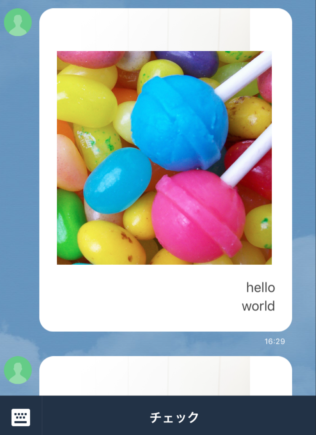
vertical
curl -X POST -H 'Content-Type:application/json' -H 'Authorization: Bearer {トークン}' -d '
{
    "messages": [
        {
        "type": "flex",
        "altText": "this is a flex message",
        "contents": {
          "type": "bubble",
          "direction": "rtl",
          "hero": {
                    "type": "image",
                    "url": "https://www.sample.jpg",
                    "size": "full"
                  },
          "body": {
            "type": "box",
            "layout": "vertical",
            "contents": [
              {
                "type": "text",
                "text": "hello"
              },
              {
                "type": "text",
                "text": "world"
              }
            ]
          }
        }
      }
    ],
    "to": "LINE UserID"
}' \https://api.line.me/v2/bot/message/push

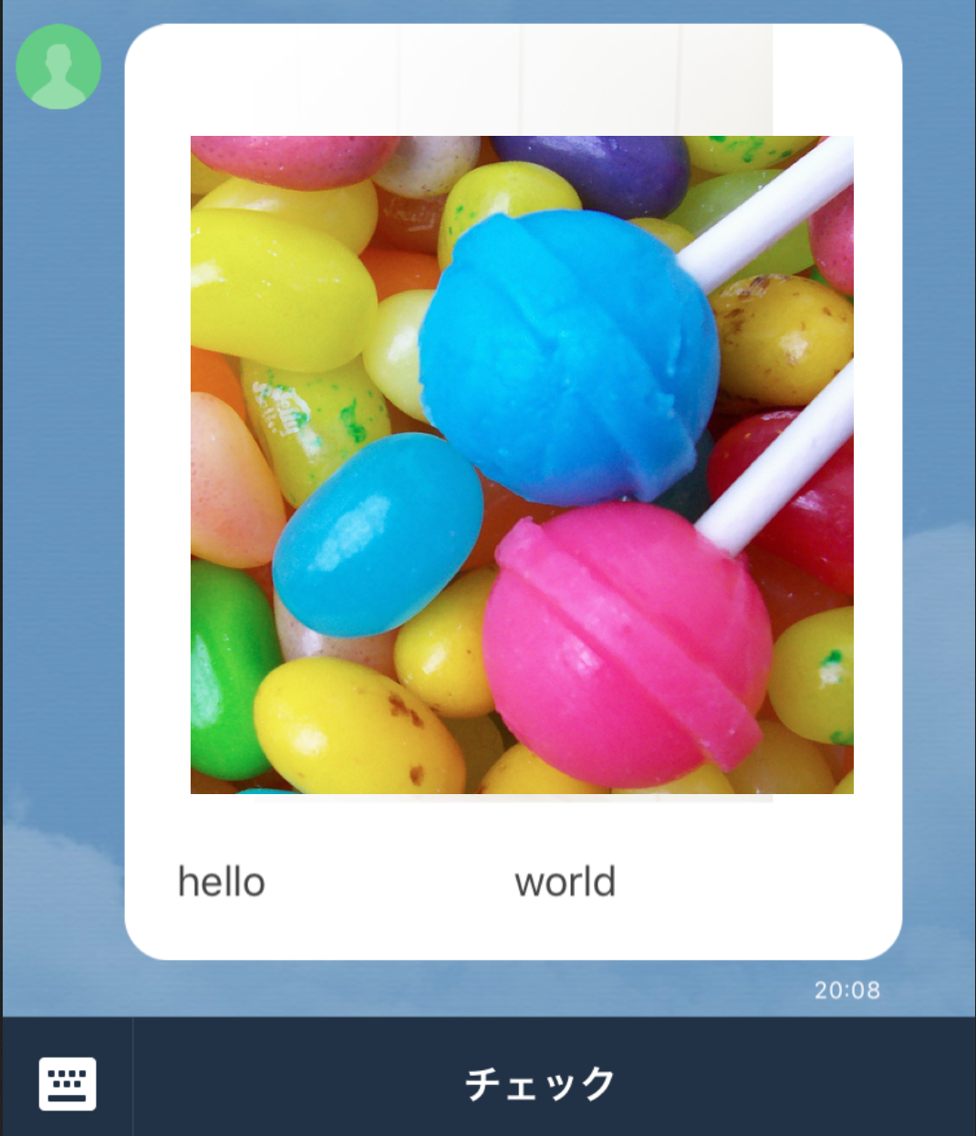
horizon
curl -X POST -H 'Content-Type:application/json' -H 'Authorization: Bearer {トークン}' -d '
{
    "messages": [
        {
        "type": "flex",
        "altText": "this is a flex message",
        "contents": {
          "type": "bubble",
          "direction": "ltr",
          "hero": {
                    "type": "image",
                    "url": "https://www.sample.jpg",
                    "size": "full"
                  },
          "body": {
            "type": "box",
            "layout": "horizontal",
            "contents": [
              {
                "type": "text",
                "text": "hello"
              },
              {
                "type": "text",
                "text": "world"
              }
            ]
          }
        }
      }
    ],
    "to": "LINE UserID"
}' \https://api.line.me/v2/bot/message/push
ボタンコンポーネントとは
ボタンを描画するコンポーネントです。ユーザーがタップすると、指定したアクションが実行されます。
ボタンコンポーネント =
  - type =  button (固定)
  - action =  アクションオブジェクト (uri / postback / message/ 日時選択)
  - color
  - height
  - mergin
SAMPLE
curl -X POST -H 'Content-Type:application/json' -H 'Authorization: Bearer {トークン}' -d '
{
    "messages": [
        {
        "type": "flex",
        "altText": "this is a flex message",
        "contents": {
          "type": "bubble",
          "direction": "ltr",
          "hero": {
                    "type": "image",
                    "url": "https://rs-j.adtdp.com/line-dev/10/carousel_image/pixta_29373431_M.jpg",
                    "size": "full"
                  },
          "body": {
            "type": "box",
            "layout": "vertical",
            "contents": [
              {
                "type": "text",
                "text": "hello"
              },
              {
                "type": "text",
                "text": "world"
              },
              {
              "type": "button",
              "action": {
                "type": "uri",
                "label": "Tap me",
                "uri": "https://example.com"
              },
              "style": "primary",
              "color": "#0000ff"
            }
            ]
          }
        }
      }
    ],
    "to": "LINE UserID"
}' \https://api.line.me/v2/bot/message/push

アイコンコンポーネントとは
アイコンを描画するコンポーネントです。
アイコンコンポーネント =
  - type =  icon (固定)
  - url =  画像url (最大画像サイズ:240×240px)
  - size
  - mergin
curl -X POST -H 'Content-Type:application/json' -H 'Authorization: Bearer {トークン}' -d '
{
    "messages": [
        {
        "type": "flex",
        "altText": "this is a flex message",
        "contents": {
          "type": "bubble",
          "body": {
            "type": "box",
            "layout": "baseline",
            "contents": [
            {
              "type": "icon",
              "url": "https://sample.jpg",
              "size": "lg"
            },
            {
              "type": "icon",
              "url": "https://sample.jpg",
              "size": "lg"
            }
            ]
          }
        }
      }
    ],
    "to": "LINE UserID"
}' \https://api.line.me/v2/bot/message/push

セパレータコンポーネントとは
親ボックス内のコンポーネントの間に境界線を描画するコンポーネントです。
セパレータコンポーネント =
  - type =  separator (固定)
  - margin
  - color
SAMPLE
curl -X POST -H 'Content-Type:application/json' -H 'Authorization: Bearer {トークン}' -d '{
    "messages": [
        {
        "type": "flex",
        "altText": "this is a flex message",
        "contents": {
          "type": "carousel",
          "contents": [
          {
            "type": "bubble",
            "header": {
              "type": "box",
              "layout": "vertical",
              "contents": [
                {
                  "type": "text",
                  "text": "Header text"
                }
              ]
            },
            "hero": {
              "type": "image",
              "url": "https://example.com/flex/images/image.jpg"
            },
            "body": {
              "type": "box",
              "layout": "vertical",
              "contents": [
                {
                  "type": "text",
                  "text": "hello"
                },
                {
                  "type": "separator",
                  "color": "#000000"
                },
                {
                  "type": "text",
                  "text": "world"
                }
              ]
            },
            "footer": {
              "type": "box",
              "layout": "vertical",
              "contents": [
                {
                  "type": "text",
                  "text": "Footer text"
                }
              ]
            },
            "styles": {
               "header": {
                 "backgroundColor": "#00ffff"
               },
               "hero": {
                 "separator": true,
                 "separatorColor": "#000000"
               },
               "footer": {
                 "backgroundColor": "#00ffff",
                 "separator": true,
                 "separatorColor": "#000000"
               }
             }
          },
            {
              "type": "bubble",
              "body": {
                "type": "box",
                "layout": "vertical",
                "contents": [
                  {
                    "type": "text",
                    "text": "Second bubble"
                  }
                ]
              }
            }
          ]
        }
      }
    ],
    "to": "LINE UserID"
}' \https://api.line.me/v2/bot/message/push

スペーサーコンポーネントとは
ボックス内の先頭または末尾に固定サイズのスペースを配置する不可視のコンポーネントです
スペーサーコンポーネント =
  - type =  spacer (固定)
  - size = xs / sm / md / lg / xx / xxl
SAMPLE
curl -X POST -H 'Content-Type:application/json' -H 'Authorization: Bearer {トークン' -d '{
    "messages": [
        {
        "type": "flex",
        "altText": "this is a flex message",
        "contents": {
          "type": "carousel",
          "contents": [
          {
            "type": "bubble",
            "header": {
              "type": "box",
              "layout": "vertical",
              "contents": [
                {
                  "type": "text",
                  "text": "Header text"
                }
              ]
            },
            "hero": {
              "type": "image",
              "url": "https://example.com/flex/images/image.jpg"
            },
            "body": {
              "type": "box",
              "layout": "vertical",
              "contents": [
                {
                  "type": "text",
                  "text": "hello"
                },
                {
                  "type": "separator",
                  "color": "#000000"
                },
                {
                  "type": "text",
                  "text": "world"
                },
                {
                  "type": "spacer",
                  "size": "xxl"
                }
              ]
            },
            "footer": {
              "type": "box",
              "layout": "vertical",
              "contents": [
                {
                  "type": "text",
                  "text": "Footer text"
                }
              ]
            },
            "styles": {
               "header": {
                 "backgroundColor": "#00ffff"
               },
               "hero": {
                 "separator": true,
                 "separatorColor": "#000000"
               },
               "footer": {
                 "backgroundColor": "#00ffff",
                 "separator": true,
                 "separatorColor": "#000000"
               }
             }
          },
            {
              "type": "bubble",
              "body": {
                "type": "box",
                "layout": "vertical",
                "contents": [
                  {
                    "type": "text",
                    "text": "Second bubble"
                  }
                ]
              }
            }
          ]
        }
      }
    ],
    "to": "LINE UserID"
}' \https://api.line.me/v2/bot/message/push
スペーサー無

スペーサー有

注意事項
- multi castで Flex Messageは送信できません。