PythonにHoloViewsというライブラリがある。bokehやmatplotlibといったグラフ描画ライブラリを簡単かつ共通のコードで使えるようにしてくれる便利なもので、その中にChordというエレメントがある。Reference Galleryの該当ページに2つの例が載っていて、それをbokehで再現しようとしたらGraphRendererの勉強になったのでまとめておく。
bokehについて
ブラウザやjupyter notebook上でデータのインタラクティブな可視化ができるライブラリ。pythonだけでグリグリ動かせるグラフをつくり、データを差し替えたりできる。2021年9月にバージョン2.4.0がリリースされた。公式ドキュメントのReferenceが見やすくなってうれしい。
参考サイト
バージョン情報
- python 3.8.8
- bokeh 2.3.3
- holoviews 1.14.5
- pandas 1.3.2
- jupyterlab 3.1.7
使用するデータ
import pandas as pd
from bokeh.sampledata.les_mis import data

print(data.keys())

nodes = pd.DataFrame(data['nodes'])
links = pd.DataFrame(data['links'])

print(len(nodes), len(links))
print(nodes.head(), end='\n\n')
print(links.head())
dict_keys(['nodes', 'links'])
77 254
              name  group
0           Myriel      1
1         Napoleon      1
2  Mlle.Baptistine      1
3     Mme.Magloire      1
4     CountessdeLo      1

   source  target  value
0       1       0      1
1       2       0      8
2       3       0     10
3       3       2      6
4       4       0      1
Chord
import holoviews as hv

hv.extension('bokeh')
hv.output(size=200)
chord = hv.Chord(links)
chord


一行書いただけで何だかすごいグラフが出てくる。ホバーやタップにも対応している。でも、これのベースはbokehなので、bokehで描こうと思えば描けるはず。とはいうものの、どうやればいいのか全く分からない。公式のギャラリーをのぞいてみても、それらしいものはない。
仕方がないので、エレメントからbokehのFigureを取り出して参照する。
from bokeh.io import show, output_notebook
from bokeh.plotting import figure

output_notebook()
p = hv.render(chord)  # bokehの Figureを取り出す
p
Figure( id = '1248', …)
GlyphRendererとGraphRendererで構成されているのがわかる。
p.renderers
[GlyphRenderer(id='1314', ...), GraphRenderer(id='1295', ...)]
GlyphRenderer
先ずはGlyphRendererを見てみる。GlyphRendererは描画するグリフ(図形)とデータを持っている。GlyphRenderer.glyphに何らかのグリフ(図形)、GlyphRenderer.data_sourceにデータであるColumnDataSourceが入っている。
MultiLine
取り出したglyph_rendererのglyph属性を確認。グリフはMultiLine。
描画してみると、輪っか部分だった。幾つもの弧を組み合わせてひとつの円を作っているのが、ホバーツールでわかる。
glyph_renderer = p.renderers[0]
print(glyph_renderer.glyph)
print(glyph_renderer.data_source)

p2 = figure(frame_height=300,
            frame_width=300,
            tooltips=[('', '$index')])
p2.renderers.append(glyph_renderer)

show(p2)
MultiLine(id='1310', ...)
ColumnDataSource(id='1280', ...)


MultiLineは複数の線を描画できる。xsにxの座標、ysにyの座標をそれぞれ渡す。データの形は"list of list"で、np.nanで区切って複数の線をひとまとまりにすることもできる。
import numpy as np

xs = [[1, 2, 3, 4, 4, np.nan, 7, 8, 9],
      [1, 2, 3, 4, 5, 6]]
ys = [[3, 1, 2, 4, 4, np.nan, 7, 8, 9],
      [6, 8, 8, 6, 7, 2]]
colors = ['firebrick', 'navy']
alpha = [0.8, 0.6]

p3 = figure(frame_height=200,  # 描画スペースの高さ指定
           frame_width=200,   # 描画スペースの横幅指定
           tooltips='$index'
           )
p3.multi_line(xs, ys,
             color=colors,
             alpha=alpha,
             line_width=10
             )
show(p3)

ColumnDataSource
GlyphRenderer.data_source属性にはColumnDataSourceが入っている。
ColumnDataSourceはglyphの描画やホバーツールに必要なデータを保持している。data属性でデータの参照、to_df()メソッドでデータをデータフレームに変換できる。他にもデータの追加や削除のメソッドがある。詳しくは公式を参照。
glyph_rendererのデータをデータフレーム化してみる。'index', 'index_hover', 'arc_xs', 'arc_ys'の列がある。
- 'index' - 頂点のインデックス、固有値。
- 'index_hover' - HoverTool用(?)の'index'のstr型
- 'arc_xs' - x座標
- 'arc_ys' - y座標
multi_cds = glyph_renderer.data_source

df = multi_cds.to_df()

print(multi_cds)
print(len(df))
df.head()
ColumnDataSource(id='1280', ...)
77
| index | index_hover | arc_xs | arc_ys | |
|---|---|---|---|---|
| 0 | 0 | 0 | [1.0, 0.9999799714965371, 0.9999198867884302, ... | [0.0, 0.006329028818457834, 0.0126578041149644... |
| 1 | 1 | 1 | [0.9927783948222082, 0.9927467247726159, 0.992... | [0.11996273910777294, 0.12022454180924975, 0.1... |
| 2 | 2 | 2 | [0.9921648603295138, 0.9917982703635422, 0.991... | [0.12493554309049267, 0.12781310928025358, 0.1... |
| 3 | 3 | 3 | [0.9837758550359634, 0.9831550409112764, 0.982... | [0.17940197058075802, 0.1827735361882195, 0.18... |
| 4 | 4 | 4 | [0.9700122274758824, 0.9699480971028605, 0.969... | [0.24305612221722958, 0.24331191694312868, 0.2... |
print(*df['index'])
0 1 2 3 4 5 6 7 8 9 10 11 12 13 14 15 16 17 18 19 20 21 22 23 24 25 26 27 28 29 30 31 32 33 34 35 36 37 38 39 40 41 42 43 44 45 46 47 48 49 50 51 52 53 54 55 56 57 58 59 60 61 62 63 64 65 66 67 68 69 70 71 72 73 74 75 76
for v in df['index_hover']:
    print(f'{v!r}', end=' ')
'0' '1' '2' '3' '4' '5' '6' '7' '8' '9' '10' '11' '12' '13' '14' '15' '16' '17' '18' '19' '20' '21' '22' '23' '24' '25' '26' '27' '28' '29' '30' '31' '32' '33' '34' '35' '36' '37' '38' '39' '40' '41' '42' '43' '44' '45' '46' '47' '48' '49' '50' '51' '52' '53' '54' '55' '56' '57' '58' '59' '60' '61' '62' '63' '64' '65' '66' '67' '68' '69' '70' '71' '72' '73' '74' '75' '76'
multi_cds.data['arc_xs'][:2]
[array([1.        , 0.99997997, 0.99991989, 0.99981975, 0.99967956,
        0.99949933, 0.99927906, 0.99901876, 0.99871845, 0.99837812,
        0.99799781, 0.99757752, 0.99711727, 0.99661708, 0.99607697,
        0.99549696, 0.99487707, 0.99421733, 0.99351776, 0.99277839]),
 array([0.99277839, 0.99274672, 0.99271499, 0.99268318, 0.9926513 ,
        0.99261935, 0.99258734, 0.99255525, 0.9925231 , 0.99249088,
        0.99245859, 0.99242623, 0.9923938 , 0.9923613 , 0.99232873,
        0.9922961 , 0.99226339, 0.99223062, 0.99219777, 0.99216486])]
multi_cds.data['arc_ys'][:2]
[array([0.        , 0.00632903, 0.0126578 , 0.01898607, 0.02531358,
        0.03164007, 0.0379653 , 0.04428901, 0.05061094, 0.05693084,
        0.06324847, 0.06956356, 0.07587586, 0.08218512, 0.0884911 ,
        0.09479352, 0.10109215, 0.10738673, 0.11367701, 0.11996274]),
 array([0.11996274, 0.12022454, 0.12048634, 0.12074812, 0.1210099 ,
        0.12127167, 0.12153343, 0.12179518, 0.12205693, 0.12231866,
        0.12258039, 0.12284211, 0.12310382, 0.12336552, 0.12362721,
        0.12388889, 0.12415057, 0.12441224, 0.12467389, 0.12493554])]
GraphRenderer
グラフを描画するためのレンダラー。頂点と辺、2つのGlyphRendererを持つ。頂点のレンダラーはnode_renderer属性、辺はedge_renderer属性にある。公式のReferenceとUser guideも参照。グラフの描画にかかわる属性は以下。
- 頂点 :
node_rendererとlayout_provider - 辺 :
edge_renderer - ホバー :
inspection_policy - セレクト :
selection_policy
chordのgraph_rendererを描画してみる。円状に並んでいる青い丸が頂点、黒い線が辺。
graph_renderer = p.renderers[1]

p4 = figure(frame_height=350,
            frame_width=350,
            tooltips='$index')
p4.renderers.append(graph_renderer)

show(p4)

print(graph_renderer)
print()
vars(graph_renderer)
GraphRenderer(id='1295', ...)

{'_id': '1295',
 '_document': <bokeh.document.document.Document at 0x1af1e43c670>,
 '_temp_document': None,
 '_event_callbacks': {},
 '_callbacks': {},
 '_property_values': {'layout_provider': StaticLayoutProvider(id='1282', ...),
  'node_renderer': GlyphRenderer(id='1287', ...),
  'edge_renderer': GlyphRenderer(id='1293', ...),
  'selection_policy': NodesAndLinkedEdges(id='1304', ...),
  'inspection_policy': NodesAndLinkedEdges(id='1306', ...)},
 '_unstable_default_values': {'js_property_callbacks': {},
  'tags': [],
  'js_event_callbacks': {}},
 '_unstable_themed_values': {},
 '_initialized': True}
頂点(ノード)
GraphRenderer.node_renderer
中身はGlyphRenderer。デフォルトのグリフはCircle。Scatter、Rectのようにx, yを指定するグリフに置き換え可能。データには頂点のユニーク値となる'index'列が必要。
node_renderer = graph_renderer.node_renderer
node_cds = node_renderer.data_source

print(node_renderer)
print(node_renderer.glyph)
print(node_cds)
GlyphRenderer(id='1287', ...)
Circle(id='1283', ...)
ColumnDataSource(id='1280', ...)
データを見てみると輪っかのデータとキーが同じ。
確認してみると、同一のColumnDataSourceを使用していることがわかる。となると、データにはそれぞれの頂点の位置を指定する列が存在しないことになる。arc_xs, arc_ysは輪っかのMultiLine用。試しに描画してみても何も表示されない。
print(node_cds.data.keys())
print(multi_cds.data.keys())
node_cds is multi_cds
dict_keys(['index', 'index_hover', 'arc_xs', 'arc_ys'])
dict_keys(['index', 'index_hover', 'arc_xs', 'arc_ys'])
True
p5 = figure(plot_width=250, plot_height=250)
p5.renderers.append(node_renderer)

show(p5)

GraphRenderer.layout_provider
ノードの位置を指定するデータはlayout_providerの中に入っている。中身はStaticLayoutProvider。graph_layoutキーワード引数にノードの位置を指定する辞書を渡す。キーが頂点のindex、値が座標(x, y)。以下のように使う。
from bokeh.models import GraphRenderer, StaticLayoutProvider

gr = GraphRenderer()

graph_layout = {0: [1, 0],
                1: [0, 1],
                2: [-1, 0],
                3: [0, -1]}
gr.layout_provider = StaticLayoutProvider(graph_layout=graph_layout)
これで頂点の描画ができる。
from bokeh.models import Scatter

# GraphRendererのインスタンス化
gr = GraphRenderer()

# 頂点
index = [0, 1, 2, 3]
gr.node_renderer.glyph = Scatter(size=20, fill_color='orange')
gr.node_renderer.data_source.add(index, 'index')  # data_source.data['index'] = index

# layout_provider
graph_layout = {0: [1, 0], 1: [0, 1], 2: [-1, 0], 3: [0, -1]}
gr.layout_provider = StaticLayoutProvider(graph_layout=graph_layout)

print(gr.node_renderer.glyph, gr.node_renderer.data_source.data)
print(gr.layout_provider.graph_layout)

p6 = figure(frame_width=250,
            frame_height=250,
            x_range=(-1.3, 1.3),
            y_range=(-1.3, 1.3))
p6.renderers.append(gr)

show(p6)
Scatter(id='1805', ...) {'index': [0, 1, 2, 3]}
{0: [1, 0], 1: [0, 1], 2: [-1, 0], 3: [0, -1]}

辺(エッジ)
GraphRenderer.edge_renderer
中身はGlyphRenderer。グリフはMultiLine。データには始点と終点をあらわす'start'と'end'列が必要。
edge_renderer = graph_renderer.edge_renderer
edge_cds = edge_renderer.data_source

print(edge_renderer)
print(edge_renderer.glyph)
print(edge_cds)
GlyphRenderer(id='1293', ...)
MultiLine(id='1289', ...)
ColumnDataSource(id='1281', ...)
df = edge_cds.to_df()

print(len(df))
df.head()
254
| start | end | xs | ys | |
|---|---|---|---|---|
| 0 | 1 | 0 | [0.9927783948222082, 0.9630074475389099, 0.934... | [0.11996273910777294, 0.11636535584423288, 0.1... |
| 1 | 2 | 0 | [0.9837758550359634, 0.9542808382004578, 0.926... | [0.17940197058075802, 0.17398204989887306, 0.1... |
| 2 | 3 | 0 | [0.9700122274758824, 0.9409401385262388, 0.913... | [0.24305612221722958, 0.23567173954270657, 0.2... |
| 3 | 3 | 2 | [0.978545131672936, 0.9492070855485545, 0.9211... | [0.20603258305228409, 0.19982079380656642, 0.1... |
| 4 | 4 | 0 | [0.9700122274758824, 0.9409417399748237, 0.913... | [0.24305612221722958, 0.23564908833075593, 0.2... |
データを見てみると、'start'、'end'、 'xs'、 'ys'の列がある。このうち、'start'と'end'は必須。値は頂点のインデックスのシーケンス。これだけで頂点と頂点を結ぶ直線を描画してくれる。'xs'と'ys'が辺の座標になる。'xs'、'ys'はMultiLine用なので、値はx, yそれぞれの"list of list"。
# nanで区切られているのを確認できる。
print('始点', df['start'][8], '終点', df['end'][8])
print('辺:\n', df['xs'][8])
始点 8 終点 0
辺:
 [0.962268   0.93343509 0.9058501  0.87951207 0.85442005 0.83057311
 0.80797028 0.78661061 0.76649317 0.74761699 0.72998113 0.71358464
 0.69842656 0.68450596 0.67182188 0.66037336 0.65015947 0.64117925
 0.63343175 0.62691602 0.62163111 0.61757608 0.61474997 0.61315183
 0.61278072 0.61363568 0.61571576 0.61902002 0.62354751 0.62929727
 0.63626836 0.64445982 0.65387071 0.66450008 0.67634697 0.68941045
 0.70368955 0.71918333 0.73589084 0.75381113 0.77294325 0.79328625
 0.81483918 0.83760109 0.86157104 0.88674806 0.91313122 0.94071956
 0.96951214 0.999508          nan 0.9649464  0.9360316  0.90836497
 0.88194562 0.85677267 0.83284523 0.81016242 0.78872335 0.76852714
 0.7495729  0.73185974 0.71538679 0.70015315 0.68615794 0.67340028
 0.66187928 0.65159405 0.64254371 0.63472738 0.62814417 0.6227932
 0.61867357 0.61578441 0.61412482 0.61369393 0.61449086 0.6165147
 0.61976458 0.62423962 0.62993893 0.63686162 0.6450068  0.6543736
 0.66496113 0.6767685  0.68979483 0.70403923 0.71950082 0.73617871
 0.75407202 0.77317986 0.79350135 0.8150356  0.83778173 0.86173884
 0.88690607 0.91328251 0.94086729 0.96965952 0.99965832]
これで頂点と辺の両方を描画できる。始点と終点を一本の直線で結ぶ場合、'xs'、'ys'は必要ない。
from bokeh.models import MultiLine

gr = GraphRenderer()

# 頂点
index = [0, 1, 2, 3]
gr.node_renderer.glyph = Scatter(marker='hex', size=16, fill_color='orange')
gr.node_renderer.data_source.add(index, 'index')

# 頂点の位置
graph_layout = {0: [1, 0], 1: [0, 1], 2: [-1, 0], 3: [0, -1]}
gr.layout_provider = StaticLayoutProvider(graph_layout=graph_layout)

# 辺
gr.edge_renderer.glyph = MultiLine(line_width=5, line_color='colors')

edge_source = dict(
    start=[0, 1],
    end=[2, 3],
    xs=[[1, 0, -1], [0, -0.2, 0, np.nan, 0.2, 0, 0.2]],
    ys=[[0, 0.2, 0], [1, 0, -1, np.nan, 1, 0, -1]],
    colors=['tomato', 'lightblue']
)
gr.edge_renderer.data_source.data = edge_source

p7 = figure(frame_width=250,
            frame_height=250,
            x_range=(-1.3, 1.3),
            y_range=(-1.3, 1.3),
            )
p7.renderers.append(gr)

show(p7)

ホバーツール
GraphRenderer.inspection_policy
ホバーツールがどこでどこに働くかを決めるもの。中身はEdgesOnly, NodesOnly, NodesAndLinkedEdges, EdgesAndLinkedNodesの4つのインスタンスのいずれか。デフォルトはNodesOnly。
graph_renderer.inspection_policy = NodesAndLinkedEdges()のように使う。
カーソル位置(どこで) 対象(どこに)は以下の表。
| クラス名 | カーソル位置 | 対象 |
|---|---|---|
| NodesOnly | 頂点 | 頂点 |
| EdgesOnly | 辺 | 辺 |
| NodesAndLinkedEdges | 頂点 | 頂点・辺 |
| EdgesAndLinkedNodes | 辺 | 辺・両端の頂点 |
Chordで描画されるグラフにマウスカーソルを乗っけると、頂点で、頂点と辺に働いているので、NodesAndLinkedEdgesだとわかる。
graph_renderer.inspection_policy # Chordの graph_renderer
NodesAndLinkedEdges(id='1306', ...)
Chordのようにカーソルを乗っけると色が変わるようにするには、もう一手間必要。GlyphRendererのhover_glyph属性に、graph_renderer.node_renderer.hover_glyph = Circle(fill_color='green', line_color='green')のように色違いのグリフを設定する必要がある。違う種類のグリフを設定すると挙動が怪しくなるので避けた方がいいのかもしれない。
from bokeh.models import (Circle,
                          NodesOnly,
                          EdgesOnly,
                          EdgesAndLinkedNodes,
                          NodesAndLinkedEdges)

gr = GraphRenderer()

# 頂点
node_source = dict(
    index=[0, 1, 2, 3],
    node_text=['zero', 'one', 'two', 'three']
)
gr.node_renderer.glyph = Circle(size=20,
                                fill_color='orange',
                                fill_alpha=0.5,
                                )
gr.node_renderer.data_source.data = node_source

# 頂点の位置
graph_layout = {0: [1, 0], 1: [0, 1], 2: [-1, 0], 3: [0, -1]}
gr.layout_provider = StaticLayoutProvider(graph_layout=graph_layout)

# 辺
edge_source = dict(
    start=[0, 1],
    end=[2, 3],
    xs=[[1, 0, -1], [0, -0.2, 0, np.nan, 0.2, 0, 0.2]],
    ys=[[0, 0.2, 0], [1, 0, -1, np.nan, 1, 0, -1]],
    colors=['tomato', 'lightblue'],
    edge_text=['辺(0, 2)', '辺(1, 3)']
)
gr.edge_renderer.glyph = MultiLine(line_width=5, line_color='colors')
gr.edge_renderer.data_source.data = edge_source

# 頂点と辺の hover_glyphの設定
gr.node_renderer.hover_glyph = Circle(fill_alpha=1,
                                      line_color='firebrick',
                                      fill_color='darkgreen',
                                      )
gr.edge_renderer.hover_glyph = MultiLine(line_alpha=0.5,
                                         line_color='darkblue',
                                         line_width=10
                                         )

# Figureを作成してGraphRendererを追加
p8 = figure(frame_width=250,
            frame_height=250,
            x_range=(-1.3, 1.3),
            y_range=(-1.3, 1.3),
            tooltips=[('node_text', '@node_text'), ('edge_text', '@edge_text')]
            )

p8.renderers.append(gr)
# NodesOnly(デフォルト)
print(gr.inspection_policy)

show(p8)
NodesOnly(id='2155', ...)

# EdgesOnly
gr.inspection_policy = EdgesOnly()
print(gr.inspection_policy)

show(p8)
EdgesOnly(id='2375', ...)

# NodesAndLinkedEdges
gr.inspection_policy = NodesAndLinkedEdges()
print(gr.inspection_policy)

show(p8)
NodesAndLinkedEdges(id='2590', ...)

# EdgesAndLinkedNodes
gr.inspection_policy = EdgesAndLinkedNodes()
print(gr.inspection_policy)

show(p8)
EdgesAndLinkedNodes(id='2804', ...)

タップツール
GraphRenderer.selection_policy
タップツールやボックスセレクトなど選択用ツールに関しての設定。中身や挙動はinspection_policyと同じで、NodesOnly, EdgesOnly, NodesAndLinkedEdges, EdgesAndLinkedNodesとなる。デフォルトはNodesOnly。辺に関してはタップツールのみ有効っぽい。
選択した部分の色を変えたりするのもホバーツールと同様。selection_glyph属性に別のグリフを設定する。違うのは、選択していない部分のグリフも設定できること。nonselection_glyph属性にグリフを設定する。
gr = GraphRenderer()

# 頂点
node_source = dict(
    index=[0, 1, 2, 3],
    node_text=['zero', 'one', 'two', 'three']
)
gr.node_renderer.glyph = Circle(size=20,
                                fill_color='orange',
                                fill_alpha=0.5,
                                )
gr.node_renderer.data_source.data = node_source

# 頂点の位置
graph_layout = {0: [1, 0], 1: [0, 1], 2: [-1, 0], 3: [0, -1]}
gr.layout_provider = StaticLayoutProvider(graph_layout=graph_layout)

# 辺
edge_source = dict(
    start=[0, 1],
    end=[2, 3],
    xs=[[1, 0, -1], [0, -0.2, 0, np.nan, 0.2, 0, 0.2]],
    ys=[[0, 0.2, 0], [1, 0, -1, np.nan, 1, 0, -1]],
    colors=['tomato', 'lightblue'],
    edge_text=['辺(0, 2)', '辺(1, 3)']
)
gr.edge_renderer.glyph = MultiLine(line_width=5, line_color='colors')
gr.edge_renderer.data_source.data = edge_source

# 頂点と辺の selection_glyph, nonselection_glyphの設定
gr.node_renderer.selection_glyph = Circle(fill_alpha=1,
                                      line_color='firebrick',
                                      fill_color='darkgreen',
                                      )
gr.node_renderer.nonselection_glyph = Circle(fill_alpha=0.2,
                                             line_alpha=0.2,
                                             fill_color='orange'
                                             )

gr.edge_renderer.selection_glyph = MultiLine(line_alpha=0.5,
                                         line_color='darkblue',
                                         line_width=10
                                         )
gr.edge_renderer.nonselection_glyph = MultiLine(line_alpha=0.2,
                                                line_color='grey',
                                                line_width=3
                                                )

# Figureを作成してGraphRendererを追加
p9 = figure(frame_width=250,
            frame_height=250,
            x_range=(-1.3, 1.3),
            y_range=(-1.3, 1.3),
            tools='pan, wheel_zoom, tap, box_select, reset',
            tooltips=[('node_text', '@node_text'), ('edge_text', '@edge_text')]
            )

p9.renderers.append(gr)
# NodesOnly(デフォルト)
print(gr.selection_policy)

show(p9)
NodesOnly(id='3089', ...)

# EdgesOnly
gr.selection_policy = EdgesOnly()
print(gr.selection_policy)

show(p9)
EdgesOnly(id='3326', ...)

# NodesAndLinkedEdges
gr.selection_policy = NodesAndLinkedEdges()
print(gr.selection_policy)

show(p9)
NodesAndLinkedEdges(id='3562', ...)

# EdgesAndLinkedNodes
gr.selection_policy = EdgesAndLinkedNodes()
print(gr.selection_policy)

show(p9)
EdgesAndLinkedNodes(id='3798', ...)

これでChordと同様のグラフを描画できる。上のグラフに輪っかにあたる部分を加えてみる。Figure.multi_lineメソッドを使うと、ホバー、セレクトの設定が楽になる。
gr = GraphRenderer()

# 頂点
# 頂点のソースは輪っか部分と共通なので、ここに輪っかの座標 xs, ysを加える
node_source = dict(
    index=[0, 1, 2, 3],
    node_text=['zero', 'one', 'two', 'three'],
    xs=[[0.5, 1, 0.5],[0.5, 0, -0.5], [-0.5, -1, -0.5], [-0.5, 0, 0.5]],
    ys=[[-0.5, 0, 0.5], [0.5, 1, 0.5], [0.5, 0, -0.5], [-0.5, -1, -0.5]]
)
gr.node_renderer.glyph = Circle(size=20,
                                fill_color='orange',
                                fill_alpha=0.5,
                                )
gr.node_renderer.data_source.data = node_source

# 頂点の位置
graph_layout = {0: [1, 0], 1: [0, 1], 2: [-1, 0], 3: [0, -1]}
gr.layout_provider = StaticLayoutProvider(graph_layout=graph_layout)

# 辺
edge_source = dict(
    start=[0, 1],
    end=[2, 3],
    xs=[[1, 0, -1], [0, -0.2, 0, np.nan, 0.2, 0, 0.2]],
    ys=[[0, 0.2, 0], [1, 0, -1, np.nan, 1, 0, -1]],
    colors=['tomato', 'lightblue'],
    edge_text=['zero to one', 'two to three']
)
gr.edge_renderer.glyph = MultiLine(line_width=5, line_color='colors')
gr.edge_renderer.data_source.data = edge_source

# 頂点と辺の hover_glyph, selection_glyph, nonselection_glyphの設定
gr.node_renderer.hover_glyph = Circle(fill_color='limegreen')
gr.node_renderer.selection_glyph = Circle(line_color='firebrick',
                                          fill_color='darkgreen',
                                          )
gr.node_renderer.nonselection_glyph = Circle(fill_alpha=0.2,
                                             line_alpha=0.2,
                                             fill_color='grey',
                                             line_color='grey'
                                             )
gr.edge_renderer.hover_glyph = MultiLine(line_color='limegreen',
                                         line_width=10
                                         )
gr.edge_renderer.selection_glyph = MultiLine(line_alpha=0.5,
                                             line_color='darkblue',
                                             line_width=10
                                             )
gr.edge_renderer.nonselection_glyph = MultiLine(line_alpha=0.2,
                                                line_color='grey',
                                                line_width=3
                                                )
# inspection_policy, selection_policyの設定
gr.inspection_policy = gr.selection_policy = NodesAndLinkedEdges()

# Figureを作成してGraphRendererを追加
p10 = figure(frame_width=250,
             frame_height=250,
             x_range=(-1.3, 1.3),
             y_range=(-1.3, 1.3),
             tools='box_select, tap, wheel_zoom, reset',
             tooltips=[('node_text', '@node_text'), ('edge_text', '@edge_text')]
             )

# MultiLine(輪っかにあたる部分)
# Figure.multi_lineを使えば、少し面倒が省ける
p10.multi_line(source=gr.node_renderer.data_source,
               line_width=10,
               hover_color='limegreen'
               )

p10.renderers.append(gr)

show(p10)

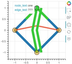

形は別として、頂点と複数の線、それに輪っかをもつChordと同様のグラフが描けた。ホバーとタップの動きも同じ。
配置
後は頂点の位置や辺の数の決め方、辺の曲線化が分かればChordを再現できるはず。と言っても全く分からないのでGithubのHoloViewsからChordのコードを見てみる。__init__の中にいかにもという感じのlayout_chordsという名前を発見。Chordのすぐ上にあるので眺めてみると、numpyを使って何かやってるなあというのはわかった。理解し得た範囲での流れは次のような感じ。
- 全体の辺の数の調整。
- 頂点に属する辺の数(重み)に応じて、円周上で占める範囲を求める。
- 頂点の座標を求める。
- 辺の端点の位置を求める。
- 辺の曲線の座標を求める。
以下、layout_chordsの処理を見ていくが、コードは同一ではない。また、自分がわかりやすいのでpandasを使っている。
全体の辺の数の調整
layout_chordsにmax_chordsという属性がある。デフォルトは500。データの重みの合計がこの値を超えたら調整するようだ。
# 最初に importしたデータ
edges = links.copy()
print(edges.head())
print(edges['value'].sum())

max_chords = 500

edges['value'] = edges['value'] / edges['value'].sum() * max_chords
edges['value'] = np.ceil(edges['value']).astype(int)  # 小数点以下は切り上げ

edges.head()
   source  target  value
0       1       0      1
1       2       0      8
2       3       0     10
3       3       2      6
4       4       0      1
820
| source | target | value | |
|---|---|---|---|
| 0 | 1 | 0 | 1 |
| 1 | 2 | 0 | 5 |
| 2 | 3 | 0 | 7 |
| 3 | 3 | 2 | 4 |
| 4 | 4 | 0 | 1 |
頂点の辺の数に応じた円周上の範囲を求める
ラジアンと言われてもピンとこない自分は次のことだけ覚えた。
- 半径1、中心が(0, 0)の円で考える。
- ラジアンは角度。180° = π、360° = 2π。
- 円周は直径×円周率で2π。
- 360° = 2π = 円周。
- 頂点が円周上で占める範囲は弧の長さで、ラジアン(角度)と同じになる。
layout_chordsの処理は以下のような感じ。
# 辺が存在する頂点一覧
nodes = np.union1d(edges['source'], edges['target'])
nodes = pd.DataFrame({'index': nodes})

# edges['value']から頂点ごとの辺の数(重み)を計算
values = edges.pivot('source', 'target', 'value')
nodes['weights_of_areas'] = values.sum().add(values.sum(axis=1), fill_value=0)

# 辺の数を範囲(弧の長さ)に変換
nodes['areas_in_radians'] = (
    nodes['weights_of_areas'] / nodes['weights_of_areas'].sum() * 2*np.pi
)
nodes.head()
| index | weights_of_areas | areas_in_radians | |
|---|---|---|---|
| 0 | 0 | 24.0 | 0.120252 |
| 1 | 1 | 1.0 | 0.005011 |
| 2 | 2 | 11.0 | 0.055116 |
| 3 | 3 | 13.0 | 0.065137 |
| 4 | 4 | 1.0 | 0.005011 |
頂点の座標を求める
中心(0, 0)、半径1の円の円周上の座標は x = cos(rad)、 y = sin(rad)。
# 各弧の長さを累積和で1つの円の上での位置に
points = nodes['areas_in_radians'].cumsum()
points.loc[-1] = 0
points = points.sort_index()
points = pd.cut(points, bins=points, precision=20)
points = pd.IntervalIndex(points[1:]) # インターバルインデックス

print(points[:5])

# 各範囲の下限、上限
nodes['points_min'] = points.left
nodes['points_max'] = points.right

nodes.head()
IntervalIndex([(0.0, 0.12025235037664278], (0.12025235037664278, 0.12526286497566957], (0.12526286497566957, 0.1803785255649642], (0.1803785255649642, 0.24551521535231238], (0.24551521535231238, 0.25052572995133915]], dtype='interval[float64, right]', name='areas_in_radians')
| index | weights_of_areas | areas_in_radians | points_min | points_max | |
|---|---|---|---|---|---|
| 0 | 0 | 24.0 | 0.120252 | 0.000000 | 0.120252 |
| 1 | 1 | 1.0 | 0.005011 | 0.120252 | 0.125263 |
| 2 | 2 | 11.0 | 0.055116 | 0.125263 | 0.180379 |
| 3 | 3 | 13.0 | 0.065137 | 0.180379 | 0.245515 |
| 4 | 4 | 1.0 | 0.005011 | 0.245515 | 0.250526 |
# 範囲の中間点が頂点の位置
midpoints = points.mid

# 必要なのは(x, y)の座標
nodes['node_x'] = np.cos(midpoints)
nodes['node_y'] = np.sin(midpoints)

nodes.head()
| index | weights_of_areas | areas_in_radians | points_min | points_max | node_x | node_y | |
|---|---|---|---|---|---|---|---|
| 0 | 0 | 24.0 | 0.120252 | 0.000000 | 0.120252 | 0.998193 | 0.060090 |
| 1 | 1 | 1.0 | 0.005011 | 0.120252 | 0.125263 | 0.992475 | 0.122450 |
| 2 | 2 | 11.0 | 0.055116 | 0.125263 | 0.180379 | 0.988346 | 0.152227 |
| 3 | 3 | 13.0 | 0.065137 | 0.180379 | 0.245515 | 0.977412 | 0.211341 |
| 4 | 4 | 1.0 | 0.005011 | 0.245515 | 0.250526 | 0.969400 | 0.245485 |
辺の端点の位置を求める
各頂点の範囲を辺の数で分割する。
def get_end_points(x):
    p0, p1 = x['points_min'], x['points_max']
    angles = np.linspace(p0, p1, int(x['weights_of_areas']))

    return angles.tolist()

nodes['edges_end_points'] = nodes.apply(get_end_points, axis=1)

nodes.head()
| index | weights_of_areas | areas_in_radians | points_min | points_max | node_x | node_y | edges_end_points | |
|---|---|---|---|---|---|---|---|---|
| 0 | 0 | 24.0 | 0.120252 | 0.000000 | 0.120252 | 0.998193 | 0.060090 | [0.0, 0.005228363059854034, 0.0104567261197080... |
| 1 | 1 | 1.0 | 0.005011 | 0.120252 | 0.125263 | 0.992475 | 0.122450 | [0.12025235037664278] |
| 2 | 2 | 11.0 | 0.055116 | 0.125263 | 0.180379 | 0.988346 | 0.152227 | [0.12526286497566957, 0.13077443103459904, 0.1... |
| 3 | 3 | 13.0 | 0.065137 | 0.180379 | 0.245515 | 0.977412 | 0.211341 | [0.1803785255649642, 0.1858065830472432, 0.191... |
| 4 | 4 | 1.0 | 0.005011 | 0.245515 | 0.250526 | 0.969400 | 0.245485 | [0.24551521535231238] |
辺の曲線の座標を求める
layout_chordsではquadratic_bezierという関数を使っている。ベジェ曲線というものらしい。中には何かの式が書いてある。理解はできないのでquadratic_bezierをそのまま使う。とりあえず、辺の両端の座標と制御点の座標を使って計算するといい感じの曲線ができるらしい。
quadratic_bezier(start, end, c0=(0, 0), c1=(0, 0), steps=50)
quadratiq bezierは2次ベジェ曲線らしいが、ベジェ曲線の説明を読む限り、4点を使うのは3次ベジェ曲線ではないかと疑問に思いつつ、
引数
- start : (x0, y0) 辺の始点の座標。
- end : (x1, y1) 辺の終点の座標。
- c0 : (cx0, cy0) 制御点の座標。
- c1 : (cx1, cy1) もう一つの制御点の座標。
- steps : 曲線の座標の数。デフォルトは50。
戻り値
- -> numpy.ndarray (shapeは(steps, 2))
from holoviews.element.util import quadratic_bezier

def get_path(x):
    xs = np.empty(0)
    ys = np.empty(0)
    for i in range(x['value']):
        # 2つの頂点から辺の端点を取得
        s = nodes.loc[x['source'], 'edges_end_points'].pop()
        t = nodes.loc[x['target'], 'edges_end_points'].pop()
        # 座標に変換
        x0, y0 = np.cos(s), np.sin(s)
        x1, y1 = np.cos(t), np.sin(t)
        # ベジェ曲線
        b = quadratic_bezier((x0, y0), (x1, y1), (x0/2, y0/2),
                             (x1/2, y1/2), steps=50)
        # MultiLine用のデータのために、xs, ysそれぞれのリスト
        xs = np.append(xs, b[:, 0].flatten())
        ys = np.append(ys, b[:, 1].flatten())
        # np.nanで区切る
        xs =  np.append(xs, np.nan)
        ys =  np.append(ys, np.nan)
    # 余分な np.nanを削除
    xs = np.delete(xs, -1)
    ys = np.delete(ys, -1)

    return xs, ys

edges[['xs', 'ys']] = edges.apply(get_path,
                                  axis=1, result_type='expand')

edges.head()
| source | target | value | xs | ys | |
|---|---|---|---|---|---|
| 0 | 1 | 0 | 1 | [0.9927783948222082, 0.9630074475389099, 0.934... | [0.11996273910777293, 0.11636535584423287, 0.1... |
| 1 | 2 | 0 | 5 | [0.9837758550359634, 0.9542808382004578, 0.926... | [0.17940197058075802, 0.17398204989887306, 0.1... |
| 2 | 3 | 0 | 7 | [0.9700122274758824, 0.9409401385262388, 0.913... | [0.24305612221722958, 0.23567173954270657, 0.2... |
| 3 | 3 | 2 | 4 | [0.978545131672936, 0.9492070855485545, 0.9211... | [0.20603258305228409, 0.19982079380656642, 0.1... |
| 4 | 4 | 0 | 1 | [0.9700122274758824, 0.9409417399748237, 0.913... | [0.24305612221722958, 0.23564908833075593, 0.2... |
これで必要なデータはほぼ出揃った。残るは輪っかの座標だが、どこで処理をしているか見つけられなかった。Chordのデータを見直すと、各頂点の弧の長さに関係なく点の数は20で共通しているので、適当に処理する。
def arc_coords(x):
    p0, p1 = x['points_min'], x['points_max']
    angles = np.linspace(p0, p1, 20)
    xs = np.cos(angles)
    ys = np.sin(angles)

    return xs, ys

nodes[['arc_xs', 'arc_ys']] = nodes.apply(arc_coords,
                                          axis=1, result_type='expand')

nodes.head()
| index | weights_of_areas | areas_in_radians | points_min | points_max | node_x | node_y | edges_end_points | arc_xs | arc_ys | |
|---|---|---|---|---|---|---|---|---|---|---|
| 0 | 0 | 24.0 | 0.120252 | 0.000000 | 0.120252 | 0.998193 | 0.060090 | [] | [1.0, 0.9999799714965371, 0.9999198867884302, ... | [0.0, 0.006329028818457834, 0.0126578041149644... |
| 1 | 1 | 1.0 | 0.005011 | 0.120252 | 0.125263 | 0.992475 | 0.122450 | [] | [0.9927783948222082, 0.9927467247726159, 0.992... | [0.11996273910777293, 0.12022454180924974, 0.1... |
| 2 | 2 | 11.0 | 0.055116 | 0.125263 | 0.180379 | 0.988346 | 0.152227 | [] | [0.9921648603295138, 0.9917982703635422, 0.991... | [0.12493554309049267, 0.12781310928025358, 0.1... |
| 3 | 3 | 13.0 | 0.065137 | 0.180379 | 0.245515 | 0.977412 | 0.211341 | [] | [0.9837758550359634, 0.9831550409112764, 0.982... | [0.17940197058075802, 0.1827735361882195, 0.18... |
| 4 | 4 | 1.0 | 0.005011 | 0.245515 | 0.250526 | 0.969400 | 0.245485 | [] | [0.9700122274758824, 0.9699480971028605, 0.969... | [0.24305612221722958, 0.24331191694312868, 0.2... |
後はデータの形を整え、GraphRendererを作るだけ
# StaticLayoutProvider用 頂点の座標
graph_layout = {
    int(idx): (x, y) for idx, (x, y) in nodes[['node_x', 'node_y']].iterrows()
}
nodes = nodes.reindex(columns=['index', 'arc_xs', 'arc_ys'])  # 'index'列は必須
edges = edges.reindex(columns=['source', 'target', 'xs', 'ys'])
edges.columns = ['start', 'end', 'xs', 'ys']  # 'start', 'end'列は必須
gr = GraphRenderer()

# 頂点
# node_rendererのデフォルトの Glyphは Circleなので、属性の値だけ変更
gr.node_renderer.glyph.update(fill_color='#30a2da', size=15)
gr.node_renderer.data_source.data = nodes

# 辺
gr.edge_renderer.data_source.data = edges

# 頂点の位置
gr.layout_provider = StaticLayoutProvider(graph_layout=graph_layout)

# ホバー用
gr.node_renderer.hover_glyph = Circle(fill_color='limegreen')
gr.edge_renderer.hover_glyph = MultiLine(line_color='limegreen')

# タップ用
gr.node_renderer.selection_glyph = Circle(fill_color='limegreen')
gr.node_renderer.nonselection_glyph = Circle(fill_color='#30a2da',
                                             fill_alpha=0.2,
                                             line_alpha=0.2
                                             )
gr.edge_renderer.selection_glyph = MultiLine(line_color='limegreen')
gr.edge_renderer.nonselection_glyph = MultiLine(line_alpha=0.2)

# 挙動設定
gr.inspection_policy = gr.selection_policy = NodesAndLinkedEdges()

# Figure作成
my_chord = figure(x_range=(-1.1, 1.1), y_range=(-1.1, 1.1),
                  tools='pan,wheel_zoom,tap,reset',
                  tooltips='@index'
                  )
# 輪っか部分
my_chord.multi_line('arc_xs', 'arc_ys',
                    source=gr.node_renderer.data_source,
                    line_color='#30a2da',
                    line_width=10,
                    hover_color='limegreen',
                    selection_color='limegreen',
                    nonselection_alpha=0.2
                    )

my_chord.renderers.append(gr)
ようやく完成!
show(my_chord)


色の塗り分け、テキストありのChord
HoloViewsのReference GalleryのChordのページにはもう一つの例が載っている。
nodes = hv.Dataset(pd.DataFrame(data['nodes']), 'index')
nodes.data.head()
| index | name | group | |
|---|---|---|---|
| 0 | 0 | Myriel | 1 |
| 1 | 1 | Napoleon | 1 |
| 2 | 2 | Mlle.Baptistine | 1 |
| 3 | 3 | Mme.Magloire | 1 |
| 4 | 4 | CountessdeLo | 1 |
色とテキストがついてより豪華なグラフに。
chord = hv.Chord((links, nodes)).select(value=(5, None))
chord.opts(
    hv.opts.Chord(cmap='Category20', edge_cmap='Category20',
                  edge_color=hv.dim('source').str(),
                  labels='name', node_color=hv.dim('index').str()))
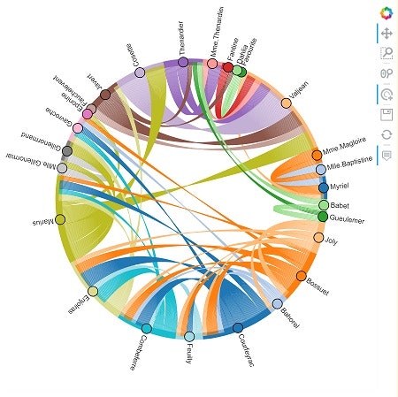


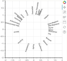
でも、よく見るとグラフ自体は上とほぼ同じ、違うのは頂点の数と色とテキストがついたこと。なので、違うところを眺めてみたい。Figureを取り出してrenderersを参照すると、レンダラーが1つ増えている。これがテキスト部分だろう。
# Figureの取り出し
p = hv.render(chord)
p.renderers
[GlyphRenderer(id='5080', ...),
 GraphRenderer(id='5061', ...),
 GlyphRenderer(id='5086', ...)]
text = p.renderers[2]
print(text.glyph)
print(text.data_source.data.keys())

p11 = figure(frame_height=350, frame_width=350,
            x_range=(-2, 2), y_range=(-2, 2))
p11.renderers.append(text)

show(p11)
Text(id='5084', ...)
dict_keys(['x', 'y', 'text', 'angle'])
Text
'x'にx座標、'y'にy座標、'text'に表示する文字列、'angle'に回転角度を渡す。
text = ['node 0', 'node 1', 'node 2', 'node 3']
x = [1, 0.5, 0, -0.5]
y = [0, 0.5, 1, 0.5]
angle = [0, np.pi/4, np.pi/2, np.pi*0.75]

p12 = figure(frame_width=250, frame_height=250,
            x_range=(-2, 2), y_range=(-2, 2))

p12.text(x=x, y=y, text=text, angle=angle,
        text_font_size='20px', text_baseline='middle',
        )

show(p12)

CategoricalColorMapper
次に色の部分。
GraphRendererから頂点と辺のGlyphRendererを取り出し、頂点はglyph.fill_color、辺はglyph.line_color属性を見てみる。どちらも'field'と'transform'のキーを持った辞書。'transform'の値がCategoricalColorMapperで、これが色の設定になる。
graph_renderer = p.renderers[1]
node_renderer = graph_renderer.node_renderer
edge_renderer = graph_renderer.edge_renderer

node_renderer.glyph.fill_color, edge_renderer.glyph.line_color
({'field': 'node_color', 'transform': CategoricalColorMapper(id='5042', ...)},
 {'field': 'edge_color', 'transform': CategoricalColorMapper(id='5044', ...)})
CategoricalColorMapperはfactorsの値とpaletteの色をマッピングするクラス。factorsは色を適用する値のリスト、paletteは色のリストになる。bokeh.transform.factor_cmapを使うと、記述が少しだけ楽になる。factorsではint型は使えない。str型、またはstr型のタプル。タプルに関しては公式のfactors, start, endを参照。
from bokeh.models import ColumnDataSource, CategoricalColorMapper

palette = ['navy', 'orange', 'olive']
factors = list('abc')

mapper = CategoricalColorMapper(palette=palette,
                                factors=factors,
                                nan_color='firebrick'  # factorsにない時の色
                                )
# factorsにない'd'の値もある
source = dict(
    x=[1, 2, 3, 4],
    y=[3, 5, 2, 4],
    value=['c', 'b', 'a', 'd']
)
source = ColumnDataSource(source)

p13 = figure(plot_height=250, plot_width=250)

p13.vbar(x='x', width=0.8, top='y',
         source=source,
         color={'field': 'value', 'transform': mapper})  # 'field'に適用する列名をいれる

show(p13)

from bokeh.transform import factor_cmap

# 違いはフィールド名も渡すところ。戻り値は辞書。
cmap = factor_cmap('value', palette, factors, nan_color='firebrick')
print(type(cmap))
print(cmap)

p14 = figure(plot_height=250, plot_width=250)

p14.vbar(x='x', width=0.8, top='y',
         source=source,
         color=cmap)

show(p14)
<class 'dict'>
{'field': 'value', 'transform': CategoricalColorMapper(id='5893', ...)}
Chordに使われている2つのCategoricalColorMapperを見てみると、factorsとpaletteの値は同じだとわかる。idは別だが、==で比較するとTrueになる。
node_mapper = node_renderer.glyph.fill_color['transform']
edge_mapper = edge_renderer.glyph.line_color['transform']

print(node_mapper.palette[:5])
print(edge_mapper.palette[:5])
print(node_mapper.palette == edge_mapper.palette)

print(node_mapper.factors[:5])
print(edge_mapper.factors[:5])
print(node_mapper.factors == edge_mapper.factors)
['#1f77b4', '#aec7e8', '#ff7f0e', '#ffbb78', '#2ca02c']
['#1f77b4', '#aec7e8', '#ff7f0e', '#ffbb78', '#2ca02c']
True
['0', '2', '3', '11', '20']
['0', '2', '3', '11', '20']
True
bokehでChordを再現する
ここまで来たら、後は実際にデータを加工して必要な部品を揃えるだけだ。
作業を始める前に、Chordで使われているデータを確認する。
node_rendererのデータには最初の例で見た列名に加えて、'name'、'group'、'node_color'列が追加されている。'name'、'group'は data['nodes']。'node_color'は'index'列をstr型にしたもの。CategoricalColorMapperのfactorsはint型ではエラーになる。
edge_rendererのデータは'edge_color'列だけ追加されている。こちらは'start'列をstr型にしたもの。
df_nodes = node_renderer.data_source.to_df()  # データフレームに
df_nodes.head()
| index | index_hover | name | group | arc_xs | arc_ys | node_color | |
|---|---|---|---|---|---|---|---|
| 0 | 0 | 0 | Myriel | 1 | [1.0, 0.9999616084203429, 0.9998464366291983, ... | [0.0, 0.008762515928708449, 0.0175243590437603... | 0 |
| 1 | 2 | 2 | Mlle.Baptistine | 1 | [0.9861725355513823, 0.9852745890889341, 0.984... | [0.1657218456455203, 0.1709794844290746, 0.176... | 2 |
| 2 | 3 | 3 | Mme.Magloire | 1 | [0.9643470021510558, 0.9627159124942113, 0.961... | [0.26464100106043953, 0.27051445771055954, 0.2... | 3 |
| 3 | 11 | 11 | Valjean | 2 | [0.9273043248938287, 0.9111224279579819, 0.893... | [0.3743082807435611, 0.4121358044042667, 0.449... | 11 |
| 4 | 20 | 20 | Favourite | 3 | [0.39435585511331855, 0.39260460034073885, 0.3... | [0.9189578116202306, 0.9197073598657829, 0.920... | 20 |
df_edges = edge_renderer.data_source.to_df()
df_edges.head()
| start | end | xs | ys | edge_color | |
|---|---|---|---|---|---|
| 0 | 2 | 0 | [0.9643470021510558, 0.9354421839235255, 0.907... | [0.26464100106043953, 0.2566436993401825, 0.24... | 2 |
| 1 | 3 | 0 | [0.9273043248938287, 0.8995384093005471, 0.873... | [0.3743082807435611, 0.36291707158663716, 0.35... | 3 |
| 2 | 3 | 2 | [0.953414147011291, 0.9248394897961085, 0.8974... | [0.3016644895885698, 0.2925577397447924, 0.283... | 3 |
| 3 | 11 | 0 | [0.39435585511331855, 0.38290561858217864, 0.3... | [0.9189578116202306, 0.8908491354595254, 0.862... | 11 |
| 4 | 21 | 20 | [0.3268606654329953, 0.3170800161987392, 0.307... | [0.9450725397516846, 0.9167244490725669, 0.889... | 21 |
データの加工
辺の'value'が5以上のデータを使う。'value'の合計は500を超えないので全体の辺の数は調整しない。
# 辺用データの作成
edges = links[links['value'] >= 5].copy()  # valueが 5以上の辺
edges.columns = ['start', 'end', 'value']
edges['color'] = edges['start'].astype(str)  # color列

print(edges['value'].sum())
edges.head()
434
| start | end | value | color | |
|---|---|---|---|---|
| 1 | 2 | 0 | 8 | 2 |
| 2 | 3 | 0 | 10 | 3 |
| 3 | 3 | 2 | 6 | 3 |
| 13 | 11 | 0 | 5 | 11 |
| 32 | 21 | 20 | 5 | 21 |
# 頂点、輪っか用データの作成
nodes = pd.DataFrame(data['nodes'])
nodes['index'] = nodes.index
nodes['color'] = nodes['index'].astype(str)  # color列

# 辺の'start', 'end'に存在する頂点を抽出
filter_1 = nodes['index'].isin(edges['start'])
filter_2 = nodes['index'].isin(edges['end'])
nodes = nodes[filter_1 | filter_2]

print(len(nodes))  # 26個に減っている
nodes.head()
26
| name | group | index | color | |
|---|---|---|---|---|
| 0 | Myriel | 1 | 0 | 0 |
| 2 | Mlle.Baptistine | 1 | 2 | 2 |
| 3 | Mme.Magloire | 1 | 3 | 3 |
| 11 | Valjean | 2 | 11 | 11 |
| 20 | Favourite | 3 | 20 | 20 |
# 各頂点の辺の数
values = edges.pivot('start', 'end', 'value')
nodes['weights_of_areas'] = values.sum().add(values.sum(axis=1), fill_value=0).astype(int)

# 弧の長さ
nodes['areas_in_radians'] = (
    nodes['weights_of_areas'] / nodes['weights_of_areas'].sum() * 2*np.pi
)

# 弧の境界
points = nodes['areas_in_radians'].cumsum()
points.loc[-1] = 0
points = points.sort_index()
points = pd.cut(points, bins=points, precision=20)
points = pd.IntervalIndex(points[1:])

nodes['points_min'] = points.left
nodes['points_max'] = points.right

# 頂点の座標
midpoints = points.mid

nodes['node_x'] = np.cos(midpoints)
nodes['node_y'] = np.sin(midpoints)

# 辺の端点
def get_end_points(x):
    p0, p1 = x['points_min'], x['points_max']
    end_points = np.linspace(p0, p1, int(x['weights_of_areas']))
    return list(end_points)

nodes['edges_end_points'] = nodes.apply(get_end_points, axis=1)

# 各辺のベジェ曲線
def get_path(x):
    s, t, v = x['start'], x['end'], x['value']
    xs = np.empty(0)
    ys = np.empty(0)
    for j in range(v):
        s_point = nodes.loc[s, 'edges_end_points'].pop()
        t_point = nodes.loc[t, 'edges_end_points'].pop()

        x0, y0 = np.cos(s_point), np.sin(s_point)
        x1, y1 = np.cos(t_point), np.sin(t_point)

        ts = quadratic_bezier((x0, y0), (x1, y1),
                              (x0/2, y0/2), (x1/2, y1/2))

        xs = np.append(xs, ts[:, 0])
        ys = np.append(ys, ts[:, 1])
        xs = np.append(xs, np.nan)
        ys = np.append(ys, np.nan)

    xs = np.delete(xs, -1)
    ys = np.delete(ys, -1)

    return xs, ys

edges[['xs', 'ys']] = edges.apply(get_path,
                                  axis=1, result_type='expand')

# 輪っか用の座標
def arc_coords(x):
    p0, p1 = x['points_min'], x['points_max']
    angles = np.linspace(p0, p1, 20)
    xs = np.cos(angles)
    ys = np.sin(angles)

    return xs, ys

nodes[['arc_xs', 'arc_ys']] = nodes.apply(arc_coords,
                                          axis=1, result_type='expand')
ここまでは上の例と同じ処理。
次にText用のデータ。回転の角度はmidpointをそのまま使える。(x, y)は頂点の(x, y)から少し外側に設定。
# Text用データ
# 頂点の位置(ラジアン)がそのままテキストの回転角度になる
texts = pd.DataFrame(midpoints, columns=['angle'], index=nodes.index)

# 位置調整
texts[['x', 'y']] = nodes[['node_x', 'node_y']] * 1.06

texts['name'] = nodes['name']

texts.head()
| angle | x | y | name | |
|---|---|---|---|---|
| 0 | 0.083245 | 1.056329 | 0.088138 | Myriel |
| 2 | 0.217161 | 1.035104 | 0.228385 | Mlle.Baptistine |
| 3 | 0.325741 | 1.004259 | 0.339212 | Mme.Magloire |
| 11 | 0.774540 | 0.757627 | 0.741351 | Valjean |
| 20 | 1.183526 | 0.400322 | 0.981500 | Favourite |
graph_layout = {
    idx: (x, y) for idx, (x, y) in nodes[['node_x', 'node_y']].iterrows()
}
nodes = nodes.reindex(columns=['index', 'name', 'group', 'color', 'arc_xs', 'arc_ys'])
nodes.head()
| index | name | group | color | arc_xs | arc_ys | |
|---|---|---|---|---|---|---|
| 0 | 0 | Myriel | 1 | 0 | [1.0, 0.9999616084203429, 0.9998464366291983, ... | [0.0, 0.008762515928708449, 0.0175243590437603... |
| 2 | 2 | Mlle.Baptistine | 1 | 2 | [0.9861725355513823, 0.9852745890889341, 0.984... | [0.1657218456455203, 0.1709794844290746, 0.176... |
| 3 | 3 | Mme.Magloire | 1 | 3 | [0.9643470021510558, 0.9627159124942113, 0.961... | [0.26464100106043953, 0.27051445771055954, 0.2... |
| 11 | 11 | Valjean | 2 | 11 | [0.9273043248938287, 0.9111224279579819, 0.893... | [0.3743082807435611, 0.4121358044042667, 0.449... |
| 20 | 20 | Favourite | 3 | 20 | [0.39435585511331855, 0.39260460034073885, 0.3... | [0.9189578116202306, 0.9197073598657829, 0.920... |
edges = edges.reindex(columns=['start', 'end', 'color', 'xs', 'ys'])
edges.head()
| start | end | color | xs | ys | |
|---|---|---|---|---|---|
| 1 | 2 | 0 | 2 | [0.9643470021510558, 0.9354421839235255, 0.907... | [0.26464100106043953, 0.2566436993401825, 0.24... |
| 2 | 3 | 0 | 3 | [0.9273043248938287, 0.8995384093005471, 0.873... | [0.3743082807435611, 0.36291707158663716, 0.35... |
| 3 | 3 | 2 | 3 | [0.953414147011291, 0.9248394897961085, 0.8974... | [0.3016644895885698, 0.2925577397447924, 0.283... |
| 13 | 11 | 0 | 11 | [0.39435585511331855, 0.38290561858217864, 0.3... | [0.9189578116202306, 0.8908491354595254, 0.862... |
| 32 | 21 | 20 | 21 | [0.3268606654329953, 0.3170800161987392, 0.307... | [0.9450725397516846, 0.9167244490725669, 0.889... |
nodesとedgesの色用列は同じcmapを使えるように'color'で統一している。データの用意ができたので、あとは描画するだけ。
描画
from bokeh.palettes import Category20

# カラーマッパー
palette = (Category20[20] * 2)[:len(nodes)]
cmap = factor_cmap('color', palette, nodes['color'])

# グラフレンダラー
gr = GraphRenderer()

# 頂点
gr.node_renderer.glyph.update(fill_color=cmap, size=15)
gr.node_renderer.hover_glyph = Circle(fill_color='limegreen')
gr.node_renderer.nonselection_glyph = Circle(fill_color=cmap,
                                             fill_alpha=0.2,
                                             line_alpha=0.2
                                             )
gr.node_renderer.data_source.data = nodes

gr.layout_provider = StaticLayoutProvider(graph_layout=graph_layout)

# 辺
gr.edge_renderer.glyph.update(line_color=cmap)
gr.edge_renderer.hover_glyph = MultiLine(line_color='limegreen')
gr.edge_renderer.nonselection_glyph = MultiLine(line_color=cmap,
                                                line_alpha=0.2,)

gr.edge_renderer.data_source.data = edges

# ホバー、タップ
gr.inspection_policy = gr.selection_policy = NodesAndLinkedEdges()

# Figure
my_chord_color = figure(x_range=(-1.55, 1.55), y_range=(-1.55, 1.55),
                        frame_width=600, frame_height=600,
                        tools='pan,wheel_zoom,tap,reset',
                        tooltips=[('index', '@index'),
                                  ('name', '@name'),
                                  ('group', '@group')]
                        )
my_chord_color.axis.visible = False
my_chord_color.grid.visible = False

# 輪っか
my_chord_color.multi_line('arc_xs', 'arc_ys',
                          source=gr.node_renderer.data_source,
                          line_color=cmap,
                          hover_color='limegreen',
                          nonselection_line_alpha=0.2,
                          line_width=10
                          )

my_chord_color.renderers.append(gr)

# テキスト
my_chord_color.text('x', 'y', 'name', 'angle',
                    source=ColumnDataSource(texts),
                    text_baseline='middle',
                    text_font_size='11px',
                    text_color='black',
                    )
これで完成! Chordをほぼ再現できた。
show(p)


