テキストを手書き風にアニメーションさせるって何?
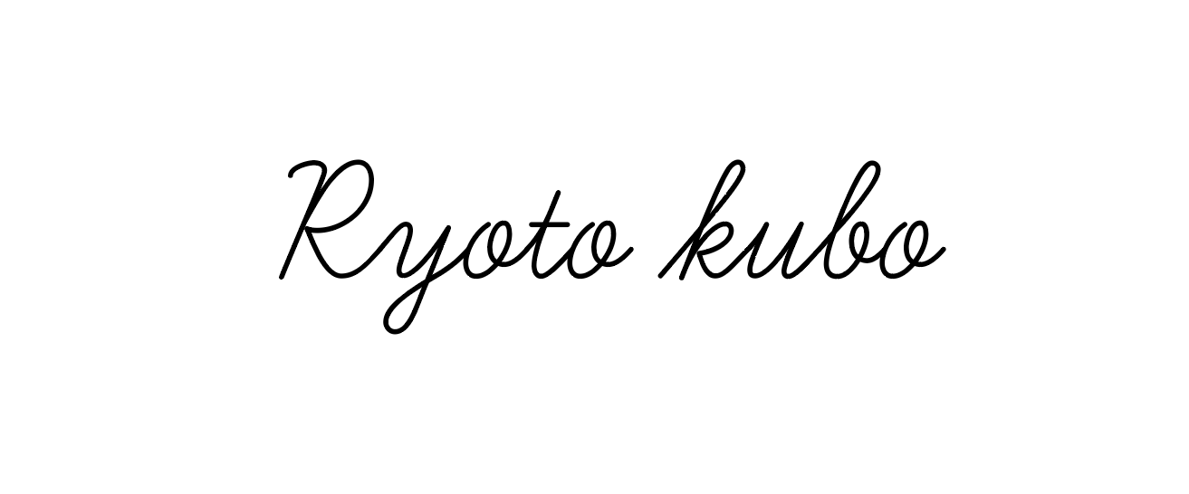
簡単に言うとこんな感じです。
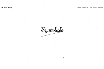
ちょっと分かりにくいですが、テキストを手書き風に見せるということです。
用意するもの
・SVG画像のテキスト
・html
・CSS
始めに「SVG画像って何?」
普通画像というものはピクセルで書かれているのですが、SVG画像は点と点をつないで書いています。(厳密には座標)
なので、その値をhtml内にコードとして書くことによってその座標を読み取り、文字になるのです。
さぁ早速コードを見ていきましょう!
コード
        <svg version="1.1" id="logo" xmlns="http://www.w3.org/2000/svg" xmlns:xlink="http://www.w3.org/1999/xlink" x="0px" y="0px"
        viewBox="0 0 841.89 595.28" style="enable-background:new 0 0 841.89 595.28;" xml:space="preserve">
     <path class="logo0" d="M200.57,238.13c0-3.89,6.48-4.54,6.48-4.54c4.7,0.16,3.89,4.54,3.89,4.54c-14.42,36.12-14.42,36.12-14.42,36.12
       c18.63-45.03,24.3-40.66,24.3-40.66c8.1,1.94,2.27,15.39,2.27,15.39c-6.8,9.88-17.49,8.59-17.49,8.59
       c4.21,18.63,10.85,16.68,10.85,16.68c9.07-3.24,16.36-17.17,16.36-17.17c4.86-4.37,3.56,2.92,3.56,2.92
       c-5.02,12.31-2.59,14.31-2.59,14.31c5.51-1.19,14.09-17.88,14.09-17.88c-10.69,31.26-10.69,31.26-10.69,31.26l-1.13,2.75
       c-4.54,6.64-6.8,1.13-6.8,1.13c-0.16-8.26,14.42-17.05,14.42-17.05c6.16-3.85,9.56-9.2,9.56-9.2c2.75-8.91,6.48-9.56,6.48-9.56
       c-9.56,8.26-6.16,16.52-6.16,16.52c3.4,5.18,9.07-3.08,9.07-3.08c6.16-10.04,2.75-13.44,2.75-13.44c-3.4-2.75-5.18,6.32-5.18,6.32
       c-0.16,13.93,8.42,5.83,8.42,5.83c11.18-14.25,11.82-23.16,11.82-23.16c-13.44,38.55-3.24,28.51-3.24,28.51
       c5.99-4.21,7.29-8.42,7.29-8.42c2.92-8.42,5.99-8.91,5.99-8.91c-9.72,10.53-5.35,17.17-5.35,17.17c5.18,5.02,11.02-7.78,11.02-7.78
       c3.24-6.8,0-10.04,0-10.04c-3.89-1.35-5.12,7.63-5.12,7.63c1.77,10.88,6.56,6.8,6.56,6.8c19.02-20.54,23.1-33.19,23.1-33.19
       c-0.68-6.26-5.17,0.14-5.17,0.14c-14.28,37.82-14.28,37.82-14.28,37.82c10.82-22.54,14.42-18.77,14.42-18.77
       c4.76,3.67-2.58,7.89-2.58,7.89c-0.95,1.36-5.85,2.59-5.85,2.59c2.65,15.89,11.64,2.08,11.64,2.08c4.33-4.82,8.51-12.84,8.51-12.84
       c-11.24,24.56-0.96,17.82-0.96,17.82c5.94-4.49,11.08-18.14,11.08-18.14c-10.76,27.61-0.96,17.5-0.96,17.5
       c26.33-30.5,24.4-35.64,24.4-35.64c-1.28-7.06-5.78,1.12-5.78,1.12c-14.29,32.11-8.99,35.16-8.99,35.16
       c4.49,4.66,9.63-5.94,9.63-5.94c5.14-12.36-0.8-11.56-0.8-11.56c-4.66,4.01-1.28,10.43-1.28,10.43c3.69,7.38,8.51-1.28,8.51-1.28
       c3.69-8.51,6.26-9.31,6.26-9.31c-12.2,14.29-4.17,18.94-4.17,18.94c6.42-0.48,10.43-10.94,10.43-10.94
       c1.93-7.37-0.96-8.17-0.96-8.17c-5.62,2.73-4.17,11.24-4.17,11.24c3.05,8.83,10.76-1.77,10.76-1.77"/>
     <line class="logo1" x1="272.14" y1="256.08" x2="283.22" y2="256.08"/>
     <path class="logo2" d="M195.57,313.39c117.94-29.56,177.87-41.23,179.79-35c0.33,1.07-1.06,2.68-4.17,4.82"/>
     </svg>
/* =========================================== */
/* TextアニメーションCSS コード */
/* =========================================== */

.logo0{
    stroke: #000;
    fill: none;
    stroke-width: 2.5;
    stroke-dasharray:  4000;
    stroke-dashoffset: 4000;
    animation: DASH 8s ease-in-out alternate 0s forwards;
    -webkit-animation: DASH 8s ease-in-out alternate 0s forwards;
}

.logo1{
    stroke: #000;
    fill: none;
    stroke-width: 2.5;
    stroke-dasharray:  4000;
    stroke-dashoffset: 4000;
    animation: DASH 8s ease-in-out alternate 0s forwards;
    animation-delay: 3s;
    -webkit-animation: DASH 8s ease-in-out alternate 0s forwards;
    -webkit-animation-delay: 3s;
}

.logo2{
    stroke: #000;
    fill: none;
    stroke-width: 1;
    stroke-dasharray:  4000;
    stroke-dashoffset: 4000;
    animation: DASH 1s ease-in-out alternate 0s forwards;
    animation-delay: 4s;
    -webkit-animation: DASH 1s ease-in-out alternate 0s forwards;
    -webkit-animation-delay: 4s;
}

@keyframes DASH {
    0% {
        stroke-dashoffset: 4000;
        }
    100% {
        stroke-dashoffset: 0;
        }
    }

@-webkit-keyframes DASH {
    0% {
        stroke-dashoffset: 4000;
    }
    100% {
        stroke-dashoffset: 0;
      }
    }
※このコードは「Ryoto kubo」と出力されます。
まず訳が分かりませんね笑
心配なさらず。
index.htmlに書いてるのが先ほど申し上げた「文字の座標」です。
それをCSSのアニメーションで動きをつけているだけです。
SVG画像を用意する
今回はIllustratorを使います。
無料でSVG画像を作ると言った記事もあった気がしたので気になる方は探してみてください。
早速説明に入ります。
まずIllustratorを起動し文字を打ちましょう。
この時フォントは筆記体の方が、それっぽく見えますよ。
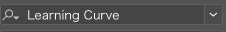
こちらのフォントは「Learning Curve」というものです。
それが終わったら、テキストを書いたレイヤーをロックして、新しいレイヤーを作りましょう。ここでは適当にをレイヤー名を「logo」としておいてください。
ちなみに最後コードとして出力されたとき、レイヤー名がid名として出力されますので、レイヤー名は「logo」じゃなくても構いません。
そしたら、これからペンツールを使ってパスで書いていきましょう!
こんな感じです。
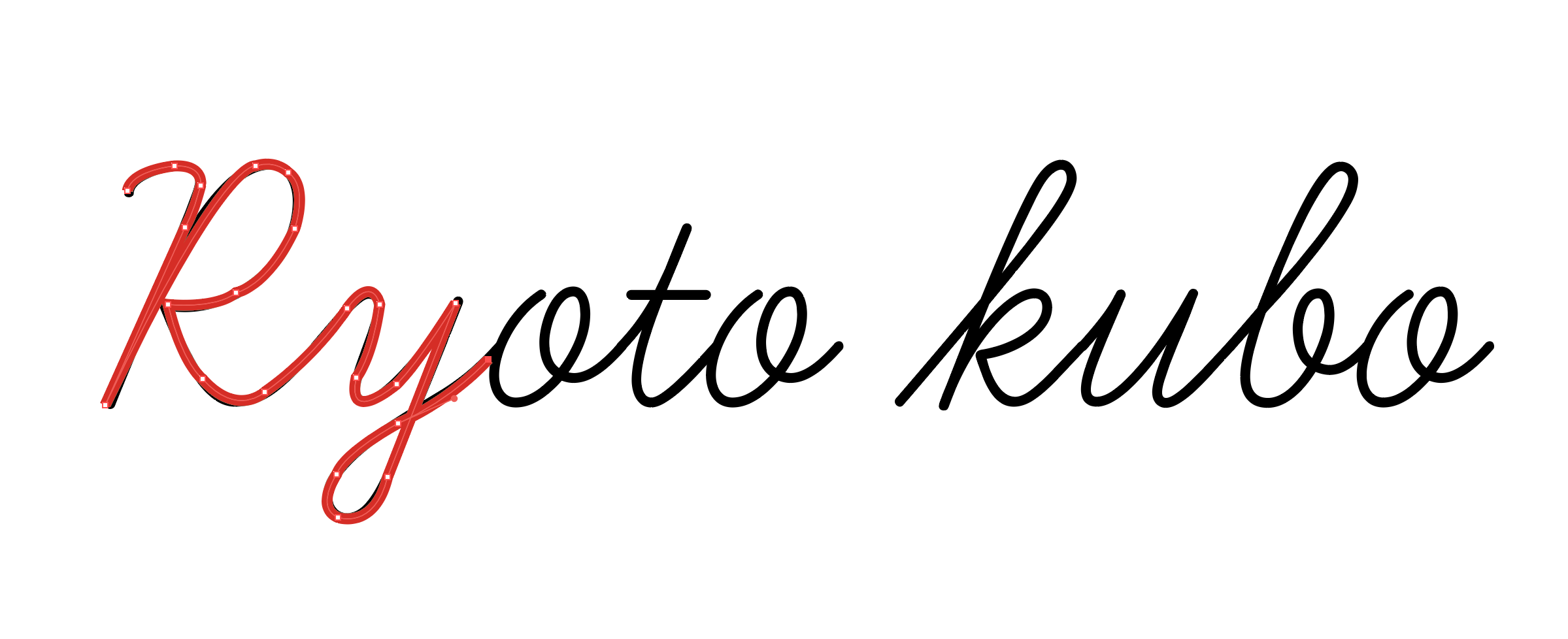
ベジェ曲線と言われるものを使って書くので少し慣れが必要ですが、僕もこれが最初なので慣れればできるようになります。
そして、お気づきだとは思うのですが、性と名の間は空白がありますよね。
これは一回パスを切って大丈夫です。
「t」の横棒は最後で構いません。
ここで注意して欲しいのが、なぞった通りに出力されるということです。
なので、逆から書いたら逆に出力されるので正規の書き順で書きましょう。
全てが書き終わったら「レイター1」をゴミ箱へポイっ!
その後「ファイル」⇨「別名で保存」をクリックして、ファイル形式をSVG画像にして「保存」をクリックしてください。
するとこんな画面になります。
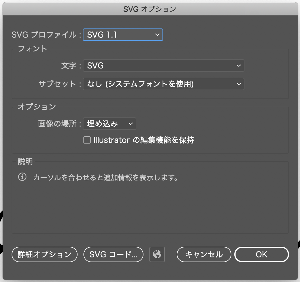
この画面の左から二つ目の「SVGコード」を押すとコードが出てきます。

この画面のをコピーしてhtmlに貼り付けましょう。
その際、が混ざっているのでこちらは削除しておいてください。
これでIllustratorの作業は終わりです。
次はCSSでの設定です。
CSSの設定
まず、先ほどコピペしたコード見てください。
<path>とか、<line>といったタグが見当たりませんか?
これが文字です。
その中に書かれている数値が文字の座標です。
これに沿ってアニメーションを走らせるだけです。
そして、これらのタグはペンツールを切った数だけこのタグが生成されます。
なので[Ryoto kubo]で言えば、最初の「Ryoto」で一回。「kubo」で二回。「t」の横棒で三回といった具合です。
一部消してみると、消した座標の部分の文字が消えるのでやってみてください。
感覚的に理解できると思います。
それぞれclassが設定されているので、そのclassにCSSを設定していきましょう。
もう一度コードを載せます。
/* =========================================== */
/* TextアニメーションCSS コード */
/* =========================================== */

.logo0{
    stroke: #000; /* 文字色 */
    fill: none; /* 塗りつぶし無し */
    stroke-width: 2.5; /* 文字の太さ */
    stroke-dasharray:  4000; /* 破線の間隔 */
    stroke-dashoffset: 4000; /* 破線の開始位置 */
    animation: DASH 8s ease-in-out alternate 0s forwards; /* アニメーション */
    -webkit-animation: DASH 8s ease-in-out alternate 0s forwards;
}

.logo1{
    stroke: #000;
    fill: none;
    stroke-width: 2.5;
    stroke-dasharray:  4000;
    stroke-dashoffset: 4000;
    animation: DASH 8s ease-in-out alternate 0s forwards;
    animation-delay: 3s;
    -webkit-animation: DASH 8s ease-in-out alternate 0s forwards;
    -webkit-animation-delay: 3s;
}

.logo2{
    stroke: #000;
    fill: none;
    stroke-width: 1;
    stroke-dasharray:  4000;
    stroke-dashoffset: 4000;
    animation: DASH 1s ease-in-out alternate 0s forwards;
    animation-delay: 4s;
    -webkit-animation: DASH 1s ease-in-out alternate 0s forwards;
    -webkit-animation-delay: 4s;
}

@keyframes DASH {
    0% {
        stroke-dashoffset: 4000;
        }
    100% {
        stroke-dashoffset: 0;
        }
    }

@-webkit-keyframes DASH {
    0% {
        stroke-dashoffset: 4000;
    }
    100% {
        stroke-dashoffset: 0;
      }
    }
と言った具合です。
アニメーションの役割はこちらから
あとは@keyframesを使ってアニメーションさせていくだけです。
何かわからないことがあれば僕のtwiiterのDMかこちらにコメントしてください。
ではでは。