Flutter で 「入力欄にボーダー設定したいけど、どうするんだろう」 と調べた時に、あまりに基本的な事すぎて?しばらく見つけられなかったので備忘録を兼ねたメモです。
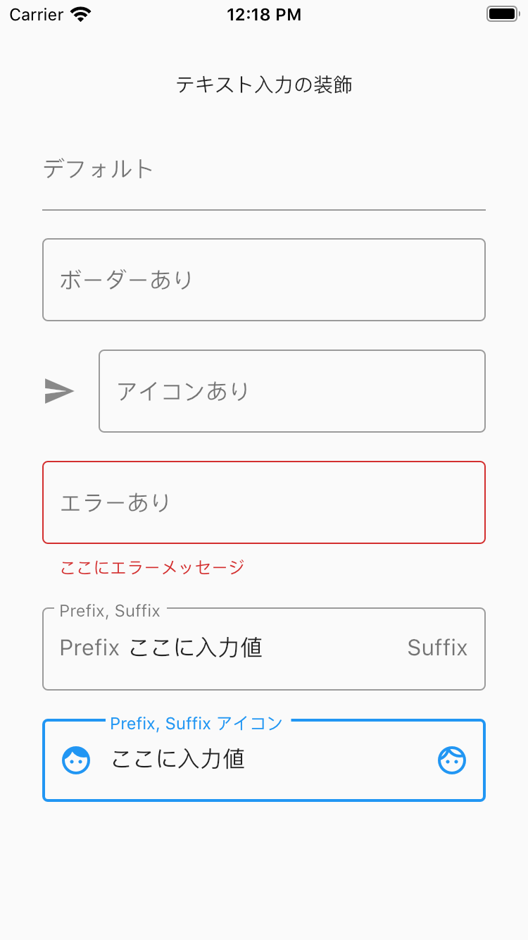
スクリーンショット
ボーダーとかアイコンを設定するとスクリーンショットにあるような入力欄が作れます。
ソースコード
TextField に InputDecoration で設定しています。
class MyWidget extends StatelessWidget {
  const MyWidget({Key key}) : super(key: key);

  @override
  Widget build(BuildContext context) {
    return Scaffold(
      body: SafeArea(
        child: Center(
          child: Container(
            padding: const EdgeInsets.all(30),
            child: Form(
              child: Column(
                children: [
                  const Text('テキスト入力の装飾'),
                  const SizedBox(height: 20),
                  TextFormField(
                    decoration: const InputDecoration(
                      labelText: 'デフォルト',
                    ),
                  ),
                  const SizedBox(height: 20),
                  TextFormField(
                    decoration: const InputDecoration(
                      border: OutlineInputBorder(),
                      labelText: 'ボーダーあり',
                    ),
                  ),
                  const SizedBox(height: 20),
                  TextFormField(
                    decoration: const InputDecoration(
                      border: OutlineInputBorder(),
                      labelText: 'アイコンあり',
                      icon: Icon(Icons.send),
                    ),
                  ),
                  const SizedBox(height: 20),
                  TextFormField(
                    decoration: const InputDecoration(
                      border: OutlineInputBorder(),
                      labelText: 'エラーあり',
                      errorText: 'ここにエラーメッセージ',
                    ),
                  ),
                  const SizedBox(height: 20),
                  TextFormField(
                    decoration: const InputDecoration(
                      border: OutlineInputBorder(),
                      labelText: 'Prefix, Suffix',
                      prefix: Text('Prefix'),
                      suffix: Text('Suffix'),
                    ),
                  ),
                  const SizedBox(height: 20),
                  TextFormField(
                    decoration: const InputDecoration(
                      border: OutlineInputBorder(),
                      labelText: 'Prefix, Suffix アイコン',
                      prefixIcon: Icon(Icons.face),
                      suffixIcon: Icon(Icons.face_outlined),
                    ),
                  ),
                ],
              ),
            ),
          ),
        ),
      ),
    );
  }
}