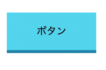
完成形
今回は下記のような立体感のあるボタンを作成します!
HTMLで<button></button>タグを追加しボタンを作成する
index.html
<!-- CSSでスタイルを設定するためclass="btn"を追加しておく -->
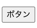
<button class="btn">ボタン</button>
下記のようなボタンが作成されます
CSSでボタンにスタイルを追加する
style.css
.btn {
    border-radius: 2px;
    padding: 15px 40px;
    background-color: #60daf0;
    cursor: pointer;
    box-shadow: 0 4px #2693b4;
    border: none;
    outline: none;
}
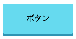
すると下記のようなボタンが作成できます!
ボタンを押下した際の動きをつける
先ほどの手順ではボタン自体は作成できましたが、押下した際の動きはまだありません。
「active」ディレクティブで押下している間適用されるスタイルを追加しましょう!
style.css
.btn {
    border-radius: 2px;
    padding: 15px 40px;
    background-color: #60daf0;
    cursor: pointer;
    box-shadow: 0 4px #2693b4;
    border: none;
    outline: none;
}

/* ボタンを押下している間のスタイルを追加 */
.btn:active {
    box-shadow: none;
    position: relative;
    top: 4px;
}
★Point ボタンを押下した際にボタンの位置を下げる
①box-shadowの2番目に指定している「4px」で影の高さを指定
②押下時は4px位置を下げるというスタイルを適用することで、押下時の立体感を出すことが可能
※「position: relative;」とセットで適用してください。
style.css
.btn {
    border-radius: 2px;
    padding: 15px 40px;
    background-color: #60daf0;
    cursor: pointer;
    box-shadow: 0 4px #2693b4; /* ①2番目に指定している4pxで影の高さを指定 */
    border: none;
    outline: none;
}

.btn:active {
    box-shadow: none;
    position: relative; /* position: relative;とセットで適用してください。 */
    top: 4px; /* ②押下時は4px位置を下げるというスタイルを適用することで押下時の立体感を出すことが可能*/
}
色の変化や、影の高さをアレンジするなど使い道がありそうです!