アイコンはユーザーインターフェース(UI)に見られるシンボルです。アイコンは普遍的であり、一定の規約に従って作成されています。ビットマップ画像とは異なり、アイコンは主にベクター形式です。
そのため、品質を損なうことなくサイズを変更でき、レスポンシブに対応しやすく最適な使用方法です。
アイコンは、アクションや状態を表すために広く使用されており、アイコンはインターフェースの使いやすさに貢献し、製品のUXを向上させるだけでなく、ビジュアルアイデンティティを強化します。
その重要性は明白であり、各プロジェクトごとにアイコンライブラリの選択が行われます。
本記事では、なぜ独自のアイコンライブラリを作成することが望ましいのかについて説明します。
なぜカスタムアイコンライブラリを作成するのか?
マテリアルシンボル(Google)やFont Awesomeなど、多くの無料で簡単に使用できるアイコンライブラリが存在するにもかかわらず、カスタムアイコンライブラリを作成することにはいくつかの利点があります。
- 著作権とライセンス: カスタムライブラリを作成すれば、これらの問題は発生しません
- 最適化: 使用しない何百ものアイコンをインストールする必要がありません
- 保守性: アイコンの変更、追加、削除が容易です
- より良いアクセシビリティ: アイコンにフォントを使用するのは悪い慣行です
- 柔軟性: 既存のさまざまなライブラリからアイコンを使用することができ、自分で作成することも可能です
アイコンライブラリの作成
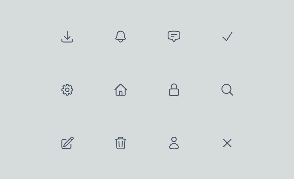
一般的なWebアプリケーションでよく見られる10個のアイコンで構成されたライブラリを一緒に作成しましょう。
まず、React / Next.jsプロジェクトをTypeScriptとTailwindCSSで作成します。
アイコンコンポーネントの作成
デザイナーから提供されたモックアップを統合していると仮定します。最初のステップとして、アイコンをSVG形式でエクスポートする必要があります。
React & Next.jsプロジェクトで使用するために、XMLベースで構築されたSVGをJSX、または今回の場合はTSXに変換する必要があります。
SVGが事前定義された色のみで使用される場合、fillやstrokeを変更する必要はありません。
しかし、アイコンが異なる色で使用される可能性がある場合、最も簡単な方法はテキストと同じ色を割り当てることです。色の値をcurrentColorに置き換えるだけです。
export const Bell = ({ ...props }: Props) => (
  <svg
    xmlns="http://www.w3.org/2000/svg"
    fill="none"
    viewBox="0 0 24 24"
    strokeWidth={1.5}
    stroke="currentColor"
    {...props}
  >
    <path
      strokeLinecap="round"
      strokeLinejoin="round"
      d="M14.857 17.082a23.848 23.848 0 0 0 5.454-1.31A8.967 8.967 0 0 1 18 9.75V9A6 6 0 0 0 6 9v.75a8.967 8.967 0 0 1-2.312 6.022c1.733.64 3.56 1.085 5.455 1.31m5.714 0a24.255 24.255 0 0 1-5.714 0m5.714 0a3 3 0 1 1-5.714 0"
    />
  </svg>
)
新しいアイコンをプロジェクトで使用する
各アイコンごとにコンポーネントをインポートする手間を省き、プロップスを毎回型付けするためにコードを重複させないようにするためには、インデックスを使用してアイコンをエクスポートするのが適切です。
アイコンをどのようにインポートすればよいのか?
インデックスを使用することで、以下のような大量のインポートを避けることができます。
import { ArrowDownTray } from "@/ui/components/icons/arrow-down-tray"
import { Bell } from "@/ui/components/icons/bell"
import { ChatBubble } from "@/ui/components/icons/chat-bubble"
import { Check } from "@/ui/components/icons/check"
import { Cog } from "@/ui/components/icons/cog"
import { Home } from "@/ui/components/icons/home"
import { Lock } from "@/ui/components/icons/lock"
import { MagnifyingGlass } from "@/ui/components/icons/magnifying-glass"
import { PencilSquare } from "@/ui/components/icons/pencil-square"
import { Trash } from "@/ui/components/icons/trash"
import { User } from "@/ui/components/icons/user"
import { XMark } from "@/ui/components/icons/x-mark"
また、長いインポート文も避けることができます。
import {
   ArrowDownTray,
   Bell,
   ChatBubble,
   Check,
   Cog,
   Home,
   Lock,
   MagnifyingGlass,
   PencilSquare,
   Trash,
   User,
   XMark,
} from "@/ui/components/icons"
下記の形式で単一のコンポーネントを簡単に使用できます。
import { Icon } from "@/ui/components/icons";

const Page = () => (
   <main>
      <Icon name="bell" />
   </main>
)
コンポーネントのインデックスの作成
import { SVGProps } from 'react'
import { ArrowDownTray } from '@/ui/components/icons/arrow-down-tray'
import { Bell } from '@/ui/components/icons/bell'
import { ChatBubble } from '@/ui/components/icons/chat-bubble'
import { Check } from '@/ui/components/icons/check'
import { Cog } from '@/ui/components/icons/cog'
import { Home } from '@/ui/components/icons/home'
import { Lock } from '@/ui/components/icons/lock'
import { MagnifyingGlass } from '@/ui/components/icons/magnifying-glass'
import { PencilSquare } from '@/ui/components/icons/pencil-square'
import { Trash } from '@/ui/components/icons/trash'
import { User } from '@/ui/components/icons/user'
import { XMark } from '@/ui/components/icons/x-mark'

const ICONS = {
  'arrow-down-tray': ArrowDownTray,
  bell: Bell,
  'chat-bubble': ChatBubble,
  check: Check,
  cog: Cog,
  home: Home,
  lock: Lock,
  'magnifying-glass': MagnifyingGlass,
  'pencil-square': PencilSquare,
  trash: Trash,
  user: User,
  'x-mark': XMark,
}

type Props = {
  name: keyof typeof ICONS
  size?: 16 | 24 | 32 | 48
} & SVGProps<SVGSVGElement>

export const Icon = ({ name, size = 24, ...rest }: Props) => {
  const Component = ICONS[name]
  return <Component height={size} width={size} {...rest} />
}
Iconコンポーネントは正しく型付けされており、アイコンのサイズを簡単に変更できます。
また、classNameを使用してTailwindCSSでサイズを変更することも可能です。
さらに、各アイコンコンポーネントは型付けされており、Iconコンポーネントのプロップスを受け取ることができます。
import { SVGProps } from 'react'

type Props = SVGProps<SVGSVGElement>

export const Bell = ({ ...props }: Props) => (
  <svg
    xmlns="http://www.w3.org/2000/svg"
    fill="none"
    viewBox="0 0 24 24"
    strokeWidth={1.5}
    stroke="currentColor"
    {...props}
  >
    <path
      strokeLinecap="round"
      strokeLinejoin="round"
      d="M14.857 17.082a23.848 23.848 0 0 0 5.454-1.31A8.967 8.967 0 0 1 18 9.75V9A6 6 0 0 0 6 9v.75a8.967 8.967 0 0 1-2.312 6.022c1.733.64 3.56 1.085 5.455 1.31m5.714 0a24.255 24.255 0 0 1-5.714 0m5.714 0a3 3 0 1 1-5.714 0"
    />
  </svg>
)
したがって、親コンポーネントであるIconを介して各アイコンを必要に応じて簡単に変更できます。
例えば、サイズを直接指定する代わりにTailwindCSSを使用することも考えられます。
export const Icon = ({ name, className, ...rest }: Props) => {
   const Component = ICONS[name]
   return <Component className={twMerge("h-4 w-4", className)} {...rest} />
}
まとめ
React、Next.js、TypeScript、TailwindCSSを使用してカスタムアイコンライブラリを作成することで、最適化が向上し、メンテナンスが簡素化され、重要な柔軟性が得られます。これにより、アイコンを完全にコントロールできます。
ライブラリを最大限に活用するために、Storybookでドキュメント化したり、npmパッケージとして公開したりすることが可能です。