はじめに
Railsでアプリを作成するさいに、レスポンシブ対応させたい場面があると思います。
有名な機能でハンバーガーメニューが挙げられます。
僕はハンバーガーメニューよりボトムナビゲーションのほうがユーザーにとって使いやすいのではないかと考えたので今回はボトムナビゲーションについての実装手順をまとめたいと思います!
目次
1.ハンバーガーメニューとボトムナビゲーションの違い
2.ボトムナビゲーションの実装手順
1. ハンバーガーメニューとボトムナビゲーションの違い
まずはそれぞれの機能がどういうものか簡単に紹介します。
1-1. ハンバーガーメニューとは
デジタルハリウッドスクールの説明によるとこのように記載されています。
ハンバーガーメニューとは、サイト内の三本線のナビゲーションメニューで、クリックすると隠れている情報が表示される仕組み。主にスマートフォンのUIデザインとして用いられている。スマートフォンでは、パソコンと比べて画面サイズに制限があるため、グローバルナビゲーションなどを表示させると画面上が情報過多になってしまうため、ハンバーガメニューの中に隠すことで情報を整理している。
以下が挙動の例です。↓
https://gyazo.com/485465ea1000cf30029e428312e5d475
1-2. ハンバーガーメニューのメリットとデメリット
メリット
- 実装しやすい
- メインのコンテンツを大きく表示できる
ヘッダー上部に余計なリンクをまとめて集約することができるので、コンテンツをお大きく表示できます。
それによって見た目のインパクトも大きくメリットがあります。
デメリット
- スマホ上部の左側だと指でタップしにくい
- ハンバーガーメニューをタップしないと中がみれない
統計的に右手で操作する人が多いそうなのですが、片手で操作することを前提とすると左にメニューを設置すると若干タップしにくいと思います。
1-3. ボトムナビゲーションとは
ボトムナビゲーションはスマホ下部に固定されているメニュー一覧のことでモバイル版でみるYoutubeやLineアプリなどで採用されています。
イメージ図はこんな感じです。↓
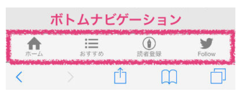
メリットとしては、メニューが隠れていないのでユーザーにとって直感的にわかりやすい親切な設計にすることができる点です。
では早速、実装に移りましょう!
2. ボトムナビゲーションの実装手順
今回はヘッダーにある項目をレスポンシブ対応によってボトムナビゲーションに移動させたいと思います。
まずはヘッダーの内容を記述します。(部分テンプレート記述)
%header
  .container
    .header-left
      - if user_signed_in?
        %ul
          %li
            = link_to "マイページ", "/users/#{current_user.id}", class: 'ToMypage'
          %li
            = link_to "ログアウト", destroy_user_session_path, method: :delete, class: 'Logout'
      - else
        %ul
          %li
            = link_to "ログイン", new_user_session_path, class: "post"
          %li
            = link_to "新規登録", new_user_registration_path, class: "post"

    .header-center
      = icon("fas", "star", class: "application-icon")
      %h2.title
        Entertainer

    .header-right
      %ul.header-right__outer
        %li.header-right__outer--inner
          = link_to " イベントを探す", root_path, class: "event-action-btn"
        %li.header-right__outer--inner
          = link_to "主催する", "#", class: "event-action-btn"
続いてscssです。
header {
  height: 80px;
  width: 100vw;
  background-color: burlywood;

  .container {
    width: 100vw;
    height: 100%;
    margin: 0 auto;
    display: flex;
    justify-content: space-evenly;
    align-items: center;

    .header-left {
      transition: all 0.5s;
      width: 20%;

      ul {
        display: flex;
        justify-content: space-around;

        li {
          .ToMypage {
            color: #fff;
            display: inline-block;
            font-size: 12px;
            font-weight: bold;
            line-height: 45px;
            width: 100px;
            position: relative;
            text-decoration: none;
            text-transform: uppercase;
            border: 1px solid transparent;
            outline: 1px solid;
            outline-color: rgba(255, 255, 255, 0.5);
            outline-offset: 0px;
            text-shadow: none;
            transition: all 1.2s cubic-bezier(0.2, 1, 0.2, 1);
            text-align: center;
            // border-radius: 50%;
          }

          .ToMypage:hover {
            border-color: #fff;
            box-shadow: inset 0 0 20px rgba(255, 255, 255, 0.5),
              0 0 20px rgba(255, 255, 255, 0.2);
            outline-color: transparent;
            outline-offset: 12px;
            text-shadow: 2px 2px 3px #000;
          }

          .Logout {
            color: #fff;
            display: inline-block;
            font-size: 12px;
            font-weight: bold;
            line-height: 45px;
            width: 100px;
            position: relative;
            text-decoration: none;
            text-transform: uppercase;
            border: 1px solid transparent;
            outline: 1px solid;
            outline-color: rgba(255, 255, 255, 0.5);
            outline-offset: 0px;
            text-shadow: none;
            transition: all 1.2s cubic-bezier(0.2, 1, 0.2, 1);
            text-align: center;
            // border-radius: 50%;
          }

          .Logout:hover {
            border-color: #fff;
            box-shadow: inset 0 0 20px rgba(255, 255, 255, 0.5),
              0 0 20px rgba(255, 255, 255, 0.2);
            outline-color: transparent;
            outline-offset: 12px;
            text-shadow: 2px 2px 3px #000;
          }

          .post {
            color: #fff;
            display: inline-block;
            font-size: 12px;
            font-weight: bold;
            line-height: 45px;
            width: 100px;
            position: relative;
            text-decoration: none;
            text-transform: uppercase;
            border: 1px solid transparent;
            outline: 1px solid;
            outline-color: rgba(255, 255, 255, 0.5);
            outline-offset: 0px;
            text-shadow: none;
            transition: all 1.2s cubic-bezier(0.2, 1, 0.2, 1);
            text-align: center;
            // border-radius: 50%;
          }

          .post:hover {
            border-color: #fff;
            box-shadow: inset 0 0 20px rgba(255, 255, 255, 0.5),
              0 0 20px rgba(255, 255, 255, 0.2);
            outline-color: transparent;
            outline-offset: 12px;
            text-shadow: 2px 2px 3px #000;
          }
        }
      }
    }

    .header-center {
      width: 10%;
      display: flex;

      .application-icon {
        padding: 9px;
        font-size: large;
      }
      .title {
        font-weight: bold;
        font-size: 1.5rem;
      }
    }

    .header-right {
      width: 20%;

      &__outer {
        display: flex;
        justify-content: space-evenly;

        &--inner {
          display: block;

          .event-action-btn {
            text-decoration: none;
            color: #666666;
          }
          .event-action-btn:hover {
            border: 1px solid lightgray;
          }
        }
      }
    }
  }
}
ヘッダーの構成やscssはあくまで一例ですが、このような見た目になります。
ボトムナビゲーションを記述します。
.Bottom-nav
  %ul.Bottom-nav__outer
    %li.Bottom-nav__outer--inner
      = link_to "#", class: "event-action" do
        = icon("fas", "calendar", class: "event-icon")
      %p イベント一覧
    %li.Bottom-nav__outer--inner
      = link_to "#", class: "event-action" do
        = icon("fas", "wrench", class: "event-icon")
      %p イベント作成
このうち、「イベントを探す」と「主催する」というリンクボタンをレスポンシブ対応でボトムナビゲーションの方に移動させます。
レスポンシブ対応させるにはscssファイルのほうでメディアクエリというメソッドを使って実装します。
# レスポンシブ対応するまではボトムナビゲーションを非表示にしておきます
.Bottom-nav {
  display: none;
}
# 1000px以下のときにレスポンシブ対応
@media screen and (max-width: 1000px) {
 #「イベントを探す」と「主催する」の2つのリンクをヘッダーから非表示にする
  .header-right {
    display: none;
  }
  .Bottom-nav {
    display: block; #非表示にしていたボトムナビゲーションを表示する
    position: fixed; #ページの一番下に固定
    bottom: 0;
    width: 100vw;
    border-top: 1px solid white;

    &__outer {
      display: flex;
      justify-content: space-evenly;

      &--inner {
        display: flex;
        flex-direction: column;
        align-items: center;

        .event-action {
          text-decoration: none;

          .event-icon {
            font-size: large;
            color: #666666;
          }
        }
      }
    }
  }
}
ここまで記述すると挙動がこのようになります↓
ヘッダーの2つの項目が1000px以下になったときにボトムナビゲーションに移動しているのが確認できると思います。
おわりに
さいごまで読んでいただきありがとうございました!
お疲れさまでした。。