Angular + ng-bootstrap でモーダルポップアップを表示したい場合、Angular powered Bootstrap - Modal に、基本的な使い方は書いてあるのですが、もっと簡単に、 modal.confirm('title', 'message') みたく使えるようにしてみました。
Components as content には、Modal に表示する内容(template)を別のコンポーネントクラスで提供する方法が書かれています。
これを Angular のサービスと組み合わせると、「モーダル表示を行うサービス」を作ることができます。
サービスは利用クラス側で、コンストラクタインジェクションが可能なので、簡単に使用できます。
部品側
以降説明するクラス群は、すべて一つの my-modal.service.ts に記述できます。
このファイル自体も ng g service my-modal で作ったものです。同時に my-modal.service.spec.ts も作成されます。こちらは作成後まったく編集しませんので、以降は触れません。
MyModalService クラス
利用者が使うサービスクラスです。ここでは「確認モーダル」を表示する confirm() メソッドを定義しています。
モーダルに表示する内容は、後述する MyModalConfirmContent により提供されます。
import { Injectable, Component, Input } from '@angular/core';
import { NgbModal, NgbActiveModal } from '@ng-bootstrap/ng-bootstrap';

@Injectable({
  providedIn: 'root'
})
export class MyModalService {
  constructor(private modalService: NgbModal) { }

  confirm(title: string, message: string, okCaption?: string, cancelCaption?: string): Promise<boolean> {
    const modalRef = this.modalService.open(MyModalConfirmContent);
    const component = modalRef.componentInstance as MyModalConfirmContent;
    if (component != null) {
      component.title = title;
      component.message = message;
      component.okCaption = okCaption || 'OK';
      component.cancelCaption = cancelCaption || 'Cancel';
    }

    return modalRef.result.then(result => {
      return true;  // はい を押したらこっち
    }, reason => {
      return false; // いいえ や x でダイアログを閉じたらこっち
    });
  }
}
MyModalConfirmContent クラス
確認モーダルの内容を示すクラスです。
実体はほぼなく、重要なのは template: に定義された HTML とそれへのデータバインディング用プロパティです。
@Component({
template:
`
<div class="modal-header">
<h4 class="modal-title">{{title}}</h4>
<button type="button" class="close" aria-label="Close" (click)="activeModal.dismiss('dissmiss')">
<span aria-hidden="true">×</span>
</button>
</div>
<div class="modal-body">
<p>{{message}}</p>
</div>
<div class="modal-footer">
<button type="button" class="btn btn-primary" (click)="activeModal.close('ok')">{{okCaption}}</button>
<button type="button" class="btn btn-outline-dark" (click)="activeModal.dismiss('cancel')">{{cancelCaption}}</button>
</div>
`
})
// tslint:disable-next-line <-- tslint さんが「コンポーネントならクラス名に Component を付けろ」と怒り心頭なので黙らせる
export class MyModalConfirmContent {
@Input() title: string;
@Input() message: string;
@Input() okCaption = 'OK';
@Input() cancelCaption = 'Cancel';
constructor(public activeModal: NgbActiveModal) { }
}
利用者側
上で作った MyModalService の使い方です。
1. app.module に登録する
まず MyModalConfirmContent を module に登録する必要があります(app.module じゃなくてもいいです)。
下記のように MyModalConfirmContent を declarations: と entryComponents: に追加します(どちらも必要です)。
xxx.moduleクラス
@NgModule({
  imports: [
    CommonModule,
    …
  ],
  declarations: [
    …
    MyModalConfirmContent], ←追加
  exports: [LayoutComponent],
  entryComponents: [MyModalConfirmContent] ←追加
})
export class AppModule { }
2. モーダルを表示する
あとは任意のコンポーネントで使用します。
コンストラクタに MyModalService を定義して注入させ、任意の場所で this.modal.confirm() を呼び出します。返値は Promise<boolean> なので async/await でも使えますね。
@Component({
selector: 'app-my-top',
templateUrl: './my-top.component.html',
styleUrls: ['./my-top.component.scss']
})
export class MyTopComponent {
constructor(
private modal: MyModalService) { }
async showConfirm() {
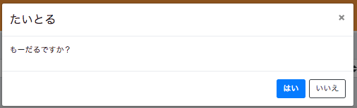
const res = await this.modal.confirm('たいとる', 'もーだるですか?', 'はい', 'いいえ');
console.log(`result = {res}`);
if (!res) {
return;
}
}
}
正しく実行できれば、次のように表示されるはずです。
すべてのソースコードは
にもあります。
実際に動いた package.json の一部はこんな感じです。
"dependencies": {
  "@angular/animations": "^6.0.3",
  "@angular/common": "^6.0.3",
  "@angular/compiler": "^6.0.3",
  "@angular/core": "^6.0.3",
  "@angular/forms": "^6.0.3",
  "@angular/http": "^6.0.3",
  "@angular/platform-browser": "^6.0.3",
  "@angular/platform-browser-dynamic": "^6.0.3",
  "@angular/router": "^6.0.3",
  "@ng-bootstrap/ng-bootstrap": "^2.2.0",
  "bootstrap": "^4.1.1",
  "core-js": "^2.5.4",
  "font-awesome": "^4.7.0",
  "moment": "^2.22.2",
  "ng-spin-kit": "^5.1.1",
  "ngx-loading": "^1.0.14",
  "rxjs": "^6.0.0",
  "zone.js": "^0.8.26"
},
モーダルの種類を増やしたい場合
-
MyModalXxxxContentを追加 -
MyModalXxxxContentをapp.module.tsに追加 -
MyModalServiceにMyModalXxxxContentに対応した新しいメソッドを追加
で ok です。