やりたいこと
- 以下のようなレーダーチャートが描けるようになる
matplotlibを使う方法
1. 必要なパッケージのインストール
- まずは基本的なパッケージをインストールする
import matplotlib.pyplot as plt
import numpy as np
import japanize_matplotlib
2. データを準備する
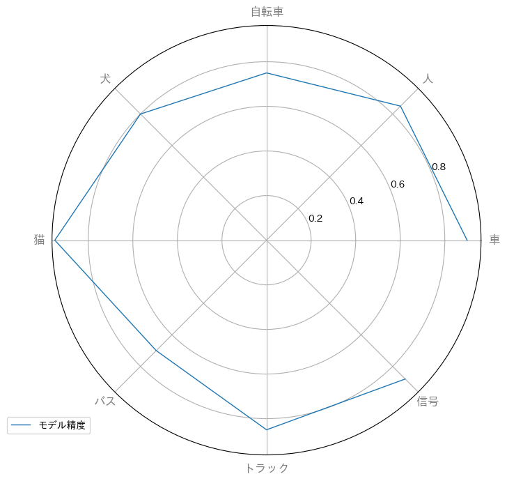
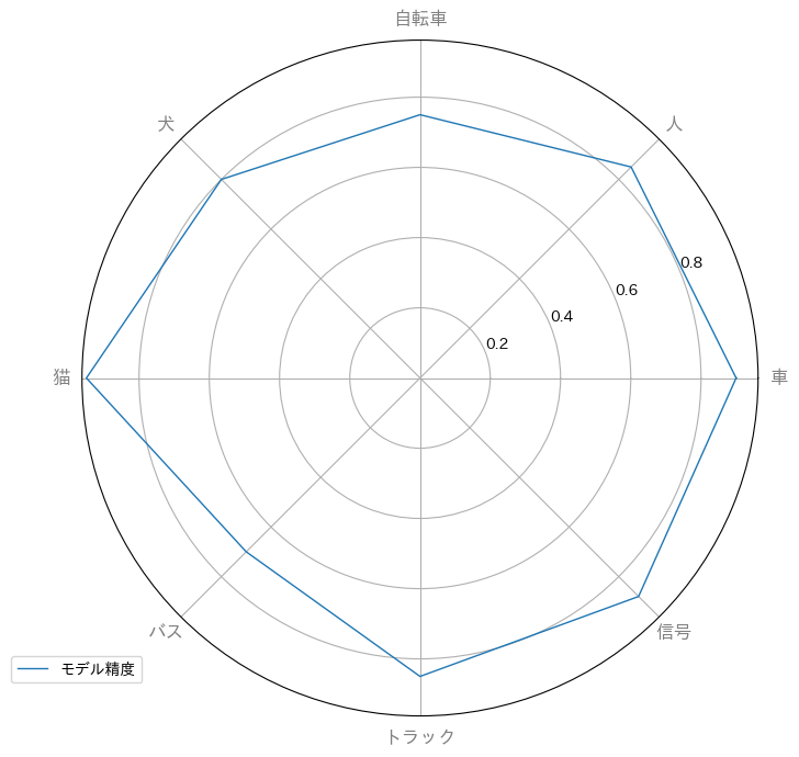
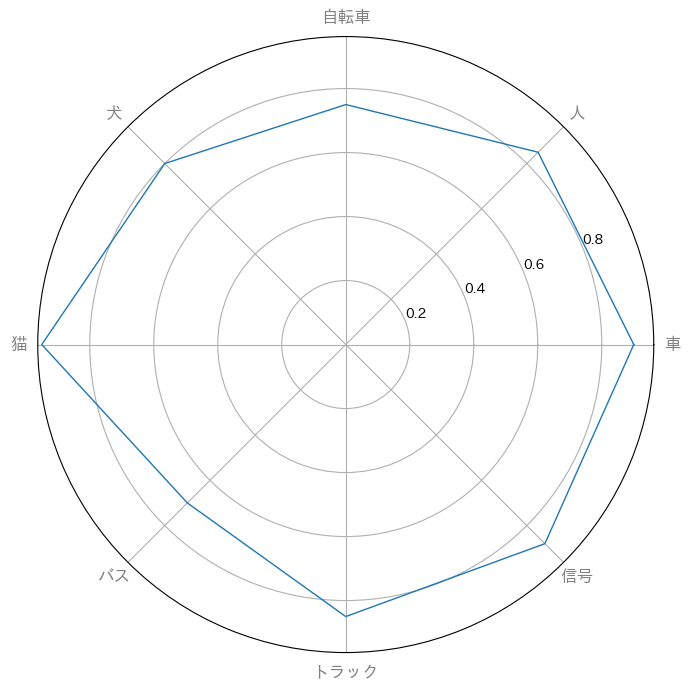
- 物体検知モデルの各ラベルごとの精度を可視化することを想定して適当なクラスおよび精度を指定
label_list = ['車', '人', '自転車', '犬', '猫', 'バス', 'トラック', '信号']
acc_list = [0.90, 0.85, 0.75, 0.80, 0.95, 0.70, 0.85, 0.88]  # 例えば、これらは各クラスの精度を表します。
acc_list += acc_list[:1]  # チャートを閉じるために最初の値を末尾に追加
- それぞれのクラスを表現する角度を指定
# レーダーチャートを描画するためのangle_listを計算
angle_list = [n / float(len(label_list)) * 2 * np.pi for n in range(len(label_list))]
angle_list += angle_list[:1]
- N個のラベルを持つレーダーチャートの場合、N+1個のラベルが必要である点に注意
- 以下のように、閉じていないチャートとなり不恰好となってしまう
| データ点数が不足 | データの長さが十分 |
|---|---|
 |
 |
3. polar形式で描画する
# matplotlibでレーダーチャートを描画
fig, ax = plt.subplots(figsize=(8, 8), subplot_kw=dict(polar=True))
-
subplot_kw=dict(polar=True)を指定するだけでレーダーチャートのベーシックな構図が表現される模様
- ラベルを付与してデータをプロットする
# matplotlibでレーダーチャートを描画
fig, ax = plt.subplots(figsize=(8, 8), subplot_kw=dict(polar=True))
plt.xticks(angle_list[:-1], label_list, color='grey', size=12)

# プロット線を描画
ax.plot(angle_list, acc_list, linewidth=1, linestyle='solid', label='モデル精度')
# クラスのlabel_listと精度の値を設定
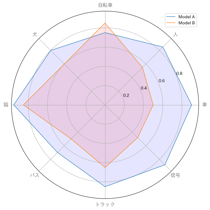
label_list = ['車', '人', '自転車', '犬', '猫', 'バス', 'トラック', '信号']
acc_list = [0.90, 0.85, 0.75, 0.80, 0.95, 0.70, 0.85, 0.88] # 例えば、これらは各クラスの精度を表します。
acc_list += acc_list[:1] # チャートを閉じるために最初の値を末尾に追加
acc_list_2 = [0.50, 0.55, 0.85, 0.60, 0.85, 0.50, 0.65, 0.48] # 例えば、これらは各クラスの精度を表します。
acc_list_2 += acc_list_2[:1] # チャートを閉じるために最初の値を末尾に追加
# レーダーチャートを描画するためのangle_listを計算
angle_list = [n / float(len(label_list)) * 2 * np.pi for n in range(len(label_list))]
angle_list += angle_list[:1]
# matplotlibでレーダーチャートを描画
fig, ax = plt.subplots(figsize=(8, 8), subplot_kw=dict(polar=True))
plt.xticks(angle_list[:-1], label_list, color='grey', size=12)
# # プロット線を描画
ax.plot(angle_list, acc_list, linewidth=1, linestyle='solid', label='Model A')
ax.fill(angle_list, acc_list, 'blue', alpha=0.1)
ax.plot(angle_list, acc_list_2, linewidth=1, linestyle='solid', label='Model B')
ax.fill(angle_list, acc_list_2, 'red', alpha=0.1)
# # チャートを表示
plt.legend(loc='upper right')
plt.show()
結論
- 棒グラフも良いけれども、より直感的に理解しやすいレーダーチャートも選択肢の一つとしてあり