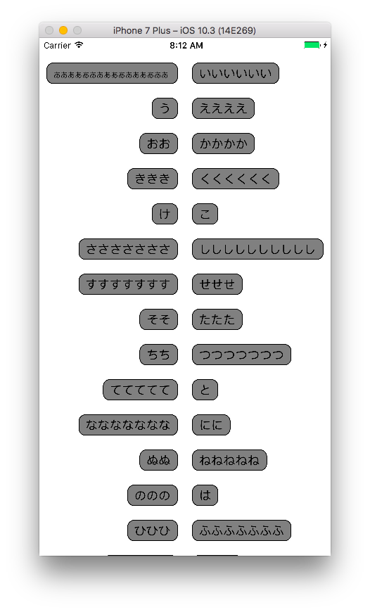
完成図
UICollectionViewを使って実現しています。サンプルコードはこちらになります。
https://github.com/akatsuki174/CenteredLayoutCollectionView
2列に表示するまで
まずは適当にUICollectionViewでカスタムセルを使ってダミーデータを表示させるところまでやります。カスタムセルにはUILabelを貼ってあるだけです。
2列で表示させるためにUICollectionViewDelegateFlowLayoutを使います。このプロトコルの中のfunc collectionView(UICollectionView, layout: UICollectionViewLayout, sizeForItemAt: IndexPath)を使うことによってセルの縦横のサイズを指定することができます。
このメソッド内で画面サイズ÷2をして、そこからマージン分を引いてセルのサイズを指定します。
extension ViewController: UICollectionViewDelegateFlowLayout {
    func collectionView(_ collectionView: UICollectionView, layout collectionViewLayout: UICollectionViewLayout, sizeForItemAt indexPath: IndexPath) -> CGSize {
        return CGSize(width: collectionView.bounds.width / 2 - 20, height: 40.0)
    }
}
これでviewDidLoadでcollectionView.delegate = selfを付け足せば2列で表示されるようになります。
文字を中央寄せにする
ポイントとしては制約とそれを設定するタイミングになります。
制約
まずカスタムセルの制約を次の通りにします。
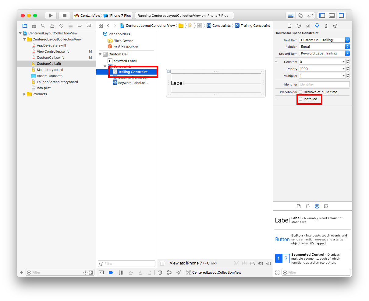
leadingとtrailingをマージン0で設定します。ただしこのままだと横幅いっぱいにラベルが広がってしまうのでActiveフラグの切り替えを行います。ひとまずどちらか1つの制約をinActiveにします。storyboard上でActiveフラグを切り替えたい時は赤枠で囲っているinstalledのチェックを外します。そうするとActiveになっていない制約は薄い青色になります。
コード上ではカスタムセルクラスに以下のコードを書いてActiveフラグの切り替えを行います。これをすることによって左側のセルならleadingの制約がなくなってtrailingのマージン0という制約だけが機能し、右側のセルではその逆の現象が起こります。
func setupAlignment(index: Int) {
    if index % 2 == 0 { // 左側のセル
        leadingConstraint.isActive = false
        trailingConstraint.isActive = true
    } else { // 右側のセル
        leadingConstraint.isActive = true
        trailingConstraint.isActive = false
    }
}
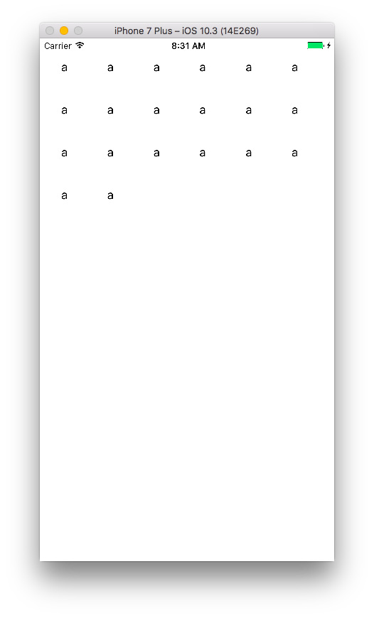
これだけでいけるかなーと思いきや、この状態で実行するとこのようになります。
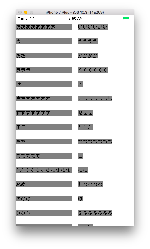
制約を呼ぶタイミング
スクロールしているうちに想定通りのラベルサイズに直ったのでActiveフラグを切り替えているメソッドを呼ぶタイミングをcellForItemAtからwillDisplayにずらしてみます。
func collectionView(_ collectionView: UICollectionView, willDisplay cell: UICollectionViewCell, forItemAt indexPath: IndexPath) {
    if let cell = cell as? CustomCell {
        cell.setupAlignment(index: indexPath.row)
    }
}
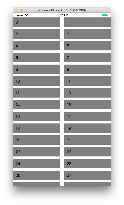
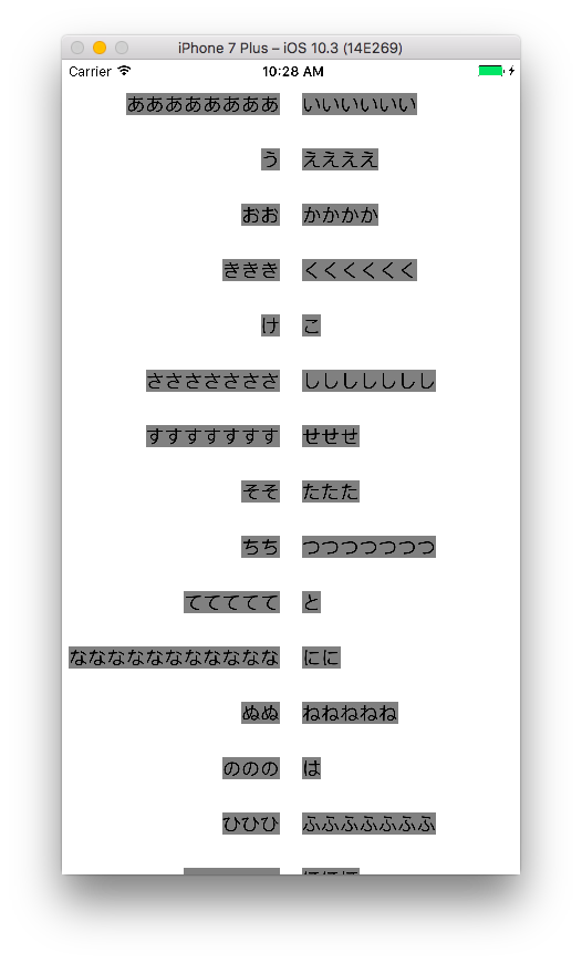
するとこのような想定通りの表示になります。
コード
xibなどはGitHubを見ていただけると。
class ViewController: UIViewController {

    @IBOutlet weak var collectionView: UICollectionView!
    let items = ["ああああああああ", "いいいいいい", "う", "ええええ", "おお", "かかかか", "ききき", "くくくくくく", "け", "こ", "さささささささ", "ししししししし", "すすすすすすす", "せせせ", "そそ", "たたた", "ちち", "つつつつつつつ", "ててててて", "と", "ななななななななななな", "にに", "ぬぬ", "ねねねねね", "ののの", "は", "ひひひ", "ふふふふふふふ", "へへへへへ", "ほほほ"]

    override func viewDidLoad() {
        super.viewDidLoad()
        collectionView.register(UINib(nibName: "CustomCell", bundle: nil), forCellWithReuseIdentifier: "CustomCell")
        self.collectionView.dataSource = self
        self.collectionView.delegate = self
    }

    override func didReceiveMemoryWarning() {
        super.didReceiveMemoryWarning()
    }

}

extension ViewController: UICollectionViewDataSource {
    func collectionView(_ collectionView: UICollectionView, numberOfItemsInSection section: Int) -> Int {
        return items.count
    }

    func collectionView(_ collectionView: UICollectionView, cellForItemAt indexPath: IndexPath) -> UICollectionViewCell {
        let cell = collectionView.dequeueReusableCell(withReuseIdentifier: "CustomCell", for: indexPath) as! CustomCell
        cell.keywordLabel.text = items[indexPath.row]
        cell.keywordLabel.backgroundColor = UIColor.gray
        return cell
    }

    func collectionView(_ collectionView: UICollectionView, willDisplay cell: UICollectionViewCell, forItemAt indexPath: IndexPath) {
        if let cell = cell as? CustomCell {
            cell.setupAlignment(index: indexPath.row)
        }
    }

}

extension ViewController: UICollectionViewDelegateFlowLayout {
    func collectionView(_ collectionView: UICollectionView, layout collectionViewLayout: UICollectionViewLayout, sizeForItemAt indexPath: IndexPath) -> CGSize {
        return CGSize(width: collectionView.bounds.width / 2 - 10, height: 40.0)
    }

}
class CustomCell: UICollectionViewCell {

    @IBOutlet weak var keywordLabel: UILabel!
    @IBOutlet weak var trailingConstraint: NSLayoutConstraint!
    @IBOutlet weak var leadingConstraint: NSLayoutConstraint!

    override func awakeFromNib() {
        super.awakeFromNib()
    }

    func setupAlignment(index: Int) {
        if index % 2 == 0 { // 左側のセル
            leadingConstraint.isActive = false
            trailingConstraint.isActive = true
        } else { // 右側のセル
            leadingConstraint.isActive = true
            trailingConstraint.isActive = false
        }
    }

}
おまけ
■セルUIカスタマイズ
一番最初に貼り付けた画像のようにinsetがあり丸みを帯びたラベルを作成してみます。
丸くする部分等は以下のコードで実現します。
func configureCell() {
    keywordLabel.backgroundColor = UIColor.gray
    keywordLabel.layer.cornerRadius = 10
    keywordLabel.layer.borderColor = UIColor.black.cgColor
    keywordLabel.layer.borderWidth = 1.0
    keywordLabel.layer.masksToBounds = true
    keywordLabel.adjustsFontSizeToFitWidth = true
}

insetの調整に関しては専用のクラスを作ります。
class PaddingLabel : UILabel {
    var insets = UIEdgeInsetsMake(0, 0, 0, 0)

    override func drawText(in rect: CGRect) {
        super.drawText(in: UIEdgeInsetsInsetRect(rect, insets))
    }

    override var intrinsicContentSize: CGSize {
        var contentSize = super.intrinsicContentSize
        contentSize.height += insets.top + insets.bottom
        contentSize.width += insets.left + insets.right
        return contentSize
    }
}
keywordLabelをUILabelからこのPaddingLabelに変更した上でセルのUIを調整する時に(configureCellのメソッド内で)以下のコードを追加すればinsetが確保できます。
keywordLabel.insets = UIEdgeInsets(top: 5, left: 10, bottom: 5, right: 10)
その他文字数が多い時の対応、Collection View自体のマージンの設定などもGitHub上では設定しています。