Visual primitives for the component age
以降の文章は、だいたい上記のreadmeの抜粋なので雑にどんなものか知りたい人以外は上記プロジェクトページを見ることをオススメする。
さて、これは、CSSinJSの一つである。
しかし、今までのCSSinJSと大きく違うところは、classNameによるあの煩わしいマッピングを廃止したところにある。
$ yarn add styled-components
import React from 'react';

import styled from 'styled-components';

// Create a <Title> react component that renders an <h1> which is
// centered, palevioletred and sized at 1.5em
const Title = styled.h1`
  font-size: 1.5em;
  text-align: center;
  color: palevioletred;
`;

// Create a <Wrapper> react component that renders a <section> with
// some padding and a papayawhip background
const Wrapper = styled.section`
  padding: 4em;
  background: papayawhip;
`;
ベンダープレフィックスは自動で付与
<Wrapper>
  <Title>Hello World, this is my first styled component!</Title>
</Wrapper>

classNameなんて一文字も出てこない。完全にコンポーネントに閉じてるので、考えることが非常に少ない。コンポーネントにCSSを当てるだけ。
mediaクエリやアニメーションも普通に使える。
サードパーティのコンポーネントへのスタイリングも可能だ。
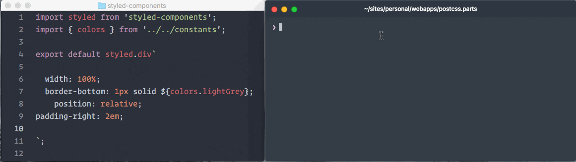
また、Atomでlanguage-babelを使ってるなら、シンタックスハイライトがサポートされている。
スニペットが使えるので、cssと同じように書いていける。
これは非常に嬉しい。
さらに、stylelintも適用可能である。
他にも、READMEが充実しているので見ることをオススメする。