はじめに
仕事でBootstrap 4.1を使ったコーディングに携わることになったため、必要な知識を共有します。
簡単な使い方
準備
Bootstrap 4 ドキュメントからStarter template
をコピー(次のindex.htmlをコピーしてもよし)
index.htmlを作成
<!doctype html>
<html lang="ja">
  <head>
    <!-- Required meta tags -->
    <meta charset="utf-8">
    <meta name="viewport" content="width=device-width, initial-scale=1, shrink-to-fit=no">

    <!-- Bootstrap CSS -->
    <link rel="stylesheet" href="https://stackpath.bootstrapcdn.com/bootstrap/4.1.3/css/bootstrap.min.css" integrity="sha384-MCw98/SFnGE8fJT3GXwEOngsV7Zt27NXFoaoApmYm81iuXoPkFOJwJ8ERdknLPMO" crossorigin="anonymous">

    <title>Hello, world!</title>
  </head>
  <body>
    <h1>Hello, world!</h1>

    <!-- Optional JavaScript -->
    <!-- jQuery first, then Popper.js, then Bootstrap JS -->
    <script src="https://code.jquery.com/jquery-3.3.1.slim.min.js" integrity="sha384-q8i/X+965DzO0rT7abK41JStQIAqVgRVzpbzo5smXKp4YfRvH+8abtTE1Pi6jizo" crossorigin="anonymous"></script>
    <script src="https://cdnjs.cloudflare.com/ajax/libs/popper.js/1.14.3/umd/popper.min.js" integrity="sha384-ZMP7rVo3mIykV+2+9J3UJ46jBk0WLaUAdn689aCwoqbBJiSnjAK/l8WvCWPIPm49" crossorigin="anonymous"></script>
    <script src="https://stackpath.bootstrapcdn.com/bootstrap/4.1.3/js/bootstrap.min.js" integrity="sha384-ChfqqxuZUCnJSK3+MXmPNIyE6ZbWh2IMqE241rYiqJxyMiZ6OW/JmZQ5stwEULTy" crossorigin="anonymous"></script>
  </body>
</html>
これで準備完了!
レイアウト
container-fluid
PC:横幅100%
SP:横幅100%
container
PC:左右の余白あり
SP:横幅100%
.container-fluid {
    width: 100%;
    padding-right: 15px;
    padding-left: 15px;
    margin-right: auto;
    margin-left: auto;
}


@media (min-width: 1200px){
    .container {
        max-width: 1140px;
    }
}

@media (min-width: 992px){
    .container {
        max-width: 960px;
    }
}
@media (min-width: 768px){
    .container {
        max-width: 720px;
    }
}
@media (min-width: 576px){
    .container {
        max-width: 540px;
    }
}
.container {
    width: 100%;
    padding-right: 15px;
    padding-left: 15px;
    margin-right: auto;
    margin-left: auto;
}
余白の指定
▼.my-n
.m{方向}-{大きさ} : マージン余白のつけかた
.p{方向}-{大きさ} : パディング余白のつけかた
{方向}
t : top
b : bottom
l : left
r : right
x : left と right
y : top と bottom
{大きさ}
0 : 0rem
1 : 0.25rem
2 : 0.5rem
3 : 1rem
4 : 1.5rem
5 : 3rem
▼.w-100
余白の大きさを%で指定することもできる
.w-25/50/75/100 : 幅(%)
.h-25/50/75/100 : 高さ(%)
.mw-100 : 最大幅(%)
.mh-100 : 最大高さ(%)
▼.my-sm-1
SP時の上下の余白を小さくする指定もできる
.m{方向}-{ブレークポイント}-{大きさ}
レイアウト
▼row(親に指定)の使いかた
例).container>.row>.col-4*3
    <div class="container">
        <div class="row">
            <div>要素1</div>
            <div>要素2</div>
            <div>要素3</div>
            <div>要素4</div>
            <div>要素5</div>
            <div>要素6</div>
        </div>
        <hr>
        <div class="row">
            <div class="col-sm">要素1</div>
            <div class="col-sm">要素2</div>
            <div class="col-sm">要素3</div>
        </div>
        <hr>
        <div class="row">
            <div class="col-4 border">要素1</div>
            <div class="col-4 border">要素2</div>
            <div class="col-4 border">要素3</div>
        </div>
    </div>
PC時
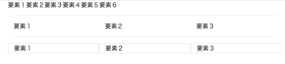
SP時
.row {
    display: flex;
    flex-wrap: wrap;
    margin-right: -15px;
    margin-left: -15px;
}
@media (min-width: 576px){
.col-sm {
    flex-basis: 0;
    flex-grow: 1;
    max-width: 100%;
    }
}
.col-4 {
    flex: 0 0 33.333333%;
    max-width: 33.333333%;
}
.border {
    border: 1px solid #dee2e6!important;
}
| 576px未満 | 576px以上 | 768px以上 | 992px以上 | 1200px以上 |
|---|---|---|---|---|
| max-width | なし | 540px | 720px | 960px |
| class | .col(xs) | .col-sm | .col-md | .col-lg |
Extra small(bp:< 576px、width:100%)
Small(≥ 576px、width:540px)
Medium(≥ 768px、width:720px)
Large(≥ 992px、width:960px)
Extra Large(≥ 1200px、width:1140px)
▼col-1(子要素に指定)のcss
.col-1 {
    flex: 0 0 8.333333%;
    max-width: 8.333333%;
}
.col-2 {
    flex: 0 0 16.666667%;
    max-width: 16.666667%;
}
.col-3 {
    flex: 0 0 25%;
    max-width: 25%;
}
.col-4 {
    flex: 0 0 33.333333%;
    max-width: 33.333333%;
}
.col-5 {
    flex: 0 0 41.666667%;
    max-width: 41.666667%;
}
.col-6 {
    flex: 0 0 50%;
    max-width: 50%;
}
.col-7 {
    flex: 0 0 58.333333%;
    max-width: 58.333333%;
}
.col-8 {
    flex: 0 0 66.666667%;
    max-width: 66.666667%;
}
.col-9 {
    flex: 0 0 75%;
    max-width: 75%;
}
.col-10 {
    flex: 0 0 83.333333%;
    max-width: 83.333333%;
}
.col-11 {
    flex: 0 0 91.666667%;
    max-width: 91.666667%;
}
.col-12 {
    flex: 0 0 100%;
    max-width: 100%;
}
.col, .col-1, .col-10, .col-11, .col-12, .col-2, .col-3, .col-4, .col-5, .col-6, .col-7, .col-8, .col-9, .col-auto, .col-lg, .col-lg-1, .col-lg-10, .col-lg-11, .col-lg-12, .col-lg-2, .col-lg-3, .col-lg-4, .col-lg-5, .col-lg-6, .col-lg-7, .col-lg-8, .col-lg-9, .col-lg-auto, .col-md, .col-md-1, .col-md-10, .col-md-11, .col-md-12, .col-md-2, .col-md-3, .col-md-4, .col-md-5, .col-md-6, .col-md-7, .col-md-8, .col-md-9, .col-md-auto, .col-sm, .col-sm-1, .col-sm-10, .col-sm-11, .col-sm-12, .col-sm-2, .col-sm-3, .col-sm-4, .col-sm-5, .col-sm-6, .col-sm-7, .col-sm-8, .col-sm-9, .col-sm-auto, .col-xl, .col-xl-1, .col-xl-10, .col-xl-11, .col-xl-12, .col-xl-2, .col-xl-3, .col-xl-4, .col-xl-5, .col-xl-6, .col-xl-7, .col-xl-8, .col-xl-9, .col-xl-auto {
    position: relative;
    width: 100%;
    min-height: 1px;
    padding-right: 15px;
    padding-left: 15px;
}
▼.no-gutters
子要素colの余白の削除(親要素.rowに.no-guttersを加える)
.no-gutters {
    margin-right: 0;
    margin-left: 0;
}
.no-gutters>.col, .no-gutters>[class*=col-] {
    padding-right: 0;
    padding-left: 0;
}
▼.justify-content-center
row + 横方向の指定(親)
.justify-content-start : 左寄せ
.justify-content-center : 中央寄せ
.justify-content-end : 右寄せ
.justify-content-around : 左右に余白を開け等間隔に配置
.justify-content-between : 等間隔に配置
.justify-content-start {
    justify-content: flex-start!important;
}
.justify-content-center {
    justify-content: center!important;
}
.justify-content-end {
    justify-content: flex-end!important;
}
.justify-content-around {
    justify-content: space-around!important;
}
.justify-content-between {
    justify-content: space-between!important;
}
▼.align-items-cente
row + 縦方向の指定(親)
.align-items-start:上寄せ
.align-items-center:中央寄せ
.align-items-end:下寄せ
.align-items-start {
    align-items: flex-start!important;
}
.align-items-center {
    align-items: center!important;
}
.align-items-end {
    align-items: flex-end!important;
}
▼.align-self-center
row + 縦方向の指定(子)
.align-self-start:上寄せ
.align-self-center:中央寄せ
.align-self-end:下寄せ
.align-self-start {
    align-self: flex-start!important;
}
.align-self-center {
    align-self: center!important;
}
.align-self-end {
    align-self: flex-end!important;
}
▼.d-sm-none
displayの指定
.d-{value}:xsの指定
.d-{breakpoint}-{value}:sm、md、lg、xlの指定
{value}:none、inline、inline-block、block、table、table-cell、table-row、flex、inline-flex
{breakpoint}:sm、md、lg、xl
見出しの指定
h1
    <div class="container">
        <h1>h1(見出し)(2.5rem = 40px)</h1>
        <h2>h2(見出し)(2rem = 32px)</h2>
        <h3>h3(見出し)(1.75rem = 28px)</h3>
        <h4>h4(見出し)(1.5rem = 24px)</h4>
        <h5>h5(見出し)(1.25rem = 20px)</h5>
        <h6>h6(見出し)(1rem = 16px)</h6>
        <p>pタグ(1rem = 16px)</p>
    </div>
下側にのみ、マージン余白がつく仕様
.h1, .h2, .h3, .h4, .h5, .h6, h1, h2, h3, h4, h5, h6 {
    margin-bottom: .5rem;
    font-family: inherit;
    font-weight: 500;
    line-height: 1.2;
    color: inherit;
}
その他の見出しの大きさ設定
.display-1 {
    font-size: 6rem;
    font-weight: 300;
    line-height: 1.2;
}
.display-2 {
    font-size: 5.5rem;
    font-weight: 300;
    line-height: 1.2;
}
.display-3 {
    font-size: 4.5rem;
    font-weight: 300;
    line-height: 1.2;
}
.display-4 {
    font-size: 3.5rem;
    font-weight: 300;
    line-height: 1.2;
}
.font-weight-bold
その他の見出し設定
.font-weight-bold : 太字
.font-weight-normal : 普通
.font-weight-light : 細字
.font-italic : イタリック
.small : テキスト85%
.text-left : 左寄せ
.text-center : 中央寄せ
.text-right : 右寄せ
.text-nowrap : テキストの折り返ししない
.sup:上付き文字
.sub:下付き文字
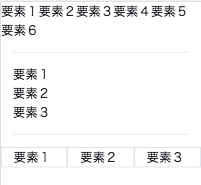
画像の配置
画像+テキストの配置
<div class="media mt-2">
    <img class="mr-2" src="http://placehold.jp/24/cc9999/993333/150x100.png" width="60">
    <div class="media-body">
        <h5 class="mt-0">子見出し</h5>
        <p>本文</p>
    </div>
</div>
.media {
    display: -ms-flexbox;
    display: flex;
    -ms-flex-align: start;
    align-items: flex-start;
}
.media-body {
    -ms-flex: 1;
    flex: 1;
}
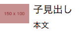
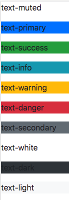
文字色
text-primary
.text-muted {
    color: #6c757d!important;
}
.text-primary {
    color: #007bff!important;
}
.text-success {
    color: #28a745!important;
}
.text-info {
    color: #17a2b8!important;
}
.text-warning {
    color: #ffc107!important;
}
.text-danger {
    color: #dc3545!important;
}
.text-secondary {
    color: #6c757d!important;
}
.text-white {
    color: #fff!important;
}
.text-dark {
    color: #343a40!important;
}
.text-light {
    color: #f8f9fa!important;
}
背景色
bg-primary
<p class="bg-muted">text-muted</p>
<p class="bg-primary">text-primary</p>
<p class="bg-success">text-success</p>
<p class="bg-info">text-info</p>
<p class="bg-warning">text-warning</p>
<p class="bg-danger">text-danger</p>
<p class="bg-secondary">text-secondary</p>
<p class="bg-white">text-white</p>
<p class="bg-dark">text-dark</p>
<p class="bg-light">text-light</p>
コンポーネンツ
buttons
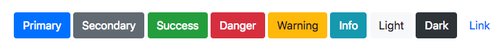
    <button type="button" class="btn btn-primary">Primary</button>
    <button type="button" class="btn btn-secondary">Secondary</button>
    <button type="button" class="btn btn-success">Success</button>
    <button type="button" class="btn btn-danger">Danger</button>
    <button type="button" class="btn btn-warning">Warning</button>
    <button type="button" class="btn btn-info">Info</button>
    <button type="button" class="btn btn-light">Light</button>
    <button type="button" class="btn btn-dark">Dark</button>
    <button type="button" class="btn btn-link">Link</button>
.btn {
    display: inline-block;
    font-weight: 400;
    text-align: center;
    white-space: nowrap;
    vertical-align: middle;
    -webkit-user-select: none;
    -moz-user-select: none;
    -ms-user-select: none;
    user-select: none;
    border: 1px solid transparent;
    padding: .375rem .75rem;
    font-size: 1rem;
    line-height: 1.5;
    border-radius: .25rem;
    transition: color .15s ease-in-out,background-color .15s ease-in-out,border-color .15s ease-in-out,box-shadow .15s ease-in-out;
}
.btn-primary {
    color: #fff;
    background-color: #007bff;
    border-color: #007bff;
}
.btn-secondary {
    color: #fff;
    background-color: #6c757d;
    border-color: #6c757d;
}
.btn-success {
    color: #fff;
    background-color: #28a745;
    border-color: #28a745;
}
.btn-danger {
    color: #fff;
    background-color: #dc3545;
    border-color: #dc3545;
}
.btn-warning {
    color: #212529;
    background-color: #ffc107;
    border-color: #ffc107;
}
.btn-info {
    color: #fff;
    background-color: #17a2b8;
    border-color: #17a2b8;
}
.btn-light {
    color: #212529;
    background-color: #f8f9fa;
    border-color: #f8f9fa;
}
.btn-dark {
    color: #fff;
    background-color: #343a40;
    border-color: #343a40;
}
.btn-link {
    font-weight: 400;
    color: #007bff;
    background-color: transparent;
}
[type=reset], [type=submit], button, html [type=button] {
    -webkit-appearance: button;
}
.btn:not(:disabled):not(.disabled) {
    cursor: pointer;
}
参考サイト
リファレンス1
https://cccabinet.jpn.org/bootstrap4/utilities/display