🎈 この記事はWP専用です
https://wp.me/pc9NHC-V8
前置き
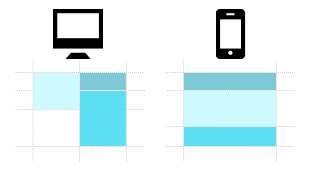
今回は
レスポンシブ 対応のしやすい
Grid Layoutです✨👏
flexよりも少し複雑になりますが、
慣れればできることは増えますよ❤️
続編ではflexとの違い、
gridにしかできないことを
実践形式を含めて
公開しようと思っています💕
Grid Layoutとは
縦線、横線に基づいて要素を置く

横線 = 行 = row
縦線 = 列 = column
線が縦横に
何本ずつあるかを決めて
要素を配置していきます🌟
何本目のrow, columnかを
指定すれば良いので
flexのorderプロパティでは
対応し切れない
レスポンシブでの
位置変更が容易にできます❤️
flexとの比較は続編にて✍️
使い方
grid-row, grid-column
このプロパティで
位置を指定します💫☝️
全体を覆うdivに
display: grid;
するのを忘れずに🪐
⬇️grid-row: 1/2;
1行目〜2行目までなので範囲はココ🍎

⬇️grid-column: 2/3;
2列目〜3列目なので範囲はココ🍎

⬇️なので
grid-row: 1/2;
grid-column: 2/3;
を指定した要素の位置は
ココです🍎

grid-gap

grid-gap: 12px;
要素同士の間隔を
空けることができます☁️
grid-template-rows, grid-template-columns

grid-template-rows: 100px 50px;
grid-template-columns: 150px 1fr;
1列目は100px, 2列目が50px
1行目は150px, 2列目が残りの幅です🌟
実践
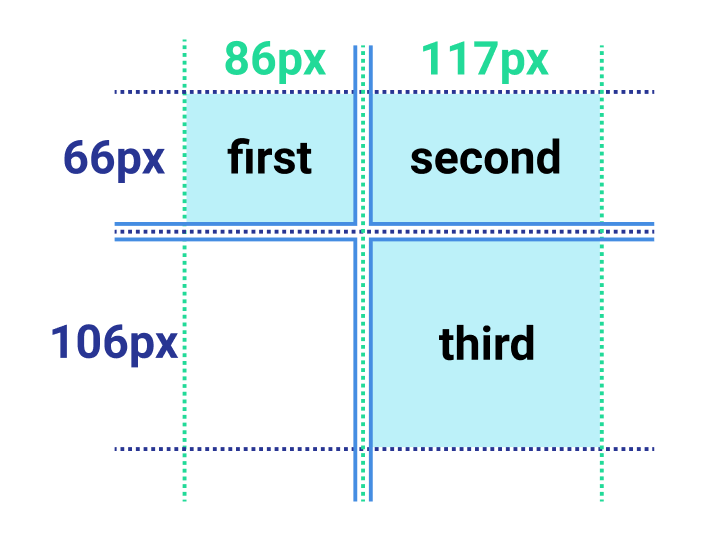
こちらを作ってみましょう🎈🧸
要素の間隔や、
要素の中身は
お好きな物で♪
中央配置だけしてあげてください💡
ticktack…
答え
いつも通りclass名は
パッとみて分かりやすくするために👀
とっても安直に命名しています。
中央配置はテキストだけの想定で
text-align: center;
を使用してももちろんOKです🌷
<template>
  <div class="page">
    <div class="container">
      <div class="box first">①</div>
      <div class="box second">②</div>
      <div class="box third">③</div>
    </div>
  </div>
</template>

<script>
export default {
}
</script>

<style lang="scss" scoped>
  .page {
    > .container {
      display: grid;
      grid-gap: 4px;
      grid-template-rows: 66px 106px;
      grid-template-columns: 86px 117px;

      > .box {
        display: flex;
        align-items: center;
        justify-content: center;

        &.first {
          grid-row: 1/2;
          grid-column: 1/2;
        }

        &.second {
          grid-row: 1/2;
          grid-column: 2/3;
        }

        &.third {
          grid-row: 2/3;
          grid-column: 2/3;
        }
      }

    }
  }
</style>
まとめ
gridの簡単な使い方が
分かったかと思います💡
次回はflexとの違いや、
レスポンシブ対応をやる予定です!
お楽しみに❤️