
前置き
今回はSwitchボタンです!✅
gifカクカクですが
実際はなめらかになります💦
(予告と違う内容ですみません)
inputの真偽値によって
クラスバインディングを行います!
propsを主に使います。
前回書いた記事と違うのは
Stringを渡すだけではなく
computed関数で切り替えを行う部分です🤗
propsでのクラスバインディングはこちら
https://note.com/aliz/n/nc4110b1128f0
構成
まずはtemplateの構成
inputをlabelで囲うとコードが
スッキリするのでこちらを採用🌱
<label><input type="text"></label>
囲わない場合は
<label for="name"></label>
<input type="text" id="name">
Step1: まずはlabel, inputを作成
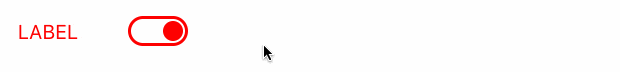
◾️label
・文字列は親で指定したいのでprops
文字列だけなのでslotでも大丈夫です!
今回はpropsを複数使うためpropsにします。
css
labelの幅を88pxにしたい!
が、labelに指定してしまうと
inputも含んだ長さのためspanを追加します。
◾️input
・input type="checkbox"に
指定可能な属性checkedを使用
後でクラスバインディングを紐づけるため、
まずはcheckedされた状態から作ります✅
・inputイベント(@input)で$emit
$emit基礎編はこちら
https://note.com/aliz/n/nd6e771724cd7
・チェックが付けられるとイベント実行
基本イベントハンドラは
まとめてあるここが参考になります!
https://blog.capilano-fw.com/?p=2787
css
まず全体をdivで囲い
そのdivにborderをつけ
●を作るdivを追加します🍩
●はcheckされた時の右側の配置を書きたいので
左側の分もまとめて書いちゃいましょう!✍️
👩💻ここまでのコード
scssは他のコンポーネントに影響が出ないよう、
基本的に直下セレクタ > をつけています。
<template>
 <label class="input switch-button">
   <span class="label">
     {{ label }}
   </span>
   <div class="box">
     <input
       :checked="checked"
       type="checkbox"
       class="input"
       @input="$emit('switch')"
     >
     <div class="mark" />
   </div>
 </label>
</template>

<script>
export default {
 props: {
   label: {
     type: String,
     default: 'label'
   },
   checked: {
     type: Boolean,
     required: true,
   },
 },
}
</script>

<style lang="scss" scoped>
 .switch-button {
   display: flex;
   align-items: center;

   > .label {
     width: 88px;
     min-width: 88px;
     color: red;
   }

   > .box {
     position: relative;
     width: 48px;
     height: 24px;
     border: 2px solid red;
     border-radius: 26px;

     > .mark {
       position: absolute;
       top: 2px;
       left: 2px;
       width: 16px;
       height: 16px;
       background-color: red;
       border-radius: 50%;
       transition: 0.12s;
     }

     > .input {
       display: none;

       &:checked ~ .mark {
         transform: translateX(24px);
         background-color: red;
       }
     }
   }
 }
</style>
親でpropsのlabelは
直接テキストを渡しています。
:label="変数名"でももちろんOK。
$emitに関しては現時点ではスルーでOK。
<template>
 <div class="page">
   <SwitchButton
     label="LABEL"
     :checked="checked"
   />
 </div>
</template>

<script>
import SwitchButton from '~/components/SwitchButton.vue'

export default {
 components: {
   SwitchButton,
 },
 data () {
   return {
     checked: true,
   }
 }
}
</script>
Step2: クラスバインディングを追加
propsとcomputed関数を使った
クラスバインディングをしていきます。
まずはinputによる真偽値は無視しましょう。
やりたいこと
チェックされたかどうかに関係なく
クラスの付け替えで全体の色を変える🎈🧸
なのでこうなればOKです!

あとでチェックされていない状態
(●が左にある状態)で
この色に変わるように変更します。
Point!
・labelにクラスバインディング
・computed関数で
propsをswitch関数で切り替え
・親でstatusがinactiveになれば
inactiveクラスがついてピンクになる
・inactiveクラスがついた時のcssを追加
👩💻ここまでのコード
<template>
 <label
   :class="classes"
   class="input switch-button"
 >
   <span class="label">
     {{ label }}
   </span>
   <div class="box">
     <input
       :checked="checked"
       type="checkbox"
       class="input"
       @input="$emit('switch')"
     >
     <div class="mark" />
   </div>
 </label>
</template>

<script>
export default {
props: {
  status: {
    type: String,
    default: '',
    required: false,
    validator (value) {
      return [
        '',
        'inactive',
      ].includes(value)
    },
  },
  label: {
    type: String,
    default: 'label'
  },
  checked: {
    type: Boolean,
    required: true,
  },
},
computed: {
  classes() {
    switch (this.status) {
      case '':
       return ''
     case 'inactive':
       return 'inactive'
     default:
       return ''
    }
  },
},
}
</script>

<style lang="scss" scoped>
.switch-button {
 display: flex;
 align-items: center;

 > .label {
   width: 69px;
   min-width: 69px;
   color: red;
 }

 > .box {
   position: relative;
   width: 48px;
   height: 24px;
   border: 2px solid red;
   border-radius: 26px;

   > .mark {
     position: absolute;
     top: 2px;
     left: 2px;
     width: 16px;
     height: 16px;
     background-color: red;
     border-radius: 50%;
     transition: 0.12s;
   }

   > .input {
     display: none;

     &:checked ~ .mark {
       transform: translateX(24px);
       background-color: red;
     }
   }
 }

 &.inactive {
   > .label {
     color: pink;
   }

   > .box {
     border: 2px solid pink;

     > .mark {
       background-color: pink;
     }

     > .input:checked ~ .mark {
       background-color: pink;
     }
   }
 }
}
</style>
<template>
 <div class="page">
   <SwitchButton
     :checked="checked"
     label="LABEL"
     status="inactive"
   />
 </div>
</template>

<script>
import SwitchButton from '~/components/SwitchButton.vue'

export default {
 components: {
   SwitchButton,
 },
 data () {
  return {
   checked: true,
  }
 },
}
</script>
これで準備はOK✨💪

Step3: 真偽値とクラスバインディングの連携
いよいよinputによるクラス付け替えです!
子ではもう全てのpropsを
書いているのでやることはありません。
親で渡したpropsの
・Boolean
・String
これを変数で連携させましょう!
Point!
・:checked="value"で
valueの初期値をfalseに
最初は選択されていない状態に変更
・statusに三項演算を使うので:を忘れず追加
valueがtrueなら'', falseなら'inactive'
・@switch="value = !value"で
switchイベント発火時にtrue, falseの切り替え
つまり初期値チェックしてない状態の時は
inactiveクラスがついて
ピンクになって●が左にある状態🍩
チェックをつけるとinactiveが外れて
通常クラスの赤になって●が右にある状態🍩
👩💻最終コード
<template>
 <div class="page">
   <SwitchButton
     :checked="value"
     label="LABEL"
     :status="value ? '' : 'inactive'"
     @switch="value = !value"
   />
 </div>
</template>

<script>
import SwitchButton from '~/components/SwitchButton.vue'

export default {
 components: {
   SwitchButton,
 },
 data () {
   return {
     value: false,
   }
 }
}
</script>
<template>
 <label
   :class="classes"
   class="input switch-button"
 >
   <span class="label">
     {{ label }}
   </span>
   <div class="box">
     <input
       :checked="checked"
       type="checkbox"
       class="input"
       @input="$emit('switch')"
     >
     <div class="mark" />
   </div>
 </label>
</template>

<script>
export default {
props: {
  status: {
    type: String,
    default: '',
    required: false,
    validator (value) {
      return [
        '',
        'inactive',
      ].includes(value)
    },
  },
  label: {
    type: String,
    default: 'label'
  },
  checked: {
    type: Boolean,
    required: true,
  },
},
computed: {
  classes() {
    switch (this.status) {
      case '':
       return ''
     case 'inactive':
       return 'inactive'
     default:
       return ''
    }
  },
},
}
</script>

<style lang="scss" scoped>
.switch-button {
 display: flex;
 align-items: center;

 > .label {
   width: 69px;
   min-width: 69px;
   color: red;
 }

 > .box {
   position: relative;
   width: 48px;
   height: 24px;
   border: 2px solid red;
   border-radius: 26px;

   > .mark {
     position: absolute;
     top: 2px;
     left: 2px;
     width: 16px;
     height: 16px;
     background-color: red;
     border-radius: 50%;
     transition: 0.12s;
   }

   > .input {
     display: none;

     &:checked ~ .mark {
       transform: translateX(24px);
       background-color: red;
     }
   }
 }

 &.inactive {
   > .label {
     color: pink;
   }

   > .box {
     border: 2px solid pink;

     > .mark {
       background-color: pink;
     }

     > .input:checked ~ .mark {
       background-color: pink;
     }
   }
 }
}
</style>
次回はVuexの続きをやります!
公開予定日は2/28(金)です。
記事が公開したときにわかる様に、
note・Twitterフォローをお願いします😀
https://twitter.com/aLizlab