はじめに
初心者・新卒の方々にHTML・CSSを教える機会が増え、
自分が初心者のときに
こんなものがあったら有難かったなと思ったので簡単にまとめてみました。
登場する書き方は私がお世話になっている書き方なので
より美しい書き方があればご教示いただけますと幸いです。
よくあるレイアウト
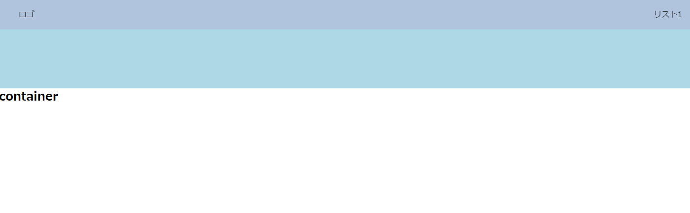
ロゴのみ右寄せになっているヘッダーナビゲーション
よくみるこのような形のレイアウト。

どうやって実装するのでしょうか?
以下のように実装することができます。
    <nav>
      <ul>
        <li class="logo">ロゴ</li>
        <li><a href="#">リスト1</a></li>
        <li><a href="#">リスト2</a></li>
        <li><a href="#">リスト3</a></li>
        <li><a href="#">リスト4</a></li>
      </ul>
    </nav>
nav ul {
 height: 60px;
 padding: 0 40px;
 display: flex;
 justify-content: flex-end;
 align-items: center;
 background: #b0c4de;
}
nav ul li {
 margin-right: 20px;
 list-style-type: none;
}
nav ul li:last-of-type {
 margin-right: 0;
}
nav ul li.logo {
 margin-right: auto;
}
nav ul li a {
 color: #333;
 text-decoration: none;
}
全体にdisplay: flexとjustify-content: flex-end;をつけ、
右寄せにしたい項目にmargin-right: autoを付与します。
左寄せにしたい場合はmargin-left: autoを付与します。
トップ固定のヘッダーナビゲーション
スクロールしてもトップの同じ位置に固定され続ける
上記のようなナビゲーションはこのように実装します。
    <nav>
      <ul>
        <li class="logo">ロゴ</li>
        <li><a href="#">リスト1</a></li>
        <li><a href="#">リスト2</a></li>
        <li><a href="#">リスト3</a></li>
        <li><a href="#">リスト4</a></li>
      </ul>
    </nav>
body {
 position: relative;
}
nav {
 width: 100%;
 position: fixed;
 top: 0;
}
position: fixedで固定指定をするだけです。
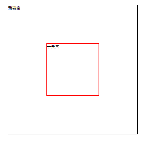
要素を親要素の上下中央に配置する
このように親要素の上下中央に子要素を配置したい場合です。
(これがまたよく使います..!)
      <div class="parent">
        <p>親要素</p>
        <div class="child">
          <p>子要素</p>
        </div>
      </div>
.parent {
 position: relative;
 width: 500px;
 height: 500px;
 margin: 30px auto 0;
 border: solid 2px #000;
}
.child {
 position: absolute;
 top: 50%;
 left: 50%;
 width: 200px;
 height: 200px;
 border: solid 2px #ff0000;
 transform: translate(-50%, -50%);
}
transform: translate(-50%, -50%);は魔法のように覚えておくと良いです。
aタグ(リンク)をボタンのように見せたい
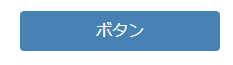
aタグをボタンのように見せたい場合、
以下のように文字を縦中央に配置することができず
悩むことがあるかもしれません。

paddingで調整したり、前述したようにpositionで調整することもできますが
以下のようにするとシンプルです。
<a href="#" class="button">ボタン</a>
.button {
 display: block;
 width: 200px;
 height: 40px;
 background: #4682b4;
 color: #fff;
 text-decoration: none;
 text-align: center;
 border: none;
 border-radius: 4px;
 line-height: 40px; /* 要素の高さと同じだけline-heightを取ってあげる */
}
同じサイズの要素を横並びにしたい
これが一番よくあるレイアウトなのですが、
要素の中ですべて同じサイズにしたいということがあると思います。
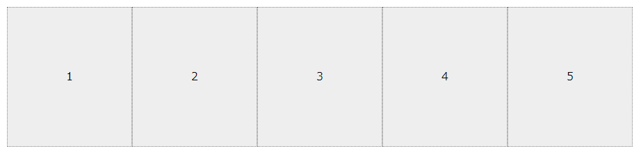
そのような場合は以下のようにすると良いでしょう。
    <div class="wrap">
      <div class="card">1</div>
      <div class="card">2</div>
      <div class="card">3</div>
      <div class="card">4</div>
      <div class="card">5</div>
    </div>
.wrap {
 display: flex;
 width: 900px;
 margin: 20px auto;
 background: #eee;
}
.card {
 flex: auto;
 height: 200px;
 border: dotted 1px #888;
 text-align: center;
 line-height: 200px;
}
flex: auto;を付けるとすべて.cardが同じ幅になります。
他のプロパティについてはぜひこちらをご参照ください。
さいごに
今回ご紹介したものはとても初歩的な技術です。
調べれば出てくるようなものばかりですが、
始めの一歩として参考にしていただければと思います