背景
カード要素をgridレイアウトで並べる。
カードのタイトルが幅よりも長くなったら省略表示を追加する。
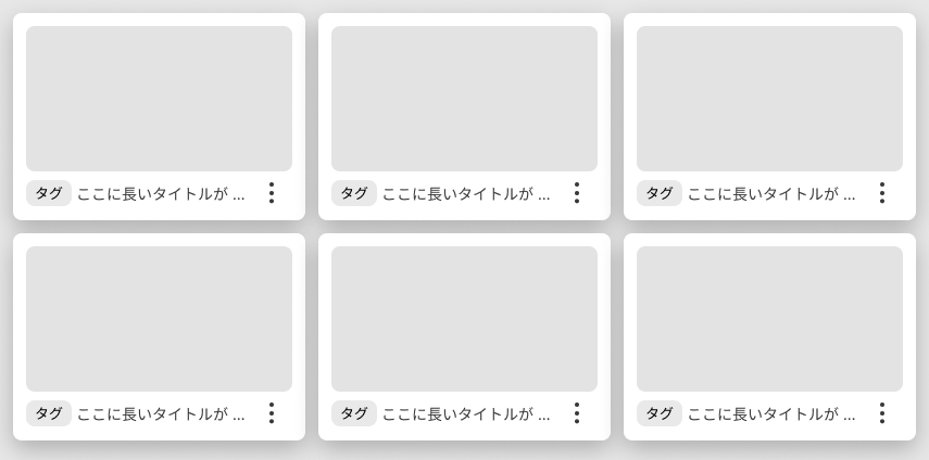
↑ これをやろうとしたら、長いタイトルでカードが横に伸びてしまった。
原因
子要素の幅が親要素お幅になっていない。
カードのレイアウトはgridレイアウト、タイトル部分の「タグ」「タイトル」「moreボタン」のレイアウトをflexにしていた。
.titleContainer {
  display: flex;
  flex: 1 1 calc(100% - 32px);

  .titleLabel {
    display: flex;
    gap: 4px;
    align-items: center;
    width: calc(100% - 32px);

    .titleLabelText {
      flex: 0 auto;
      max-width: calc(100% - 60px);
      overflow: hidden;
      font: Roboto;
      color: white;
      text-overflow: ellipsis;
      white-space: nowrap;
    }
   }
  }
解決策
タイトル部分ををgridレイアウトに変える。
  .roomLabelContainer {
    display: grid;
    grid-template-columns: auto 32px;
    gap: 4px;
    align-items: center;

    .roomLabel {
      display: grid;
      grid-template-columns: 60px auto;
      gap: 4px;
      align-items: center;
      width: 100%;

      .roomLabelText {
        max-width: 100%;
        overflow: hidden;
        font: Roboto;
        color: white;
        text-overflow: ellipsis;
        white-space: nowrap;
      }
    }
  }
最後に
原因に気づくまで沼った。
gridレイアウトの子要素はgridレイアウトにしておくと良さそう。
Gapがやりやすいし、幅も高さもいい感じになってくれる。