■ 概要
Trendlnでビットコインの転換点とトレンドラインを引く
一連のコードは↓
■ 環境
device : Mac book air 2022
yfinance : 0.2.12 (Released: Feb 16, 2023)
pandas : 1.3.5
■ 実装
( 1 ) データ収集 & グラフの表示
● データ収集
yfinanceでビットコインのデータを収集しました。
データの詳細としては、2022年の日足のデータを収集しました。
!pip install yfinance
import yfinance as yf
import pandas as pd
import trendln
import matplotlib.pyplot as plt

#取得するデータ詳細
name = 'BTC-USD'
start = '2022-11-01'
end = '2022-12-31'

#データのダウンロード
df = yf.download(tickers=name, start=start, end=end)
df.head(3)
| Date | Open | High | Low | Close | Adj Close | Volume |
|---|---|---|---|---|---|---|
| 2022-11-01 | 20494.898438 | 20647.289062 | 20359.845703 | 20485.273438 | 20485.273438 | 39819303159 |
| 2022-11-02 | 20482.958984 | 20742.810547 | 20087.134766 | 20159.503906 | 20159.503906 | 55552169483 |
| 2022-11-03 | 20162.689453 | 20382.095703 | 20086.240234 | 20209.988281 | 20209.988281 | 43228750179 |
yfinanceの詳細はこの記事をご覧ください。
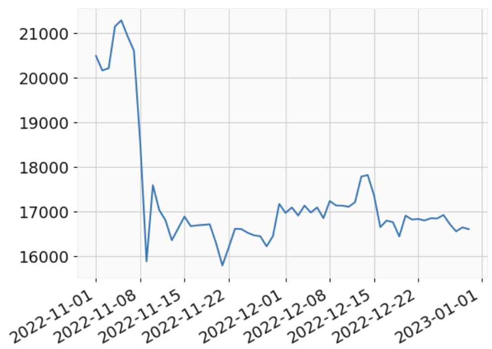
● 終値のグラフを表示
plt.plot(df['Close'])
plt.gcf().autofmt_xdate()
plt.show()
( 2 ) Trendlnをインストールする
!pip install trendln
( 3 ) トレンドラインとなる転換点を算出する
● インデックスのリストを作成
trendlnのget_extrema関数で転換点のインデックスを生成
import trendln

# インデックスのリストを作成
minimaIdxs, maximaIdxs = trendln.get_extrema(df['Close'], accuracy=2)
print(minimaIdxs)       #下落から上昇に転換するポイントのインデックス
print(maximaIdxs)       #上昇から下落に転換するポイントのインデックス
出力結果
[1, 8, 12, 15, 20, 27, 32, 36, 40, 45, 48, 52, 57]
[4, 9, 14, 18, 22, 29, 33, 37, 43, 46, 49, 55, 58]
● インデックスのリストに対応する日付と価格データを抽出
#インデックスに対応するデータポイントを抽出
mins_points = df.iloc[minimaIdxs]['Close']
maxs_points = df.iloc[maximaIdxs]['Close']

df_combined = pd.concat([mins_points, maxs_points], axis=1)
df_combined.columns = ['mins_points', 'maxs_points']
df_combined.head()
| Date | mins_points | maxs_points |
|---|---|---|
| 2022-11-02 | 20159.503906 | NaN |
| 2022-11-05 | NaN | 21282.691406 |
| 2022-11-09 | 15880.780273 | NaN |
| 2022-11-10 | NaN | 17586.771484 |
| 2022-11-13 | 16353.365234 | NaN |
( 4 ) 転換点をグラフで確認する
#グラフのサイズを設定
plt.figure(figsize=(9, 7))

#終値を表示
plt.plot(df['Close'], linestyle='dotted', color='black')
#転換点を表示
plt.scatter(mins_points.index, mins_points.values, color='blue')
plt.scatter(maxs_points.index, maxs_points.values, color='red')

#プロットの表示
plt.gcf().autofmt_xdate()
plt.show()

( 5 ) 転換点からトレンドラインを表示させる
#転換点からトレンドラインを引く
fig = trendln.plot_sup_res_date(df["Close"], df["Close"].index, accuracy=2)

■ 参考文献