備忘録で書きます。
styled-components
css in jsの一種でJSX内でcssを書くためのツールです。
ES6のタグ付きテンプレートリテラルを使用し、ネストして書けたり、extend機能などが使えて人気のツールとなっています。
SSRやReact Nativeにも対応していて、位置的にはzeitが作っているstyled-jsxに近いんじゃないかと。
styled-components
https://github.com/styled-components/styled-components
具体的には以下のようにstyled.buttonのように記述するとbutton要素としてReactコンポーネントが返る仕組みです。これをstyled.divにすればdiv要素が、styled.aにすればa要素が返ります。
import styled from 'styled-components';

const Button = styled.button`
    display: inline-block;
    padding: 0.8rem;
    border-radius: 5px;
    border: 1px solid #ddd;
    font-weight: bold;
    font-size: 0.8rem;
    line-height: 1;
    text-decoration: none;
    transition: opacity 0.3s;
    color: #8c8c8c;
    cursor: pointer;
`;

const ButtonComponent = ({...props}) => <Button {...props} />;

export default ButtonComponent;
import Button from './Button.js';
...
render() {
return() {
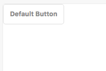
<Button>Default Button</Button>
}
}
...
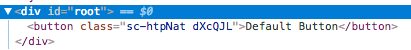
上記を実行すると以下のようにボタン要素でレンダリングになります。
classもハッシュのような形式で自動生成されますので命名規則などに縛られることはありません。

Atomic Designとの併用
Atomic Designはかなり有名なため説明は割愛します。
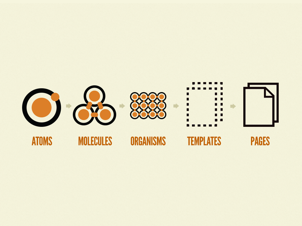
超ざっくり説明すると最小単位のAtomsからコンポーネントを作成し、Molecules、Organismsなどコンポーネントの組み合わせてUIを構築する手法です。親コンポーネントの変更が子コンポーネントに依存しないことがポイントで、これにより堅牢な設計を担保できるという設計手法です。
以下は有名な図です。
Atoms
Button.js
先程の例でButtonコンポーネントを作ります。
import React from 'react';
import styled from 'styled-components';

const Button = styled.button`
    display: inline-block;
    padding: 0.8rem;
    border-radius: 5px;
    border: 1px solid #ddd;
    font-weight: bold;
    font-size: 0.8rem;
    line-height: 1;
    text-decoration: none;
    transition: opacity 0.3s;
    color: #8c8c8c;
    cursor: pointer;
`;

const ButtonComponent = ({...props}) => <Button {...props} />;

export default ButtonComponent;
TextBox.js
続いてinput[type="text"]のコンポーネントを作成します。
styled.input.attrsでtype: 'text'にするところがポイントです。
import React from 'react';
import styled from 'styled-components';

const TextBox = styled.input.attrs({
    type: 'text',
})`
    padding: 0.5rem;
    border: 1px solid #ddd;
    border-radius: 2px;
    color: #000000;
    font-size: 0.8rem;
`;

const TextBoxComponent = ({ ...props }) => <InputEle {...props} />;

export default TextBoxComponent;
Molecules
MailForm
ここでは上で作成したAtomsであるButtonコンポーネント・TextBoxコンポーネントを使用して、MoleculesのMailFormを作成してみます。
ポイントはstyled(TextBox)の部分で、こうすることによってAtomsを拡張してcssを書くことができます。しかもclass名は自動で生成されるため、AtomsのTextBoxコンポーネントには何も影響がありません。
import React from 'react';
import styled from 'styled-components';
import TextBox from '../Atoms/TextBox';
import Button from '../Atoms/Button';
const Wrapper = styled.div`
display: flex;
align-items: center;
`;
const TextBox_Styled = styled(TextBox)`
flex: 1;
margin-right: 0.5rem;
`;
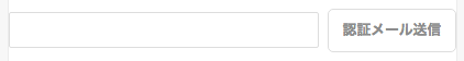
const MailForm = ({ onSubmit, ...props }) => (
<form {...props}>
<Wrapper>
<TextBox_Styled />
<Button onClick={onSubmit}>認証メール送信</Button>
</Wrapper>
</form>
);
export default MailForm;
で、これをレンダリングすると以下のように横並びになります。
Organisms ~ Templates
このあたりは上記と同じやり方で、子コンポーネントをstyled(component)で書いていくだけだと思います。
Tips
複数のHTML要素になる可能性があるコンポーネント
コンポーネントを書いているとdivでもいいしsectionでもいいし、使い方によってはmainとかarticleにもなり得る要素が存在します。その場合は、styled()のコールバック関数にReact.createElementを渡すことで対応可能です。
import React from 'react';
import styled from 'styled-components';

const Tag = styled(({ children, tag = 'div', ...props }) => {
    return React.createElement(tag, props, children);
})``;

const Layout = ({ ...props }) => <Tag {...props} />;

export default Layout;