はじめに
React 向けコンポーネントライブラリである Mantine に含まれるチャート(グラフ)機能の MantineCharts では、2024年10月時点で以下4種類の棒グラフを表現できます。
defaultstackedpercentwaterfall
この記事では、各種類の棒グラフを実装して、どのような見た目になるか確認します。
開発環境
開発環境は以下の通りです。
- Windows 11
- Next.js 14.2.4
- React 18.3.1
- TypeScript 5.5.2
- @mantine/core 7.13.2
- @mantine/hooks 7.13.2
- @mantine/charts 7.13.2
- Recharts 2.13.0
default
まずは default の棒グラフを作成します。
表示するデータは全種類共通で以下のデータです。
export const data = [
  { month: "January", Smartphones: 1200, Laptops: 900, Tablets: 200 },
  { month: "February", Smartphones: 1900, Laptops: 1200, Tablets: 400 },
  { month: "March", Smartphones: 400, Laptops: 1000, Tablets: 200 },
  { month: "April", Smartphones: 1000, Laptops: 200, Tablets: 800 },
  { month: "May", Smartphones: 800, Laptops: 1400, Tablets: 1200 },
  { month: "June", Smartphones: 750, Laptops: 600, Tablets: 1000 },
];
BarChart コンポーネントに必要な props を渡します。
type 以外は全種類共通の値になります。
import { BarChart } from "@mantine/charts";
import { data } from "./data";

export default function DefaultBarChart() {
  return (
    <BarChart
      h={400}
      data={data}
      dataKey="month"
      series={[
        { name: "Smartphones", color: "violet.6" },
        { name: "Laptops", color: "blue.6" },
        { name: "Tablets", color: "teal.6" },
      ]}
      type="default"
    />
  );
}
type のデフォルト値が default なので、type prop に何も渡さなくても同じ見た目になります。
import { BarChart } from "@mantine/charts";
import { data } from "./data";

export default function DefaultBarChart() {
  return (
    <BarChart
      h={400}
      data={data}
      dataKey="month"
      series={[
        { name: "Smartphones", color: "violet.6" },
        { name: "Laptops", color: "blue.6" },
        { name: "Tablets", color: "teal.6" },
      ]}
    />
  );
}
動作確認をします。
X軸が "month" で各 "month" ごとに series へ渡した name ("Smartphones"、"Laptops"、"Tablets") が横並びに表示される棒グラフができました。
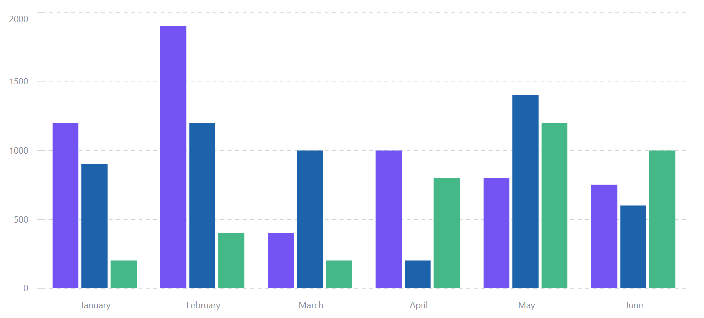
マウスオーバーするとツールチップが表示されます。

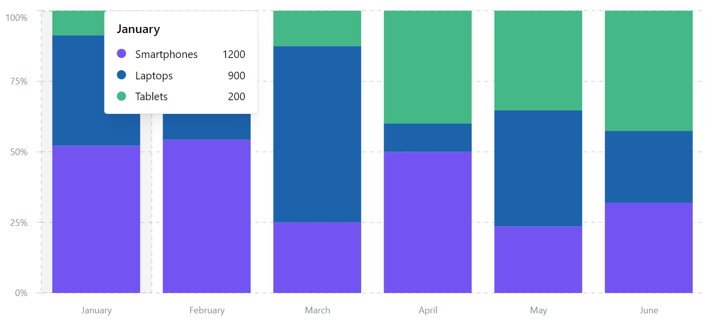
stacked
type を stacked にすると、name ("Smartphones"、"Laptops"、"Tablets") が横並びではなく、縦に積み上げ式で表示されます。

percent
type を percent にすると、Y軸は name ("Smartphones"、"Laptops"、"Tablets") の値ではなく、パーセンテージで表示されます。
ただ、マウスオーバーして表示されるツールチップには、値が表示されます。
ツールチップをカスタマイズして、パーセンテージ表示することは可能です。
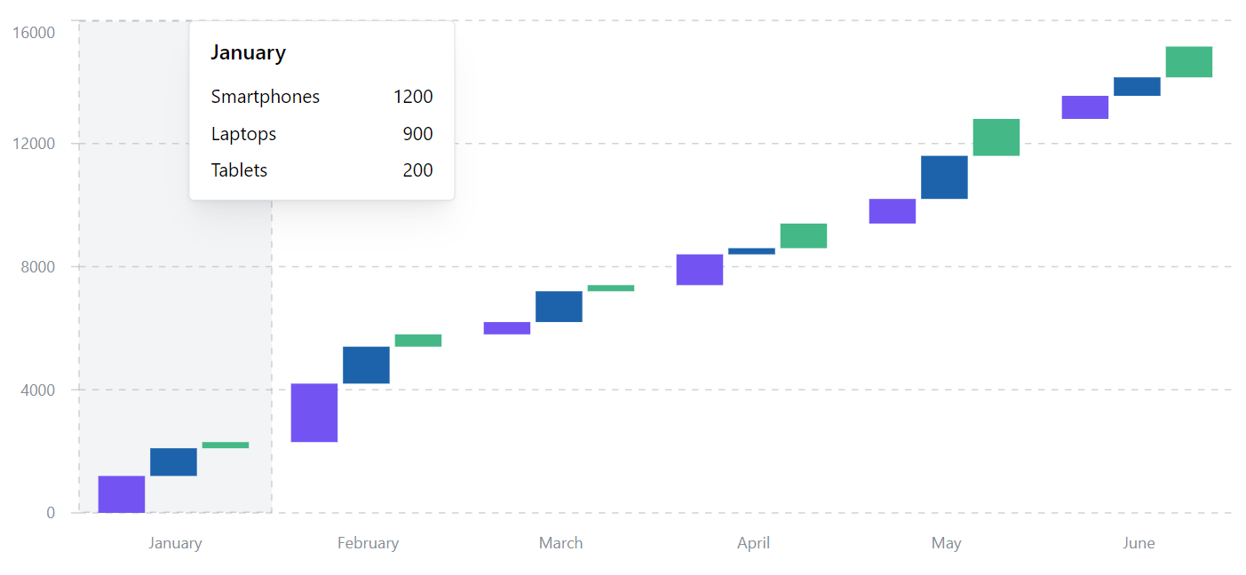
waterfall
type を waterfall にすると、前のデータに対するプラス・マイナスを表示する棒グラフが表示されます。
今回利用しているデータが全てプラスの値のため、全て右肩上がりに表示されます。
以下のようにマイナスを含むデータの場合、じぐざくのグラフになります。
const data = [
  { month: "January", Smartphones: -1200, Laptops: -900, Tablets: -200 },
  { month: "February", Smartphones: 1900, Laptops: 1200, Tablets: 400 },
  { month: "March", Smartphones: -400, Laptops: 1000, Tablets: -200 },
  { month: "April", Smartphones: -1000, Laptops: 200, Tablets: -800 },
  { month: "May", Smartphones: 800, Laptops: -1400, Tablets: 1200 },
  { month: "June", Smartphones: 750, Laptops: -600, Tablets: 1000 },
];
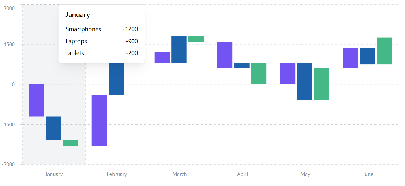
なお、上記のデータは、元データの一部にマイナスをつけただけですが、月ごとの収支など前のデータに基づいたデータを表示するのが本来の使い方だと思います。