はじめに
この記事では、React UI コンポーネントライブラリ Mantine のテーマのカスタマイズ方法を記載します。
開発環境
開発環境は以下の通りです。
- Windows 11
- Next.js 14.2.4
- React 18.3.1
- TypeScript 5.5.2
- Node.js 20.13.1
- npm
- @mantine/core 7.12.1
- @mantine/hooks 7.12.1
テーマのカスタマイズ方法
テーマのカスタマイズ方法は、カスタマイズ対象によって、以下の2種類あります。
- アプリ全体 :
MantineProviderを利用する - 各コンポーネント単位 : テーマを上書きする
今回は 1. の MantineProvider を利用して、アプリ全体のテーマを一括してカスタマイズする方法を記載します。
MantineProvider でテーマをカスタマイズ
MantineProvider の props に theme を渡してカスタマイズします。theme 内の値がアプリ全体のテーマとして設定されます。
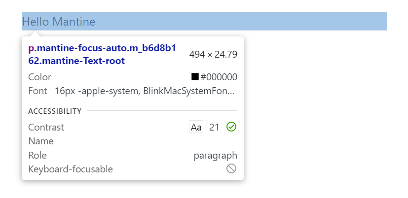
例えば、画面上に fz (font-size) が md の Text コンポーネントがあるとします。
import { Container, Text } from "@mantine/core";

export default function Home() {
  return (
    <Container m="md">
      <Text fz="md">Hello Mantine</Text>
    </Container>
  );
}
デフォルトでは、fz (font-size) が md の場合、フォントサイズは、16px となります。
import "@mantine/core/styles.css";
import { ColorSchemeScript, MantineProvider } from "@mantine/core";

export default function RootLayout({
  children,
}: Readonly<{
  children: React.ReactNode;
}>) {
  return (
    <html lang="en">
      <head>
        <ColorSchemeScript />
      </head>
      <body>
        <MantineProvider>{children}</MantineProvider>
      </body>
    </html>
  );
}
テーマをカスタマイズして、fontSizes の md を 24px にすると、フォントサイズが 24px になります。
import "@mantine/core/styles.css";
import { ColorSchemeScript, MantineProvider } from "@mantine/core";

export default function RootLayout({
  children,
}: Readonly<{
  children: React.ReactNode;
}>) {
  return (
    <html lang="en">
      <head>
        <ColorSchemeScript />
      </head>
      <body>
        <MantineProvider
          theme={{
            fontSizes: { md: "24px" },
          }}
        >
          {children}
        </MantineProvider>
      </body>
    </html>
  );
}

テーマ設定ファイル
先ほどの例では、MantineProvider の props に直接カスタマイズする値を記載しましたが、別途テーマ設定用のファイルを作成して利用することもできます。
import { createTheme } from "@mantine/core";

export const theme = createTheme({
  fontSizes: {
    md: "24px",
  },
});
import "@mantine/core/styles.css";
import { ColorSchemeScript, MantineProvider } from "@mantine/core";
import { theme } from "@/theme";

export default function RootLayout({
  children,
}: Readonly<{
  children: React.ReactNode;
}>) {
  return (
    <html lang="en">
      <head>
        <ColorSchemeScript />
      </head>
      <body>
        <MantineProvider theme={theme}>{children}</MantineProvider>
      </body>
    </html>
  );
}
カラーのカスタマイズ
Mantine では、Open Color という1つのカラーにつき、10種類の色合いを持つカラー定義を利用しています。
そのため、カラーをカスタマイズする場合、1つのカラーにつき、10種類の色合いを指定する必要があります。
import { createTheme } from "@mantine/core";

export const theme = createTheme({
  colors: {
    blue: [
      "#dff4ff",
      "#b2ddff",
      "#83c5fb",
      "#54aef7",
      "#2997f4",
      "#147edb",
      "#0862ab",
      "#00467b",
      "#002a4c",
      "#000f1e",
    ],
  },
});
import { Container, Text } from "@mantine/core";

export default function Home() {
  return (
    <Container m="md">
      <Text c="blue.6">
        Hello Mantine
      </Text>
    </Container>
  );
}

10種類の色合いを自身で作成して、指定するのは大変なので、以下のようなツールを使って生成することもできます。
コンポーネントのカスタマイズ
コンポーネントもテーマとして、カスタマイズできます。
props のデフォルト値のカスタマイズ
Default props を利用すると props のデフォルト値をカスタマイズできます。
"use client";

import { Button, createTheme } from "@mantine/core";

export const theme = createTheme({
  components: {
    Button: Button.extend({
      defaultProps: {
        color: "cyan",
        variant: "outline",
      },
    }),
  },
});
import { Button, Container, Group } from "@mantine/core";

export default function Home() {
  return (
    <Container m="md">
      <Group>
        <Button>Default Button</Button>
        <Button color="red" variant="filled">
          Button with props
        </Button>
      </Group>
    </Container>
  );
}

Styles API のカスタマイズ
Styles API のカスタマイズもできます。
"use client";

import { Button, createTheme } from "@mantine/core";

export const theme = createTheme({
  colors: {
    blue: [
      "#dff4ff",
      "#b2ddff",
      "#83c5fb",
      "#54aef7",
      "#2997f4",
      "#147edb",
      "#0862ab",
      "#00467b",
      "#002a4c",
      "#000f1e",
    ],
  },
  components: {
    Button: Button.extend({
      styles: {
        label: {
          color: "darkcyan",
        },
      },
    }),
  },
});

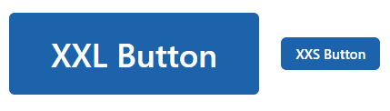
CSS 変数を利用したカスタマイズ
props で渡された値によって、カスタマイズ内容を変えることもできます。
"use client";

import { Button, createTheme, rem } from "@mantine/core";

export const theme = createTheme({
  components: {
    Button: Button.extend({
      vars: (theme, props) => {
        if (props.size === "xxl") {
          return {
            root: {
              "--button-height": rem(60),
              "--button-padding-x": rem(30),
              "--button-fz": rem(24),
            },
          };
        }

        if (props.size === "xxs") {
          return {
            root: {
              "--button-height": rem(24),
              "--button-padding-x": rem(10),
              "--button-fz": rem(10),
            },
          };
        }

        return { root: {} };
      },
    }),
  },
});
import { Button, Container, Group, Space } from "@mantine/core";

export default function Home() {
  return (
    <Container m="md">
      <Group>
        <Button size="xxl">XXL Button</Button>
        <Button size="xxs">XXS Button</Button>
      </Group>
    </Container>
  );
}