画像コンテンツのレスポンシブ対応をする際に、コンテナのサイズ計算で考えてしまうのでメモようにまとめてみました。
完成イメージ
イメージ的にはこんな感じです。
サイズがバラバラな画像を、CSS同じサイズにして、さらに画像間の余白も計算に入れたサイズにします。メリットとしてはツール等で画像のトリミングが不要になるのと、余白調整でlast-childとか特殊な指定がなくなります。
コード
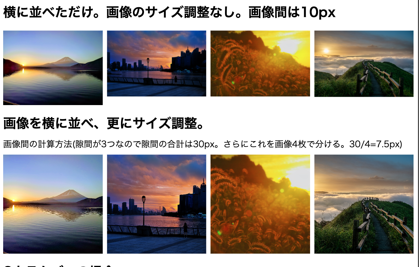
<h2>横に並べただけ。画像のサイズ調整なし。画像間は10px</h2>
<div class="flex-wrap1">
<div class="box"><p><img src="./img/modal1-lg.jpg"></p></div>
<div class="box"><p><img src="./img/modal2-lg.jpg"></p></div>
<div class="box"><p><img src="./img/modal3-lg.jpg"></p></div>
<div class="box"><p><img src="./img/modal4-lg.jpg"></p></div>
</div>
<h2>画像を横に並べ、更にサイズ調整。</h2>
<span>画像間の計算方法(隙間が3つなので隙間の合計は30px。さらにこれを画像4枚で分ける。30/4=7.5px)</span>
<div class="flex-wrap2">
<div class="box"><p><img src="./img/modal1-lg.jpg"></p></div>
<div class="box"><p><img src="./img/modal2-lg.jpg"></p></div>
<div class="box"><p><img src="./img/modal3-lg.jpg"></p></div>
<div class="box"><p><img src="./img/modal4-lg.jpg"></p></div>
</div>
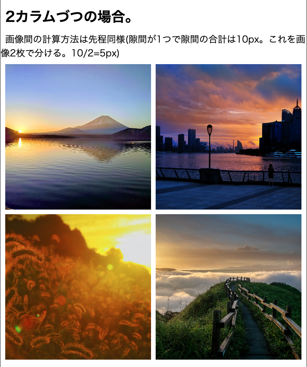
<h2>2カラムづつの場合。</h2>
<span>画像間の計算方法は先程同様(隙間が1つで隙間の合計は10px。これを画像2枚で分ける。10/2=5px)</span>
<div class="flex-wrap3">
<div class="box"><p><img src="./img/modal1-lg.jpg"></p></div>
<div class="box"><p><img src="./img/modal2-lg.jpg"></p></div>
<div class="box"><p><img src="./img/modal3-lg.jpg"></p></div>
<div class="box"><p><img src="./img/modal4-lg.jpg"></p></div>
</div>
@charset "utf-8";
/* Reset */
html,body,h1,h2,h3,p,ul,li{
    padding: 0;
    margin: 0;
}
img{
    border: none;
    vertical-align: bottom;
    max-width: 100%;
    height: auto;
}
/* common */
.container{
    max-width: 960px;
    margin: 0 auto;
}
/* main */
h2{
    padding: 10px;
}
span{
    padding: 10px;
}
/* .flex-wrap1
------------------------------------- */
.flex-wrap1{
    padding: 10px;
    display: flex;
    justify-content: space-between;
}
.flex-wrap1 .box{
    width: 25%;
}
.flex-wrap1 .box:not(:last-child){
    margin-right: 10px;
}
/* .flex-wrap2
------------------------------------- */
.flex-wrap2{
    padding: 10px;
    display: flex;
    justify-content: space-between;
}
.flex-wrap2 .box{
    /* 10px * 隙間3つ / 画像4枚 = 7.5px */
    width: calc(25% - 7.5px);
    position: relative;
}
.flex-wrap2 p{
    /* 高さを0、内側余白50%ずつにする事で幅高さの比率を1:1にする */
    height: 0;
    padding: 50% 0;
}
.flex-wrap2 img{
    /* 親クラスの幅高さを継承し、positionを使って絶対配置 */
    display: block;
    height: 100%;
    width: 100%;
    position: absolute;
    top: 0; left: 0;
    object-fit: cover;
}
/* .flex-wrap3
------------------------------------- */
.flex-wrap3{
    padding: 10px;
    display: flex;
    justify-content: space-between;
    /* 2枚で折り返したいので、flexコンテナ幅100%で折り返し設定。 */
    flex-wrap: wrap;
}
.flex-wrap3 .box{
    /* 10px * 隙間1つ / 画像2枚 = 5px */
    width: calc(50% - 5px);
    margin-bottom: 10px;
    position: relative;
}
.flex-wrap3 p{
    height: 0;
    padding: 50% 0;
}
.flex-wrap3 img{
    display: block;
    height: 100%;
    width: 100%;
    position: absolute;
    top: 0; left: 0;
    object-fit: cover;
}
解説
サイズの計算方法はコメントや画像をご確認ください。
それ以外で注意しなければいけないのは、かならずリセットとしてfuluid imageにする事です。
positionの使い方も慣れていない方にはわかりづらいかもしれませんが、relativeが基準点、つまり親クラスになるので、absoluteをかけた子クラスに幅高さ100%を指定すると、親クラスの幅高さを継承することができます。
例えば親クラスに300px * 300pxがかかっていれば、子も300px * 300pxですし、10000pxなら10000pxになります。
重要なのは親クラスの幅指定の方法で、今回の場合だと、.flex-wrapには、幅のみ指定しているということ。
では高さはどこで指定しているかというと、今回の場合は.flex-wrap pになります。
ここでpadding: 50% 0;を指定して、幅の100%の高さを指定しています。
最後に
簡単ではありますが、以上になります。
この技術は埋め込みのYoutube動画やGoogleMapのサイズ変更にも使われているものなので覚えておくと便利です。
時間が空いたらgridを使った、コードも追記していきたいと思います。多分慣れたらこっちの方がこういったレイアウトはやりやすいかもです。では、お疲れ様でした!
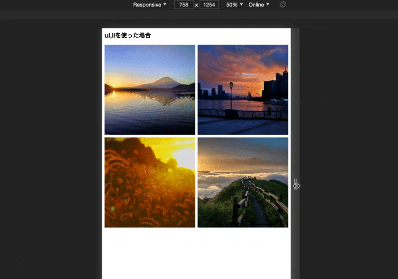
追記(2021/01/14)
今回は説明用にクラス名を使いましたが、HTMLのul,liタグだけを使う事も可能です。(通常はこっちになるかと)
<h2>ul,liを使った場合</h2>
<ul>
    <li><p><img src="./img/modal1-lg.jpg"></p></li>
    <li><p><img src="./img/modal2-lg.jpg"></p></li>
    <li><p><img src="./img/modal3-lg.jpg"></p></li>
    <li><p><img src="./img/modal4-lg.jpg"></p></li>
</ul>
/* when used ul li
------------------------------------- */
ul{
    padding: 10px;
    display: flex;
    justify-content: space-between;
    flex-wrap: wrap;
}
li{
    width: calc(50% - 5px);
    margin-bottom: 10px;
    position: relative;
}
li p{
    height: 0;
    padding: 50% 0;
}
ul img{
    display: block;
    height: 100%;
    width: 100%;
    position: absolute;
    top: 0; left: 0;
    object-fit: cover;
}
@media screen and (min-width: 768px){
    ul{
        flex-wrap: nowrap;
    }
    li{
        width: calc(25% - 7.5px);
        margin-bottom: 0;
        position: relative;
    }
}
一応@mediaを使ってレスポンシブ化してます。(モバイルファースト)
動作は以下です。