諸学者向けの話ですが、要素と要素の重なりを使ったWEBデザインを紹介したいと思います。
イメージ的には以下です。
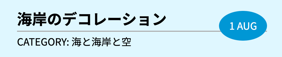
ちょっと分かりづらいですが真ん中のボーダーと右側の青丸が重なってボーダーが突き向けているが分かるでしょうか?
こう言った、要素と要素が重なりをもつデザインは結構見かけます。
positionを使う(王道パターン)
重なりのデザインと言ったらほぼこれ一択です。
html
<article>
  <time datetime="2018-08-01">1 AUG</time>
  <h2>海岸のデコレーション</h2>
  <p>CATEGORY: 海と海岸と空</p>
</article>
css
article {
  width: 500px;
  position: relative;
}
time {
  background: #0097d8;
  color: #fff;
  padding: 20px;
  border-radius: 50%;
  position: absolute;
  top: 0;
  right: 0;
}
h2 {
  border-bottom: solid 2px #aaa;
  padding-bottom: 10px;
  margin-bottom: 10px;
}
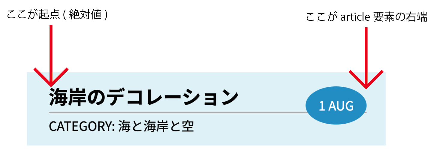
ポイントはarticleのposition: relative;とtimeのposition: absolute;です。
大雑把ですがpositionの説明を以下に図解化しました。
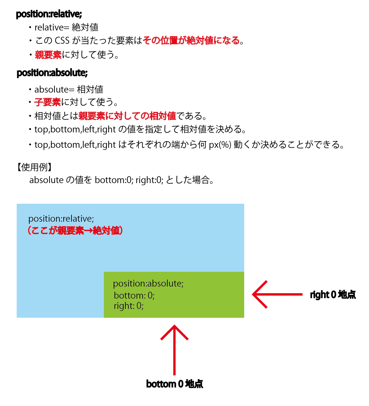
今回の場合はarticle要素の位置を起点とし、top: 0; right: 0;つまり右端にtimeが設置されるようにしました。
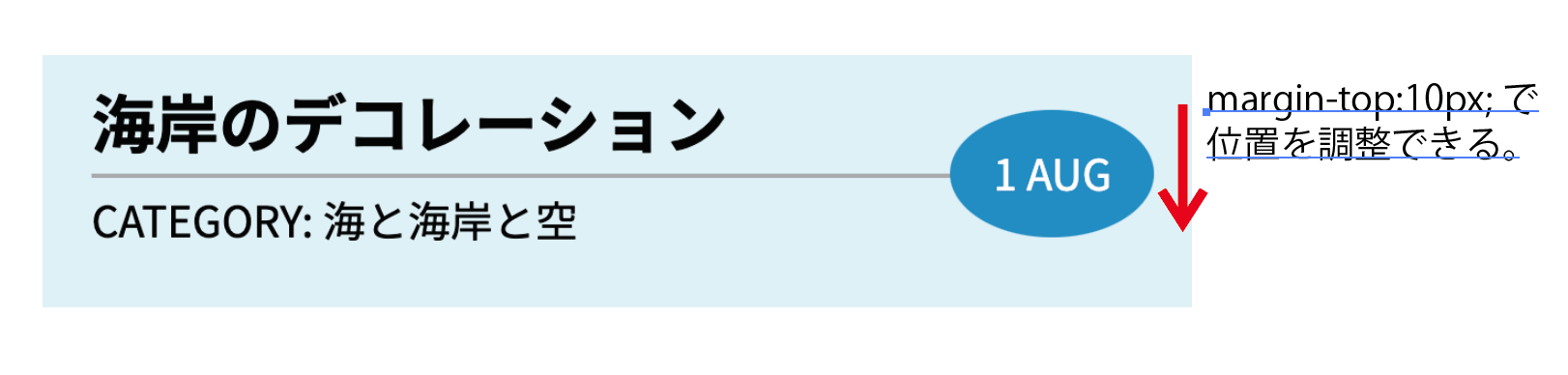
これが例えばtimeの中のtop: 0;の値をtop: 10px;に変えたとしましょう。
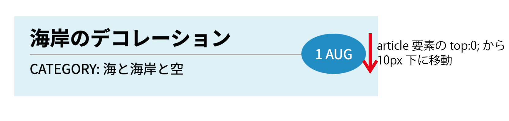
結果をこんな感じです。top,bottom,left,rightの値を変更することで自由自在にポジションを変えられます。
floatを使う(変化球パターン)
ちょっと変則的な使い方をします。floatの要素の回り込みの性質を利用したやり方です。正直あんまりおすすめのしないやり方で、今回の場合はたまたま要素の重なりっぽいデザインになったような感じです。
css
article {
  width: 500px;
}
time {
  background: #0097d8;
  color: #fff;
  padding: 20px;
  border-radius: 50%;
  float: right;
}
h2 {
  border-bottom: solid 2px #aaa;
  padding-bottom: 10px;
  margin-bottom: 10px;
}
メリットをあげるとすればコードが非常にシンプルなところでしょうか。これはこれで良いのですが正直褒められたような使い方ではないですね😅
ちなみにこれをさっきみたくボーダーの中心付近に配置したい場合は、timeにmargin-top: 10px;を追加すれば調整が可能です。
終わりに
今回は要素同士の重なりを作るCSSを紹介しました。またfloatのように通常の目的とは異なる使い方を知った時にはすごい斬新だなって思いました。皆さんも是非参考にして下さい。