デモ
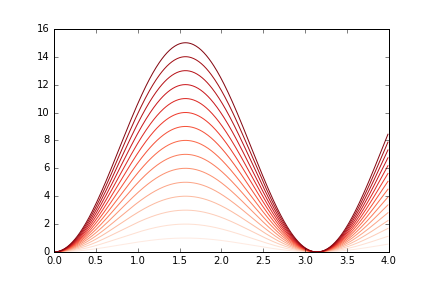
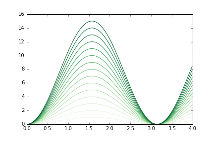
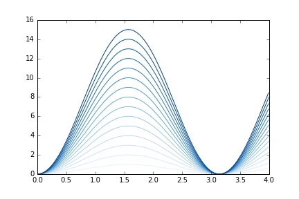
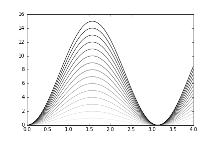
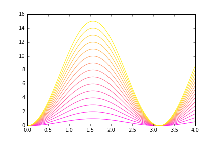
| カラーマップなし | カラーマップあり |
|---|---|
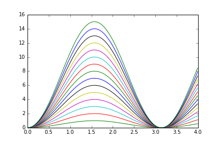 |
 |
方法
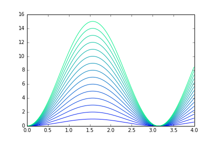
連続的なデータを扱うなら、カラーマップを利用することで美しいグラフを作成することができます。
カラーマップはplt.get_cmap()で取得します。取得したカラーマップに数値(0.0 ~ 1.0)を渡すことで、そのカラーマップ内の色を使うことができます。
demo.py
import numpy as np
import matplotlib.pyplot as plt

N = 16

x = np.arange(0, 4, 0.01)
y = [i * np.sin(x)**2 for i in xrange(N)]
cmap = plt.get_cmap("Blues")

for i in xrange(len(y)):
    plt.plot(x, y[i], c=cmap(float(i)/N))

plt.show()
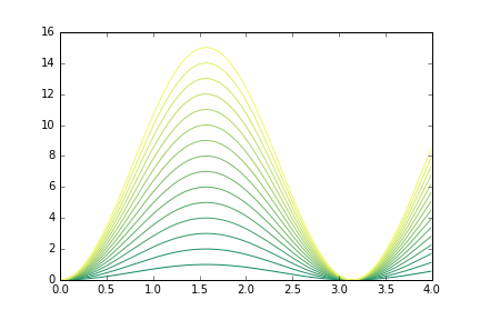
サンプル(一部)
| Reds | Greens | Blues | binary |
|---|---|---|---|
 |
 |
 |
 |
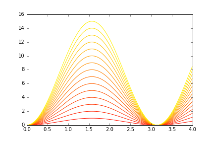
| spring | summer | autumn | winter |
|---|---|---|---|
 |
 |
 |
 |
その他のカラーマップはこちら
参考
matplotlib:自動で色分け - Qiita
http://qiita.com/konnyakmannan/items/ab297d53afd9dc94e0e8
color example code: colormaps_reference.py — Matplotlib 1.5.3 documentation
http://matplotlib.org/examples/color/colormaps_reference.html
現在のカラーマップの表示と設定 - MATLAB colormap - MathWorks 日本
http://jp.mathworks.com/help/matlab/ref/colormap.html