はじめに
タイトルの通り、状態に合わせて遷移するようなアニメーションを付与したボタンの作り方を解説したいと思います。
2025年 2/21更新
スマホ版で見ると、ボタンのsubmitのテキストの色が、buttonタグデフォルトの青色表示になっていることがわかったので、color: blackをsubmitButtonクラスに追加しました。
完成予想図
出来上がりのボタンは以下の通りです。
See the Pen sending-spinner-button6 by Yoshi2885 (@Yoshi2885) on CodePen.
`submit`と表示されているボタンをクリックすると、 送信中を示すクルクルが表示され、送信が完了したら✅マークが表示される様なものをイメージしています。作り方
ボタンを用意する
最初は、スタイルが全くない状態のボタンを用意します。
See the Pen sending-spinner-button1 by Yoshi2885 (@Yoshi2885) on CodePen.
Reactの部分を解説します。
コンポーネント部分の全文は以下の通りです。
const ChildComponent = () => {
  const [status, setStatus] = useState<"idle" | "sending" | "success">("idle");
  const clickAction = () => {
    if (status !== "idle") return;

    setStatus("sending");
    setTimeout(() => {
      setStatus("success");
      setTimeout(() => {
        setStatus("idle");
      }, 1500);
    }, 2500);
  };

  return (
    <>
      <div className="submitButtonContainer">
        <button className={`submitButton ${status}`} onClick={clickAction}>
          {status === "idle" ? "submit" : <></>}
        </button>
      </div>
    </>
  );
};
まずは、Buttonの部分から
  return (
    <>
      <div className="submitButtonContainer">
        <button className={`submitButton ${status}`} onClick={clickAction}>
          {status === "idle" ? "submit" : <></>}
        </button>
      </div>
    </>
  );
};
buttonタグには、classNameをsubmitButton と useStateで作っているstatusを入れています。
このstatusには、idle, sending, successの3種類の状態がそれぞれ入る様にしています。
したがって、共通のsubmitButtonクラスにデフォルトのボタンのスタイルを入れて、
submitButton + idle のクラスが付与されている時はボタンが押される前の状態のスタイルを
submitButton + sending のクラスが付与されている時は送信中のスタイルを
submitButton + success のクラスが付与されている時は送信完了時のスタイルをそれぞれ当てる様な戦略です。
ボタンの中身のテキストは、
{status === "idle" ? "submit" : <></>}
としていますが、
idleの状態の時のみsubmitの文字が必要なため三項演算子を用いて表現しています。
(もっと賢いやり方ある様な気もする…。)
onClickのメソッドは、
  const clickAction = () => {
    if (status !== "idle") return;

    setStatus("sending");
    setTimeout(() => {
      setStatus("success");
      setTimeout(() => {
        setStatus("idle");
      }, 1500);
    }, 2500);
  };
としてあり、擬似的に2.5s sending状態を維持し、次に 1.5s success状態を維持し、最後にidle状態に戻るような挙動を示すような形にしています。
また、1行目のif(status !== "idle") returnで、ボタンを連打しても1回しか反応しないようにしてあります。
ここまで何度も出てきているstatusの部分は、
const [status, setStatus] = useState<"idle" | "sending" | "success">("idle");
としていて、idle, sending, successの文字列のみ入るuseStateになっています。
共通のStyleを当てる
まずは、初期状態を示す様なスタイルを当てていこうと思います。
一番はじめにbuttonタグを囲っているdivタグのsubmitButtonContainerクラスにスタイルを当てて、いい感じの位置にボタンを表示させる様にします。
+ .submitButtonContainer {
+   display: flex;
+   justify-content: center;
+   align-items: center;
+   height: 80px;
+ }
次に、buttonタグのsubmitButtonクラスにスタイルを当てます。
.submitButtonContainer {
  display: flex;
  justify-content: center;
  align-items: center;
  height: 80px;

+ .submitButton {
+   width: 120px;
+   height: 36px;
+   border-radius: 18px;
+   font-weight: 600;
+   font-size: 14px;
+   color: black;
+ }
}
ここまで作ると、以下の様になります。
See the Pen sending-spinner-button1 by Yoshi2885 (@Yoshi2885) on CodePen.
ボーダーやボタンの背景などの色が違いますが、概形は完成しました。
idle状態のStyleを当てる
共通状態のスタイルを当てた段階で、基本的な部分は完成しているので、サクッとidle状態のスタイルを当てていきます。
.submitButtonContainer {
  display: flex;
  justify-content: center;
  align-items: center;
  height: 80px;

  .submitButton {
    width: 120px;
    height: 36px;
    border-radius: 18px;
    font-weight: 600;
    font-size: 14px;
    color: black;

+   &.idle {
+     background-color: white;
+     border: 2px solid coral;
+     cursor: pointer;
+   }
  }
}
&.idleと表記することで、submitButtonクラス とidleクラスの両方が当たっている時のスタイルを記述することができます。
ここでは
-
background-colorで背景色を白に -
borderで枠線の太さと色を -
cursorでマウスカーソルの状態を
それぞれ指定しました。
さらに、完成図のボタンを見ると、ホバーさせた時に背景色と文字色が変わっているので、scssに追加します。
.submitButtonContainer {
  display: flex;
  justify-content: center;
  align-items: center;
  height: 80px;

  .submitButton {
    width: 120px;
    height: 36px;
    border-radius: 18px;
    font-weight: 600;
    font-size: 14px;
    color: black;

    &.idle {
      background-color: white;
      border: 2px solid coral;
      cursor: pointer;

+     &:hover {
+       background-color: coral;
+       color: white;
+     }
    }
  }
}
&:hoverを定義するネストの場所に注意です。
submitBtton, idleクラスの2種類が共に当たっている時にhoverさせると色が変わる様にしたいので、
&.idleの中に記述する必要があります。
ここまで作ると以下の様になります。
See the Pen sending-spinner-button2 by Yoshi2885 (@Yoshi2885) on CodePen.
ホバーさせると色が変わる様になりましたね!💡
sending状態のStyleを作る
いよいよここからが本題です。
ボタンをクリックしたタイミングでsendingのクラスが当たる様になるので今度は、
submitButton + sendingのクラスが当たった時にクルクルが出るようにします。
.submitButtonContainer {
  display: flex;
  justify-content: center;
  align-items: center;
  height: 80px;

  .submitButton {
    width: 120px;
    height: 36px;
    border-radius: 18px;
    font-weight: 600;
    font-size: 14px;
    color: black;

    &.idle {
      background-color: white;
      border: 2px solid coral;
      cursor: pointer;

      &:hover {
        background-color: coral;
        color: white;
      }
    }

+   &.sending {
+     width: 36px;
+     background-color: white;
+     cursor: default;
+     border: 3px solid lightgray;
+     border-top-color: coral;
+   }
  }
}
追加したのは、
-
widthで幅を高さと同じ36pxにして円を作る -
background-colorで円の中央の色を白くする -
corsorをdefaultにすることで矢印ポインターに変更(クリックできなさそうに見える) -
borderでクルクルの円の太さ指定し色を明るいグレーに調整 -
border-top-colorで上の4分の1の範囲だけ色を変更
しています。
ここまで作成すると以下の通りです。
ボタンをクリックすると円に変わるのがわかると思います。
See the Pen sending-spinner-button3 by Yoshi2885 (@Yoshi2885) on CodePen.
ここからは、円のくるくるを回すアニメーションをつけていきます。
アニメーションは、
.submitButtonContainer {
  display: flex;
  justify-content: center;
  align-items: center;
  height: 80px;

  .submitButton {
    width: 120px;
    height: 36px;
    border-radius: 18px;
    font-weight: 600;
    font-size: 14px;
    color: black;

    &.idle {
      background-color: white;
      border: 2px solid coral;
      cursor: pointer;

      &:hover {
        background-color: coral;
        color: white;
      }
    }

    &.sending {
      width: 36px;
      background-color: white;
      cursor: default;
      border: 3px solid lightgray;
      border-top-color: coral;
+     animation: spin 2s 0.25s linear infinite;
    }
  }
}

+ @keyframes spin {
+   from {
+     transform: rotate(0deg);
+   }
+   to {
+     transform: rotate(360deg);
+   }
}
と記述します。
&.sendingの中で、animationを指定します。
今回は、無限に回転させたいので、
@keyframesでspinを定義し、0 ~ 360 deg 回転する様に設定します。
animation: spin 2s 0.25s linear infinite;
の部分は、
- 動作は
spinのkeyframesを使用する -
2sで一回転 - アニメーションの開始は
0.25s遅延させる -
linearで一定速度に回転させる(加減速させない) -
infinteで無限に繰り返し処理を行う
という処理を記述しています。
ここまで実装できたらこの様になります。
See the Pen sending-spinner-button4 by Yoshi2885 (@Yoshi2885) on CodePen.
だいぶそれっぽくなりました💡
success状態のStyleを作成する
3つ目の状態である送信完了を示すsuccess状態のスタイルを当てていきます。
基本はidle状態のボタンと同じ様なスタイルで、テキストがチェックマークであるところがちょっと違う…という感じです。
まずは、ボタンの背景色を調整します。
.submitButtonContainer {
  display: flex;
  justify-content: center;
  align-items: center;
  height: 80px;

  .submitButton {
    width: 120px;
    height: 36px;
    border-radius: 18px;
    font-weight: 600;
    font-size: 14px;
    color: black;

    &.idle {
      background-color: white;
      border: 2px solid coral;
      cursor: pointer;

      &:hover {
        background-color: coral;
        color: white;
      }
    }

    &.sending {
      width: 36px;
      background-color: white;
      cursor: default;
      border: 3px solid lightgray;
      border-top-color: coral;
      animation: spin 2s 0.25s linear infinite;
    }

+   &.success {
+     background-color: coral;
+     border: 2px solid coral;
+   }
  }
}

@keyframes spin {
  from {
    transform: rotate(0deg);
  }
  to {
    transform: rotate(360deg);
  }
}
たった4行の追加しかありませんが、今の状態でボタンをクリックするとこの様な形になります。
See the Pen sending-spinner-button4 by Yoshi2885 (@Yoshi2885) on CodePen.
チェックマークがまだ入っていないので、擬似要素を使ってテキストを入れていきます。
今回、チェックマークはFontAwesomeを使用しています。
そのため、CodePenではSettingからHTMLの部分を開き、
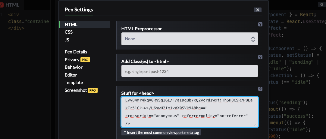
Stuff for <head>の部分に、
<link rel="stylesheet" href="https://cdnjs.cloudflare.com/ajax/libs/font-awesome/6.7.2/css/all.min.css" integrity="sha512-Evv84Mr4kqVGRNSgIGL/F/aIDqQb7xQ2vcrdIwxfjThSH8CSR7PBEakCr51Ck+w+/U6swU2Im1vVX0SVk9ABhg==" crossorigin="anonymous" referrerpolicy="no-referrer" />
を入れてください。
Reactの場合は、npmやyarnなどでfontAwesomeが使えるようにinstallをしてください。
擬似要素の部分のスタイルは以下の通りです。
.submitButtonContainer {
  display: flex;
  justify-content: center;
  align-items: center;
  height: 80px;

  .submitButton {
    width: 120px;
    height: 36px;
    border-radius: 18px;
    font-weight: 600;
    font-size: 14px;
    color: black;

    &.idle {
      background-color: white;
      border: 2px solid coral;
      cursor: pointer;

      &:hover {
        background-color: coral;
        color: white;
      }
    }

    &.sending {
      width: 36px;
      background-color: white;
      cursor: default;
      border: 3px solid lightgray;
      border-top-color: coral;
      animation: spin 2s 0.25s linear infinite;
    }

    &.success {
      background-color: coral;
      border: 2px solid coral;

+     &:after {
+       font-family: "Font Awesome 5 Free", sans-serif;
+       content: "\f00c";
+       font-weight: 900;
+       color: white;
+       font-size: 20px;
+     }
    }
  }
}

@keyframes spin {
  from {
    transform: rotate(0deg);
  }
  to {
    transform: rotate(360deg);
  }
}
font-familyでFontAwesomeを使用することを定義しています。
contentで\f00cと書いていますがチェックマークを表しています。
font-weightは900にしていますが好みの問題です←
colorで文字色を白色にし、
font-sizeは意外とチェックマークが小さかったのでバランスを取るために大きくしています。
まだ、パラパラ漫画のようなボタンの動作になっていますが、ほぼ完成した状態がこちらです。
See the Pen sending-spinner-button5 by Yoshi2885 (@Yoshi2885) on CodePen.
全体をなめらかに調整する
ここまで完成したらあとはなめらかにそれぞれのアニメーションを繋ぐ様にします。
.submitButtonContainer {
  display: flex;
  justify-content: center;
  align-items: center;
  height: 80px;

  .submitButton {
    width: 120px;
    height: 36px;
    border-radius: 18px;
    font-weight: 600;
    font-size: 14px;
    color: black;
+   transition: all 0.3s ease-in-out;

    &.idle {
      background-color: white;
      border: 2px solid coral;
      cursor: pointer;

      &:hover {
        background-color: coral;
        color: white;
      }
    }

    &.sending {
      width: 36px;
      background-color: white;
      cursor: default;
      border: 3px solid lightgray;
      border-top-color: coral;
      animation: spin 2s 0.25s linear infinite;
    }

    &.success {
      background-color: coral;
      border: 2px solid coral;

      &:after {
        font-family: "Font Awesome 5 Free", sans-serif;
        content: "\f00c";
        font-weight: 900;
        color: white;
        font-size: 20px;
      }
    }
  }
}

@keyframes spin {
  from {
    transform: rotate(0deg);
  }
  to {
    transform: rotate(360deg);
  }
}
最後1行追加するだけですが、パラパラ漫画の様だったボタンがぬるぬる動く様になります。
これで完成です。
See the Pen sending-spinner-button6 by Yoshi2885 (@Yoshi2885) on CodePen.
最後に
ネットに転がっていたおしゃれなボタンを自分で実装してみたのですが、完成状態のコードはあれど作り方ってなかなか載ってなくてどんなステップで作成すればいいか?が知りたいのに…となったのが正直なところでした。
せっかく自分で作ったので、そういった解説があってもいいかなと思い今回記事にしてみました。
完全に余談になりますが、日頃、scssは*.module.scssを使用しているので、
classNameの部分は、
  <div className={styles.submitButtonContainer}>
    <button
      className={`${styles.submitButton} ${styles[status]}`}
      onClick={clickAction}
    >
      {status === 'idle' ? 'submit' : <></>}
    </button>
  </div>
この様に記述すると、CodePenのクラスと同じように設定することができます。
特に注意しないといけないのが、
className={`${styles.submitButton} ${styles[status]}`}
の部分で、
className={`${styles.submitButton} ${styles.status}`}
この様に書いてしまい、
あれ?Style全然当たらねぇ…。とハマりやすいので要注意です。
styles.statusと書いてしまうと、statusクラスが付与されてしまいます💦(直近3連敗中)
複数クラスを当てながら上手に状態遷移させることでおしゃれなアニメーションのボタンが作れる様になりますのでぜひ参考にしながら実装に挑戦してみてください。