はじめに
今回はCSSによる中央寄せについてまとめていきます。
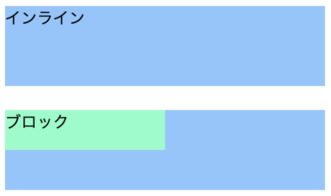
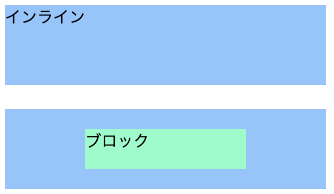
HTMLとCSSの初期状態
中央寄せする前のHTMLとCSSは次のようになります。
<div class="inline-outer">
  <span class="inline-inner">インライン</span>
</div>
<br>
<div class="block-outer">
  <div class="block-inner">ブロック</div>
</div>
.inline-outer {
  background-color: #8bc6ff;
  width: 320px;
  height: 80px;
}

.inline-inner {

}

.block-outer {
  background-color: #8bc6ff;
  width: 320px;
  height: 80px;
}

.block-inner {
  background-color: #7fffc8;
  width: 160px;
  height: 40px;
}
line-height
次のような特徴があります。
- インライン要素の上下中央寄せ
- 子要素が1行の場合のみ有効
- heightとline-heightの値を合わせる
.inline-outer {
  background-color: #8bc6ff;
  width: 320px;
  height: 80px;

  line-height: 80px;
}

.inline-inner {

}

.block-outer {
  background-color: #8bc6ff;
  width: 320px;
  height: 80px;

  line-height: 80px;
}

.block-inner {
  background-color: #7fffc8;
  width: 160px;
  height: 40px;
}
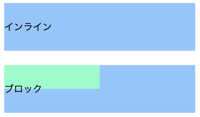
インライン要素が上下中央寄せされています。
ブロック要素は上下中央寄せされず、その中のテキストが上下中央寄せされています。
また、インライン要素が2行以上の場合、2行目以降がはみ出てしまいます。

position, transform, top, left
次のような特徴があります。
- インライン要素、ブロック要素の中央寄せ
- 親要素に「position: relative」、子要素に「position: absolute」を指定する
- 上下中央寄せの場合、子要素に「top: 50%」と「transform: translateY(-50%)」を指定する
- 左右中央寄せの場合、子要素に「left: 50%」と「transform: translateX(-50%)」を指定する
- 上下左右中央寄せの場合、子要素に「top: 50%」「left: 50%」と「transform: translate(-50%, -50%)」を指定する
どのような動きとなるか、上下中央寄せの場合で説明します(左右中央寄せも同じです)
positionの指定により、子要素は親要素を基準とした絶対位置に配置されます。
そしてtopの指定により、子要素は親要素の上下中央に配置されます。
しかし、このままでは親要素の上下中央に来るのは子要素の一番上の部分となります。
そこでtransformの指定により、子要素を半分だけ上に移動しています。
次のCSSは、上下左右中央寄せをした場合です。
.inline-outer {
  background-color: #8bc6ff;
  width: 320px;
  height: 80px;

  position: relative;
}

.inline-inner {
  position: absolute;
  transform : translate(-50%,-50%);
  top: 50%;
  left: 50%;
}

.block-outer {
  background-color: #8bc6ff;
  width: 320px;
  height: 80px;

  position: relative;
}

.block-inner {
  background-color: #7fffc8;
  width: 160px;
  height: 40px;

  position: absolute;
  transform : translate(-50%,-50%);
  top: 50%;
  left: 50%;
}
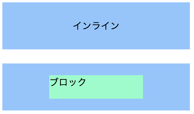
text-align
次のような特徴があります。
- インライン要素の左右中央寄せ
.inline-outer {
  background-color: #8bc6ff;
  width: 320px;
  height: 80px;

  text-align:center
}

.inline-inner {

}

.block-outer {
  background-color: #8bc6ff;
  width: 320px;
  height: 80px;

  text-align:center
}

.block-inner {
  background-color: #7fffc8;
  width: 160px;
  height: 40px;
}

インライン要素が左右中央寄せされています。
ブロック要素は左右中央寄せされず、その中のテキストが左右中央寄せされています。
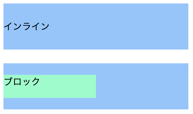
margin
次のような特徴があります。
- ブロック要素の左右中央寄せ
.inline-outer {
  background-color: #8bc6ff;
  width: 320px;
  height: 80px;
}

.inline-inner {
  margin: auto;
}

.block-outer {
  background-color: #8bc6ff;
  width: 320px;
  height: 80px;
}

.block-inner {
  background-color: #7fffc8;
  width: 160px;
  height: 40px;

  margin: auto;
}

ブロック要素が左右中央寄せされています。
インライン要素は左右中央寄せされていません。
また、どちらも上下中央寄せはされていません。
display, justify-content, align-items
次のような特徴があります。
- インライン要素、ブロック要素の中央寄せ
- 左右中央寄せの場合、「justify-content: center」を指定する
- 上下中央寄せの場合、「align-items」を指定する
.inline-outer {
  background-color: #8bc6ff;
  width: 320px;
  height: 80px;

  display: flex;
  justify-content: center;
  align-items: center;
}

.inline-inner {

}

.block-outer {
  background-color: #8bc6ff;
  width: 320px;
  height: 80px;

  display: flex;
  justify-content: center;
  align-items: center;
}

.block-inner {
  background-color: #7fffc8;
  width: 160px;
  height: 40px;
}

vertical-align, display
次のような特徴があります。
- インライン要素、ブロック要素の上下中央寄せ
- 「vertical-align:middle」は「display: table-cell」の子要素に有効
.inline-outer {
  background-color: #8bc6ff;
  width: 320px;
  height: 80px;

  display:  table-cell;
  vertical-align: middle;
}

.inline-inner {

}

.block-outer {
  background-color: #8bc6ff;
  width: 320px;
  height: 80px;

  display:  table-cell;
  vertical-align: middle;
}

.block-inner {
  background-color: #7fffc8;
  width: 160px;
  height: 40px;
}
position, margin
次のような特徴があります。
- ブロック要素の上下左右中央寄せ
- 親要素に「position: relative」、子要素に「position: absolute」を指定する
- 子要素のtop、right、bottom、leftをauto以外に指定する
- 子要素のmarginをautoに指定する
なぜ「margin: auto」とは違って上下中央寄せされるのかというと、
次の条件を満たしている場合、上下のmarginは等しい扱いになるためです。
- top、bottom、heightがauto以外
- margin-top、margin-bottomがauto
次の記事が大変参考になります。
position: absolute; の指定で要素が上下左右中央配置になる理由
.inline-outer {
  background-color: #8bc6ff;
  width: 320px;
  height: 80px;

  position: relative;
}

.inline-inner {
  position: absolute;
  top: 0;
  right: 0;
  bottom: 0;
  left: 0;
  margin: auto;
}

.block-outer {
  background-color: #8bc6ff;
  width: 320px;
  height: 80px;

  position: relative;
}

.block-inner {
  background-color: #7fffc8;
  width: 160px;
  height: 40px;

  position: absolute;
  top: 0;
  right: 0;
  bottom: 0;
  left: 0;
  margin: auto;
}
おわりに
他にも中央寄せの方法はあると思いますが、ざっとまとめただけでも方法がたくさんあることが分かりました。
方法によってはブラウザに対応していなかったりなどするので、色々な方法を知っていた方が良さそうです。