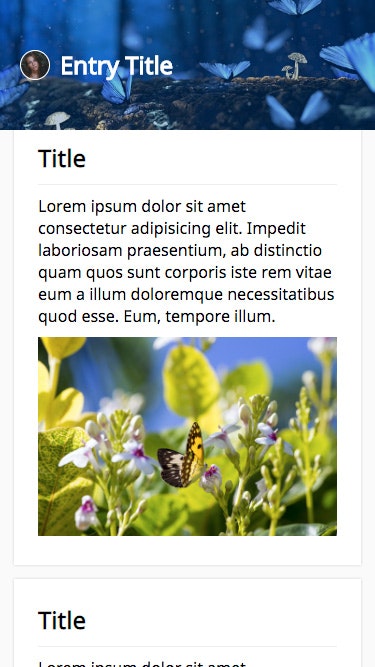
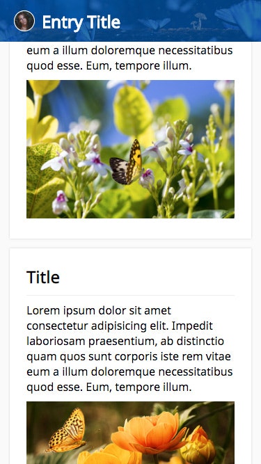
先日のサンプルは画面内判定で toggle class を発火するだけのものでした。本日は Hero image を header に変形させるサンプルの紹介です。スクロール 1px 単位で要素矩形を変形させます。
code: github / $ yarn 1208
 |
 |
 |
|---|
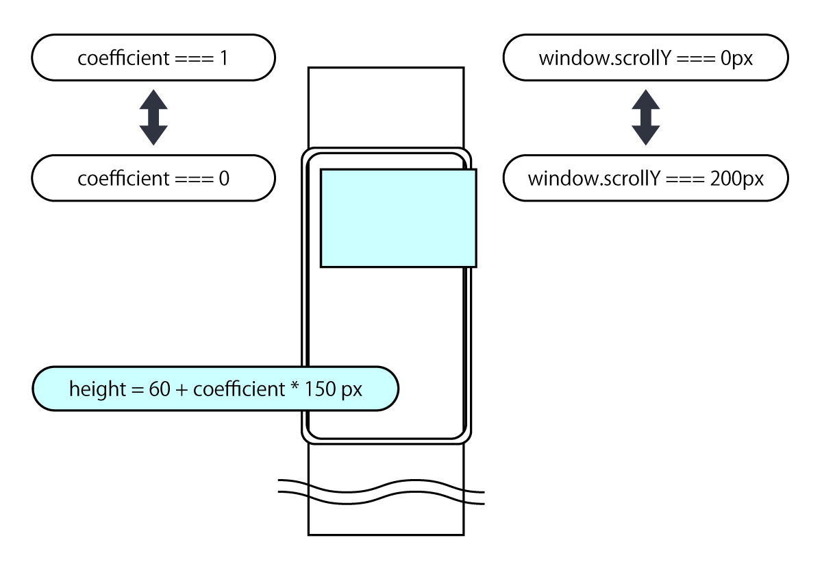
Component 概要図
ある要素は、所定始点から終点までの間を 0〜1 の係数として、プロパティに変化を与えられます。今回の例では、window.scrollY = 0px〜200px の間を 1〜0 とし、150px 加算の係数としています。
0〜1 の値が得られるので、係数利用で様々な inline-style を構築することが出来ます。Hero image 以外の要素にも適用出来るので遊んでみてください。
なお、ランディングページなどでは派手な演出効果として有効かもしれませんが、アプリケーションを作っている場合、この効果の多様は鬱陶しいだけのものになり兼ねません。目的を明確にし、機能と連動する有益な効果にしましょう。
Context API / Provider 構成
今日はこのカレンダーサンプル集で、初めて Context API を利用します。まず始めに、createContext で空の Context を作成します。サンプルでは TypeScript を利用しているので、assertion を付与します。最新の@types/react で既に hooks の型定義が入っているので、そちらを利用します。(この箇所はカレンダー公開時から変更が入っていますので、現行のリポジトリを参照ください。)
export const CTX = createContext({} as {
  coefficient: number
  updateCoefficient: Dispatch<SetStateAction<number>>
})
次に、useState の戻り値を Provider の初期値として注入します。
export default (props: Props) => {
  const [coefficient, updateCoefficient] = useState(1)
  return (
    <Provider value={{ coefficient, updateCoefficient }}>
      {props.children}
    </Provider>
  )
}
今回は Custom Hooks を用意せず、Wrapper Component に記述しています。今までと同様に、lodash.throttle と lodash.merge を利用します。
export default (props: Props) => {
  const { updateCoefficient } = useContext(CTX)
  const options = useMemo(
    (): Options =>
      merge(defaultOptions(), {
        threthold: props.threthold,
        throttleInterval: props.throttleInterval
      }),
    [props.threthold, props.throttleInterval]
  )
  const handleScroll = useCallback(
    throttle(() => {
      const diff = options.threthold - window.scrollY
      const offset = diff > 0 ? diff : 0
      const coefficient = offset / options.threthold
      updateCoefficient(coefficient)
    }, options.throttleInterval),
    [options.threthold, options.throttleInterval]
  )
  useEffect(() => {
    handleScroll()
    window.addEventListener('scroll', handleScroll)
    return () =>
      window.removeEventListener('scroll', handleScroll)
  }, [])
  return (
    <div className={props.className}>{props.children}</div>
  )
}
ここまでで用意したものを組み立てると以下の構成になります。(Head Component に指定している props は、Hooks や Context API とは無関係)
const View = (props: Props) => (
  <>
    <Provider>
      <Wrapper className={props.className}>
        <Head
          title={'Entry Title'}
          subTitle={'subTitle'}
          avatorImgSrc={require('../assets/avator.jpg')}
          bgImgSrc={require('../assets/hero.jpg')}
          bgColor={'#004c94'}
        />
      </Wrapper>
    </Provider>
    <Body />
    <Footer />
  </>
)
Container Component
ContextAPI では createContext で同時に Consumer が得られますが、useContext を利用する場合はそれは不要になります。useContext する層は、Redux の connect 相当の働きをするため Container と呼んでいます。接続する context に変化がある度この層は再実行対象になります。下層コンポーネントへの不要な伝搬をブロックするため、ここで memoize します。
export default (props: ContainerProps) => {
  const { coefficient } = useContext(CTX)
  const isHide = useMemo(() => coefficient < 0.5, [
    coefficient
  ]) // 表示エリアが半分になったらヘッダーに変形させるフラグ
  const nodeStyle = useMemo(
    () => ({ height: 60 + coefficient * 150 }),
    [coefficient]
  )
  const bgStyle = useMemo(
    () => ({
      opacity: coefficient + 0.2,
      transform: `scale(${1 + coefficient * 0.2})`
    }),
    [coefficient]
  )
  return useMemo(
    () => (
      <StyledView
        isHide={isHide}
        bgStyle={bgStyle}
        nodeStyle={nodeStyle}
        {...props}
      />
    ),
    [isHide, nodeStyle, bgStyle]
  )
}
変化が必要なタイミングで props が styled-components を経由し、子コンポーネントへ伝播します。
const StyledView = styled(View)`...`
const View = (props: Props) => (
  <div className={props.className}>
    <div className="bg" style={props.bgStyle} />
    <div className="wrapper" style={props.nodeStyle}>
      <Photo
        isHide={props.isHide}
        imgSrc={props.avatorImgSrc}
      />
      <Description
        title={props.title}
        subTitle={props.subTitle}
        isHide={props.isHide}
      />
    </div>
  </div>
)
Child Component
子コンポーネントにあたるサムネイル画像です。description が隠れている状態フラグを「isHide」として受領します。ここでも、styled-components の高階コンポーネントで memoize します。
export default (props: ContainerProps) => {
  const nodeStyle = useMemo(
    () => {
      return props.isHide
        ? {
            transform: `scale(.5) translateX(-30px)`
          }
        : { transform: `scale(1) translateX(0px)` }
    },
    [props.isHide]
  )
  return useMemo(
    () => (
      <StyledView
        nodeStyle={nodeStyle}
        imgSrc={props.imgSrc}
      />
    ),
    [nodeStyle]
  )
}
算出した props は StyledView を経由し、FC に到達します。
const StyledView = styled(View)`...`
const View = (props: Props) => (
  <p className={props.className} style={props.nodeStyle} />
)