本記事は岩手県立大学 Advent Calendar 2019 4日目の記事です。
はじめに

Webページを作っているとアスペクト比を設定できる<img>タグが欲しいと思うことがありました。
これまではCSSの@media screenとか:beforeで頑張って実現していましたが、理解が難しいです。
その割に使いたい場面は結構あります(部品化したい)。
そのため、今回は**「CSSを頑張らない」アスペクト比を設定できるVueコンポーネント**を作っていきます。
(jQueryで実現する方法もあるみたいですが、私はjQueryを使ったことがないのでスルーします。)
CSSでアスペクト比を設定するときに困ること
width: 100%にしたいときの高さが定まらない
基本的に<img>の縦横サイズはwidth: 640px; height: 360pxという感じでpxで設定します。そうしないと好きなアスペクト比に設定できません。
それではwidth: 100%の時、実際の要素の横は何pxで、縦は何pxにするのでしょうか?
私も若かりし頃は、width: 100%; height: 56.25%とすればいけるんじゃね?と思っていましたが、それでは高さは0になってしまいます。
<div>
  <img src="..." style="width: 100%; height: 56.25%">
  <!-- 高さは0!! -->
</div>
これは、そもそも親の要素の高さが指定されていないからです。
したがって、動的にwidthとheightを〇〇pxで設定することが必要です。
コーディングのおことわり
- Vue単一ファイルコンポーネントで記述します
- TypeScriptで書きます
- style部はStylus記法で書きます
- vue-property-decoratorを使います
- class styleでコンポーネントを定義します
実装したコード
<template>
<div class="v-aspect-ratio-img" :style="style">
  <img :src="imageData">
</div>
</template>
<script lang="ts">
import { Vue, Component, Prop } from 'vue-property-decorator'
@Component
export default class VueAspectRatioImage extends Vue {
  @Prop({ type: String, required: false, default: '128x128' })
  size!: string

  @Prop({ type: Number, required: false, default: 0 })
  aspectRatio!: number // height/width

  @Prop({ type: Boolean, required: false, default: false })
  fullWidth!: boolean

  @Prop({ type: String, required: false, default: null })
  refName!: string|null

  @Prop({ type: String, required: false, default: 'px' })
  unit!: string

  @Prop({ type: String, default: '', required: false })
  src!: string

  clientWidth: number|null = null

  mounted() {
    this.handleResize()
    // 画面サイズ変更イベント
    window.addEventListener('resize', this.handleResize)
  }
  beforeDestory() {
    window.removeEventListener('resize', this.handleResize)
  }

  handleResize() {
    if (this.refName) {
      const vc = this.$parent.$refs[this.refName] as any
      if (vc && Array.isArray(vc)) {
        try {
          vc[0].$el.style.minWidth = '0'
          this.clientWidth = vc[0].$el.clientWidth
        } catch {
          this.clientWidth = null
        }
      } else if (vc) {
        vc.$el.style.minWidth = '0'
        this.clientWidth = vc.$el.clientWidth
      }
    }
  }

  get imageData() {
    if (this.src.indexOf('http') === 0 || this.src.indexOf('data:image') === 0) {
      return this.src
    } else if (this.src) {
      return require('../assets/' + this.src)
    } else {
      return ''
    }
  }

  get style() {
    let width = '128'
    let height = '128'
    if (/\d+x\d+/.test(this.size)) {
      width = this.size.split('x')[0]
      height = this.size.split('x')[1]
    }

    if (this.fullWidth && this.refName && this.clientWidth) {
      width = String(this.clientWidth)
    }

    if (this.aspectRatio > 0) {
      height = String(this.aspectRatio * parseInt(width))
    }

    return {
      width: this.fullWidth ? '100%' : `${width}${this.unit}`,
      height: `${height}${this.unit}`,
      minWidth: `${width}${this.unit}`
    }
  }
}
</script>
<style lang="stylus" scoped>
.v-aspect-ratio-img
  img
    width 100%
    height 100%
    object-fit cover
</style>
コード解説
<templete>部
<template>
<div class="v-aspect-ratio-img" :style="style">
  <img :src="imageData">
</div>
</template>
ポイント
-
<img>を囲む<div>に動的スタイルを適用すること
ここで<img>だけに動的スタイルを適用すると、このコンポーネント全体の横幅は常に100%になります。(divがblock要素だから)
<script>の@Prop群
  @Prop({ type: String, required: false, default: '128x128' })
  size!: string

  @Prop({ type: Number, required: false, default: 0 })
  aspectRatio!: number // height÷width

  @Prop({ type: Boolean, required: false, default: false })
  fullWidth!: boolean

  @Prop({ type: String, required: false, default: null })
  refName!: string|null

  @Prop({ type: String, required: false, default: 'px' })
  unit!: string

  @Prop({ type: String, default: '', required: false })
  src!: string
上からそれぞれ
size
縦横のサイズを決めます。
単位は他のPropで決めるので、ここでは256x256という感じで書きます。
(ここでは横 x 縦)
aspectRatio
アスペクト比を決めます。縦÷横の値。
横16:縦9ならば、9 ÷ 16 = 0.5625 です。
fullWidth
横いっぱいにするか決めます。
この場合でもアスペクト比は保たれます。
【重要】refName
このコンポーネントからみた親コンポーネントで設定するref属性名です。
これがないとwidth:100%の時の自身の横幅がわかりません。
unit
サイズの単位です。sizeで20x20、unitでremとすると、
width: 20rem;
height: 20rem;
とスタイリングされます。
src
画像URLを指定します。
コード中で<img :src="imageData">となっているのは、外部またはassets内のどちらからでも画像を参照できるように工夫するためです。
<script>のmounted()とbeforeDestory()
  mounted() {
    this.handleResize()
    // 画面サイズ変更イベント
    window.addEventListener('resize', this.handleResize)
  }
  beforeDestory() {
    window.removeEventListener('resize', this.handleResize)
  }
ポイント
-
mounted()で画面サイズが変更されたときにhandleResize()が呼ばれるように設定する。 - beforeDestoryでイベントリスナーを取り消す
<script>のhandleResize()
  handleResize() {
    if (this.refName) {
      const vc = this.$parent.$refs[this.refName] as any
      if (vc && Array.isArray(vc)) {
        try {
          vc[0].$el.style.minWidth = '0'
          this.clientWidth = vc[0].$el.clientWidth
        } catch {
          this.clientWidth = null
        }
      } else if (vc) {
        vc.$el.style.minWidth = '0'
        this.clientWidth = vc.$el.clientWidth
      }
    }
  }
ここではrefNameを使って、このコンポーネント自身のサイズを測定します。
正確には、width:100%の時の横幅を測定します。
3行目
const vc = this.$parent.$refs[this.refName] as any
ここで自身のVueComponentを取得します。(vcはその略)
7行目
this.clientWidth = vc[0].$el.clientWidth
ここで自身の横幅を測定します。
その他
if (vc && Array.isArray(vc)) {
...
} else if (vc) {
という条件分岐を書いているのは、場合によってはvcが配列になるからです。
<script>のget imageData()
  get imageData() {
    if (this.src.indexOf('http') === 0 || this.src.indexOf('data:image') === 0) {
      return this.src
    } else if (this.src) {
      return require('../assets/' + this.src)
    } else {
      return ''
    }
  }
算出プロパティです。
ここでは、Propのsrcに外部URL(https://~)とassets内のファイル名のどちらが設定されても画像を参照できるようにしています。
ポイントはassets内のファイルを参照する時に、require(..)を使うことです。
<script>のget style()
  get style() {
    let width = '128'
    let height = '128'
    if (/\d+x\d+/.test(this.size)) {
      width = this.size.split('x')[0]
      height = this.size.split('x')[1]
    }

    if (this.fullWidth && this.refName && this.clientWidth) {
      width = String(this.clientWidth)
    }

    if (this.aspectRatio > 0) {
      height = String(this.aspectRatio * parseInt(width))
    }

    return {
      width: this.fullWidth ? '100%' : `${width}${this.unit}`,
      height: `${height}${this.unit}`,
      minWidth: `${width}${this.unit}`
    }
  }
算出プロパティです。
ここでアスペクト比を保つように動的にスタイルしています。
4~7行目
    if (/\d+x\d+/.test(this.size)) {
      width = this.size.split('x')[0]
      height = this.size.split('x')[1]
    }
正規表現を使って、@Prop sizeの256x256などの文字列をパースします。
9~11行目
    if (this.fullWidth && this.refName && this.clientWidth) {
      width = String(this.clientWidth)
    }
@Prop fullWidthがtrueのときに、横いっぱいになるようにwidthを指定してます。
handleResize()で測定したclientWidthはwidthが100%の時の値です。
13~15行目
    if (this.aspectRatio > 0) {
      height = String(this.aspectRatio * parseInt(width))
    }
アスペクト比が設定された場合、heightを更新します。
17~21行目
    return {
      width: this.fullWidth ? '100%' : `${width}${this.unit}`,
      height: `${height}${this.unit}`,
      minWidth: `${width}${this.unit}`
    }
最終的にCSSの形のオブジェクトを返します。
このコンポーネントの利用方法
    <v-aspect-ratio-img
      src="background-sky.png"
      :fullWidth="true"
      ref="image3"
      ref-name="image3"
      :aspect-ratio="0.5625"
    />
実行イメージ
| PC | スマホ |
|---|---|
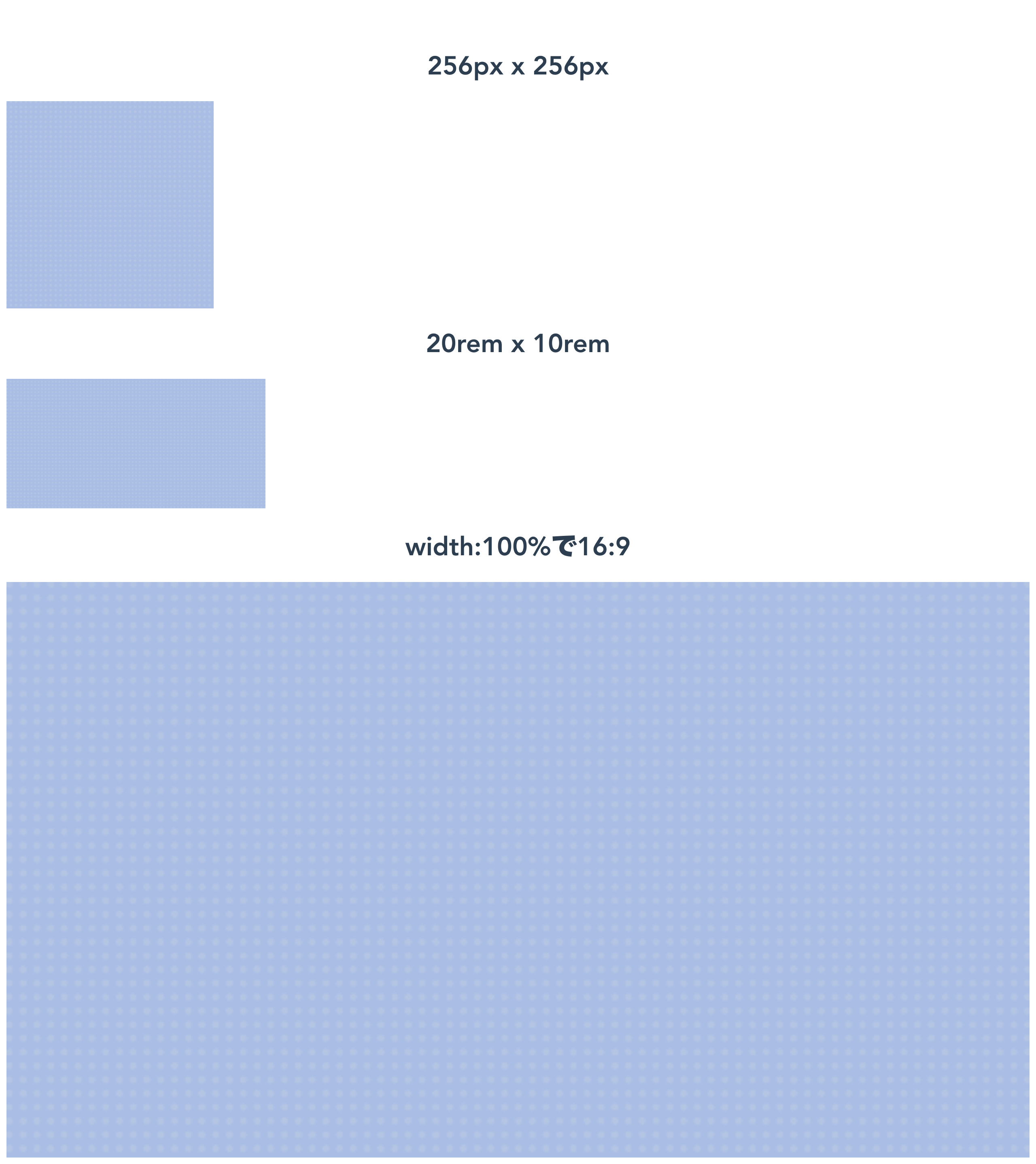 |
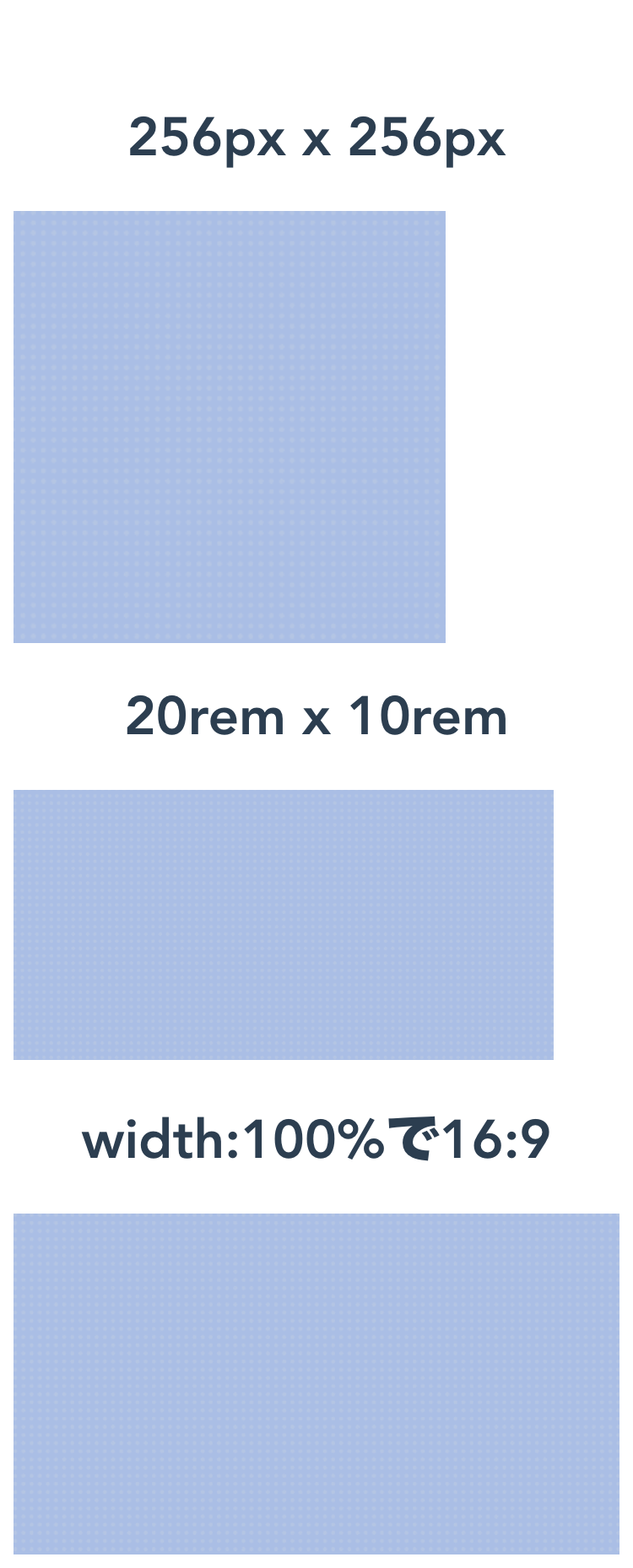 |
終わりに
Vueで好きな部品を作れるようになったので、コードを再利用することを前提に書いていけるのがいいですね。