はじめに
前回の記事「[SVGで作るかわいいキャラクターアニメーション - 表情の動きを実装してみよう]」では、SVGを使ってキャラクターの表情アニメーションを実装しました。今回は、そのキャラクターにさらに魅力的な動きを追加する方法を解します。
実装する動きの概要
今回追加する動きは以下の3種類です:
- ジャンプするような上下の動き
- くるくると回転する動き
- 跳ねるような伸縮の動き
完成イメージ

SVGアニメーションの基本
まず、SVGのanimateTransform要素について理解しましょう。これは要素の変形アニメーションを定義するために使用します。
<animateTransform
  attributeName="transform"  // 変形属性
  type="translate|rotate|scale"  // 変形の種類
  values="..."  // アニメーションの値
  dur="2s"  // アニメーション時間
  repeatCount="indefinite"  // 繰り返し
  additive="sum"  // アニメーションの合成
/>
動きの実装手順
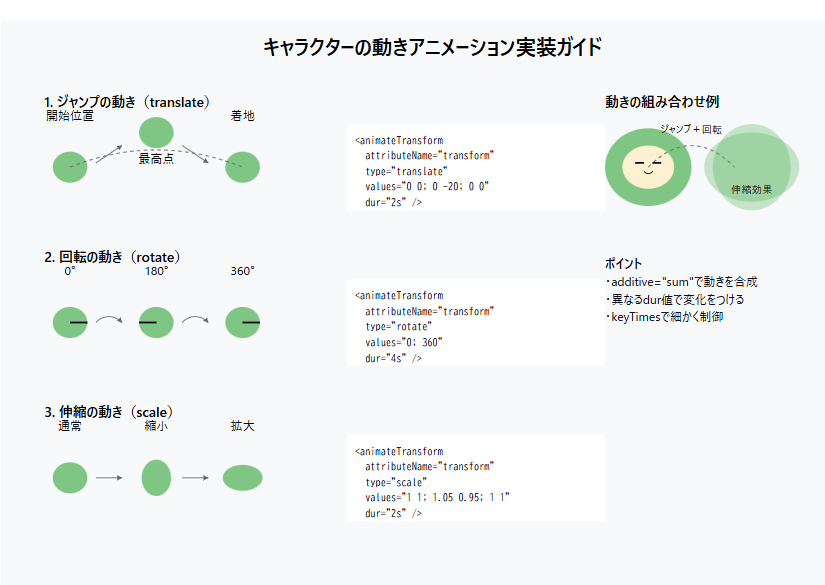
1. 上下の動き(ジャンプ)
最初に、キャラクターが上下に動くアニメーションを追加します。
<g id="character">
  <!-- 上下の動き -->
  <animateTransform
    attributeName="transform"
    type="translate"
    values="0 0; 0 -20; 0 -15; 0 0"
    dur="2s"
    repeatCount="indefinite" />

  <!-- キャラクターの各パーツ -->
  ...
</g>
ポイント解説
-
valuesの値は「Y座標0 → -20px → -15px → 0」と変化 -
dur="2s"で2秒周期の動き - 中間点(-15px)を入れることで、自然な落下の動きを表現
2. 回転の動き
ジャンプと組み合わせて、くるくると回転する動きを追加します。
<!-- くるくる回転 -->
<animateTransform
  attributeName="transform"
  type="rotate"
  values="0; 0; 360; 360; 0"
  dur="4s"
  repeatCount="indefinite"
  additive="sum" />
ポイント解説
-
values="0; 0; 360; 360; 0"で1回転を表現 -
additive="sum"で上下の動きと合成 - 最初と最後に同じ角度を入れることでスムーズな動きに
3. 伸縮の動き
ジャンプ時の躍動感を出すため、伸縮のアニメーションを追加します。
<!-- ポップな伸縮 -->
<animateTransform
  attributeName="transform"
  type="scale"
  values="1 1; 1.05 0.95; 1 1"
  dur="2s"
  repeatCount="indefinite"
  additive="sum" />
ポイント解説
- X方向に1.05倍、Y方向に0.95倍で潰れる動き
- ジャンプのタイミングと合わせることで立体感が出る
アニメーションの組み合わせ方
1. 基本的な組み合わせ方
<g id="character">
  <!-- 上下の動き -->
  <animateTransform id="jump" .../>
  <!-- 回転 -->
  <animateTransform id="rotate" .../>
  <!-- 伸縮 -->
  <animateTransform id="scale" .../>

  <!-- キャラクターの要素 -->
  ...
</g>
2. タイミング調整のコツ
-
durの値を調整して動きの速さを変更 -
valuesの中間点を追加してより細かい動きを表現 - アニメーション周期を互いに素な数字にすることで変化のある動きに
カスタマイズ例
1. よりアクティブな動き
<!-- 高くジャンプ -->
<animateTransform
  attributeName="transform"
  type="translate"
  values="0 0; 0 -30; 0 -25; 0 0"
  dur="1.5s"
  repeatCount="indefinite" />

<!-- 速い回転 -->
<animateTransform
  attributeName="transform"
  type="rotate"
  values="0; 0; 720; 720; 0"
  dur="3s"
  repeatCount="indefinite"
  additive="sum" />
2. よりゆっくりな動き
<!-- ゆっくりジャンプ -->
<animateTransform
  attributeName="transform"
  type="translate"
  values="0 0; 0 -15; 0 -12; 0 0"
  dur="3s"
  repeatCount="indefinite" />
実装時の注意点
1. パフォーマンスへの配慮
- 複数のアニメーションを組み合わせると負荷が高くなる
- 必要最小限のアニメーションにとどめる
- 変形の原点(transform-origin)に注意
2. ブラウザ対応
- 基本的なSVGアニメーションは広くサポート
- 複雑な組み合わせは事前テストが推奨
- fallback処理の検討
3. アニメーションの最適化
- 動きが不自然にならないよう中間点を適切に設定
- アニメーション時間は人間の知覚に合わせて調整
- 過剰な動きは避ける
まとめ
SVGのアニメーション機能を使うことで、JavaScriptなしでもダイナミックな動きを実現できます。
ポイントは:
- 基本的な動きの組み合わせ
- タイミングの適切な調整
- パフォーマンスへの配慮
キャラクターの性格や用途に合わせて、動きのパラメータを調整してみてください。
参考資料
実装例
htmlで保存してブラウザで表示するとアニメーションを確認することができます。
<svg width="200" height="200" viewBox="-100 -100 200 200" xmlns="http://www.w3.org/2000/svg">
  <g id="character">
    <!-- 基本的な上下の動き -->
    <animateTransform
      attributeName="transform"
      type="translate"
      values="0 0; 0 -20; 0 -15; 0 0"
      dur="2s"
      repeatCount="indefinite" />

    <!-- くるくる回転 -->
    <animateTransform
      attributeName="transform"
      type="rotate"
      values="0; 0; 360; 360; 0"
      dur="4s"
      repeatCount="indefinite"
      additive="sum" />

    <!-- ポップな伸縮 -->
    <animateTransform
      attributeName="transform"
      type="scale"
      values="1 1; 1.05 0.95; 1 1"
      dur="2s"
      repeatCount="indefinite"
      additive="sum" />

    <!-- 以下、元の形状をそのまま維持 -->
    <!-- 本体(緑色) -->
    <ellipse cx="0" cy="0" rx="50" ry="45" fill="#4CAF50"></ellipse>

    <!-- 顔部分(クリーム色の緑部分) -->
    <ellipse cx="0" cy="0" rx="30" ry="25" fill="#FDF1D2"></ellipse>

    <!-- 左葉 -->
    <path d="M -20 -32 C -30 -50, -10 -60, -15 -40 C -18 -35, -18 -35, -20 -32 Z" fill="#4CAF50" />
    <path d="M -20 -34 C -27 -47, -13 -52, -16 -40 C -18 -37, -18 -37, -20 -34 Z" fill="#FFD83D" />

    <!-- 右葉 -->
    <path d="M 20 -32 C 30 -50, 10 -60, 15 -40 C 18 -35, 18 -35, 20 -32 Z" fill="#4CAF50" />
    <path d="M 20 -34 C 27 -47, 13 -52, 16 -40 C 18 -37, 18 -37, 20 -34 Z" fill="#FFD83D" />

    <!-- 左目 -->
    <path id="left-eye" d="M -20 -5 L -10 -5" stroke="#000" stroke-width="2" fill="none">
      <animate
        attributeName="d"
        values="
          M -20 -5 A 5 5 0 1 1 -10 -5;
          M -18 -8 L -12 -2 L -18 4;
          M -20 -8 Q -15 -3 -10 -8;
          M -20 -5 L -10 -5;
          M -20 -5 A 5 5 0 1 1 -10 -5"
        dur="2s"
        repeatCount="indefinite"
        keyTimes="0;0.25;0.5;0.75;1" />
    </path>

    <!-- 右目 -->
    <path id="right-eye" d="M 10 -5 L 20 -5" stroke="#000" stroke-width="2" fill="none">
      <animate
        attributeName="d"
        values="
          M 10 -5 A 5 5 0 1 1 20 -5;
          M 13 -8 L 17 -2 L 13 4;
          M 10 -8 Q 15 -3 20 -8;
          M 10 -5 L 20 -5;
          M 10 -5 A 5 5 0 1 1 20 -5"
        dur="2s"
        repeatCount="indefinite"
        keyTimes="0;0.25;0.5;0.75;1" />
    </path>

    <!-- 口 -->
    <path id="mouth" d="M -5 5 Q 0 10 5 5" stroke="#000" stroke-width="1" fill="none">
      <animate
        attributeName="d"
        values="
          M -5 5 Q 0 10 5 5;
          M -5 5 Q 0 0 5 5;
          M -5 5 Q 0 12 5 5;
          M -5 7 Q 0 3 5 7;
          M -5 5 Q 0 10 5 5"
        dur="2s"
        repeatCount="indefinite"
        keyTimes="0;0.25;0.5;0.75;1" />
    </path>

    <!-- ヒゲ(直線) -->
    <!-- 左側のヒゲ -->
    <line x1="-20" y1="0" x2="-35" y2="0" stroke="#000" stroke-width="1"></line>
    <line x1="-20" y1="5" x2="-35" y2="7" stroke="#000" stroke-width="1"></line>
    <line x1="-20" y1="10" x2="-35" y2="14" stroke="#000" stroke-width="1"></line>

    <!-- 右側のヒゲ -->
    <line x1="20" y1="0" x2="35" y2="0" stroke="#000" stroke-width="1"></line>
    <line x1="20" y1="5" x2="35" y2="7" stroke="#000" stroke-width="1"></line>
    <line x1="20" y1="10" x2="35" y2="14" stroke="#000" stroke-width="1"></line>

    <!-- しっぽ -->
    <path d="M 35 30 C 45 40, 60 35, 50 20 C 45 10, 40 20, 35 30 Z" fill="#4CAF50" />
  </g>
</svg>