はじめに
Webサイトやアプリケーションに可愛らしいキャラクターを追加して、ユーザーとのインタラクションを楽しくしたいと思ったことはありませんか?今回は、SVGとCSSを使用して、ボタンクリックに反応するインタラクティブなキャラクターを作成する方法をご紹介します。
以下の記事の続編です。
完成イメージ
このチュートリアルでは、以下のような機能を持つキャラクターを作成します:
- 通常状態での表情表示
- 「応援する!」ボタンでやる気満々な表情に変化
- 「お祝いする!」ボタンで嬉しそうな表情に変化
- キャラクターの周りにエフェクトを表示
実装の解説
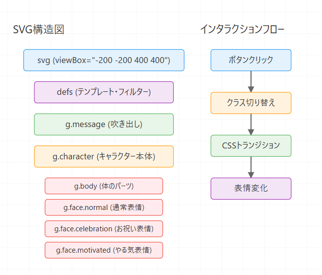
1. SVGの基本構造
まず、キャラクターの基本となるSVGを作成します。SVGは以下のような構造になっています:
<svg id="mainSvg" width="100%" height="100%" viewbox="-200 -200 400 400">
    <defs>
        <!-- エフェクト用のフィルターとテンプレート -->
    </defs>

    <!-- メッセージ表示部分 -->
    <g class="message">...</g>

    <!-- キャラクター本体 -->
    <g id="character" class="character">...</g>
</svg>
2. キャラクターの体の部分
キャラクターの体は、複数の基本図形を組み合わせて作成します:
<g class="body">
    <!-- 体の外側(緑色) -->
    <ellipse cx="0" cy="0" rx="50" ry="45" fill="#4CAF50"/>

    <!-- 体の内側(薄い黄色) -->
    <ellipse cx="0" cy="0" rx="30" ry="25" fill="#FDF1D2"/>

    <!-- 耳と尻尾 -->
    <path d="M -20 -32 C -30 -50, -10 -60, -15 -40..." fill="#4CAF50"/>
    ...
</g>
3. 表情の切り替え
キャラクターの表情は3種類用意し、CSSのクラス切り替えで制御します:
<g class="face normal active">
    <!-- 通常の表情 -->
</g>

<g class="face celebration">
    <!-- お祝いモード -->
</g>

<g class="face motivated">
    <!-- やる気モード -->
</g>
4. インタラクションの実装
表情の切り替えは以下のようなCSSで実現します:
.face {
    opacity: 0;
    transition: opacity 0.3s ease-in-out;
}

.face.active {
    opacity: 1;
}
JavaScriptで表情を切り替える処理は以下のようになります:
function switchFace(mode) {
    // 現在のアクティブな表情を非アクティブに
    document.querySelector('.face.active').classList.remove('active');

    // 指定されたモードの表情をアクティブに
    document.querySelector(`.face.${mode}`).classList.add('active');
}
5. エフェクトの追加
キャラクターの周りに表示するエフェクトは、SVGの<defs>内にテンプレートとして定義し、必要な時にクローンして使用します:
<defs>
    <g id="sparkleTemplate">
        <path d="M 0,-5 L 2,-2 5,0 2,2 0,5 -2,2 -5,0 -2,-2 Z" fill="#FFD700"/>
    </g>
    <!-- その他のエフェクトテンプレート -->
</defs>
実装のポイント
-
SVGのviewBox: キャラクターを中心に配置しやすいよう、viewBoxの原点を中央に設定しています。
-
トランジション: 表情の切り替えをスムーズにするため、opacityプロパティにトランジションを設定しています。
-
フィルター効果: メッセージ吹き出しに影をつけるため、SVGのfilterを使用しています。
-
コンポーネント化: 各パーツを
<g>タグでグループ化し、管理しやすい構造にしています。
まとめ
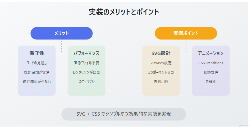
SVGとCSSを組み合わせることで、JavaScriptのコードを最小限に抑えながら、インタラクティブなキャラクターアニメーションを実装することができました。
このような実装は以下のような用途に活用できます:
- Webサイトのマスコットキャラクター
- ゲーミフィケーションの要素として
- ユーザーアクションへのフィードバック
- チュートリアルやガイド画面
また、SVGを使用することで、高解像度ディスプレイでも美しく表示され、アニメーションもスムーズに動作するという利点があります。
参考資料
実装例
<!DOCTYPE html>
<html lang="ja">
<head>
<meta charset="UTF-8">
<meta name="viewport" content="width=device-width, initial-scale=1.0">
<title>Enhanced Qiita Support Character</title>
<style>
/* スタイル部分 */
body {
margin: 0;
padding: 20px;
background: #f0f0f0;
font-family: "Helvetica Neue", Arial, "Hiragino Kaku Gothic ProN", "Hiragino Sans", Meiryo, sans-serif;
}
.container {
width: 100%;
max-width: 800px;
margin: 0 auto;
background: white;
padding: 20px;
border-radius: 8px;
box-shadow: 0 2px 4px rgba(0,0,0,0.1);
}
.svg-container {
width: 100%;
height: 500px; /* 高さを増やしました */
border: 1px solid #ddd;
border-radius: 4px;
margin: 20px 0;
background: #fff;
overflow: hidden;
position: relative;
}
.controls {
margin: 20px 0;
padding: 10px;
text-align: center;
display: flex;
justify-content: center;
gap: 10px;
flex-wrap: wrap;
}
button {
padding: 8px 16px;
border: none;
border-radius: 4px;
background: #55C500;
color: white;
cursor: pointer;
transition: all 0.3s;
font-size: 16px;
}
button:hover {
background: #3C8D00;
transform: translateY(-1px);
}
.message {
/* SVG内で位置を管理するため、positionなどのCSSを削除 */
font-size: 14px;
opacity: 0;
transition: opacity 0.5s;
pointer-events: none;
/* 背景やパディングはSVG内で管理 */
}
.message.active {
opacity: 1;
}
.face {
opacity: 0;
transition: opacity 0.3s;
}
.face.active {
opacity: 1;
}
@keyframes sparkle {
0%, 100% { opacity: 0; }
50% { opacity: 1; }
}
.sparkle {
position: absolute;
width: 10px;
height: 10px;
background: #FFD700;
clip-path: polygon(50% 0%, 61% 35%, 98% 35%, 68% 57%, 79% 91%, 50% 70%, 21% 91%, 32% 57%, 2% 35%, 39% 35%);
opacity: 0;
}
.sparkle.active {
animation: sparkle 1s infinite;
}
.heart {
fill: #ff4d4d;
opacity: 0;
transition: opacity 0.3s;
}
.heart.active {
opacity: 1;
animation: heartbeat 1s infinite;
}
@keyframes heartbeat {
0%, 100% { transform: scale(1); }
50% { transform: scale(1.1); }
}
.stars {
opacity: 0;
transition: opacity 0.3s;
}
.stars.active {
opacity: 1;
animation: stars 2s infinite;
}
@keyframes stars {
0%, 100% { transform: scale(1) rotate(0deg); }
50% { transform: scale(1.2) rotate(180deg); }
}
</style>
</head>
<body>
<div class="container">
<div class="controls">
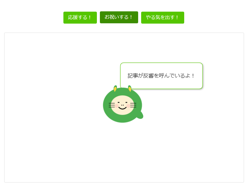
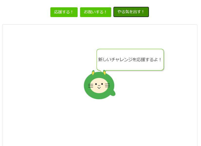
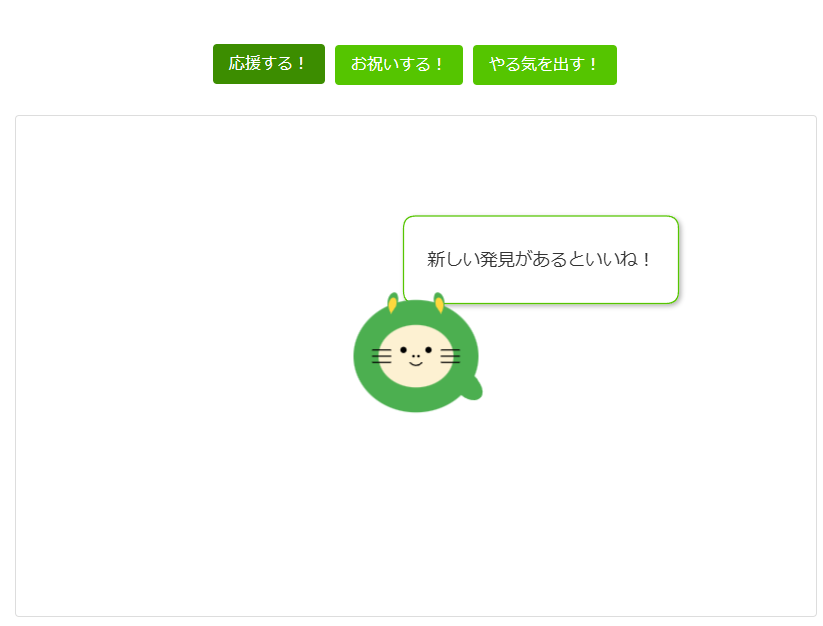
<button onclick="showRandomMessage('normal')" aria-label="応援するボタン">応援する!</button>
<button onclick="showRandomMessage('celebration')" aria-label="お祝いするボタン">お祝いする!</button>
<button onclick="showRandomMessage('motivation')" aria-label="やる気を出すボタン">やる気を出す!</button>
</div>
<div class="svg-container">
<svg id="mainSvg" width="100%" height="100%" viewBox="-200 -200 400 400" xmlns="http://www.w3.org/2000/svg">
<defs>
<filter id="shadow" x="-20%" y="-20%" width="140%" height="140%">
<feGaussianBlur in="SourceAlpha" stdDeviation="2"/>
<feOffset dx="2" dy="2"/>
<feComponentTransfer>
<feFuncA type="linear" slope="0.3"/>
</feComponentTransfer>
<feMerge>
<feMergeNode/>
<feMergeNode in="SourceGraphic"/>
</feMerge>
</filter>
<g id="sparkleTemplate">
<path d="M 0,-5 L 2,-2 5,0 2,2 0,5 -2,2 -5,0 -2,-2 Z" fill="#FFD700"/>
</g>
<g id="heartTemplate">
<path d="M 0,-3 L 3,0 0,3 -3,0 Z" class="heart"/>
</g>
<g id="starTemplate">
<path d="M 0,-5 L 2,-2 5,0 2,2 0,5 -2,2 -5,0 -2,-2 Z" fill="#FFD700"/>
</g>
</defs>
<!-- 吹き出しを上に移動 -->
<g class="message" transform="translate(0, -120)" filter="url(#shadow)">
<path d="M 0,0 L 200,0 Q 210,0 210,10 L 210,60 Q 210,70 200,70 L 20,70 L 10,80 L 0,70 Q -10,70 -10,60 L -10,10 Q -10,0 0,0 Z"
fill="white" stroke="#55C500"/>
<text id="messageText" x="100" y="40" text-anchor="middle"
fill="#333" font-size="14" font-family="sans-serif">
今日もお疲れさま!
</text>
</g>
<!-- キャラクターを下に移動 -->
<g id="character" class="character" transform="translate(0, 80)">
<g class="body">
<ellipse cx="0" cy="0" rx="50" ry="45" fill="#4CAF50" />
<ellipse cx="0" cy="0" rx="30" ry="25" fill="#FDF1D2" />
<path d="M -20 -32 C -30 -50, -10 -60, -15 -40 C -18 -35, -18 -35, -20 -32 Z" fill="#4CAF50" />
<path d="M -20 -34 C -27 -47, -13 -52, -16 -40 C -18 -37, -18 -37, -20 -34 Z" fill="#FFD83D" />
<path d="M 20 -32 C 30 -50, 10 -60, 15 -40 C 18 -35, 18 -35, 20 -32 Z" fill="#4CAF50" />
<path d="M 20 -34 C 27 -47, 13 -52, 16 -40 C 18 -37, 18 -37, 20 -34 Z" fill="#FFD83D" />
<g class="whiskers">
<line x1="-20" y1="-5" x2="-35" y2="-5" stroke="#000" stroke-width="1" />
<line x1="-20" y1="0" x2="-35" y2="0" stroke="#000" stroke-width="1" />
<line x1="-20" y1="5" x2="-35" y2="5" stroke="#000" stroke-width="1" />
<line x1="20" y1="-5" x2="35" y2="-5" stroke="#000" stroke-width="1" />
<line x1="20" y1="0" x2="35" y2="0" stroke="#000" stroke-width="1" />
<line x1="20" y1="5" x2="35" y2="5" stroke="#000" stroke-width="1" />
</g>
<path class="tail" d="M 35 30 C 45 40, 60 35, 50 20 C 45 10, 40 20, 35 30 Z" fill="#4CAF50" />
</g>
<!-- 表情グループ -->
<g class="face normal active">
<circle cx="-10" cy="-5" r="2.5" fill="#000" />
<circle cx="10" cy="-5" r="2.5" fill="#000" />
<circle cx="-2" cy="0" r="1" fill="#000" />
<circle cx="2" cy="0" r="1" fill="#000" />
<path d="M -5 5 Q 0 10 5 5" stroke="#000" stroke-width="1" fill="none" />
</g>
<g class="face celebration">
<path d="M -12 -7 L -8 -7" stroke="#000" stroke-width="2"/>
<path d="M 8 -7 L 12 -7" stroke="#000" stroke-width="2"/>
<circle cx="-2" cy="0" r="1" fill="#000" />
<circle cx="2" cy="0" r="1" fill="#000" />
<path d="M -10 5 Q 0 15 10 5" stroke="#000" stroke-width="2" fill="none" />
<circle cx="-15" cy="2" r="5" fill="#FFB3B3" opacity="0.4" />
<circle cx="15" cy="2" r="5" fill="#FFB3B3" opacity="0.4" />
</g>
<g class="face motivated">
<circle cx="-10" cy="-5" r="2.5" fill="#000" />
<circle cx="10" cy="-5" r="2.5" fill="#000" />
<circle cx="-2" cy="0" r="1" fill="#000" />
<circle cx="2" cy="0" r="1" fill="#000" />
<path d="M -5 5 L 0 10 L 5 5" stroke="#000" stroke-width="1" fill="none" />
</g>
</g>
</svg>
<!-- エフェクト用の要素 -->
<div class="sparkle" style="top: 50%; left: 50%;"></div>
<div class="heart" style="top: 60%; left: 60%; position: absolute;"></div>
<div class="stars" style="top: 40%; left: 40%; position: absolute;"></div>
</div>
</div>
<script>
// 要素が存在することを確認してから処理を開始
document.addEventListener('DOMContentLoaded', function() {
const messageTypes = {
normal: {
messages: [
"今日もお疲れさま!",
"プログラミング楽しもう!",
"素敵な技術ライフを!",
"新しい発見があるといいね!",
"わからないことがあったら聞いてね!"
],
animation: {
keyframes: [
{ transform: 'translate(0, 0)' },
{ transform: 'translate(0, -10px)' },
{ transform: 'translate(0, 0)' }
],
options: { duration: 800, easing: 'ease-in-out' }
},
face: 'normal'
},
celebration: {
messages: [
"記事が反響を呼んでいるよ!",
"コントリビューションおめでとう!",
"素晴らしい成果だね!",
"みんなの役に立っているよ!",
"技術の共有ありがとう!"
],
animation: {
keyframes: [
{ transform: 'translate(0, 0) scale(1)' },
{ transform: 'translate(0, -20px) scale(1.1)' },
{ transform: 'translate(10px, -10px) scale(1.05)' },
{ transform: 'translate(-10px, -15px) scale(1.1)' },
{ transform: 'translate(0, 0) scale(1)' }
],
options: { duration: 1500, easing: 'cubic-bezier(0.4, 0, 0.2, 1)' }
},
face: 'celebration',
effects: ['sparkle', 'heart']
},
motivation: {
messages: [
"君ならできる!",
"一緒に頑張ろう!",
"新しいチャレンジを応援するよ!",
"その調子!その調子!",
"絶対に成功するよ!"
],
animation: {
keyframes: [
{ transform: 'translate(0, 0) rotate(0deg)' },
{ transform: 'translate(-10px, 0) rotate(-5deg)' },
{ transform: 'translate(10px, 0) rotate(5deg)' },
{ transform: 'translate(0, 0) rotate(0deg)' }
],
options: { duration: 1000, easing: 'cubic-bezier(0.68, -0.55, 0.265, 1.55)' }
},
face: 'motivated',
effects: ['star']
}
};
let currentAnimation = null;
const character = document.getElementById('character');
const messageElement = document.querySelector('.message');
const messageText = document.getElementById('messageText');
// グローバルスコープで関数を定義
window.showRandomMessage = function(type = 'normal') {
const messageType = messageTypes[type];
const message = messageType.messages[Math.floor(Math.random() * messageType.messages.length)];
// メッセージを表示
messageText.textContent = message;
messageElement.classList.add('active');
// 表情を切り替え
document.querySelectorAll('.face').forEach(face => {
face.classList.remove('active');
});
const activeFace = document.querySelector(`.face.${messageType.face}`);
if (activeFace) {
activeFace.classList.add('active');
}
// エフェクトの処理
if (messageType.effects) {
messageType.effects.forEach(effect => {
const elements = document.querySelectorAll(`.${effect}`);
elements.forEach(el => {
el.classList.add('active');
setTimeout(() => el.classList.remove('active'), 2000);
});
});
}
// アニメーション実行
if (currentAnimation) {
currentAnimation.cancel();
}
currentAnimation = character.animate(
messageType.animation.keyframes,
messageType.animation.options
);
// 5秒後にメッセージと表情をリセット
setTimeout(() => {
messageElement.classList.remove('active');
document.querySelectorAll('.face').forEach(face => {
face.classList.remove('active');
});
const normalFace = document.querySelector('.face.normal');
if (normalFace) {
normalFace.classList.add('active');
}
}, 5000);
};
// 要素が存在する場合のみイベントリスナーを追加
if (character) {
character.addEventListener('click', () => showRandomMessage('normal'));
}
// 初期メッセージを表示(要素の存在確認後)
if (messageElement && messageText) {
setTimeout(() => showRandomMessage('normal'), 1000);
}
});
</script>
</body>
</html>