はじめに
StreamlitがFlexbox対応を進めており、st.containerをflexbox-likeなレイアウト要素に変更することで、従来のレイアウト制約が改善しました。
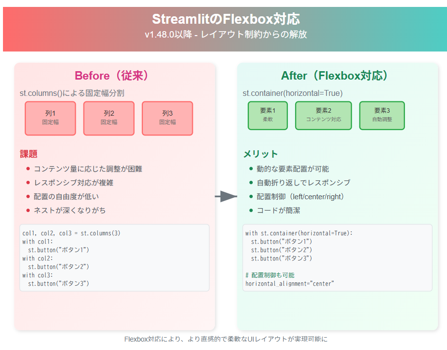
対象バージョン: Streamlit v1.48.0 以降で利用可能
本記事では、Flexbox対応前後でのUI構築方法の違いを具体的なコード例とともに紹介します。
Flexbox対応前の課題
従来のStreamlitでは、レイアウトは主に縦方向(vertical layout)が基本で、水平方向(horizontal layout)の選択肢はごく限られていました。
従来の制約
従来のStreamlitでは、レイアウトは主にst.columns()による固定幅の列分割に限られており、要素を動的に配置するのが難しい状況でした。そのため画面サイズに合わせたレイアウト調整(レスポンシブ対応)が複雑になり、コンテンツ量に応じて柔軟に最適化することも困難でした。
Flexbox対応後の新機能

新しいst.containerでは、horizontal=Trueパラメータを指定できるようになり、Flexboxのように要素を柔軟に横方向へ配置できるようになりました。
Flexboxとは、Web開発で一般的に使われるCSSのレイアウト方式で、要素を横並びや縦並びに柔軟に整列させたり、画面幅に応じて自動的に折り返したりできる仕組みです。
主な新機能
新しいst.containerでは、要素を水平方向に並べられるようになり、コンテンツ量に応じてサイズを自動調整できます。さらにhorizontal_alignmentで配置を細かく制御でき、画面幅に合わせて自動的に折り返す柔軟なレイアウトも実現可能になりました。
Before/After コード比較
【Before】従来の列レイアウト

import streamlit as st

st.title("従来のレイアウト方法")

# 固定幅の3列レイアウト
col1, col2, col3 = st.columns(3)

with col1:
    st.button("ボタン1")
    st.write("短いテキスト")

with col2:
    st.button("ボタン2")
    st.write("これは少し長めのテキストコンテンツです")

with col3:
    st.button("ボタン3")
    st.write("長い")

# 課題:コンテンツ量が異なると見た目のバランスが悪い
st.write("---")

# カードレイアウトの無理やりな実装
cols = st.columns(4)
for i, col in enumerate(cols):
    with col:
        with st.container():
            st.subheader(f"カード {i+1}")
            st.write("固定幅のため調整が困難")
            st.button(f"アクション{i+1}")
【After】Flexbox対応後のレイアウト

import streamlit as st

st.title("Flexbox対応後のレイアウト")

# 1. 水平レイアウトコンテナ
st.subheader("1. 基本的な水平配置")
with st.container(horizontal=True):
    st.button("ボタン1")
    st.button("ボタン2")
    st.button("ボタン3")

# 2. 配置制御(右揃え)
st.subheader("2. 右揃えレイアウト")
with st.container(horizontal=True, horizontal_alignment="right"):
    st.button("戻る")
    st.button("次へ")
    st.button("完了")

# 3. 中央揃えレイアウト
st.subheader("3. 中央揃えレイアウト")
with st.container(horizontal=True, horizontal_alignment="center"):
    st.metric("売上", "1,234,567円", "12%")
    st.metric("利益", "234,567円", "8%")
    st.metric("成約率", "15.6%", "2.1%")

# 4. 柔軟なカードレイアウト
st.subheader("4. 動的カードレイアウト")
cards_container = st.container(horizontal=True)

with cards_container:
    # カード1(小)
    with st.container():
        st.info("📊 売上")
        st.metric("", "¥1.2M", "+5%")

    # カード2(中)
    with st.container():
        st.success("✅ 完了タスク")
        st.metric("", "24件", "+3件")
        st.button("詳細表示")

    # カード3(大)
    with st.container():
        st.warning("⚠️ 注意項目")
        st.write("システムメンテナンスが予定されています")
        col_a, col_b = st.columns(2)
        col_a.button("詳細")
        col_b.button("設定")

# 5. レスポンシブなツールバー
st.subheader("5. ツールバーレイアウト")
toolbar = st.container(horizontal=True, horizontal_alignment="right")
with toolbar:
    if st.button("🔍"):
        st.info("検索機能")
    if st.button("⚙️"):
        st.info("設定画面")
    if st.button("📊"):
        st.info("統計表示")
    if st.button("💾"):
        st.success("保存完了!")
実装のポイント
1. horizontal=Trueの活用
# 基本的な水平配置
with st.container(horizontal=True):
    st.write("要素1")
    st.write("要素2")
    st.write("要素3")
2. alignment制御
# 左揃え(デフォルト)
with st.container(horizontal=True, horizontal_alignment="left"):
    st.button("左")

# 中央揃え
with st.container(horizontal=True, horizontal_alignment="center"):
    st.button("中央")

# 右揃え
with st.container(horizontal=True, horizontal_alignment="right"):
    st.button("右")

# 均等分散
with st.container(horizontal=True, horizontal_alignment="distribute"):
    st.button("分散1")
    st.button("分散2")
    st.button("分散3")
3. ネストしたレイアウト
# 外側:垂直レイアウト、内側:水平レイアウト
with st.container():
    st.subheader("セクション1")
    with st.container(horizontal=True):
        st.button("アクション1")
        st.button("アクション2")

    st.subheader("セクション2")
    with st.container(horizontal=True, horizontal_alignment="right"):
        st.button("キャンセル")
        st.button("OK")
機能比較
| 項目 | 従来手法(st.columns) | 新機能(horizontal container) |
|---|---|---|
| レイアウト柔軟性 | 固定幅の列分割 | 動的な要素配置 |
| コード記述量 | やや冗長 | 簡潔 |
| 自動折り返し | 非対応 | 横幅に応じて自動折り返し |
| 配置制御 | 限定的 | left/center/right/distribute |
| 適用場面 | 構造的なレイアウト | 動的なコンテンツ配置 |
注意: st.columns()も引き続き有効で、グリッドレイアウトが必要な場面では適切な選択肢です。ただし、深いネスト(入れ子)は避けることが推奨されています。
実用的な活用例
ダッシュボードのヘッダー
# ページヘッダー
header = st.container(horizontal=True)
with header:
    st.title("📊 営業ダッシュボード")
    # 右側にアクションボタン
    with st.container(horizontal=True, horizontal_alignment="right"):
        st.button("🔄 更新")
        st.button("⚙️ 設定")
        st.button("📤 エクスポート")

st.divider()
統計カード群
# KPIカード
metrics_row = st.container(horizontal=True)
with metrics_row:
    with st.container():
        st.metric("今月の売上", "¥2,345,678", "+12.3%")
    with st.container():
        st.metric("新規顧客", "156件", "+8.2%")
    with st.container():
        st.metric("成約率", "18.5%", "+2.1%")
    with st.container():
        st.metric("顧客満足度", "4.7/5.0", "+0.3")
注意点と使い分け
水平レイアウトを使う際は、画面幅に応じて要素が自動的に折り返される点に注意が必要です。1行に配置する要素は3〜5個程度に抑えるのが望ましく、スクリーンリーダー対応などアクセシビリティも考慮しましょう。また、st.columns()は構造的なレイアウトに、st.container(horizontal=True)は動的な配置に使い分けが必要となりそうです。
まとめ
StreamlitのFlexbox対応により、従来の制約から解放され、よりモダンで柔軟なUIデザインが可能になりました。
主なメリット
Flexbox対応により、Streamlitでは直感的にレイアウトを組めるようになりました。コードの可読性や修正のしやすさも向上し、ユーザーにとってより使いやすいインターフェースを提供しやすくなります。
これによりWebアプリ開発が一段と快適になるため、新機能を試してみてほしいです。
参考リンク
- Streamlit公式ドキュメント - Layouts and Containers
- Streamlit GitHub Issue - Flex layout
- CSS Flexbox基本概念 - MDN