はじめに
本稿の目的は、以下リンク(以下チュートリアル)先チュートリアルを学習し、Pythonのライブラリであるcausalmlを用いた所謂ツリーベースのアップリフトモデリングに関する理解を深めることです.
私個人としては、ゆくゆくは以下のリンクのコンテンツに挑戦したく、本稿の位置付けはそのための基礎トレーニングです.
環境など
- 私用Macパソコン(M2チップ)
- conda仮想環境
- VisualStudioCode
ライブラリのインストール
公式サイト(以下リンク)を参考にターミナル上で以下のコマンドを実行しました.
$ conda create --name envforcausalml python=3.8
$ conda install -c conda-forge causalml
参考
消去法的に上記手法になった、という感じです.
というのも、上記以外の方法も試みたのですが、エラーが解消できませんでした.
本編
関連ライブラリのインポート
関連ライブラリをインポートするためのコードです.
import pandas as pd
import numpy as np

import multiprocessing as mp
np.random.seed(42)
from sklearn.model_selection import train_test_split
from sklearn.inspection import permutation_importance
import shap
import causalml
from causalml.metrics import plot_gain, plot_qini, qini_score
from causalml.dataset import synthetic_data
from causalml.inference.tree import plot_dist_tree_leaves_values, get_tree_leaves_mask
from causalml.inference.tree import CausalRandomForestRegressor, CausalTreeRegressor
from causalml.inference.tree.utils import timeit
import matplotlib.pyplot as plt
import seaborn as sns
%config InlineBackend.figure_format = 'retina'
今回使用しないライブラリがインポートされていないとも限らないので、深入りせず、先へ進みます.
合成データの生成
以下のコードで合成データを作成します. 変数は全てndarrayで、Xは2次元配列, それ以外は1次元配列です.
# Simulate randomized trial: mode=2
y, X, w, tau, b, e = synthetic_data(
    mode=2,
    n=2000,
    p=10,
    sigma=3.0
)
説明書きに記載のとおり、今回もRCT(Randomized Controlled Trial)による介入割当を前提としたデータであるようです.
参考: Bingとのチャット
- causalmlのsynthetic_data()の引数について教えてください.
synthetic_data() という関数は、人工的なデータを生成するためのものです。この関数には以下の引数があります。
- mode: 人工データの生成方法を指定するパラメータです。1から4までの整数値を指定できます。デフォルトは1です。
- n: 生成するデータのサンプル数を指定するパラメータです。デフォルトは10000です。
- p: 生成するデータの特徴量の数を指定するパラメータです。デフォルトは8です。
- sigma: 生成するデータのノイズの標準偏差を指定するパラメータです。デフォルトは1.0です。
random_state: 生成するデータの乱数シードを指定するパラメータです。デフォルトはNoneです。
- ノイズは正規分布に従うのでしょうか?
はい、ノイズは正規分布に従います。synthetic_data() 関数のソースコードを見ると、ノイズは np.random.normal(0, sigma, size=n) というように生成されています。ここで、sigma は引数で指定した標準偏差です。正規分布の平均は0です。したがって、ノイズは平均0、標準偏差 sigma の正規分布に従うと言えます。
- mode=2の場合どのようなデータが生成されますか?
mode=2 の場合、以下のようなデータが生成されます。
特徴量 X は、標準正規分布から独立にサンプリングされます。
処置変数 treatment は、X[:, 0] + X[:, 3] + np.random.normal(0, 0.01, size=n) に基づいて、ロジスティック回帰で確率を計算し、ベルヌーイ分布からサンプリングされます。
アウトカム変数 y は、treatment * (X[:, 0] + X[:, 9]) + X[:, 1] + np.random.normal(0, sigma, size=n) として計算されます。
因果効果変数 tau は、X[:, 0] + X[:, 9] として計算されます。
つまり、mode=2 の場合、特徴量の一部が処置割り当てやアウトカムに影響を与えることになります。また、因果効果は特徴量に依存することになります。
続いて、これらをpandasデータフレームへ格納します.
df = pd.DataFrame(X)
feature_names = [f'feature_{i}' for i in range(X.shape[1])]
df.columns = feature_names
df['outcome'] = y
df['treatment'] = w
df['treatment_effect'] = tau
続いて、データを分割します.
# Split data to training and testing samples for model validation
df_train, df_test = train_test_split(df, test_size=0.2, random_state=111)
n_train, n_test = df_train.shape[0], df_test.shape[0]

X_train, y_train = df_train[feature_names], df_train['outcome'].values
X_test, y_test = df_test[feature_names], df_test['outcome'].values
treatment_train, treatment_test = df_train['treatment'].values, df_test['treatment'].values
effect_test = df_test['treatment_effect'].values
effect_testという変数は何に使うのか気になりますね.
sklearnのtrain_test_split()について、よく分からない点があったのでBingに確認してみました.
参考: Bingとのチャット
- sklearn.model_selection.train_test_split()の返り値のデータ型はなんですか?
返り値のデータ型は、入力配列と同じです。入力がスパースの場合は、scipy.sparse.csr_matrixになります。それ以外の場合は、numpyの配列やpandasのdataframeなど、入力と同じタイプになります。
ここで、データの中身を確認しておきたいと思います.
まずはdf_trainです.
| 1696 | |
|---|---|
| feature_0 | -1.59201 |
| feature_1 | 0.452005 |
| feature_2 | 0 |
| feature_3 | -0.466855 |
| feature_4 | -0.363785 |
| feature_5 | -0.770119 |
| feature_6 | -0.348852 |
| feature_7 | 1.03256 |
| feature_8 | -0.713953 |
| feature_9 | 0.545141 |
| outcome | 0.831146 |
| treatment | 1 |
| treatment_effect | -0.647534 |
続いて、dfをoutcomeでピボット集計したものです.
| treatment | ('size', 'outcome') | ('sum', 'outcome') | ('mean', 'outcome') |
|---|---|---|---|
| 0 | 1009 | 830.695 | 0.823286 |
| 1 | 991 | 1360.44 | 1.3728 |
| All | 2000 | 2191.14 | 1.09557 |
上表のとおり、outcomeの平均はおよそ0.5異なっているようです. 確認のために、dfをtreatment_effectでピボット集計します.
| treatment | ('size', 'treatment_effect') | ('sum', 'treatment_effect') | ('mean', 'treatment_effect') |
|---|---|---|---|
| 0 | 1009 | 895.044 | 0.88706 |
| 1 | 991 | 781.618 | 0.788716 |
| All | 2000 | 1676.66 | 0.838331 |
CausalTreeRegressorの実行
ここでは以下のとおり、causalml.inference.tree.CausalTreeRegressorで学習を行います.
ctree = CausalTreeRegressor()
ctree.fit(X=X_train.values, y=y_train, treatment=treatment_train)
公式サイトのコードを見ると、CausalTreeRegressor()の引数control_nameはデフォルトが0になっているようでした. 今回はデフォルト値で問題なさそうです.
CausalRandomForestClassifierの実行
続いてCausal Random Forestを実施します.
crforest = CausalRandomForestRegressor(
    criterion="causal_mse",
    min_samples_leaf=200,
    control_name=0,
    n_estimators=50,
    n_jobs=mp.cpu_count() - 1
)
crforest.fit(X=X_train, y=y_train, treatment= treatment_train)
不純度ベースの特徴量重要度の計算
以下のように特徴量の重要度をツリーモデル、フォレストモデルそれぞれについて対応する列に格納し、pandasデータフレームを作成します.
df_importances = pd.DataFrame(
    {'tree': ctree.feature_importances_,
     'forest': crforest.feature_importances_,
     'feature': feature_names
     })
ツリーモデルやランダムフォレストでは、上記コードのように特徴量の重要度が.feature_importances_に格納されているようです.
続いてランダムフォレストについて標準偏差を計算します.
forest_std = np.std(
    [tree.feature_importances_ for tree in crforest.estimators_],
    axis=0
)
なお、crforest.estimators_には50個の要素が格納されており、ランダムフォレスト分類器をインスタンス化する際の引数n_estimatorsに紐づいているようです.
以下は参考です.
print(type(crforest.estimators_))
print(len(crforest.estimators_))
print(type(crforest.estimators_[0]))

"""
<class 'list'>
50
<class 'causalml.inference.tree.causal.causaltree.CausalTreeRegressor'>
"""
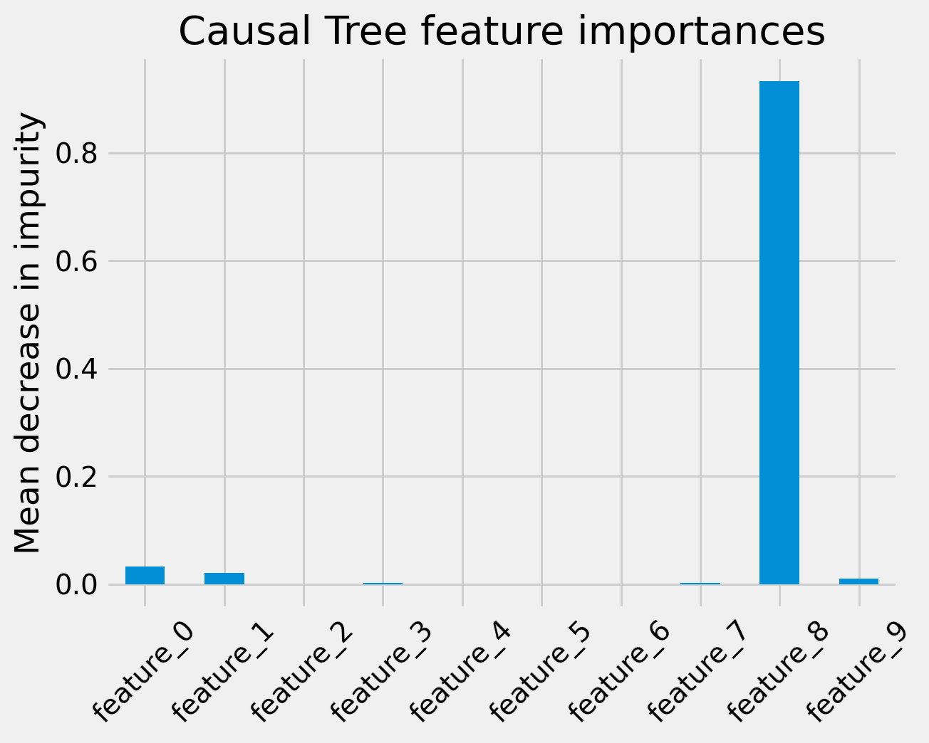
続いて、Causal Treeの特徴量重要度を棒グラフで表示します. 以下はそのコードです.
fig, ax = plt.subplots()
df_importances['tree'].plot.bar(ax=ax)
ax.set_title("Causal Tree feature importances")
ax.set_ylabel("Mean decrease in impurity")
ax.set_xticklabels(feature_names, rotation=45)
plt.show()
上記のコードの実行結果は下図のとおりです.
同様に、Causal Random Forest についても描画します. 以下はコードです.
fig, ax = plt.subplots()
df_importances['forest'].plot.bar(yerr=forest_std, ax=ax)
ax.set_title("Causal Forest feature importances")
ax.set_ylabel("Mean decrease in impurity")
ax.set_xticklabels(feature_names, rotation=45)
plt.show()
下図は上記コードの実行結果です.
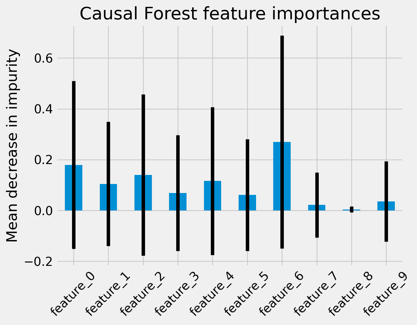
Causal Random Forestの場合棒グラフ上にエラーバーが表示されていることが分かります. これは標準誤差でしょうか. 不純度ベースの特徴量重要度とは一体何を指すのかイマイチ判然としませんが、全ての特徴量について、エラーバーの範囲が0.0を含んでいます. つまり今回のケースですと、サンプル数不足で不純度ベースの特徴量重要度については何も言えないということでしょうか.
Permutation importance
今度はpermutation importanceと呼ばれる数値を計算し、不純度ベースの特徴量重要度と同様に、棒グラフへ描画します.
permutation importanceとは、任意の特徴量をレコード間で無作為にシャッフルした場合の精度悪化の度合いをもとに算出された特徴量重要度のことみたいです.
以下はその計算及び描画のためのコードです.
for name, model in zip(('Causal Tree', 'Causal Forest'), (ctree, crforest)):
    imp = permutation_importance(model, X_test, y_test,
                                 n_repeats=50,
                                 random_state=0)
    fig, ax = plt.subplots()
    ax.set_title(f'{name} feature importances')
    ax.set_ylabel('Mean decrease in impurity')
    plt.bar(feature_names, imp['importances_mean'], yerr=imp['importances_std'])
    ax.set_xticklabels(feature_names, rotation=45)
    plt.show()
permutation_importance()は冒頭にインポートしたsklearnの関数です. 返り値には標準誤差(標準偏差?)のフィールドも入っているようですね.
下図は上記コードの実行結果です.
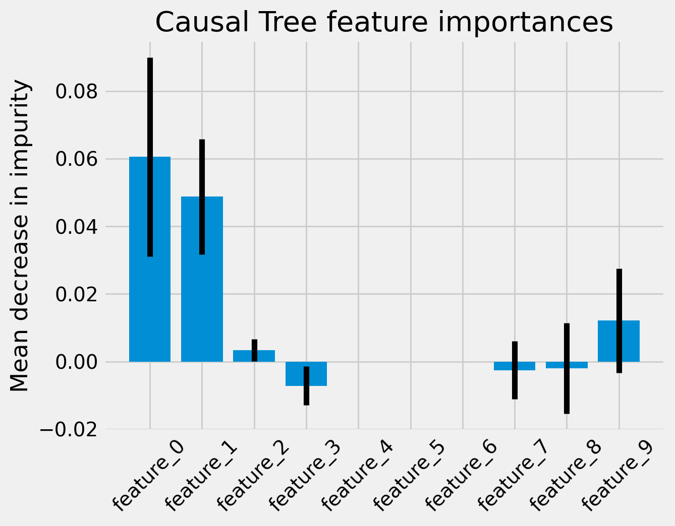

今度は標準誤差(偏差?)が0.0から離陸することができたようです.
先ほどBingチャットに教えてもらった真のモデルの生成ロジックと照らし合わせると違和感があるのでもとのコードを確認したところ以下のようになっていました.
def simulate_randomized_trial(n=1000, p=5, sigma=1.0, adj=0.0):
    """Synthetic data of a randomized trial
        From Setup B in Nie X. and Wager S. (2018) 'Quasi-Oracle Estimation of Heterogeneous Treatment Effects'
    Args:
        n (int, optional): number of observations
        p (int optional): number of covariates (>=5)
        sigma (float): standard deviation of the error term
        adj (float): no effect. added for consistency
    Returns:
        (tuple): Synthetically generated samples with the following outputs:
            - y ((n,)-array): outcome variable.
            - X ((n,p)-ndarray): independent variables.
            - w ((n,)-array): treatment flag with value 0 or 1.
            - tau ((n,)-array): individual treatment effect.
            - b ((n,)-array): expected outcome.
            - e ((n,)-array): propensity of receiving treatment.
    """

    X = np.random.normal(size=n * p).reshape((n, -1))
    b = np.maximum.reduce([np.repeat(0.0, n), X[:, 0] + X[:, 1], X[:, 2]]) + np.maximum(
        np.repeat(0.0, n), X[:, 3] + X[:, 4]
    )
    e = np.repeat(0.5, n)
    tau = X[:, 0] + np.log1p(np.exp(X[:, 1]))

    w = np.random.binomial(1, e, size=n)
    y = b + (w - 0.5) * tau + sigma * np.random.normal(size=n)

    return y, X, w, tau, b, e
上記だと、outcomeにはインデックス0〜4番目の特徴量のみが使用されているようです. またプロペンシティスコアは定数0.5です. どうやら生成系AIに出まかせを吹き込まれていたようです.
ともあれ、こちらの棒グラフは、真のモデルと平仄がとれていそうな佇まいであることが分かりました.
SHAP値
続いて、SHAP値です.
以下のコードでは、レコードごとのSHAP値を特徴量ごとに打点します.
# The error "Model type not yet supported by TreeExplainer" will occur
# if causalml support PR is not closed yet.
# git clone https://github.com/alexander-pv/shap.git && cd shap
# pip install .
import shap
tree_explainer = shap.TreeExplainer(ctree)
shap.initjs()
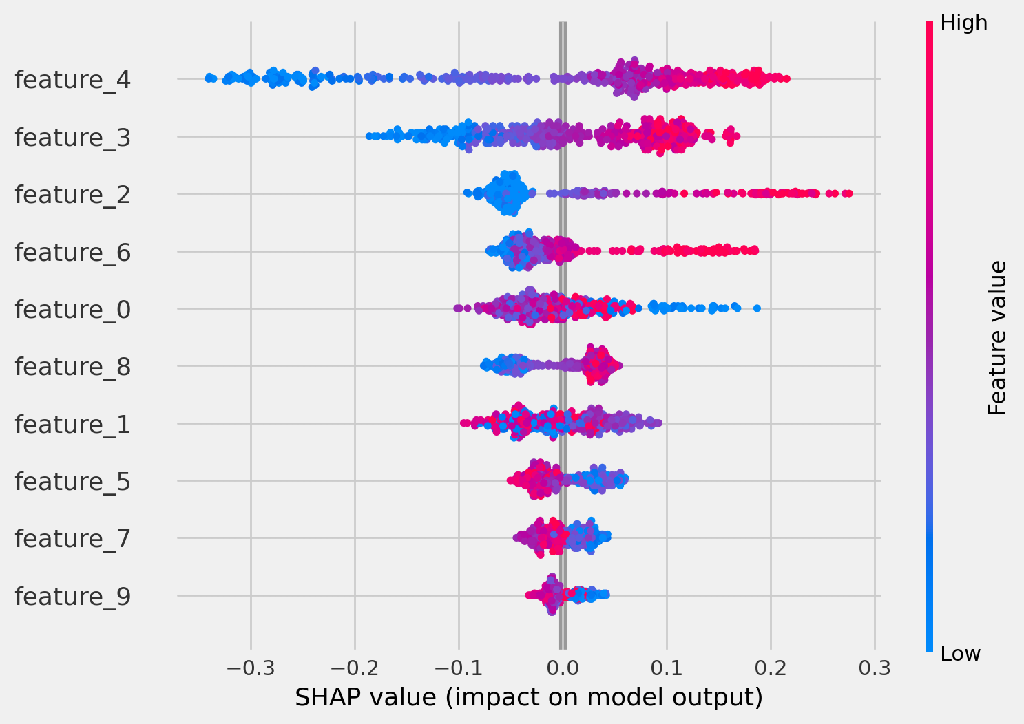
shap.summary_plot(tree_explainer.shap_values(X_test)[0], X_test, plot_type="dot")
shap_values()[0]のように最初のインデックスを指定する必要があるようで、チュートリアルどおりのコードだとうまくいかなかったので修正しました. shap_values(X_test)は2要素あり、実は2要素目が何なのか、イマイチ理解が出来ていないのですが先に進みます. 下図は上記コードの実行結果です.
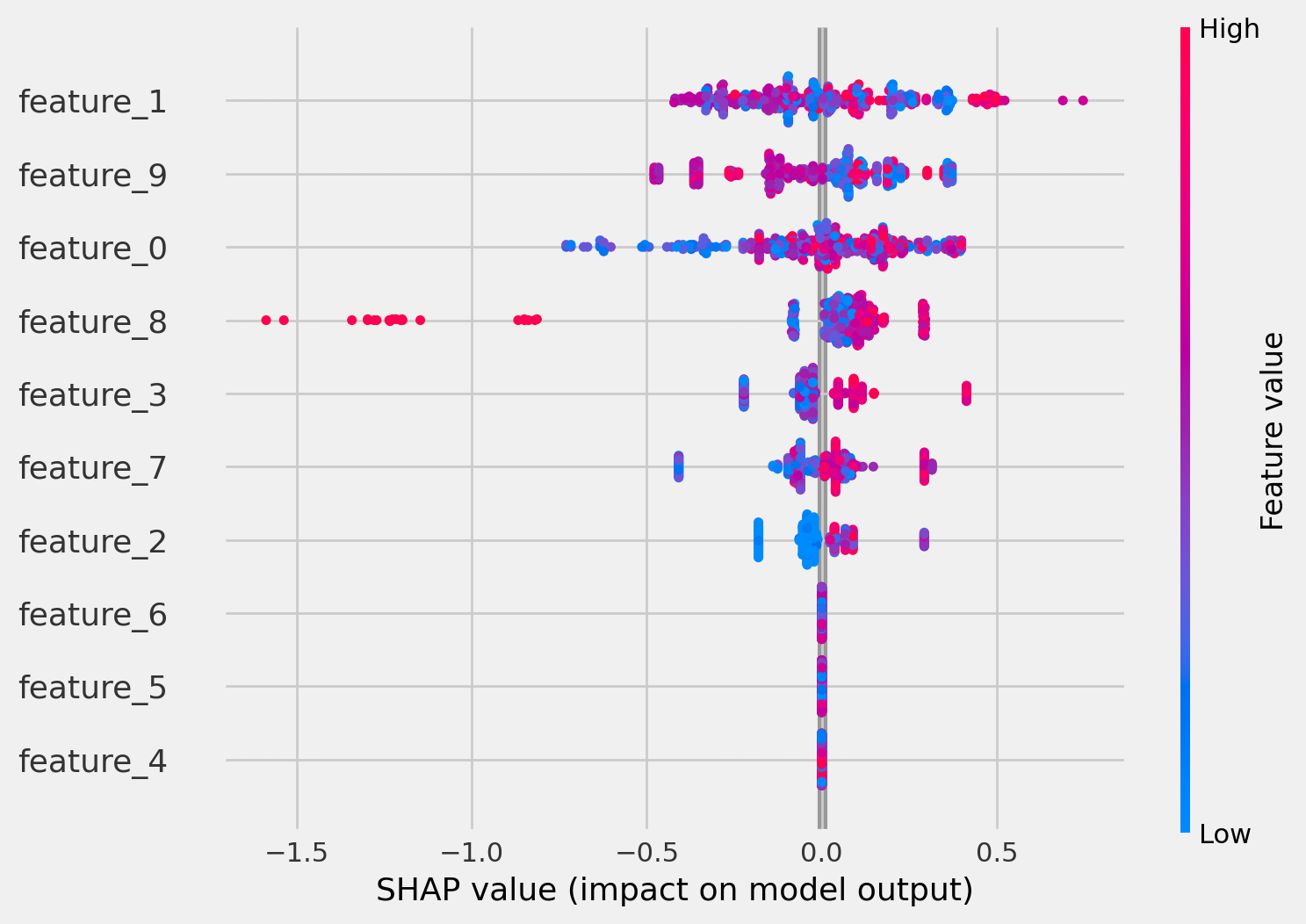
これは一見すると何が言いたいのか分かりませんね.
続いてCausal Random Forestについても同様の手順を実施します. 以下はそのためのコードです.
cforest_explainer = shap.TreeExplainer(crforest)
shap.initjs()
shap.summary_plot(cforest_explainer.shap_values(X_test)[0], X_test)
以下は実行結果です.
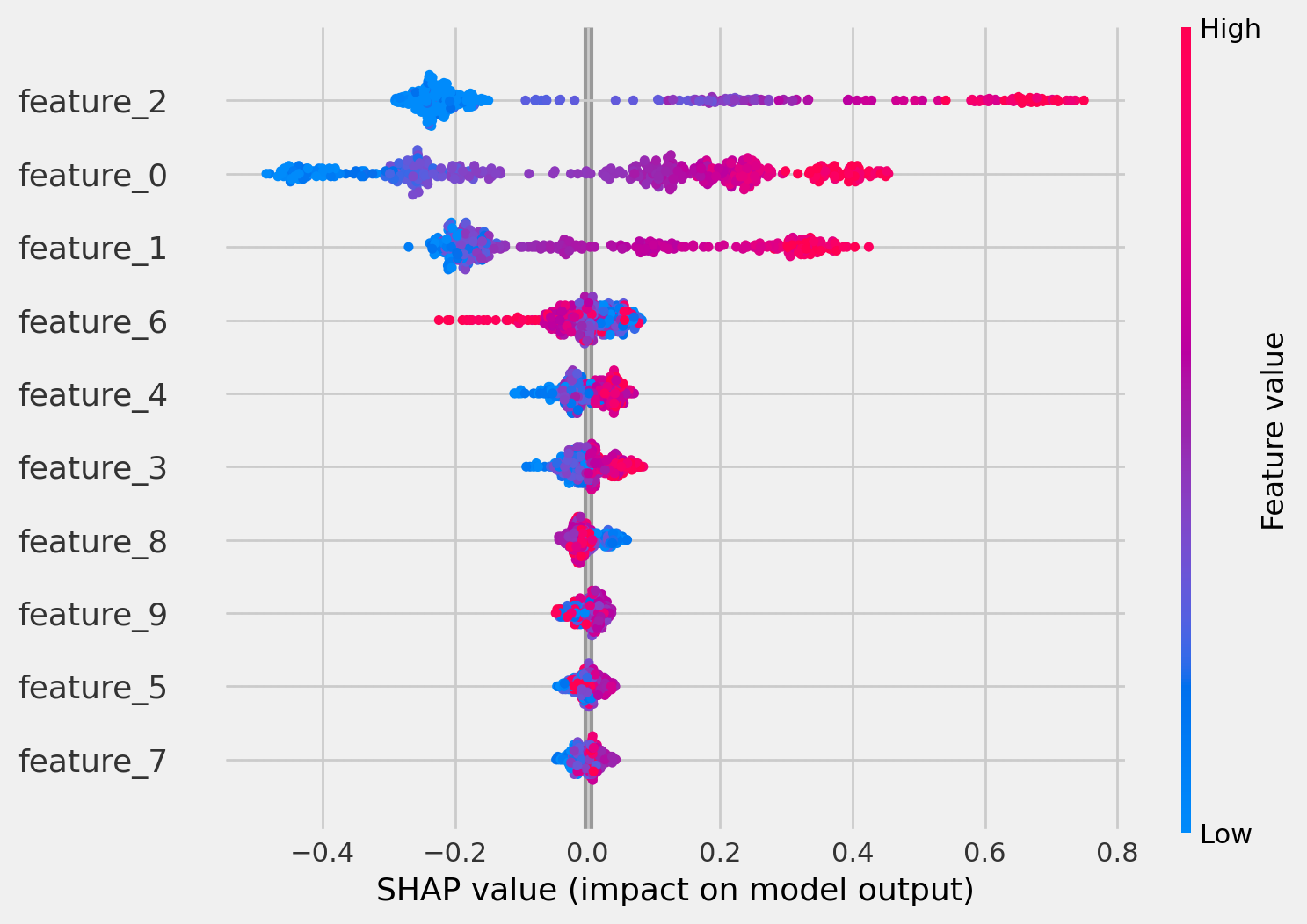
これはよく分かりませんね. 例えば真のモデルではfeature_0が使われていますが、このグラフを見ると説明力があるのかないのか判然としません. また、そもそも論ですが、チュートリアルの描画と全く異なります. そこで、shap_values(X_test)[1]で再描画してみました. 以下はそのコードです.
shap.summary_plot(cforest_explainer.shap_values(X_test)[1], X_test)
下図は上記コードの結果です.
ここで、shap.TreeExplainer()の挙動を知るために公式サイト(以下リンク)を確認しました.
shap.TreeExplainer().shap_values()の返り値はlistかarrayであるようです. アウトプットがベクトルであるようなモデルの場合返り値はリストになり、リストの各要素はそれぞれのアウトプットに対応するshap値の行列になるそうです. 今回は返り値が要素数2のリストになっているので、モデルのアウトプットがベクトルということになりますね.
以下はpredict()のコードで,返り値は1個, 又は3個になるように見えます.
    def predict(self, X: np.ndarray, with_outcomes: bool = False) -> np.ndarray:
        """Predict individual treatment effects

        Args:
            X (np.matrix): a feature matrix
            with_outcomes (bool), default=False,
                                  include outcomes Y_hat(X|T=0), Y_hat(X|T=1) along with individual treatment effect
        Returns:
           (np.matrix): individual treatment effect (ITE), dim=nx1
                        or ITE with outcomes [Y_hat(X|T=0), Y_hat(X|T=1), ITE], dim=nx3
        """
        if with_outcomes:
            self.n_outputs_ = self.max_outputs_
            for estimator in self.estimators_:
                estimator._with_outcomes = True
        else:
            self.n_outputs_ = 1
        y_pred = super().predict(X)
        return y_pred
残念ながらこれ以上のことは分かりませんでしたが、先に進みたいと思います.
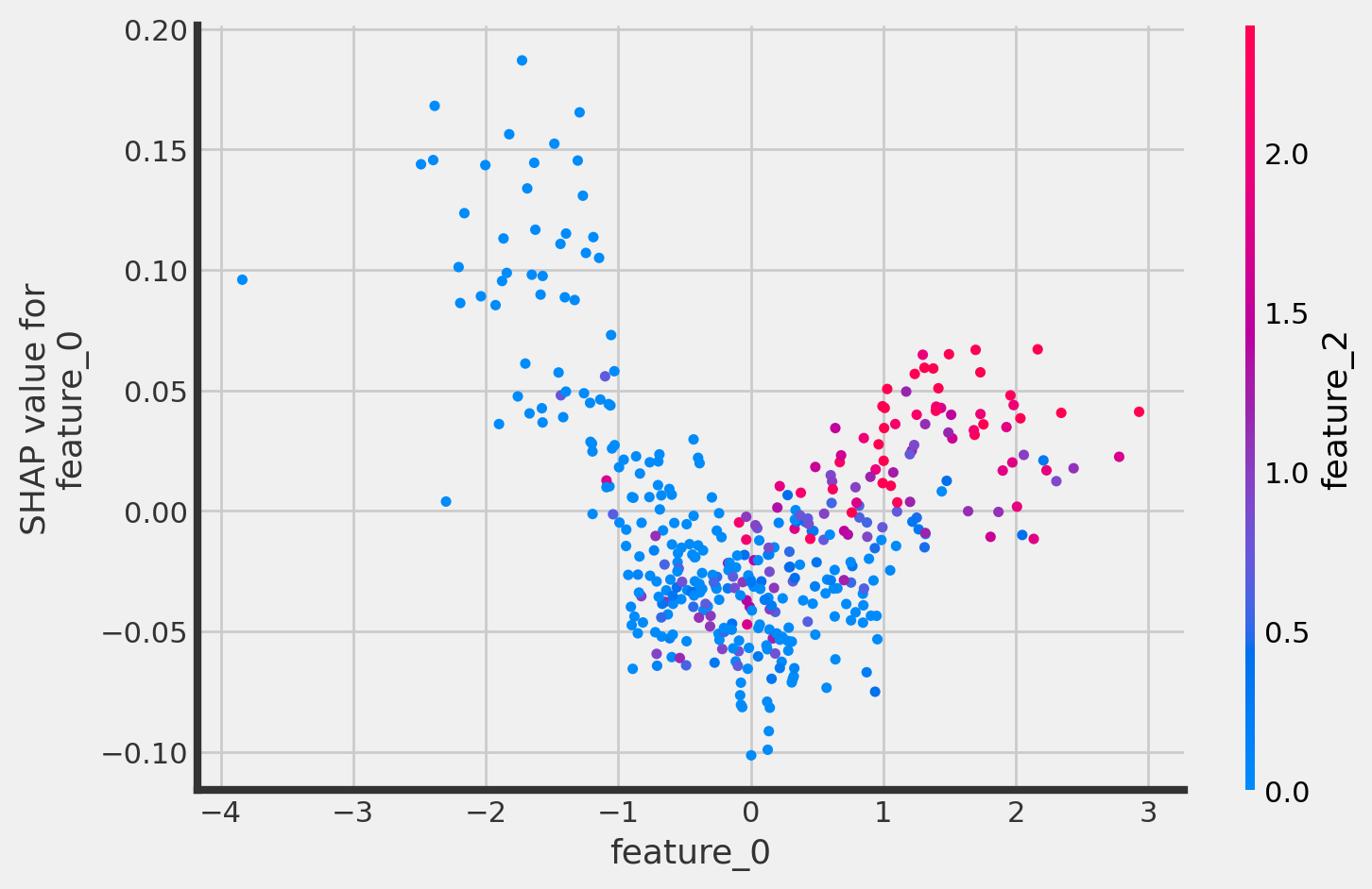
以下では、shap.dependence_plotで、各特徴量のshap値について詳しく確認することができます. 以下はそのためのコードとその実行結果です.
shap.dependence_plot("feature_0",
                     cforest_explainer.shap_values(X_test)[1],
                     X_test,
                     interaction_index="feature_2")

feature_0とそのSHAP valueには正の相関があるといってよさそうです. またfeature_0とfeature_2に相関がありそうなことも見て取れます.ちなみにshap_values(X_test)[0]だとこうなります.
shap.dependence_plot("feature_0",
                     cforest_explainer.shap_values(X_test)[0],
                     X_test,
                     interaction_index="feature_2")
上図を見ると、feature_0は数値が負のときにshap値と負の相関を持っているように見えますね. 数値が小さいほど、予測値の押し上げ要因になるということでしょうか. 真のモデルではそのようになっていなかったのでイマイチ釈然としません.
チュートリアルは以上です.
最後にアップリフトカーブを描画して終了したいと思います. 以下はそのコードと実行結果です.
usecols = [
    'treatment',
    'outcome'
]
auuc_metrics = df_test[usecols]
pred_uplift = crforest.predict(X=X_test, with_outcomes=True)
auuc_metrics['pred_uplift'] = pred_uplift[:, 0]

from causalml.metrics import plot_lift, plot_gain

plot_lift(auuc_metrics,
          outcome_col='outcome',
          treatment_col='treatment'
          )
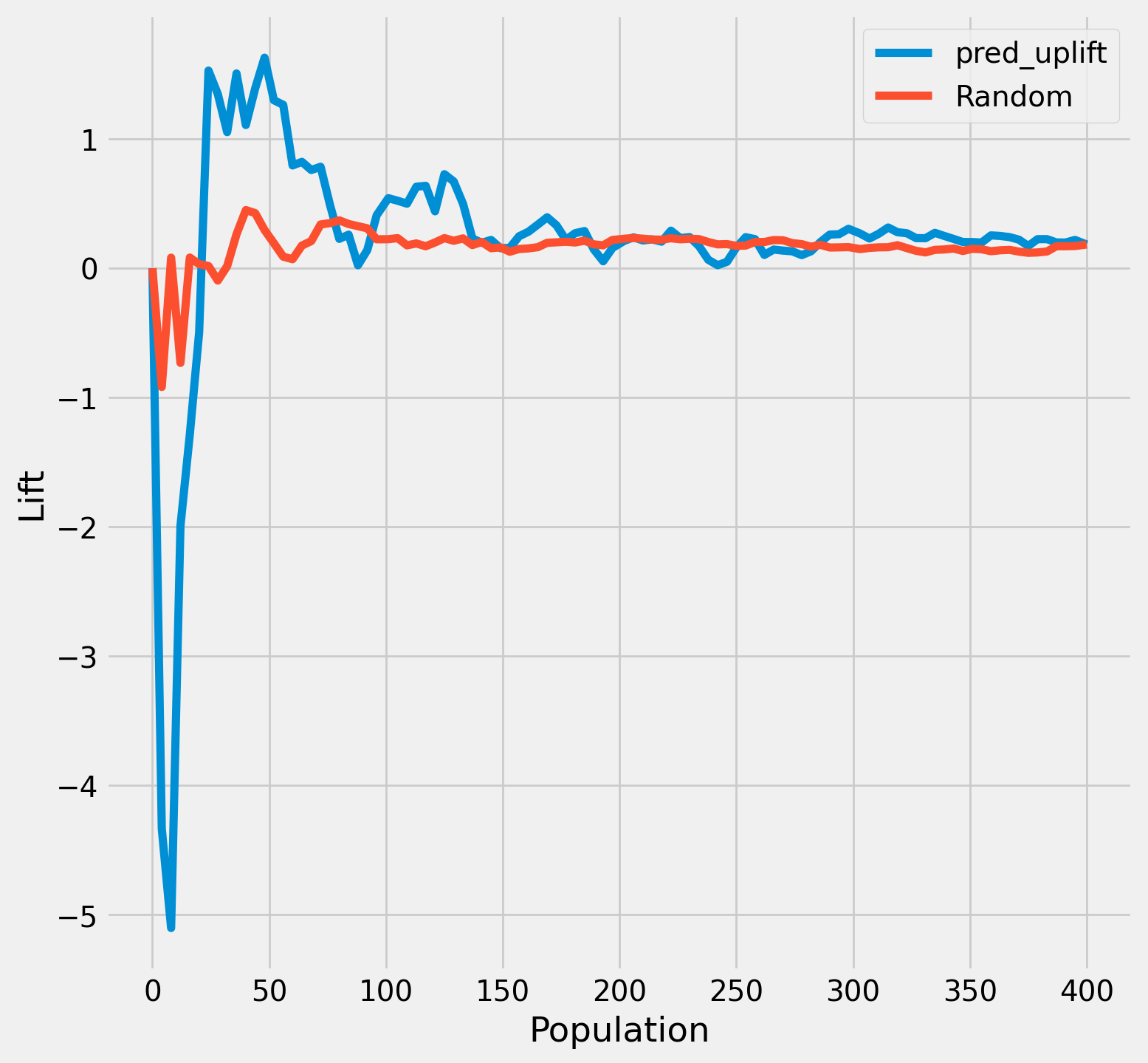
uplift降順に並び替えて最初の50人あたりまでが施策効果が平均以上に効いているようです.
まとめ
- causalmlのCausalRandomForestClassifierを用いて学習、予測タスクを行うことができた
- causalmlのCausalRandomForestClassifierのfeature_importancesやsklearnのpermutation importance、shapのshap_valuesを用いて特徴量の重要度を可視化することができた
- SHAP値の可視化については、その数値の生成過程に不可解な点があり、未解決
- UpliftRandomForestClassifierとCausalRandomForestClassifierの棲み分けは不明