2回連続でモーダルを出したい
何か重大な決定をするときに、2回連続でモーダルを出して再度確認を取りたい場面があると思います。 一番わかりやすいのが、セーブデータを削除するなど、致命的な決定に対して何度か確認をする場面です。それを今回はMaterialUIを使って実装していきます!
実装
モーダルの中のボタンに、別のモーダル呼び出しを入れるだけというシンプルなつくり。 Iconたモーダルに表示する文字列は呼び出し元の画面から渡されるようにしています。styled-componentsで形を整えていますが、本筋とは違うので略。
ModalInModal.js
import React, { Fragment, useEffect, useState } from 'react';
import styled from "styled-components";
import { makeStyles } from '@material-ui/core/styles';
import Modal from '@material-ui/core/Modal';
import { MaterialUICommonButton } from "../MaterialUICommonButton";
import { modalButtomLabel } from "../../constants";

const OKButtomWrapper = styled.div`
  margin-left:45%;
  float:left;
`;

const NGButtomWrapper = styled.div``;


const RectangleWrapper = styled.h2`
  border: solid;
  border-color: #F0F0F0 ;
  color:black;
  border-width:2px;
  display: flex;
  padding-left:1%;
  padding-top:1%;
  padding-bottom:1%;
  height:100%;
  width:100%;
`;

const RectangleIcon = styled.div`
  padding-top:1%;
  padding-right:1%;
`;

const RectangleText = styled.div`
  padding-top:1%;
`;


function rand() {
  return Math.round(Math.random() * 20) - 10;
}

function getModalStyle() {
  const top = 50;
  const left = 50;

  return {
    top: `${top}%`,
    left: `${left}%`,
    transform: `translate(-${top}%, -${left}%)`,
  };
}

const useStyles = makeStyles((theme) => ({
  paper: {
    position: 'absolute',
    width: 400,
    backgroundColor: theme.palette.background.paper,
    border: '2px solid #000',
    boxShadow: theme.shadows[5],
    padding: theme.spacing(2, 4, 3),
  },
}));

export default function ModalInModal({ Icon, text, onClick, modalTilte, modalText, modalVerificationTitle, modalVerificationText }) {
  const classes = useStyles();
  // getModalStyle is not a pure function, we roll the style only on the first render
  const [modalStyle] = useState(getModalStyle);
  const [open, setOpen] = useState(false);
  const [verificationOpen, setVerificationOpen] = useState(false);

  const handleOpen = () => {
    setOpen(true);
  };

  const handleClose = () => {
    setOpen(false);
  };

  const handleVerificationOpen = () => {
    setVerificationOpen(true);
  };

  const handleVerificationClose = () => {
    setVerificationOpen(false);
  };

  const handleOK = () => {
    handleClose();
    handleVerificationOpen();
  }

  const handleVerificationOK = () => {
    onClick();
    handleVerificationClose();
  }

  const body = (
    <div style={modalStyle} className={classes.paper}>
      <h2 id="simple-modal-title">{modalTilte}</h2>
      <p id="simple-modal-description">
        {modalText}
      </p>
      <OKButtomWrapper>
        <MaterialUICommonButton onClick={() => handleOK()} btnLabel={modalButtomLabel.MODAL_OK}></MaterialUICommonButton>
      </OKButtomWrapper>
      <NGButtomWrapper>
        <MaterialUICommonButton onClick={() => handleClose()} btnLabel={modalButtomLabel.MODAL_NG}></MaterialUICommonButton>
      </NGButtomWrapper>
    </div>
  );

  const VerificationBody = (
    <div style={modalStyle} className={classes.paper}>
      <h2 id="simple-modal-title">{modalVerificationTitle}</h2>
      <p id="simple-modal-description">
        {modalVerificationText}
      </p>
      <OKButtomWrapper>
        <MaterialUICommonButton onClick={() => handleVerificationOK()} btnLabel={modalButtomLabel.MODAL_OK}></MaterialUICommonButton>
      </OKButtomWrapper>
      <NGButtomWrapper>
        <MaterialUICommonButton onClick={() => handleVerificationClose()} btnLabel={modalButtomLabel.MODAL_NG}></MaterialUICommonButton>
      </NGButtomWrapper>
    </div>
  );

  return (
    <Fragment>
      <RectangleWrapper onClick={() => { handleOpen() }}>
        <RectangleIcon>
          <Icon fontSize='large' />
        </RectangleIcon>
        <RectangleText>
          {text}
        </RectangleText>
      </RectangleWrapper>
      <Modal
        open={open}
        onClose={handleClose}
        aria-labelledby="simple-modal-title"
        aria-describedby="simple-modal-description"
      >
        {body}
      </Modal>
      <Modal
        open={verificationOpen}
        onClose={handleVerificationClose}
        aria-labelledby="simple-modal-title"
        aria-describedby="simple-modal-description"
      >
        {VerificationBody}
      </Modal>
    </Fragment>
  );
}
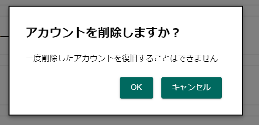
アカウント削除する際に出す想定でアイコンや値を渡して、上記のモーダルを呼び出すとこんな感じになります。
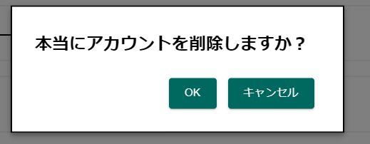
一度目のOKを押下後
参考