はじめに
私は勉強がてらGithubにてリンク:HandbrakeBatchRunnerという、オープンソースのHandbrakeを使った動画をバッチ変換を行うソフトを作っています。
その開発中に覚えたTips集などを、Qiitaで今後記事にしていきたいと思っています。
今回のはその第二弾となっています。
環境
VisualStudio 2019
.NET Core 3.1
WPF(C#)
今回のお話
「う~~~ん?ツールで補足説明を吹き出しっぽく出したいんだけどどう出せばいいんだ??」
-
WindowsFormなら
→ToolTipコントロールを配置してIsBalloon=tureすれば良いんだけど… -
WINDOWSAPIなら
→CreateWindowExで、tooltips_class32を引数に与えてウインドウを作ればいいんだけど…
「WPFってどうしたらいいんだろう」
~ぐぐってみる~
「おっ?Expression Blendってのがあるらしいぞ」
「むきー!VisualStudio2019だと同梱されてない!」
「ならばNuget!!」
「…同じような名前のがいっぱいあるわ。どれなのよこれ…」
「キー!もうアタイ自分で作っちゃうわよ!!」
解説
はい。
今回は簡単な自作吹出し表示を作ってみます。
WPFはUI構造が非常によくできててライブラリに頼らなくても
標準コントロールに対してカスタマイズの設定をすれば
結構簡単に作ることができるんで、自作してやり方を記事にしていきます。
(なお、吹き出しの根本は固定です(;・∀・)それやりだすとカオス!)
自分で記事を書こうと思ったのは、他記事では凝ったものが多かったりするし、そのためだけにライブラリを入れるのもな~
というのを今回思って、自作の吹き出しを採用しました。
副産物的にコントロールのカスタマイズというのは色々なところで
分かっていると役に立ちそうなのでそこの学びになるといいなと思っています。
早速作ってみよう
まずはそっけないTextBoxを2個配置したXAMLを書く。
<Window
    x:Class="WpfBallon.MainWindow"
    xmlns="http://schemas.microsoft.com/winfx/2006/xaml/presentation"
    xmlns:x="http://schemas.microsoft.com/winfx/2006/xaml"
    xmlns:d="http://schemas.microsoft.com/expression/blend/2008"
    xmlns:local="clr-namespace:WpfBallon"
    xmlns:mc="http://schemas.openxmlformats.org/markup-compatibility/2006"
    Title="MainWindow"
    Width="800"
    Height="450"
    mc:Ignorable="d">
    <Grid>
        <Grid.RowDefinitions>
            <RowDefinition Height="*" />
            <RowDefinition Height="*" />
        </Grid.RowDefinitions>
        <TextBox
            Name="TextBoxA"
            Grid.Row="0"
            Width="300"
            Height="100"
            Text="aaaaa" />
        <TextBox
            Name="TextBoxB"
            Grid.Row="1"
            Width="300"
            Height="100"
            Text="bbbbb" />
    </Grid>
</Window>
んでとりあえずポップアップを作ってみる。
        <Popup
            Name="BallonPopup"
            AllowsTransparency="True"
            IsOpen="{Binding ElementName=TextBoxA, Path=IsFocused, Mode=OneWay}"
            PlacementTarget="{Binding ElementName=TextBoxA}">
            <TextBlock>BallonPopup Here!!!</TextBlock>
        </Popup>
TextBoxAにフォーカスがあたったときにだけポップアップが出るようにとりあえずしてみる。
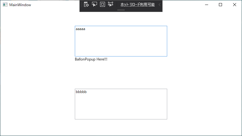
吹き出しなら枠が出て角は丸くないとね!
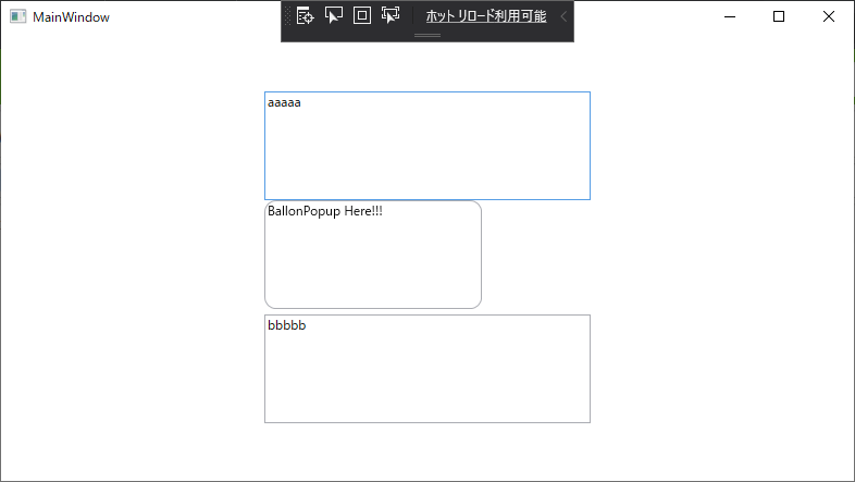
お次は吹き出しになるように角を丸める。
コピペもできるようにしたいのでTextboxにしちゃおう。
       <Popup
            Name="BallonPopup"
            AllowsTransparency="True"
            IsOpen="{Binding ElementName=TextBoxA, Path=IsFocused, Mode=OneWay}"
            PlacementTarget="{Binding ElementName=TextBoxA}">
            <TextBox
                Width="200"
                Height="100"
                Background="Transparent"
                IsReadOnly="True"
                Text="BallonPopup Here!!!">
                <TextBox.Template>
                    <ControlTemplate TargetType="{x:Type TextBoxBase}">
                        <Border
                            x:Name="Bd"
                            Background="{TemplateBinding Background}"
                            BorderBrush="{TemplateBinding BorderBrush}"
                            BorderThickness="{TemplateBinding BorderThickness}"
                            CornerRadius="10">
                            <ScrollViewer x:Name="PART_ContentHost" />
                        </Border>
                    </ControlTemplate>
                </TextBox.Template>
            </TextBox>
        </Popup>
コントロールのTempleteを変更することで、なんと見た目の表示がかんたんに変えれる。
これまじでWPFすごいよね。エクセレント!
CornerRadiusで角丸めてるよ。
吹き出しの本丸。吹き出しの根本を作るぞ
ControlTemplateは中にコントロールを一つ置けるので
Gridも置くことができる。角を丸めたBorderの上に
吹き出しの角をくっつけるためグリッドで縦に並べる。
           <TextBox
                Width="200"
                Height="100"
                Background="White"
                IsReadOnly="True"
                Text="BallonPopup Here!!!">
                <TextBox.Template>
                    <ControlTemplate TargetType="{x:Type TextBoxBase}">
                        <Grid Background="Transparent">
                            <Grid.RowDefinitions>
                                <RowDefinition Height="10" />
                                <RowDefinition Height="*" />
                            </Grid.RowDefinitions>
                            <Path
                                Grid.Row="0"
                                Data="M50,10 L60,0 70,10 "
                                Stroke="{TemplateBinding BorderBrush}" />
                            <Polygon
                                Grid.Row="0"
                                Fill="{TemplateBinding Background}"
                                Points="50,10 60,0 70,10" Panel.ZIndex="1" />
                            <Border
                                Grid.Row="1"
                                Background="{TemplateBinding Background}"
                                BorderBrush="{TemplateBinding BorderBrush}"
                                BorderThickness="{TemplateBinding BorderThickness}"
                                CornerRadius="10" Margin="0,-1,0,0" >
                                <ScrollViewer x:Name="PART_ContentHost" />
                            </Border>
                        </Grid>
                    </ControlTemplate>
                </TextBox.Template>
            </TextBox>
Pathで線を引いて吹き出しの角を書いて、Polygonで吹き出しの中を塗りつぶして
角を丸めたテキストをくっつけると・・・吹き出しの完成!!!
すべて合わせるとこう
<Window
    x:Class="WpfBallon.MainWindow"
    xmlns="http://schemas.microsoft.com/winfx/2006/xaml/presentation"
    xmlns:x="http://schemas.microsoft.com/winfx/2006/xaml"
    xmlns:d="http://schemas.microsoft.com/expression/blend/2008"
    xmlns:local="clr-namespace:WpfBallon"
    xmlns:mc="http://schemas.openxmlformats.org/markup-compatibility/2006"
    Title="MainWindow"
    Width="800"
    Height="450"
    mc:Ignorable="d">
    <Grid>
        <Grid.RowDefinitions>
            <RowDefinition Height="*" />
            <RowDefinition Height="*" />
        </Grid.RowDefinitions>
        <TextBox
            Name="TextBoxA"
            Grid.Row="0"
            Width="300"
            Height="100"
            Text="aaaaa" />
        <TextBox
            Name="TextBoxB"
            Grid.Row="1"
            Width="300"
            Height="100"
            Text="bbbbb" />
        <Popup
            Name="BallonPopup"
            AllowsTransparency="True"
            IsOpen="{Binding ElementName=TextBoxA, Path=IsFocused, Mode=OneWay}"
            PlacementTarget="{Binding ElementName=TextBoxA}">
            <TextBox
                Width="200"
                Height="100"
                Background="White"
                IsReadOnly="True"
                Text="BallonPopup Here!!!">
                <TextBox.Template>
                    <ControlTemplate TargetType="{x:Type TextBoxBase}">
                        <Grid Background="Transparent">
                            <Grid.RowDefinitions>
                                <RowDefinition Height="10" />
                                <RowDefinition Height="*" />
                            </Grid.RowDefinitions>
                            <Path
                                Grid.Row="0"
                                Data="M50,10 L60,0 70,10 "
                                Stroke="{TemplateBinding BorderBrush}" />
                            <Polygon
                                Grid.Row="0"
                                Fill="{TemplateBinding Background}"
                                Points="50,10 60,0 70,10" Panel.ZIndex="1" />
                            <Border
                                Grid.Row="1"
                                Background="{TemplateBinding Background}"
                                BorderBrush="{TemplateBinding BorderBrush}"
                                BorderThickness="{TemplateBinding BorderThickness}"
                                CornerRadius="10" Margin="0,-1,0,0" >
                                <ScrollViewer x:Name="PART_ContentHost" />
                            </Border>
                        </Grid>
                    </ControlTemplate>
                </TextBox.Template>
            </TextBox>
        </Popup>
    </Grid>
</Window>
まとめ
WPF難しそうで手を付けてなかったけど、バインディングやら
こういったビジュアルのカスタマイズやら、使い始めるとなにこれすごい便利。
Enjoy C# and WPF and .NET Core
おわり。
PS:
記事タイトルの「τ□」は吹き出しを意識した絵文字を書いてみたんだけど、
エロと間違えられてないか心配になってきたw
サンプルについて
GitHubに動かして試せるようにサンプルを入れました。
リンク:サンプルソース
02_WpfBallon
.NET Core 3.1 + WPF C#で作っています。
※完成形としてHandBrakeBatchRunnerにもほぼ同じソースが載っています。