分布(distribution)
・分布とはどの値にどれくらいデータが存在するか表したもの
・データの分布を図で表すことができる
・データを図で可視化することにより、データの大きさや偏りがわかる
# データ準備

import seaborn as sns

df = sns.load_dataset('tips')
df['tip_rate'] = df['tip'] / df['total_bill']
ヒストグラム
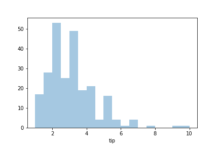
データが連続変数の場合はヒストグラムを使う。
※連続変数とは連続した数値で表現できる変数です。身長や体重、テストの点数など
・一つの連続変数の分布を表すのに使う
複数の連続変数の分布を見たいとなると、違う図が必要。
・各棒の区間に間隔がない
・横軸はデータの区間で区切られている
・ビン(bin)を使ってその区間の度数(frequency)を表す
sns.distplot(df['tip'], kde=False)
seabornのバージョン(sns.version)が0.11.0以上ならsns.displot()を使う
棒グラフ
データがカテゴリ変数の場合は棒グラフを使う。
※カテゴリ変数とは一般的に数や量で測れない変数。性別(0:男性、1:女性)、職業、地名や行政名、意識や実態に関する質問に対する回答(1.はい 2.いいえ)など
・一つのカテゴリ変数の分布を表すのに使うことができる
・各棒の区間には間隔がある
・横軸はカテゴリ変数のとりうる値
・棒を使ってその値の度数(frequency)を表す
sns.catplot(x='time', data=df, kind='count')
