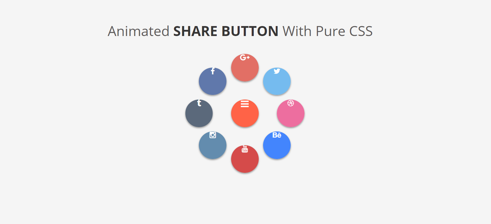
01.デザイン

02.流用元
■それからデザイン
https://sole-color-blog.com/blog/668/(https://sole-color-blog.com/blog/668/)
https://codepen.io/Mhmdhasan/pen/KdmOrY(https://codepen.io/Mhmdhasan/pen/KdmOrY)
03.基本的にコピペ...だが注意点
①boostlapのCDN記述が必要
test.html
<head>
    <link rel="stylesheet" href="https://maxcdn.bootstrapcdn.com/font-awesome/4.5.0/css/font-awesome.min.css">
</head>
最終的なソースは以下
test.html
<!DOCTYPE html PUBLIC "-//W3C//DTD XHTML 1.0 Transitional//EN" "http://www.w3.org/TR/xhtml1/DTD/xhtml1-transitional.dtd">
<html xmlns="http://www.w3.org/1999/xhtml">


    <head>
	    <!-- ①boostlapのCDN記述が必要 -->
		<link rel="stylesheet" href="https://maxcdn.bootstrapcdn.com/font-awesome/4.5.0/css/font-awesome.min.css">

		<style>

			/* ここからCSSコピペ*/
			@import url(https://fonts.googleapis.com/css?family=Open+Sans:400,700);

			body
			{
			   background: #f5f5f5;
			   color: #fff;
			   font-family: 'Open Sans', sans-serif;
			   text-align: center
			}

			h1
			{
			   color: #5C5959;
			   font-size: 30px;
			   padding-top: 40px;
			   font-weight: 400;;
			}

			strong
			{
			   text-transform: uppercase;
			   color: #373535
			}

			input
			{
			   display: none
			}

			div.share
			{
			   width: 60px;
			   height: 60px;
			   border-radius: 50%;
			   margin: 100px auto;
			   position: relative;
			}

			   label.click
			   {
				  width: 60px;
				  height: 60px;
				  border-radius: 50%;
				  text-align: center;
				  font-size: 20px;
				  line-height: 60px;
				  background: tomato;
				  box-shadow: 0px 2px 5px 0px rgba(0, 0, 0, 0.4);
				  position: absolute;
				  top: 30px;
				  left: 10px;
				  z-index: 1;
				  cursor: pointer
			   }

			   a, a:hover
			   {
				  text-decoration: none;
				  color: #fff
			   }

			   ul
			   {
				  list-style: none;
				  margin: 20px 0 0 0;
				  padding: 0;
				  position: absolute;
				  top: -50px;
				  left: -50px;
				  width: 200px;
				  height: 200px;
			   }

			   ul li a
			   {
				  display: inline-block;
				  width: 60px;
				  height: 60px;
				  line-height: 60px;
				  border-radius: 50%;
				  text-align: center;
				  position: absolute;
				  top: 60px;
				  left: 60px;
				  background: lightblue;
				  transition: all .4s cubic-bezier(0.935, 0, 0.34, 1.33);
				  -webkit-transition: all .5s cubic-bezier(0.935, 0, 0.34, 1.33);
			   }

			ul li:nth-of-type(2) a {transition-delay: .1s}
			ul li:nth-of-type(3) a {transition-delay: .2s}
			ul li:nth-of-type(4) a {transition-delay: .3s}
			ul li:nth-of-type(5) a {transition-delay: .4s}
			ul li:nth-of-type(6) a {transition-delay: .5s}
			ul li:nth-of-type(7) a {transition-delay: .6s}
			ul li:nth-of-type(8) a {transition-delay: .7s}

			   #click:checked ~ ul li a
			   {
				  box-shadow: 0px 2px 5px 0px rgba(0, 0, 0, 0.4);
			   }

			   #click:checked ~ ul li a.facebook
			   {
				  background: rgba(59,89,152,.8);
				  top: -10px;
				  left: -10px
			   }
			   #click:checked ~ ul li a.tumblr
			   {
				  background: rgba(53,70,92,.8);
				  transition-delay: .2s;
				  -webkit-transition-delay: .2s;
				  top: 60px;
				  left: -40px
			   }

			   #click:checked ~ ul li a.instagram
			   {
				  background: rgba(63,114,156,.8);
				  transition-delay: .3s;
				  -webkit-transition-delay: .3s;
				  top: 130px;
				  left: -10px
			   }
			   #click:checked ~ ul li a.youtube
			   {
				  background: rgba(205,32,31,.8);
				  transition-delay: .4s;
				  -webkit-transition-delay: .4s;
				  top: 160px;
				  left: 60px
			   }
			   #click:checked ~ ul li a.behance
			   {
				  background: rgba(23,105,255,.8);
				  transition-delay: .5s;
				  -webkit-transition-delay: .5s;
				  top: 130px;
				  left: 130px
			   }
			   #click:checked ~ ul li a.dribbble
			   {
				  background: rgba(235,76,137,.8);
				  transition-delay: .6s;
				  -webkit-transition-delay: .6s;
				  top: 60px;
				  left: 160px
			   }

			   #click:checked ~ ul li a.twitter
			   {
				  background: rgba(85,172,238,.8);
				  transition-delay: .7s;
				  -webkit-transition-delay: .7s;
				  top: -10px;
				  left: 130px
			   }

			   #click:checked ~ ul li a.google-plus
			   {
				  background: rgba(221,78,65,.8);
				  transition-delay: .8s;
				  -wenkit-transition-delay: .8s;
				  top: -40px;
				  left: 60px
			   }
			   /* CSSコピペ end*/
		</style>
	</head>

	<body>
		<!-- ここからhtmlコピペ -->
		<h1>Animated <strong>Share Button</strong> With Pure CSS</h1>

		<div class="share">
		   <input type="checkbox" id="click" name="share">
		   <label for="click" class="click"><i class="fa fa-bars"></i></label>

		   <ul>
			  <li><a href="#" class="facebook" title="facebook"><i class="fa fa-facebook"></i></a></li>
			  <li><a href="#" class="tumblr" title="tumblr"><i class="fa fa-tumblr"></i></a></li>
			  <li><a href="#" class="instagram" title="instagram"><i class="fa fa-instagram"></i></a></li>
			  <li><a href="#" class="youtube" title="youtube"><i class="fa fa-youtube"></i></a></li>
			  <li><a href="#" class="behance" title="behance"><i class="fa fa-behance"></i></a></li>
			  <li><a href="#" class="dribbble" title="dribbble"><i class="fa fa-dribbble"></i></a></li>
			  <li><a href="#" class="twitter" title="twitter"><i class="fa fa-twitter"></i></a></li>
			  <li><a href="#" class="google-plus" title="google plus"><i class="fa fa-google-plus"></i></a></li>

		   </ul>
		 <!-- htmlコピペ end-->
		</div>
    </body>
</html>
②コピペで完了…かと思いきや何故かアイコンが中心からずれる(原因不明)
↓CSSにmarginを追加して暫定対応
test.html
   /* 中心のボタンのi要素 */
   label i{
	   margin-top:20px;
   }

   /* 周囲のボタンのi要素*/
   ul li i
   {
	   margin-top:22px;
   }
④完成
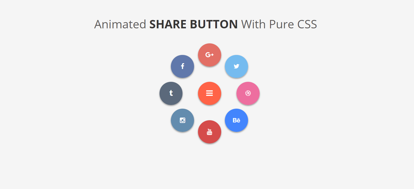
コピペのままのCSSだと配置が親要素の下部の真ん中(モンスターボールみたいな配置)になる
変えたければcssのpositionを変更することで対応可能

と、まぁ完全にメモでした
おーわり