Data-Driven-Formsのカスタムフォームを使ってみる
やりたいこと
-
Ant Designのフォームを参考に、
schemaを渡して動的にフォームを作る
フォームの完成図は下記の通りです。
Title,questionText,inputLabelAhead,inputLabelBackはschemaから受け取ったものを表示する予定です。

準備
data-driven-forms、使用するcssフレームワークを取得。
data-driven-formsの準備については別でまとめています。
実装
コード全文
コード全文は下記の通りです。
import React from 'react';
import FormRenderer from '@data-driven-forms/react-form-renderer/form-renderer';
import componentTypes from '@data-driven-forms/react-form-renderer/component-types';
import AntFormTemplate from '@data-driven-forms/ant-component-mapper/form-template';
import TextField from '@data-driven-forms/ant-component-mapper/text-field';
import useFieldApi from '@data-driven-forms/react-form-renderer/use-field-api';
import FormGroup from '@data-driven-forms/ant-component-mapper/form-group';
import { Input, Typography } from 'antd';
import 'antd/dist/antd.css';
import './textboxForm.css';

const { Text } = Typography;

const schema = {
    fields: [
        {
            component: 'textbox-component',
            name: 'textbox-form',
            label: 'textbox-form',
            questionText: 'questionText',
            inputLabelAhead: 'inputLabelAhead',
            inputLabelBack: 'inputLabelBack',
        }
    ]
};

const TextboxComponent = ( props: any ) => {
    const {
        input,
        isReadOnly,
        isDisabled,
        placeholder,
        isRequired,
        label,
        helperText,
        description,
        validateOnMount,
        meta,
        FormItemProps,
        layout,
        questionText,
        questionNotice,
        inputLabelAhead,
        inputLabelBack,
        inputNotice,
        ...rest
    } = useFieldApi( props );

    return (
        <div className='wrapper'>
            <FormGroup
                label={label}
                meta={meta}
                validateOnMount={validateOnMount}
                helperText={helperText}
                description={description}
                FormItemProps={FormItemProps}
                isRequired={isRequired}
                layout={layout}
            >
                <div>
                    <Text>{questionText}</Text>
                </div>
                <Text>{inputLabelAhead}</Text>
                <Input
                    {...input}
                    defaultValue={input.value ? input.value : undefined}
                    disabled={isDisabled}
                    readOnly={isReadOnly}
                    placeholder={questionText}
                    {...rest}
                />
                <Text>{inputLabelBack}</Text>
            </FormGroup>
        </div>
    );
};

const componentMapper = {
    [ componentTypes.TEXT_FIELD ]: TextField,
    'textbox-component': TextboxComponent
};

// formの向きをhorizontalに指定
const FormTemplate = ( props: any ) => <AntFormTemplate {...props} showFormControls={false} layout='horizontal' />;

const TextboxForm = () => (
    <FormRenderer
        FormTemplate={FormTemplate}
        componentMapper={componentMapper}
        schema={schema}
        onSubmit={console.log} />
);

export default TextboxForm;
1.schemaでコンポーネント、内容を定義
const schema = {
    fields: [
        {
            component: 'textbox-component',
            name: 'textbox-form',
            label: 'textbox-form',
            questionText: 'questionText',
            inputLabelAhead: 'inputLabelAhead',
            inputLabelBack: 'inputLabelBack',
        }
    ]
};
schemaでコンポーネント、内容を定義し、TextFormに渡しています。schemaの中身を追加することで複数のコンポーネントを表示させることができます。
component: 'textbox-component'としていますが、data-driven-formsで用意されているコンポーネントや自作したコンポーネントとすることで、別の種類のコンポーネントを表示させることもできます。
const schema = {
    fields: [
        {
            component: 'textbox-component',
            name: 'textbox-form',
            label: 'textbox-form',
            questionText: 'questionText',
            inputLabelAhead: 'inputLabelAhead',
            inputLabelBack: 'inputLabelBack',
        },
        {
          component: componentTypes.TEXT_FIELD
          name: 'first-name',
          label: 'First name',
        },
    ]
};
2. Formに表示するためのコンポーネントを作成
このコンポーネントは受け取ったschemaに応じてフォームの内容を動的に変更するためのものです。
ANT Text Fieldをベースに、見出し部分、入力エリア前後のラベルを追加しています。コンポーネントの中身はpropsで受け取った値(=schemaの値)を表示します。
ANT Text Fieldのソースはdata-driven-formsのGitHubから持ってきています。returnの中で画面に表示する部分の実装を行います。
AntのFormをdata-driven-formsではFormGroupとして定義されていましたのでFormGroupを使います。
FormGroupの定義はGitHubから確認しました。
const TextboxComponent = ( props: any ) => {
    const {
        // ... 略
        questionText,
        questionNotice,
        inputLabelAhead,
        inputLabelBack,
        inputNotice,
        ...rest
    } = useFieldApi( props );

    return (
        <div className='wrapper'>
            <FormGroup
                label={label}
                meta={meta}
                validateOnMount={validateOnMount}
                helperText={helperText}
                description={description}
                FormItemProps={FormItemProps}
                isRequired={isRequired}
                layout={layout}
            >
                <div className='question-textarea'>
                    <Text className='question-text'>{questionText}</Text>
                </div>
                <Text >{inputLabelAhead}</Text>
                <Input
                    {...input}
                    defaultValue={input.value ? input.value : undefined}
                    disabled={isDisabled}
                    readOnly={isReadOnly}
                    placeholder={questionText}
                    {...rest}
                />
                <Text>{inputLabelBack}</Text>
            </FormGroup>
        </div>
    );
};
3.コンポーネントマッパーを割り当て
schemaで渡したコンポーネントをFormRendererでレンダリングするためにコンポーネントマッパーを割り当てます。
const componentMapper = {
    [ componentTypes.TEXT_FIELD ]: TextField,
    'textbox-component': TextboxComponent
};
4.FormRendererでコンポーネントをレンダリングする
FormRendererにschema、componentMapperを渡してコンポーネントをレンダリングします。
Ant Designのフォームにはhorizontalとverticalのレイアウトがあり、デフォルトではvertical、FormTemplateにlayout='horizontal'を渡すことでレイアウトを変更することができます。
// formの向きをhorizontalに指定
const FormTemplate = ( props: any ) => <AntFormTemplate {...props} showFormControls={false} layout='horizontal' />;

const TextboxForm = () => (
    <FormRenderer
        FormTemplate={FormTemplate}
        componentMapper={componentMapper}
        schema={schema}
        onSubmit={(value) =>console.log(value)} />
);

export default TextboxForm;
5.App.tsxにTextboxFormをインポートして表示する
import React from 'react';
import './App.css';
import TextboxFrom from './components/TextboxForm/TextboxForm';

function App() {
  return (
    <div className="App">
      <TextboxFrom />
    </div>
  );
}

export default App;
ここまでのものを実行すると下記画像のようになります。
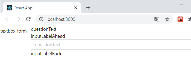
※cssでフォームのテキストを左寄せにしています。
最後に
data-driven-formsのドキュメントを参考に、まずは見た目を作ることを目標に実装を行いました。
ですので、テキストボックスに入力された時のバリデーションや処理は考慮していません。この辺りを考慮するとコードに修正が必要な部分があるかと思います。