本記事では、GAIAのDR3 の、python を用いた基本的な扱い方について記述します。
今回は、比較の例としてHerschelのアーカイブデータも用います。データは
http://herschel.esac.esa.int/Science_Archive.shtml
から
Taurus
と検索して、一番上に出てくる level3 のfits
hspireplw_30pxmp_0436_p2515_1476896810029.fits
を使用します。
まずは必要なものを import します。
from astropy.io import fits
import numpy as np
import pandas as pd
from matplotlib import pyplot as plt
import aplpy
from astropy import units as u
from astropy.wcs import WCS
from astropy.coordinates import SkyCoord
from astroquery.gaia import Gaia
import pandas as pd
pd.set_option('display.max_columns', 100)
とりあえず、Herschel のデータを見ます。
hdu = fits.open("hspireplw_30pxmp_0436_p2515_1476896810029.fits")[1] ### 普通は[0]
w = WCS(hdu)

fig = plt.figure(figsize=(8, 8))
f = aplpy.FITSFigure(hdu, slices=[0], convention='wells', figure=fig)
f.show_colorscale(cmap="jet", aspect="equal")
plt.show()

Gaia データのダウンロード
Gaiaのデータは膨大ですので、全部ダウンロードすると大変なことになります。基本的には必要な部分のみをダウンロードして使います。
ウェブのフォームからもダウンロード可能なのですが、一度に取得できる量に制限があるので、python による方法をお勧めします。
まずは以下の変数を書き換えます。
Gaia.MAIN_GAIA_TABLE = "gaiadr3.gaia_source"  # DR3
# Gaia.MAIN_GAIA_TABLE = "gaiaedr3.gaia_source"  # EDR3
Gaia.ROW_LIMIT = -1 # -1を指定すると上限青天井
今回は例として、適当にこのあたりの星を取得します。
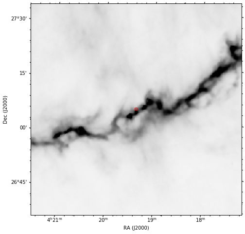
coords = "4:19:52.0 +27:12:30.0"
c = SkyCoord(coords, frame="fk5", unit=(u.hourangle, u.deg))

fig = plt.figure(figsize=(8, 8))
f = aplpy.FITSFigure(hdu, slices=[0], convention='wells', figure=fig)
f.show_colorscale(cmap="Greys", aspect="equal")
f.show_markers(c.fk5.ra.deg, c.fk5.dec.deg)
f.recenter(c.fk5.ra.deg, c.fk5.dec.deg, width=0.5, height=0.5)
plt.show()
半径 0.5 度の範囲を取得します。
radius = 0.5*u.deg
j = Gaia.cone_search_async(c, radius)
r = j.get_results()
少し時間がかかります。
結果を見ます。
r.pprint

#<bound method Table.pprint of <Table length=8131>
#        dist         ...
#                     ...
#      float64        ...
#-------------------- ...
# 0.01910917798307798 ...
#0.021585256432401608 ...
# 0.02757292230391897 ...
#0.029302247109999367 ...
#0.031447477553026355 ...
#0.032318879498195584 ...
# 0.03500904509716016 ...
# 0.03884074378865377 ...
#0.039060427046933945 ...
#                 ... ...
#  0.4995100823717482 ...
# 0.49954443834279916 ...
#  0.4996255278820678 ...
#  0.4996465140393764 ...
# 0.49977119463277786 ...
#  0.4997756139360711 ...
# 0.49977785016602705 ...
# 0.49991212461028306 ...
# 0.49994741414110117 ...
#  0.4999627788926277 ...>
もしくは
r[0]
などで見られます。
このままでは少し扱いづらいので、pandas 形式に変換します。
df = r.to_pandas()
これでpandas 形式になりました。
csv で保存したいときは
df.to_csv("stars_test.csv")
とします。
使い方の例
例えば、"radial_velocity" のデータが入っているものだけ欲しい場合は、
df_vr = df[df["radial_velocity"]==df["radial_velocity"]]
などで絞ります。(※ バージョンによってキーの名前が微妙に異なっている可能性があります。)
"radial_velocity"が 10 km/s 以上のものだけ拾いたい場合は
df[df["radial_velocity"]>10.0]
などとします。
星までの距離を"parallax"から計算します。
distance_all = 1.0/(np.abs(df["parallax"])/1000.0)
中身を見ます。
plt.hist(distance_all, bins=np.linspace(0, 3000.0, 100))
plt.xlabel("pc")
plt.ylabel("Number of stars")

plt.hist(df[df["radial_velocity"]==df["radial_velocity"]]["radial_velocity"], bins=50)
plt.xlabel("km/s")
plt.ylabel("Number of stars")

マップの上に plot します。
fig = plt.figure(figsize=(12, 12))
f = aplpy.FITSFigure(hdu, slices=[0], convention='wells', figure=fig)
f.show_colorscale(cmap="Greys", aspect="equal")
f.show_markers(df["ra"], df["dec"], c="r", s=5)
f.recenter(c.fk5.ra.deg, c.fk5.dec.deg, width=1.0, height=1.0)
plt.show()
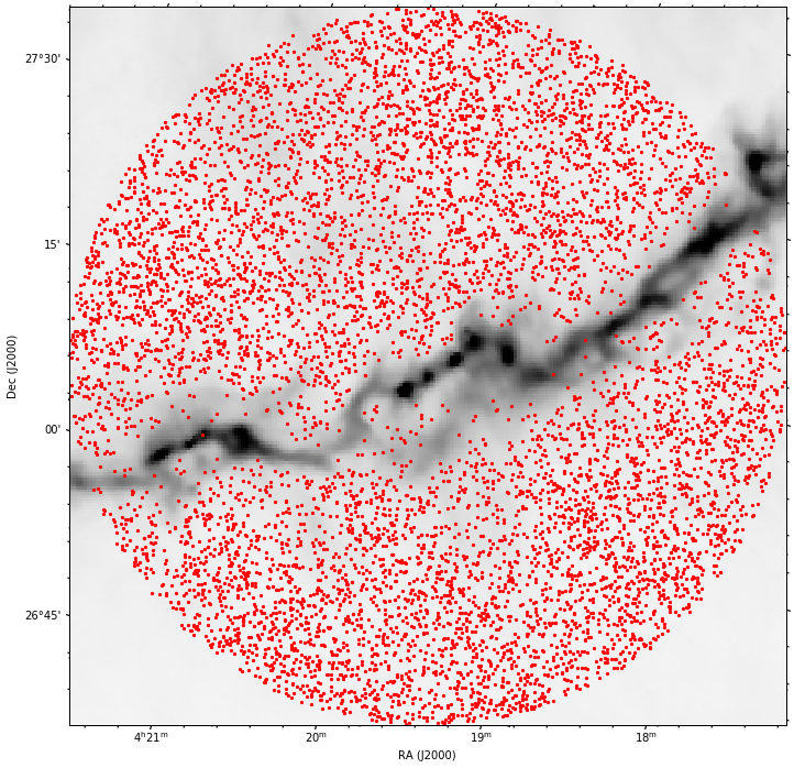
綺麗に減光されていることがわかります。
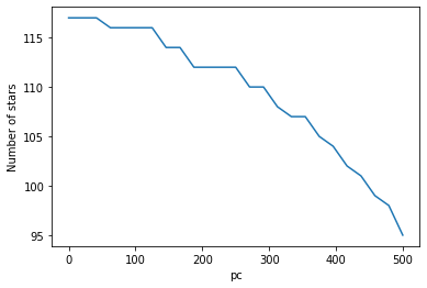
どの距離から減光されて居なくなっているのかを調べます。
dist_list = np.linspace(0, 500, 25)
print(dist_list)
#[  0.          20.83333333  41.66666667  62.5         83.33333333
# 104.16666667 125.         145.83333333 166.66666667 187.5
# 208.33333333 229.16666667 250.         270.83333333 291.66666667
# 312.5        333.33333333 354.16666667 375.         395.83333333
# 416.66666667 437.5        458.33333333 479.16666667 500.        ]

num_stars_list = [len(distance_all[distance_all>dist]) for dist in dist_list]

plt.plot(dist_list, num_stars_list)
plt.xlabel("pc")
plt.ylabel("Number of stars")

思ったよりわかりませんでした。
Herschel の強度も使ってみます。
ra_ch_list, dec_ch_list = w.wcs_world2pix(df["ra"], df["dec"], 0)
ra_ch_list = [int(round(ra_ch)) for ra_ch in ra_ch_list]
dec_ch_list = [int(round(dec_ch)) for dec_ch in dec_ch_list]

int_array = np.array([hdu.data[dec_ch, ra_ch] for  ra_ch, dec_ch in zip(ra_ch_list, dec_ch_list)])
例えば、Herschel の強度が 20 MJy/sr 以上のものだけ plot します。
mask = int_array>=20.0

fig = plt.figure(figsize=(12, 12))
f = aplpy.FITSFigure(hdu, slices=[0], convention='wells', figure=fig)
f.show_colorscale(cmap="Greys", aspect="equal")
f.show_markers(df["ra"][mask], df["dec"][mask], c="r", s=5)
f.recenter(c.fk5.ra.deg, c.fk5.dec.deg, width=1.0, height=1.0)
plt.show()

num_stars_list_over20 = [len(distance_all[(distance_all>dist) & (int_array>=20.0)]) for dist in dist_list]

plt.plot(dist_list, num_stars_list_over20)
plt.xlabel("pc")
plt.ylabel("Number of stars")
距離 150 pc 付近に大きな段差があるような気もしますし、ないような気もします。
といった感じで、pandas 形式にしてしまえば、あとは自由な解析が可能です。
以上です。
リンク
目次