はじめに
react-primitives, react-native-webを実務で使う機会があったのですが、そこでwebにおいてweb特有の挙動を再現するのにかなり手こずる箇所がありました。
そのひとつとして、擬似クラスの実装があります。cssに擬似クラスのプロパティを書くだけでwebでは動くのですが、nativeにはhover等の動作がありません。
これを実現する擬似擬似クラスの実装が、まだまだ実務レベルで使われるケースが少ないのかなかなか知見が貯まっていないようなので、一例として共有させていただきます。
そもそも、react-primitivesがなになのか分からない!といった方は以下の記事をご参照ください!
react-primitivesってなにやってるんですか?! 〜ソースコードから要点を解説〜
example
こちらを紹介するにあたってのexampleは以下のレポジトリとなっていますので、手元で動かしたい方等はご参照ください。
https://github.com/Shagamii/pseudo-class-example
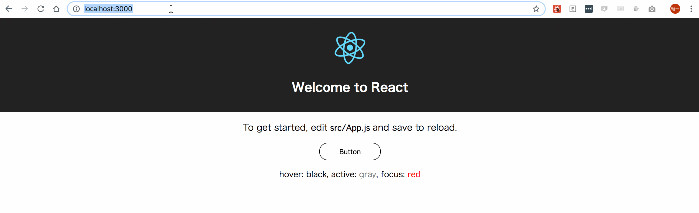
挙動はこのような形になります。
hover(黒)

active(グレー)

focus(赤、 ボタンクリック後とタブ移動)
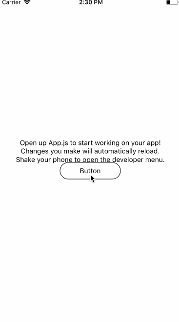
native
実装
最初に参考にした記事
最初に擬似クラスを実装するにあたって参考にした記事は以下の記事です。
https://github.com/necolas/react-native-web/issues/205
このなかでは、二つの方法が紹介されています。
- https://github.com/necolas/react-native-web/issues/205#issuecomment-297030147
- https://github.com/necolas/react-native-web/issues/205#issuecomment-311947750
前者では、擬似クラスに該当するトリガーでstateを更新し、そのstateを元にスタイルを切り替えています。
後者では、擬似クラスに該当するトリガーでstyleを直接書き換えています。
ここで僕は前者の方法を採用しました。
理由としては、後者の方法では複数の擬似クラスが作用した際にstyleの順番を変更できないためオーバーライドの順番を自由に決定できないことや、一つの擬似クラスコンポーネントに対し1つのstyleしか指定できないため変更できるstyleが一つの要素のみになってしまいます。
また、以下のようなstyle内で擬似クラスのプロパティによってスタイルを決定するインターフェイスで利用できるようにすることでよりCSSの擬似クラスに近い使用感を生み出すことができます。
インターフェイス
コンポーネントを使用する際の主なインターフェイスとしては次のようなものになりました。
- 擬似クラスを付与できるコンポーネントを独立させるAccessibleComponentを作る
- AccessibleComponentのrenderPropsパターンで擬似クラスを付与させたいコンポーネント(ここではButtonPresenter)を子コンポーネントとして定義し、擬似クラス要素等を渡す
// 擬似クラスを付与させたいコンポーネント
export const ButtonPresenter = ({
  children,
  pseudo: { hover, active, focus, disabled } = {},
  accessibilityRole,
  style,
  ...rest
}) => (
  <Text>
    <View
        style={[
          styles.button,
        // CSSに近い記述を可能に
          hover && styles.hoverButton,
          focus && styles.focusButton,
          focus && {
            outline: "none"
          },
          active && styles.activeButton,
          style
        ]}
        accessibilityRole={accessibilityRole}
        {...rest}
    >
      <Text
        style={[
          (hover || focus) && styles.hoverText,
        ]}
      >
        { children }
      </Text>
    </View>
  </Text>
)

const Button = ({
  disabled,
  ...rest
}) => (
  <AccessibleComponent
    render={(data) => (
      <ButtonPresenter {...data} />
    )}
    accessibilityRole="button"
    disabled={disabled}
    {...rest}
  />
);

export default Button;
上のインターフェイスでまだ説明していないaccessibilityRoleというプロパティがあると思いますが、これはhtmlにおいてのh1, h2, buttonタグなどの意味・役割を明示的に持つ要素を生成できるプロパティです。ここでは主にfocusを実装するために使われおり、その説明は後述します。
Accessibility
擬似クラスコンポーネントの実装
実装は以下のソースコードのようになっており、stateで管理している擬似クラスの状態をrenderPropsに渡しており、その状態は各トリガーで変更しているのがわかります。
ここからそれぞれの擬似クラスのstateを変更するトリガーは以下のようになっています。
| 擬似クラス名 | trueにするトリガー | falseにするトリガー |
|---|---|---|
| hover | onMouseEnter | onMouseLeave |
| active | onPressIn | onPressOut |
| focus | onFocus | onBlur |
この中で多少ややこしくなっているfocusの処理について解説しておきます。
focus
focusではトリガーはonFocusとonBlurで制御することができ非常に用意に見えますが、それぞれを発火することができる要素を作る必要があります。ここで役に立つのが先ほど紹介したaccessibilityRoleのプロパティです。
これを用いて、それらを発火することのできるaccessibilityRoleを指定し解決しています。
ただaccessibilityRoleが指定されない場合も存在します。そのためにrenderPropsに渡すchildrenに対してaccessibilityRoleをボタンとして見えないViewコンポーネントを仕込んで解決しています。
また、focus状態でEnterを押してonPressを発火させるために、onKeyDownでkeyを取得してEnterの場合に発火させています。
(onPressをaccessibilityRoleをもつ要素に渡せば行けるかなと思ったけど発火しなかった、、、)
import React, { Component } from "react";
import { Touchable, Text } from "react-primitives";

const triggerableAccessibilityRole = [
  "link",
  "button"
]

class AccessibleComponent extends Component {

  state = {
    focus: false,
    active: false,
    hover: false
  }

  onPressIn = () => {
    this.setState({
      active: true,
    });

    const { onPressIn } = this.props;
    if (onPressIn) {
      onPressIn();
    }
  };

  onKeyDown = (e) => {
    const { key } = e
    const { onPress, onKeyDown } = this.props;
    if (key === "Enter" && onPress) {
      onPress();
    }

    if (onKeyDown) {
      onKeyDown();
    }
  };

  onMouseLeave = () => {
    this.setState({
      hover: false
    });

    const { onMouseLeave } = this.props;
    if (onMouseLeave) {
      onMouseLeave();
    }
  };

  onFocus = () => {
    this.setState({ focus: true });

    const { onFocus } = this.props;
    if (onFocus) {
      onFocus();
    }
  };

  onBlur = () => {
    this.setState({ focus: false });

    const { onBlur } = this.props;
    if (onBlur) {
      onBlur();
    }
  };

  onPressOut = () => {
    this.setState({
      active: false,
    });

    const { onPressOut } = this.props;
    if (onPressOut) {
      onPressOut();
    }
  };

  onMouseEnter = () => {
    this.setState({
      hover: true
    });

    const { onMouseEnter } = this.props;
    if (onMouseEnter) {
      onMouseEnter();
    }
  };

  renderPropsChildren = () => {
    const { accessibilityRole, inputProps, children } = this.props;
    return (
      <React.Fragment>
        {
          (!accessibilityRole || !triggerableAccessibilityRole.includes(accessibilityRole)) && (
          <Text
            accessibilityRole="button"
            style={{
              width: 0,
              height: 0,
              position: "absolute"
            }}
            onFocus={this.onFocus}
            onKeyDown={this.onKeyDown}
            onBlur={this.onBlur}
            {...inputProps}
          />
        )}
        {children}
      </React.Fragment>
    );
  };

  render() {
    const {
      disabled,
      render,
      accessibilityRole,
      ...rest
    } = this.props;
    const { focus, hover, active } = this.state;
    const pseudo = {
      focus,
      hover,
      active,
      disabled
    };

    const renderData = {
      children: this.renderPropsChildren(),
      onMouseEnter: this.onMouseEnter,
      onMouseLeave: this.onMouseLeave,
      onFocus: this.onFocus,
      onKeyDown: this.onKeyDown,
      onBlur: this.onBlur,
      accessibilityRole,
      pseudo
    };
   return (
      <Touchable
        onPressIn={this.onPressIn}
        onPressOut={this.onPressOut}
        disabled={disabled}
        {...rest}
      >
        {render(renderData)}
      </Touchable>
    );
  }
}


export default AccessibleComponent;
その他注意すべき点
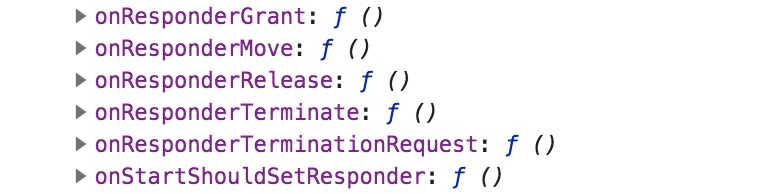
注意すべき点として、必ずonMouseEnter等のトリガーを子コンポーネントで作用させたい要素に適切に渡す必要があると共に、renderDataプロパティで渡ってきているプロパティ以外にも、TouchableにおいてonPress, In, Outを発火させるためにrn-webでは、トリガーを発火させたい要素に渡すメソッドが存在しpropsにインジェクションされています。今回の場合、Buttonコンポーネント内では {...rest} で展開させていますが、これを忘れないようにしましょう。
内容としてはこのコンソールのプロパティです。
※ここの部分の解釈を間違えている可能性があるので気になる方はこの辺を読んで解釈してください
https://github.com/necolas/react-native-web/blob/9a1cade1f0b62068072ceb73f93b4b3cf259128c/packages/react-native-web/src/exports/Touchable/index.js#L61
まとめ
以上が今回の実装です。
あくまで一例であり、これがベストプラクティスではないだろうなとは思っている部分もあるのでまた違ったものを共有していただいたり、レビュー等よろしくお願いします!