初めに
今回の記事はkaggleのデータにあるEffective Targetting of Advertismentsを使用しユーザが広告をクリックしたかどうかを2値分類で予測してみました。
データ
1 データの確認
import numpy as np
import pandas as pd
import seaborn as sns
import plotly.express as px
import matplotlib.pyplot as plt
import plotly.graph_objects as go
from plotly.subplots import make_subplots
from sklearn.impute import SimpleImputer
from sklearn.metrics import accuracy_score
from sklearn.preprocessing import LabelEncoder
from sklearn.model_selection import StratifiedKFold, train_test_split
from lightgbm import LGBMClassifier
import time
import warnings
warnings.filterwarnings('ignore')
from sklearn.decomposition import PCA #主成分分析
from sklearn.linear_model import LogisticRegression # ロジスティック回帰
from sklearn.neighbors import KNeighborsClassifier # K近傍法
from sklearn.svm import SVC # サポートベクターマシン
from sklearn.tree import DecisionTreeClassifier # 決定木
from sklearn.ensemble import RandomForestClassifier # ランダムフォレスト
from sklearn.ensemble import AdaBoostClassifier # AdaBoost
from sklearn.naive_bayes import GaussianNB # ナイーブ・ベイズ
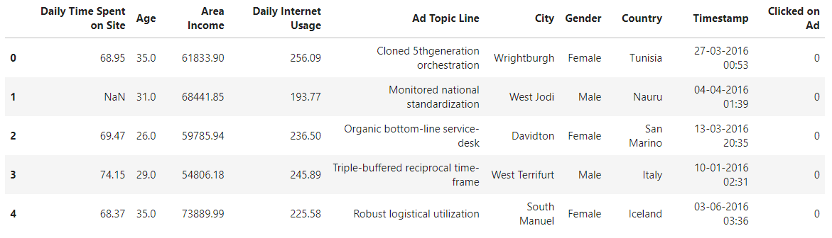
df_all = pd.read_csv("/kaggle/input/advertising-ef/advertising_ef.csv")
df_all.head()
df_all.describe(include='all')
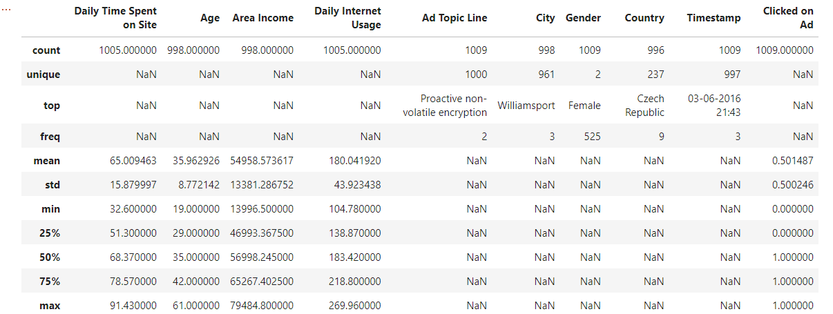
このようなデータになっています。
具体的に説明すると、
Daily Time Spent on Site:1日にどのくらいサイトに時間を使っているか?
Age: ユーザの年齢
Area Income: 地域の収入
Daily Internet Usage:毎日どのくらいインターネットを使うか?
Ad Topic Line:広告トピックライン(ここはuniqueが多すぎるので外しました)
City:町の名前(ここはuniqueが多すぎるので外しました)
Male:男女
Country:国の名前(ここはuniqueが多すぎるので外しました)
Timestamp:クリックした日時
Clicked on Ad:クリックしたかどうか?(ここが求めたい変数です。)
これらの変数を使用してユーザがクリックするかどうかを予測する。
これは2値分類ですね.....
2 前処理
df_all['Age'].fillna(df_all['Age'].median(),inplace=True)
df_all['Area Income'].fillna(df_all['Area Income'].mean(),inplace=True)
df_all['Daily_Time_Spent_on_Site'].fillna(df_all['Daily_Time_Spent_on_Site'].mean(),inplace=True)
df_all['Daily Internet Usage'].fillna(df_all['Daily Internet Usage'].mean(),inplace=True)
ここは平均と中央値が大体同じなので平均を使用しました。
不均衡データか確認
df_all['Clicked on Ad'].value_counts()
1    506
0    503
Name: Clicked on Ad, dtype: int64
偏りなし!!!
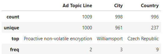
object_Dtype = ['Ad Topic Line', 'City', 'Country']
df_all[object_Dtype].describe(include=['O'])
df_all = df_all.drop(['Ad Topic Line', 'City', 'Country'], axis=1)
これら3つの変数は説明変数ですがuniqueが多すぎるためクリック予測に適さないと思い外しました。
from sklearn.preprocessing import LabelEncoder
label_encoder = LabelEncoder()
df_all['Gender'] = label_encoder.fit_transform(df_all['Gender'])
df_all['Timestamp'] = pd.to_datetime(df_all['Timestamp'])
df_all['Month'] = df_all['Timestamp'].dt.month
df_all['Date'] = df_all['Timestamp'].dt.day
df_all['Hour'] = df_all['Timestamp'].dt.hour
df_all['Min'] = df_all['Timestamp'].dt.minute
df_all = df_all.drop(['Timestamp'], axis=1)
変数を増やし精度を上げるために寄与しました。
yearはすべてのデータが2016年なので使用しませんでした。
3 データの傾向を視覚化
df_all.iloc[:, :-1].describe().T.sort_values(by='std' , ascending = False)\
                     .style.background_gradient(cmap='GnBu')\
                     .bar(subset=["max"], color='#BB0000')\
                     .bar(subset=["mean",], color='green')
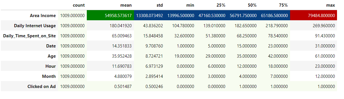
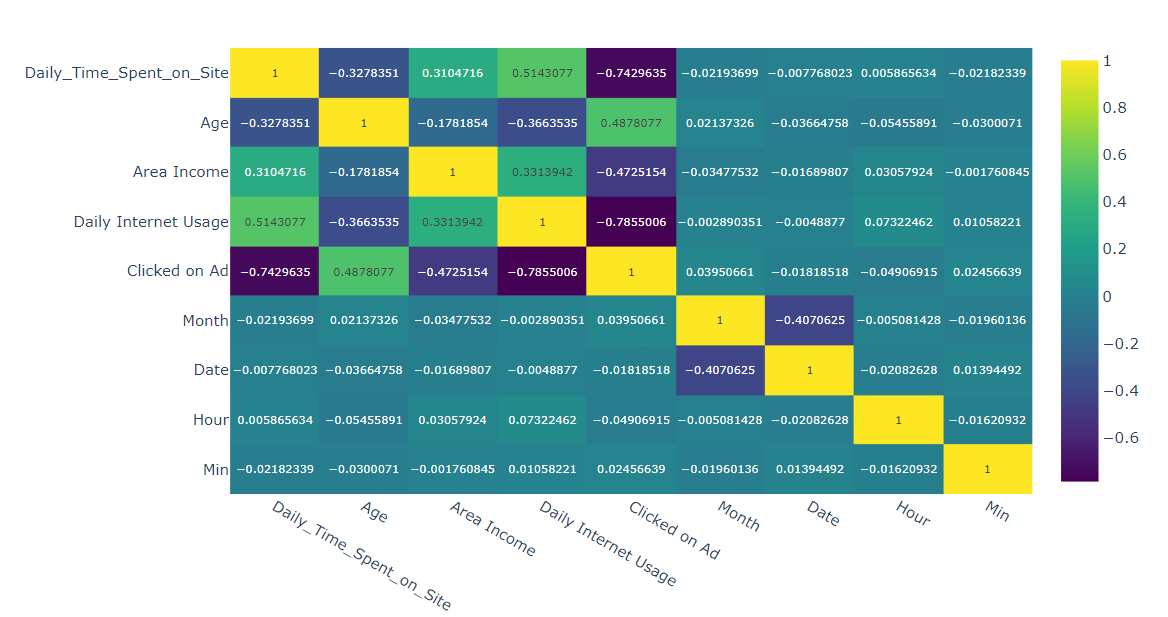
fig = px.imshow(df_all.corr() ,text_auto=True, aspect="auto" , color_continuous_scale = "viridis")
fig.show()
sns.pairplot(df_all, hue='Clicked on Ad', palette="Reds")
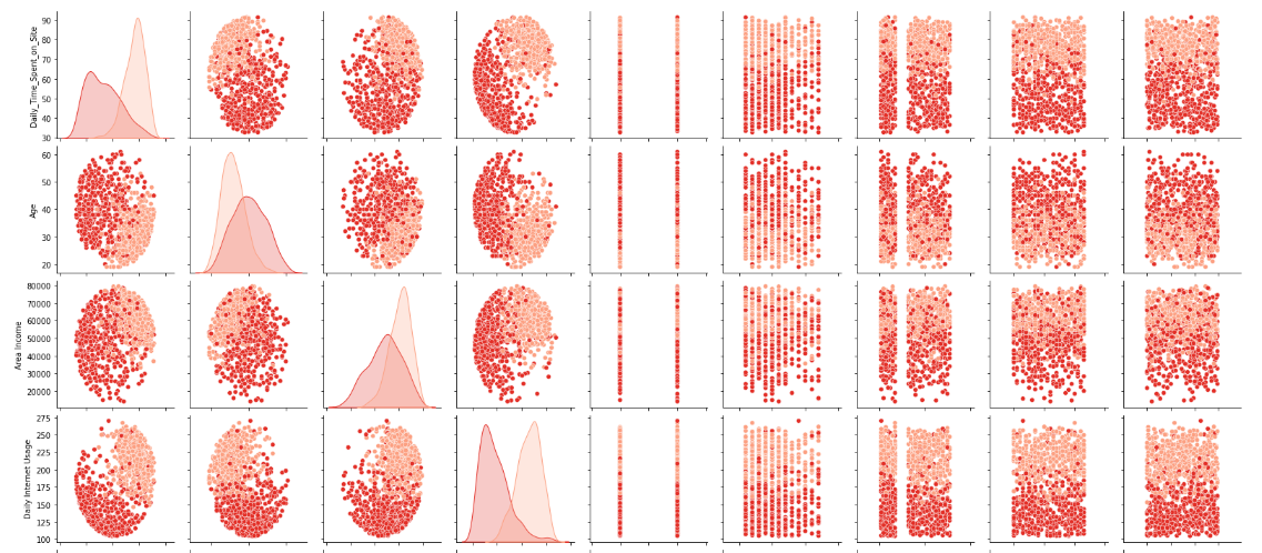
これを見る限りDaily_Time_Spent_on_Siteが分類に一番寄与しそうな感じがします。
from sklearn.decomposition import PCA
y = df_all["Clicked on Ad"].values
df_all = df_all.drop(['Clicked on Ad'], axis=1)
X = df_all.values
pca = PCA(n_components=2)
pca_df_all = pca.fit_transform(X)
colors = ['red', 'blue']
plt.xlim(pca_df_all[:, 0].min(), pca_df_all[:, 0].max() + 1)
plt.ylim(pca_df_all[:, 1].min(), pca_df_all[:, 1].max() + 1)
for i in range(len(pca_df_all)):
    plt.text(
        pca_df_all[i, 0],
        pca_df_all[i, 1],
        str(y[i]),
        color = colors[y[i]]
        )
plt.xlabel('pca Feature1')
plt.ylabel('pca Feature2')
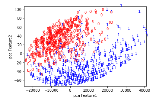
pcaで次元圧縮したところ分類できそうになっています。(赤と青が分かれている)
4 モデル作成,予測
まずは何があれロジスティクス回帰を使用します、
from sklearn.metrics import confusion_matrix
clf = LogisticRegression() #モデルの生成
clf.fit(X_train, y_train) #学習
clf.score(X_train,y_train)
clf.score(X_test,y_test)
y_predict = clf.predict(X_test)
pd.DataFrame(confusion_matrix(y_predict, y_test), index=['predict no click', 'predict click'], columns=['real no click', 'real click'])
0.9129129129129129
たくさんのモデルでやってみる.
names = ["Logistic Regression", "Nearest Neighbors",
"Linear SVM", "Polynomial SVM", "RBF SVM", "Sigmoid SVM",
"Decision Tree","Random Forest", "AdaBoost", "Naive Bayes",
"Linear Discriminant Analysis"]
classifiers = [
LogisticRegression(),
KNeighborsClassifier(),
SVC(kernel="linear"),
SVC(kernel="poly"),
SVC(kernel="rbf"),
SVC(kernel="sigmoid"),
DecisionTreeClassifier(),
RandomForestClassifier(),
AdaBoostClassifier(),
GaussianNB(),
LDA()]
result = []
for name, clf in zip(names, classifiers): # 指定した複数の分類機を順番に呼び出す
clf.fit(X_train, y_train) # 学習
score1 = clf.score(X_train, y_train) # 正解率(train)の算出
score2 = clf.score(X_test, y_test) # 正解率(test)の算出
result.append([score1, score2]) # 結果の格納
# test の正解率の大きい順に並べる
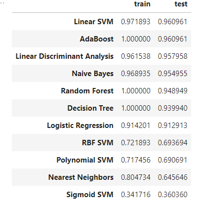
df_result = pd.DataFrame(result, columns=['train', 'test'], index=names).sort_values('test', ascending=False)
5 最後に
このような場合だとLinear SVM と AdaBoostが一番いい結果となりました。
ここももっと精度があげられると思います.
コード